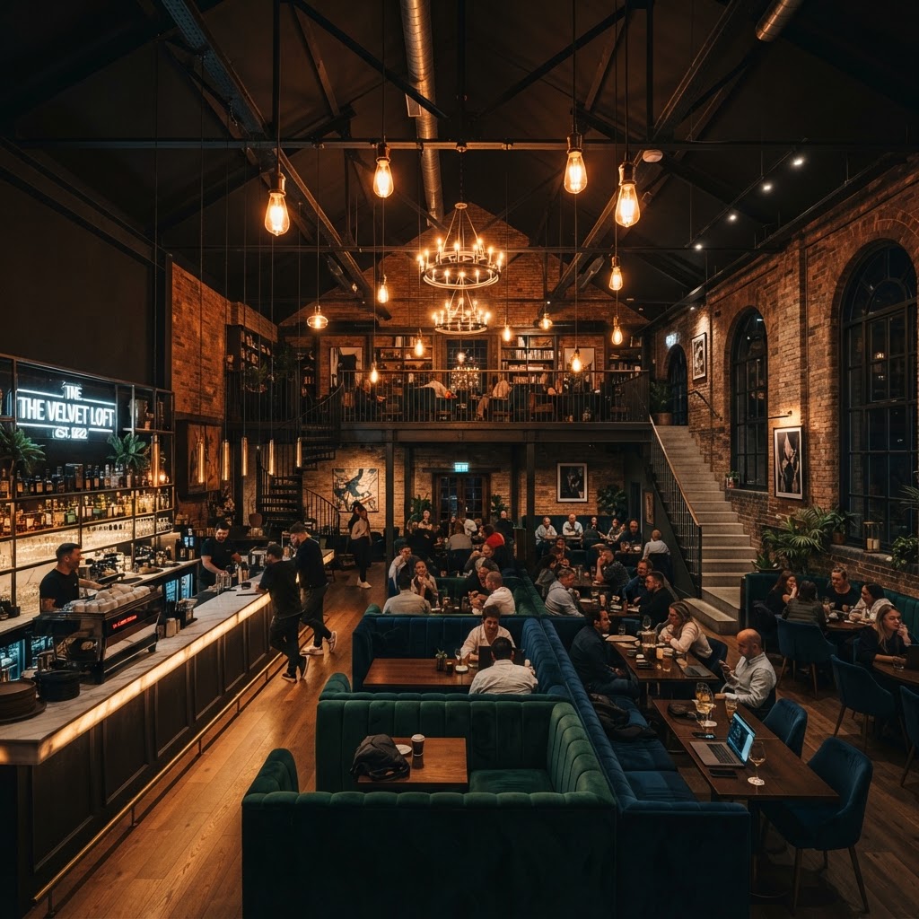
5 Cafe Designs That Are Breaking Every Interior Rule
Tired of the same minimalist white walls and subway tile aesthetic. These five cafes are pushing boundaries with unconventional materials and bold spatial planning. Discover how these unique spots are redefining the coffee shop experience through daring architectural choices.
The Brutalist Coffee Bunker
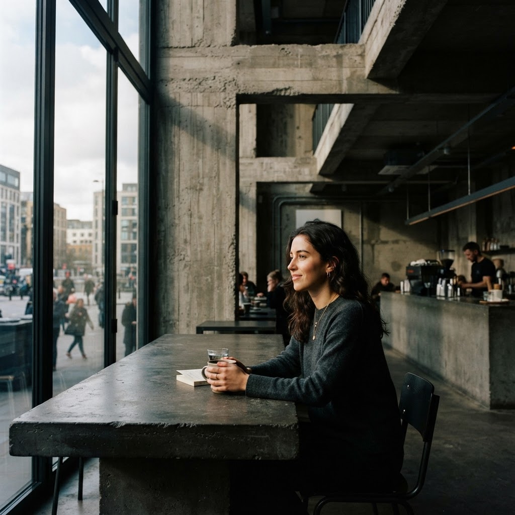
Okay, so when most people hear "brutalist cafe," their first reaction is something like, "that sounds deeply uncomfortable." And honestly, I get it. Brutalism has this reputation for being cold, institutional, kind of oppressive. But here's the thing: when it's done right in a cafe setting, it flips the whole script in the most unexpected way.
The brutalist coffee bunker concept is built around raw, exposed concrete as the hero material. We're talking poured concrete walls, ceiling soffits left completely unfinished, aggregate floors that haven't been touched with so much as a coat of epoxy. The entire philosophy is about honesty in materials. Nothing is hiding. Nothing is pretending to be something it's not. And in a world saturated with shiplap and subway tiles, that kind of unapologetic rawness hits different.
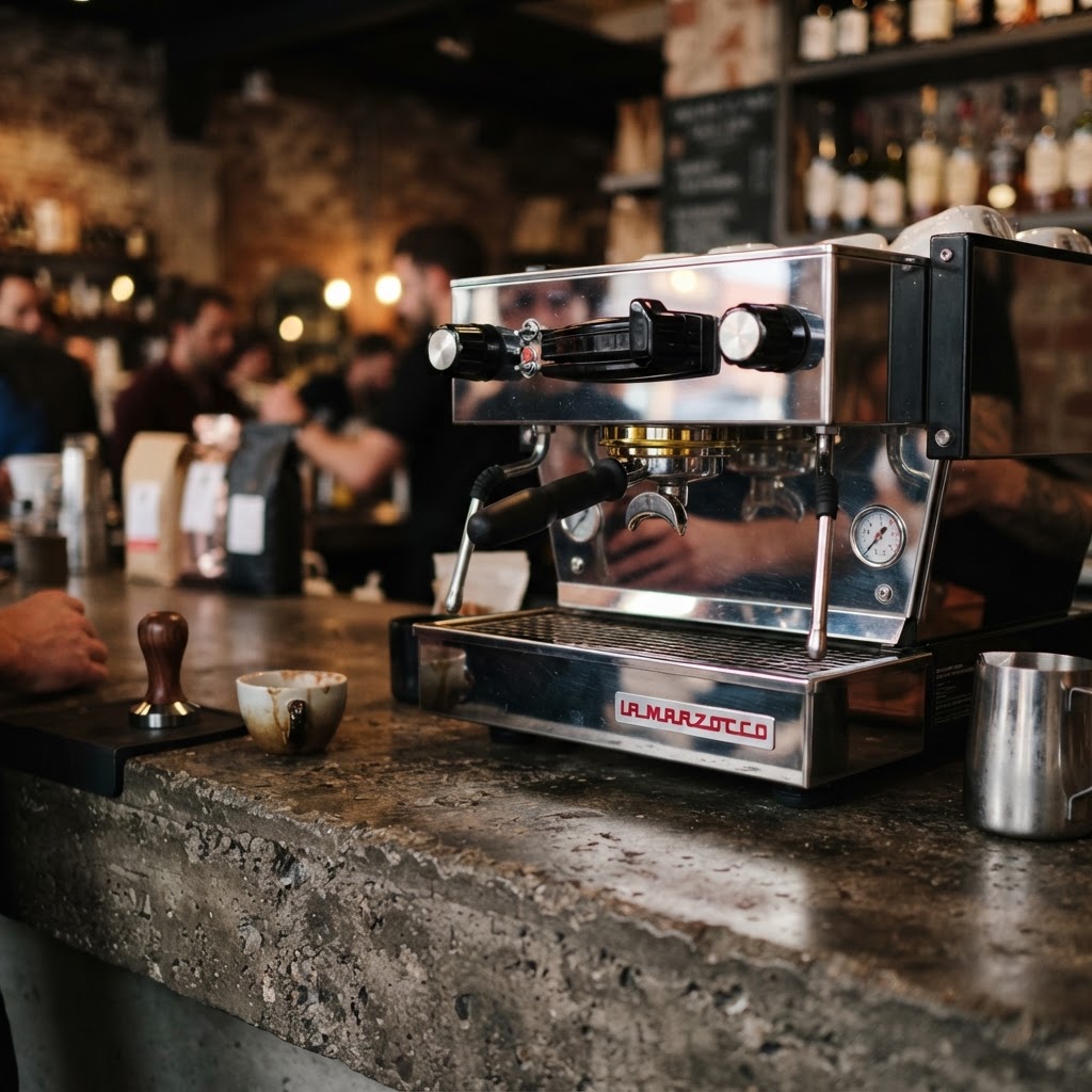
What makes these spaces actually work for hospitality, and not just feel like you're drinking your flat white in a parking garage, is the lighting strategy. The best brutalist cafes use incredibly warm, almost amber-toned pendant lights and recessed strips that fight against the grey. That contrast is everything. The cold material meets warm light and suddenly the room feels like a cave in the best possible sense, intimate and weirdly cozy.
The furniture choices matter enormously here too. Real talk, you cannot put flimsy plastic chairs in a brutalist space. It looks insane. The cafes that are nailing this aesthetic are pairing heavy concrete with chunky solid wood benches, leather stools in dark cognac tones, and custom steel-frame chairs with real weight to them. The rule they're breaking is the old idea that a cafe needs to feel soft and inviting to attract customers. These spaces prove that drama and edge can be just as welcoming, maybe even more memorable.
There's also something genuinely clever happening with the acoustics challenge. Concrete is notoriously terrible for sound, so these designers are sneaking in sound absorption through unexpected means, think ceiling baffles that look like sculptural art, upholstered wall panels disguised as graphic installations, and deliberately low furniture arrangements that break up sound travel. It's smart, practical design wrapped in a punk rock aesthetic.
Living Jungle Atriums
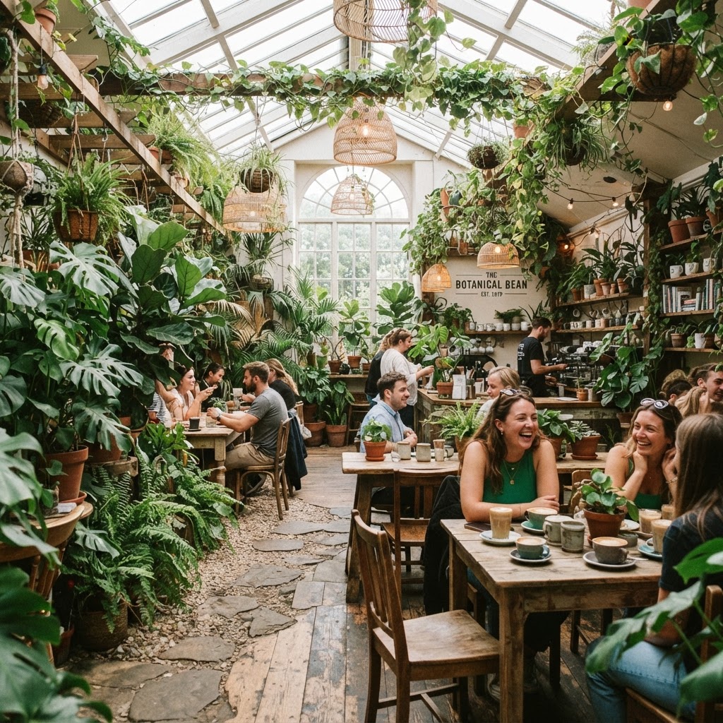
Look, the "plants in a cafe" thing has been done to death. A little succulent on the counter, a fiddle leaf fig in the corner, we've all seen it a thousand times. But what some seriously ambitious cafe designers are doing right now goes so far beyond that it basically belongs in a different category entirely. We're talking about living jungle atriums, spaces where the plant life is so dense and intentional that it becomes the architecture itself.
The rule being broken here is the traditional boundary between interior and exterior. In a conventional commercial space, greenery is decoration. It's supplementary. In these jungle atrium cafes, the plants are load-bearing in a conceptual sense. They determine traffic flow, they create visual separation between seating zones, and they're doing real acoustic and air quality work. Some of these installations use hydroponic wall systems that span entire two-story heights. Others incorporate mature trees planted directly into the floor through custom cutouts in the slab. It's genuinely extraordinary to see in person.
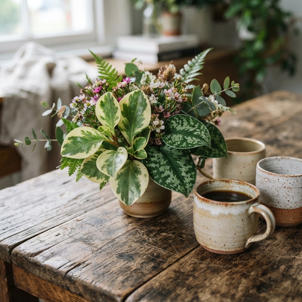
And honestly, the maintenance reality of these spaces is part of what makes them so impressive. These aren't fake plants or low-effort arrangements. Many of these cafes employ a dedicated horticulturist on staff, someone who manages irrigation systems, monitors light levels, rotates plants seasonally, and prunes the whole ecosystem constantly. It's a serious operational commitment, and the fact that cafe owners are making it tells you everything about where commercial hospitality design is heading.
- Hydroponic vertical walls that require no soil and minimal floor space but deliver maximum visual impact
- Skylights and grow lighting systems designed in tandem so natural and artificial light work together for plant health
- Biophilic zoning where denser planting creates private nooks versus open canopy areas for communal seating
- Water feature integration with small streams or misting systems that add humidity and ambient sound
The payoff for customers is something that's genuinely hard to replicate digitally, a sensory experience that involves smell, humidity, filtered green light, and the particular quiet that comes from being surrounded by living things. In an era where most of our experiences are mediated through screens, sitting inside an actual jungle to drink your coffee is a pretty radical act. These cafes understand that completely.
Neon Futurism Reimagined
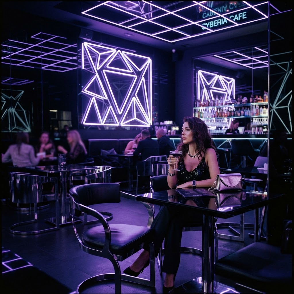
Okay here's the thing about neon in interiors. For a while it got totally ruined. Every brunch spot in every mid-size city had a neon sign above the bar that said something like "but first, coffee" and it became the most eye-roll-inducing cliche in commercial design. So when I say neon futurism is back and it's actually good, trust me on this, because the designers doing it now have completely reinvented the application.
The new neon futurism isn't about signage. It's about using LED neon tubing as a structural and spatial element. Think neon strips embedded into the edges of custom-built counters so the bar seems to float and glow from beneath. Think ceiling grids made entirely from intersecting neon lines in deep violet and cool white that replace traditional lighting fixtures altogether. The color palettes being used have shifted dramatically too, away from the warm pinks and reds of retro diner nostalgia and toward cooler, more cinematic tones like electric blue, deep magenta, and acid green.
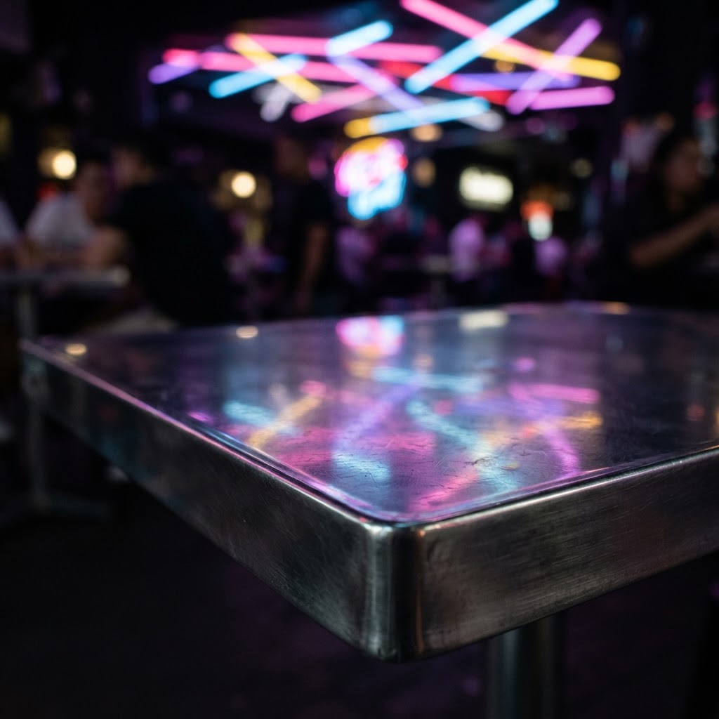
What makes this work as a cafe environment rather than just a nightclub that serves espresso is the balance with matte, light-absorbing surfaces. The best examples pair their neon installations with matte black walls, darkened concrete floors, and furniture in deep charcoal or near-black tones. The neon does all the visual work against those quiet backgrounds. It's actually a very controlled, deliberate design move that requires a ton of restraint even when the result looks wild and chaotic.
The rule being shattered here is the old commercial design wisdom that cafes need natural light and bright, welcoming interiors to feel approachable. These neon futurist spaces are often completely windowless or deliberately block out natural light with blackout treatments. They're creating their own reality inside, a controlled cinematic universe where the coffee ritual feels like an event rather than a routine. Honestly? It works. People seek these spaces out specifically for the experience, not just the caffeine.
The Upcycled Warehouse Aesthetic
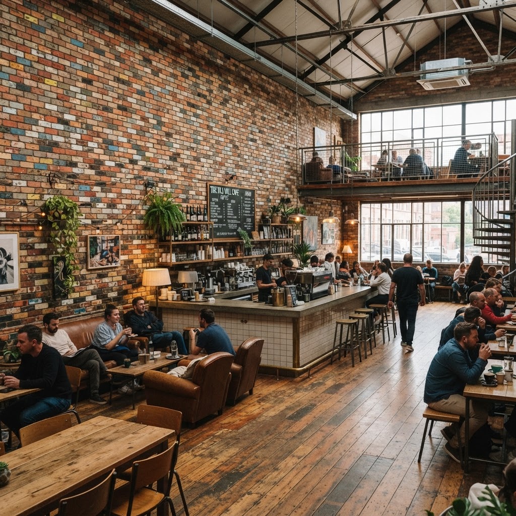
I need to be really clear about something before we dig into this one. The upcycled warehouse aesthetic I'm talking about is not the same as "industrial chic" from 2012 with its Edison bulbs and reclaimed wood shelving. That aesthetic has been so thoroughly commercialized and replicated that it stopped being interesting years ago. What's happening now is genuinely different, and the difference is in the specificity and commitment of the salvage.
The cafes breaking rules in this category are sourcing materials with real provenance and letting that story drive the entire design. One cafe might be built entirely around materials salvaged from a specific demolished textile factory, with the machinery parts repurposed as structural columns, the original factory floor tiles reinstated, and the old ventilation ductwork converted into the new HVAC system. Another might source every piece of furniture from a single era of office liquidation and create a coherent mid-century industrial universe. The sourcing IS the design concept. That's the shift.
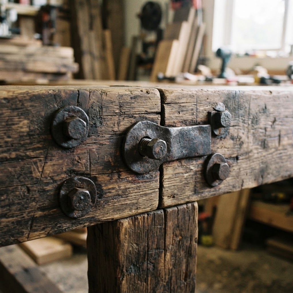
The rule this breaks is the assumption that a commercial space needs to present itself as polished and finished to be taken seriously as a business. These cafes are leaning hard into imperfection, into patina, into the visual evidence of time and use. Cracked surfaces aren't repaired. Mismatched elements aren't reconciled. The deliberate imperfection communicates authenticity in a way that no amount of new construction can fake, and customers are responding to that deeply.
- Site-specific salvage sourced from a single building or location to create narrative coherence
- Functional repurposing of industrial equipment as furniture, lighting fixtures, or structural elements
- Intentional imperfection where damaged or worn surfaces are preserved rather than repaired
- Historical documentation displayed in the space so customers understand the material story
- Hybrid craftsmanship combining salvaged elements with precision custom fabrication for contrast
There's also an environmental argument here that these cafes are increasingly making explicit. When you divert a massive quantity of materials from demolition waste and give them a second life in a high-traffic space, that's a real sustainability win. The cafes doing this well are talking about it openly, sometimes even displaying the weight of materials diverted from landfill as part of their interior narrative. It adds a layer of meaning that genuinely enhances the experience of being in the space.
Soft Minimalist Sculptures
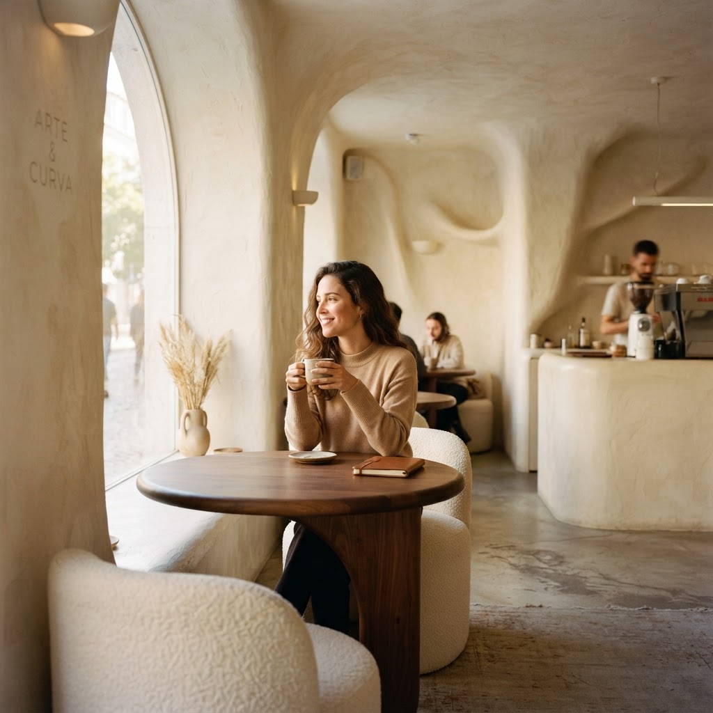
If brutalism is the loudest design on this list, soft minimalist sculpture is absolutely the quietest. And honestly, in some ways it's the most radical. Because the rule it breaks isn't about materials or lighting or sourcing, it's about the fundamental purpose of a commercial space. These cafes are arguing, pretty convincingly, that a cafe can function primarily as an art installation that also serves coffee rather than the other way around.
The defining characteristic here is the absence of hard edges. Literally every surface in these spaces is curved, rounded, or organically shaped. Counters flow without corners. Walls curve into ceilings without a visible transition. Built-in seating follows sinuous lines that seem sculpted rather than constructed. The color palettes are aggressively restrained, working almost entirely within a single tonal family, think all cream and off-white, or all terracotta and sand, with zero visual contrast fighting for attention. The result is a space that feels like being inside a ceramic vessel, or a very beautiful cave.
The materials doing the heavy lifting in these spaces are plaster, microcement, and Tadelakt, a traditional Moroccan waterproof plaster that has this incredible silky, almost skin-like quality when applied correctly. These aren't cheap or easy materials to work with. The skilled plasterers and finishers required to execute this aesthetic are rare and genuinely expensive, which is part of why these cafes feel so precious and considered when you encounter them.
Here's the thing about soft minimalism that I find genuinely fascinating from a hospitality design perspective. By removing virtually all visual noise and stimulation, these spaces create an environment of unusual psychological calm. In a city full of competing visual demands, walking into a room that asks absolutely nothing of your eyes except to rest is almost shockingly pleasant. Customers report staying longer, feeling more relaxed, and being willing to pay more for the experience. The minimalism isn't aesthetic laziness, it's a deeply calculated hospitality strategy.
The furniture in these spaces deserves its own mention because it's so carefully chosen. Every piece is either custom-made to match the sculptural language of the space or sourced from a tiny number of designers working in the same organic-form tradition. Nothing generic, nothing off-the-shelf, nothing that would introduce a contradictory visual note. It's an incredibly disciplined approach that requires enormous confidence from both the designer and the client. Real talk, most cafe owners would be terrified to commit this fully to a single vision. The ones who do it anyway are creating the most memorable spaces in commercial hospitality right now.
Final Thoughts
What connects all five of these cafe design approaches, underneath the very different aesthetics, is a shared willingness to treat the customer as someone who wants an experience rather than just a transaction. The brutalist bunker, the jungle atrium, the neon universe, the salvage story, the sculptural sanctuary. Each one is making a strong, unapologetic argument about what a cafe can be.
And honestly, that confidence is the real rule being broken. For years, commercial hospitality design defaulted to safe, crowd-pleasing choices because the stakes felt too high to alienate anyone. What these designers have figured out is that trying to please everyone usually results in pleasing no one particularly deeply. A space with a genuine point of view attracts people who share that view, and those people become genuinely loyal in a way that a generic nice-enough cafe never achieves.
If you're a cafe owner thinking about a new build or a serious renovation, I'd encourage you to spend real time with these concepts. Not to copy them, but to ask what your version of this kind of commitment might look like. The market is not rewarding average right now. It's rewarding specific, thoughtful, and brave. These five cafes prove that pretty convincingly.
More in Commercial
Stay Inspired
Subscribe for new essays on architecture, design, and the spaces that shape us.