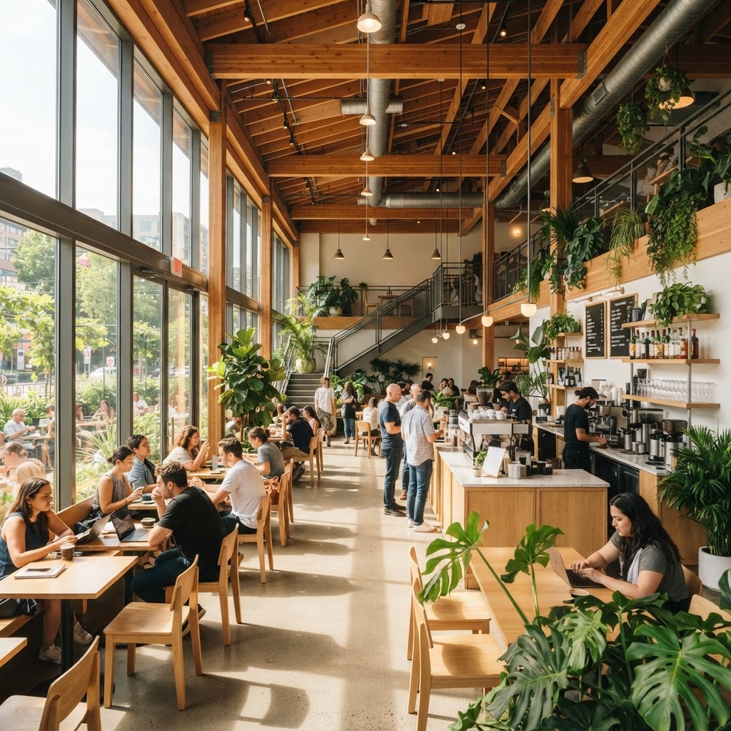
5 Cafe Designs That Are Totally Redefining The Coffee Experience
Looking for fresh interior design inspiration for your next project. We are exploring five unique cafes that push the boundaries of architecture and atmosphere to create truly memorable spaces.
The Biophilic Sanctuary
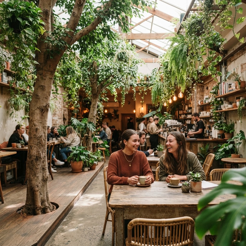
Honestly, when I first walked into a cafe designed around the biophilic concept, I had this weird moment where I forgot I was inside a commercial space. There were trailing plants cascading from ceiling-mounted planters, moss walls acting as living art installations, and natural light pouring in through carefully positioned skylights. It didn't feel like a coffee shop. It felt like someone had carved out a room inside a forest and decided to serve espresso there. And honestly? That's exactly the point.
Biophilic design in cafes isn't just about throwing a few succulents on a windowsill and calling it a day. Real talk, it's a deeply considered design philosophy that centers on our innate human need to connect with nature. The best examples of it use layered greenery at multiple heights, natural materials like raw timber, rattan, stone, and linen, and acoustic strategies that mimic the ambient noise of natural environments. Water features are increasingly popular too, because the soft sound of running water does something genuinely calming to the nervous system. Designers who get this right aren't just making pretty spaces. They're engineering a feeling.
The commercial implications are significant, and any smart cafe owner knows it. Studies have consistently shown that people stay longer in biophilic environments, they spend more, and they come back more often. That's not just good vibes, that's good business. From a design standpoint, the challenge is maintenance. Living walls require irrigation systems, proper lighting spectrums for plant health, and regular horticultural upkeep. But the payoff in atmosphere and customer loyalty is almost impossible to replicate with any other design approach.
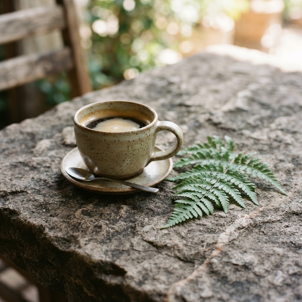
What really sets the best biophilic cafes apart is the attention to sensory layering. It's not enough for a space to look natural. It needs to smell like it, sound like it, and feel like it under your fingertips. Think rough-hewn timber bar tops with visible grain, earthenware cups that warm your hands differently than a standard ceramic mug, and the faint, clean smell of damp soil and fresh herbs. Some cafes are now growing their own garnishes and ingredients right there in the space, which creates this beautiful loop where the design and the product become one continuous experience.
If you're a cafe owner or a designer working on a hospitality brief, look at biophilic design not as a trend but as a long-term investment in your space's identity. The most iconic examples of this style have been around for years and they still look fresh. Nature, it turns out, doesn't go out of fashion.
Industrial Brutalism Reimagined
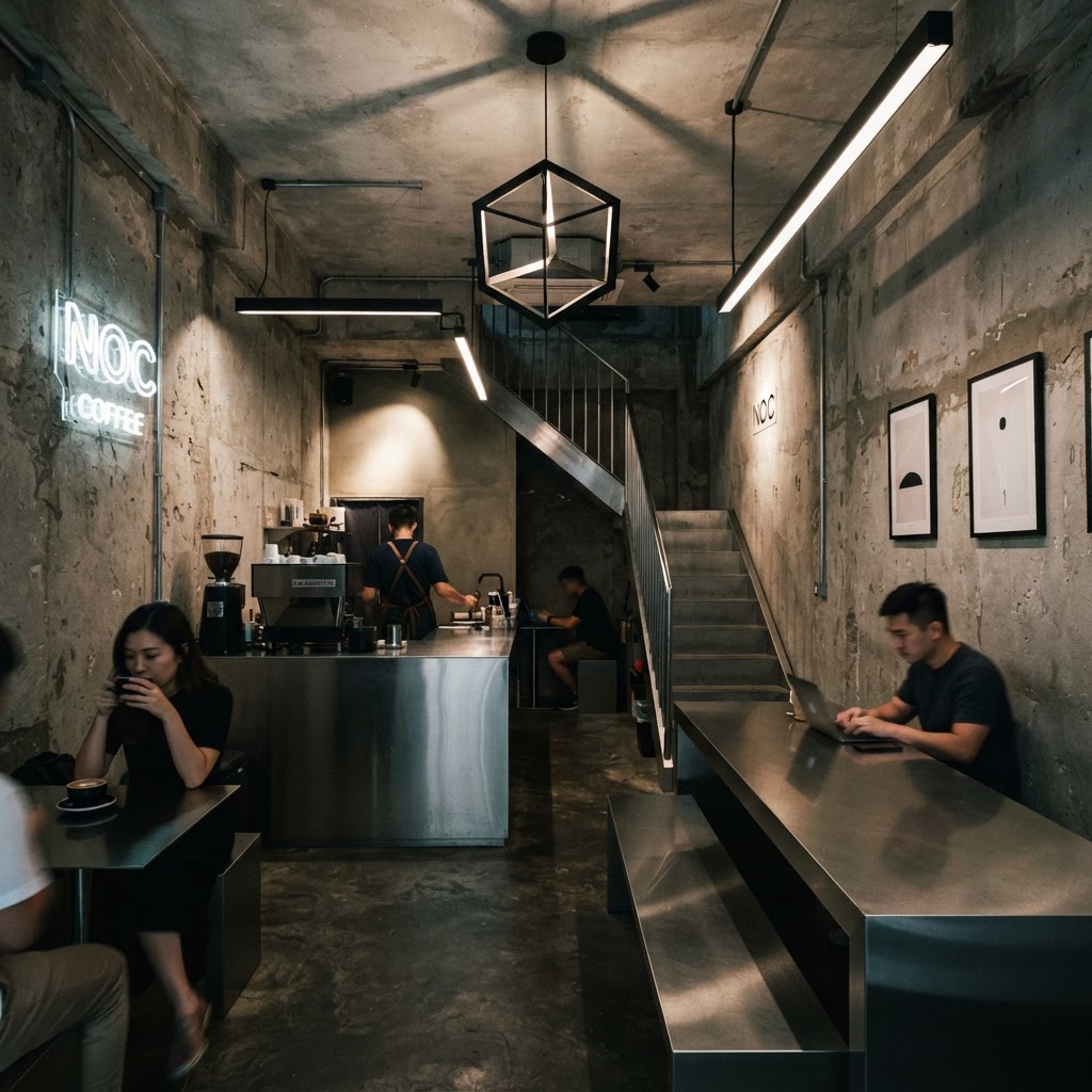
Look, I know what you're thinking. Brutalism? In a cafe? That sounds cold and unwelcoming and frankly a bit intimidating. And if you're picturing the grim, grey government buildings of the 1960s, I get it. But here's the thing: when brutalist aesthetics are applied thoughtfully to a hospitality space, something genuinely surprising happens. The rawness becomes warmth. The weight of the concrete becomes grounding. And the honesty of exposed structure starts to feel, weirdly, like integrity.
The cafes leading this movement aren't just slapping exposed concrete onto everything and calling it brutalism. They're taking the core principles of the style, the celebration of structural honesty, the use of bold geometric forms, the refusal to hide functional elements, and they're filtering them through a lens of warmth and hospitality. Pendant lights in warm amber tones against a poured concrete ceiling. Plush, deep-colored velvet seating tucked into angular concrete alcoves. The contrast is the whole point. It's deliberate and it's brilliant.
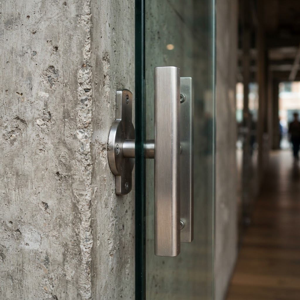
One of the most exciting things happening in this space is the reuse of existing brutalist architecture. Rather than demolishing old concrete structures, savvy developers are converting them into hospitality venues. The bones are already there, which means the design team gets to work with genuinely dramatic spaces, massive ceiling heights, chunky load-bearing columns, raw soffits with visible conduit. Instead of fighting these elements, the best designers lean all the way in. They let the architecture be the statement, and furnish around it with restraint.
From a material perspective, the palette tends to stay tight. Concrete, steel, dark timber, and leather are the usual players, with an occasional pop of a single bold color, maybe an oxidized copper bar top or a deep forest green banquette. The menu design, branding, and even the barista uniforms tend to reflect the same spare, graphic sensibility. It's a total world-building exercise. When it works, it works incredibly hard. Customers don't just visit. They become regulars because the space gives them something to feel, not just somewhere to sit.
This style isn't for everyone, and honestly that's fine. The cafes doing industrial brutalism well have a very clear idea of who their customer is. They're not trying to be universally appealing. And in a crowded market, that kind of confident design identity is worth more than any amount of generic Scandinavian minimalism.
Monochromatic Maximalism
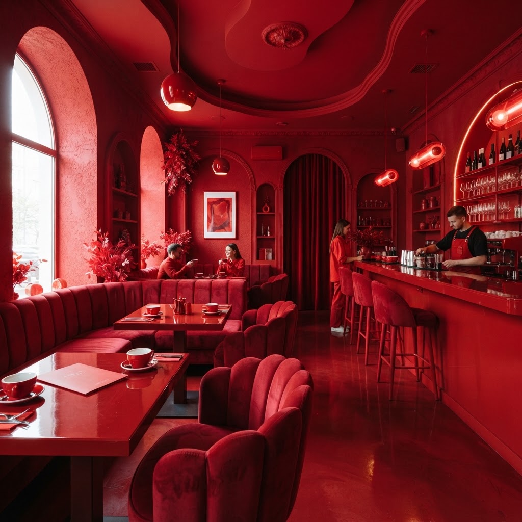
This one is genuinely bold, and I say that as someone who has seen a lot of cafes that thought they were bold but were actually just doing the safe version of edgy. Monochromatic maximalism is different. It takes one color, or a very tight family of closely related tones, and commits to it completely and without apology. We're talking walls, ceiling, floor, furniture, crockery, staff aprons, and menu boards. Everything. One color. Maximum everything.
The effect is initially shocking. Your brain doesn't quite know how to process it because you're so used to spaces that use color as an accent rather than a total environment. But give it thirty seconds and something shifts. You start reading the space differently, noticing texture instead of color contrast, noticing form and shadow in a way you normally wouldn't. It's genuinely one of the most interesting perceptual tricks in contemporary hospitality design, and it photographs spectacularly, which in this era matters more than most designers will publicly admit.
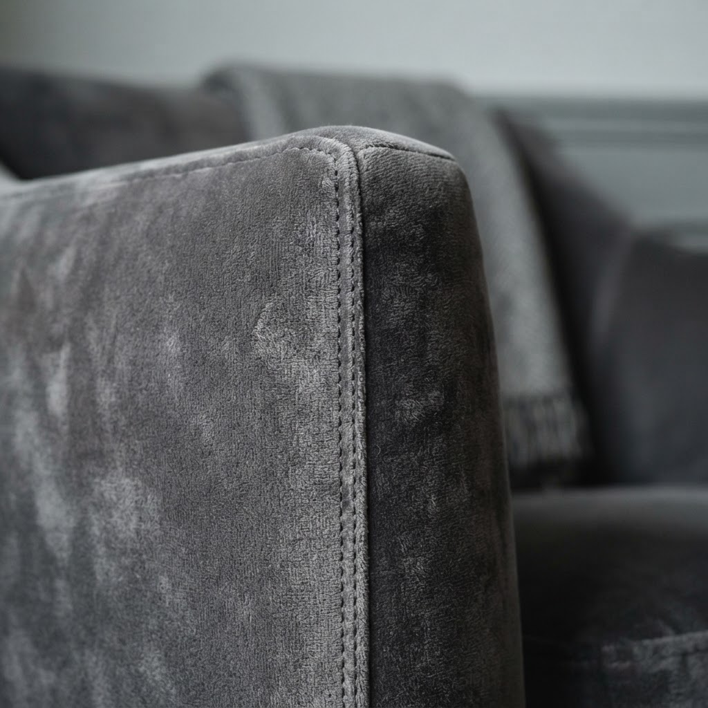
The colors being used aren't pastels and they're not safe neutrals. The cafes doing this most successfully are going for deep terracotta, rich burgundy, saturated cobalt, or warm dusty sage. Colors that have actual personality and emotional weight. The maximalism part comes from the layering, floor tiles in the same tone as the painted walls, velvet seating in a slightly deeper shade, ceramic art pieces throughout, patterned textiles with tonal variation. It's dense and rich and completely intentional.
From a design execution standpoint, this approach demands a very skilled hand. Get the undertones slightly wrong and the whole thing reads muddy and oppressive rather than immersive and luxurious. The lighting strategy is critical too, because artificial light can shift color temperature dramatically. Designers working in this style typically spend a huge amount of time on mock-ups and material samples under different lighting conditions before committing to anything.
Trust me on this: monochromatic maximalism is not a shortcut or a gimmick. Done right, it represents some of the most technically demanding and visually rewarding work in commercial interior design right now. And the cafes that have pulled it off have become genuine design landmarks in their cities.
The Floating Coffee Bar
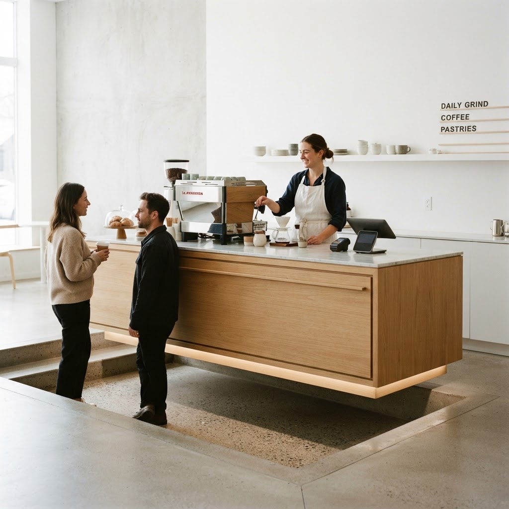
Here's the thing about most cafe layouts: the bar is just kind of there. It's a counter, usually along one wall, usually pretty standard in terms of height and depth, and while it might be finished nicely, it doesn't really make a statement as an object in space. The floating coffee bar concept completely blows up that convention. And I find it genuinely exciting because it asks a question that most hospitality designers never bother to ask: what if the bar itself was the architecture?
The idea centers on detaching the bar structure from the walls and floors, or at least creating the illusion of that detachment through clever structural engineering and material choices. Cantilevered elements, backlit bases that create the impression of hovering above the floor, bar tops suspended on thin steel rods from the ceiling, all of these techniques contribute to a bar counter that reads as a sculptural installation rather than a piece of furniture. The barista becomes a performer on a stage, which changes the whole energy of the customer interaction.
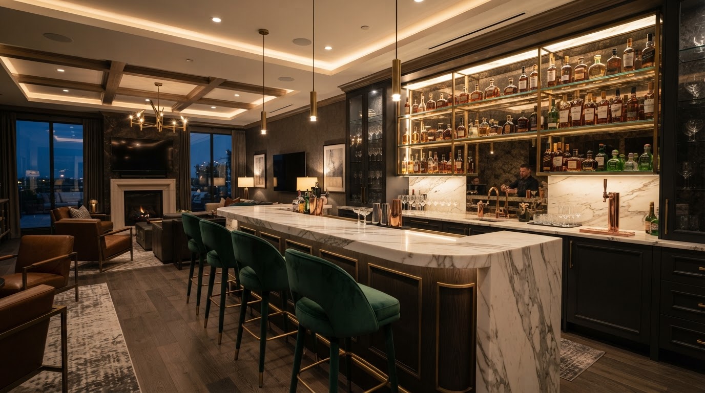
The materials used in these bar structures tend to be precious and considered. Book-matched marble slabs, hand-poured glass panels, oxidized metal, or sculpted terrazzo are common choices because they reward close inspection and look beautiful from across the room. The under-bar lighting is usually tuned very carefully, warm enough to feel welcoming but directional enough to highlight the material quality. Some of the most stunning examples use a single uninterrupted slab of stone as the bar top, which involves serious structural engineering to achieve safely.
What makes this approach so compelling from a commercial perspective is how effectively it anchors the spatial experience. Walk into a cafe with a floating bar and your eye goes straight to it. It's the focal point, the organizing principle, the thing around which everything else is arranged. This kind of clarity is incredibly valuable in hospitality design because it tells the customer immediately where to go and what to do. The journey to the counter becomes part of the experience, and that's smart design working on multiple levels simultaneously.
Honestly, this is the concept I'd most love to see more of in smaller, independent cafes. It doesn't have to cost a fortune if you find the right structural engineer and a designer who knows how to work with interesting material offcuts. The impact is outsized relative to the investment, and it gives a small cafe a genuinely distinctive identity in a way that no amount of Instagram-friendly wall murals ever could.
Adaptive Heritage Preservation
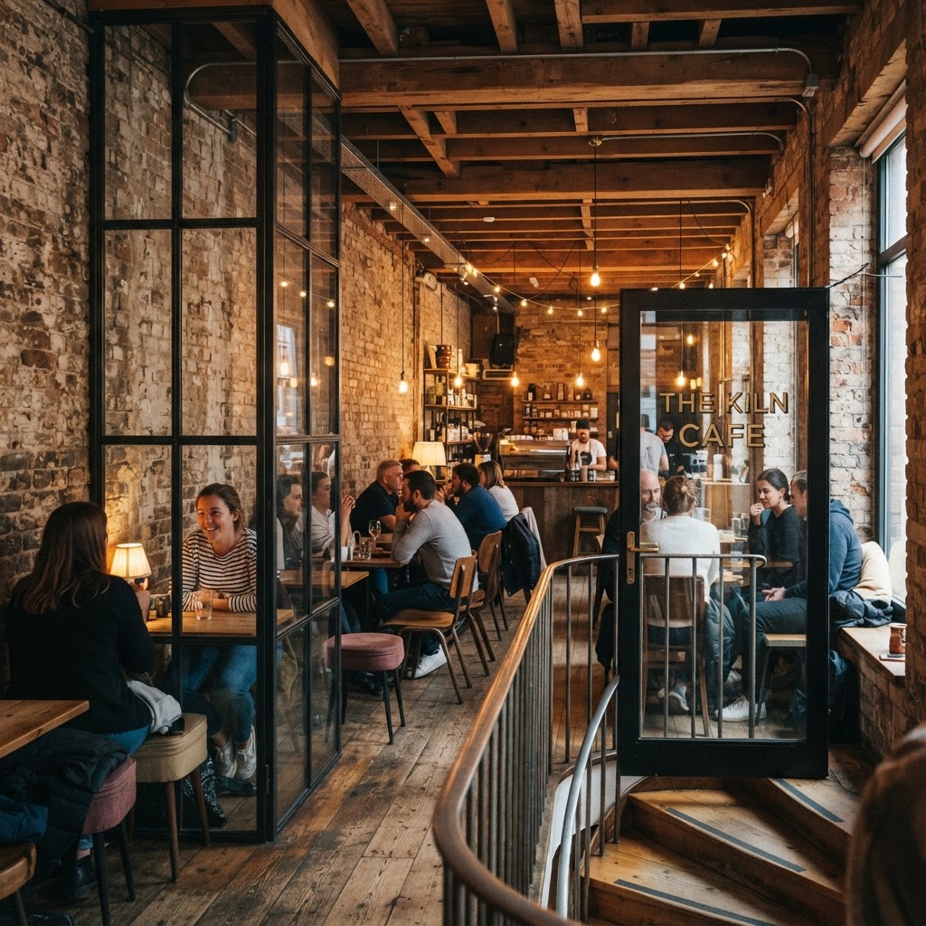
Of all the cafe design approaches on this list, adaptive heritage preservation is the one that makes me genuinely emotional, and I'm not even slightly embarrassed about that. There's something profoundly moving about walking into a building that has existed for over a hundred years, that has housed businesses and families and entire chapters of a city's history, and finding it transformed into a vibrant, contemporary space that honors every layer of its past. Done well, this kind of design is more than aesthetics. It's an act of cultural stewardship.
The best examples of adaptive reuse in cafe design don't try to make old buildings look new. They do the opposite. They strip back the layers of bad renovation that accumulated over decades, exposing original timber floors, pressed metal ceilings, hand-laid brick walls, and ornate plasterwork cornices. Then they introduce contemporary elements with careful restraint, precision-detailed joinery, current lighting technology, modern service equipment, in a way that creates a clear and honest dialogue between old and new. You always know what's original and what's been added. That honesty is what makes it beautiful.
The technical challenges here are substantial. Heritage buildings come with constraints that can feel maddening: load-bearing walls that can't be moved, ceiling heights that dictate furniture scale, planning regulations that govern what can and cannot be altered. Experienced designers who specialize in adaptive reuse have developed sophisticated strategies for working within these constraints creatively. A column you can't remove becomes a display element. A low ceiling in one zone creates an intimate nook. A structural element that would normally be hidden becomes a feature.
What I find most interesting about the cafes doing this brilliantly is their approach to storytelling. The best ones make the building's history part of their brand narrative. Framed archival photographs of the original structure, menu copy that references the building's past uses, staff who can speak knowledgeably about the space's history. The cafe becomes a destination not just for coffee but for a genuine sense of connection to place. And in cities that are changing rapidly and often losing their architectural character in the process, that sense of rootedness is genuinely priceless.
Real talk: adaptive heritage preservation is almost always more expensive and more complicated than starting from scratch. But the result is a space that can never be replicated, that carries genuine authenticity, and that tends to attract a deeply loyal community of regulars. In an industry where differentiation is everything, you simply cannot put a price on that.
Final Thoughts
What all five of these cafe designs have in common is a refusal to settle for generic. Each one starts with a strong point of view, commits to it fully, and trusts that the right customers will find their way to it. That's a lesson that goes well beyond cafe design. The spaces that are truly redefining the coffee experience aren't trying to appeal to everyone. They're trying to mean something to someone, and they're doing it through the language of architecture and design.
Whether it's the sensory richness of a biophilic sanctuary, the confrontational beauty of reimagined brutalism, the perceptual adventure of monochromatic maximalism, the sculptural drama of a floating bar, or the emotional depth of a preserved heritage building, each of these approaches offers a genuinely different answer to the same question: what should it feel like to sit down with a good cup of coffee?
And honestly, the fact that we're even asking that question in such creative and ambitious ways right now is one of the most exciting things happening in commercial interior design. The cafe has become one of the most interesting design laboratories we have. I, for one, cannot wait to see what comes next.
More in Commercial
Stay Inspired
Subscribe for new essays on architecture, design, and the spaces that shape us.