5 Cafe Interiors That Are Breaking Every Design Rule
Tired of the same minimalist coffee shops with subway tiles and exposed bulbs. We found five unique cafes that push the boundaries of design with bold colors and experimental textures. Discover the spaces that are redefining the modern coffee experience.
The Maximalist Sanctuary
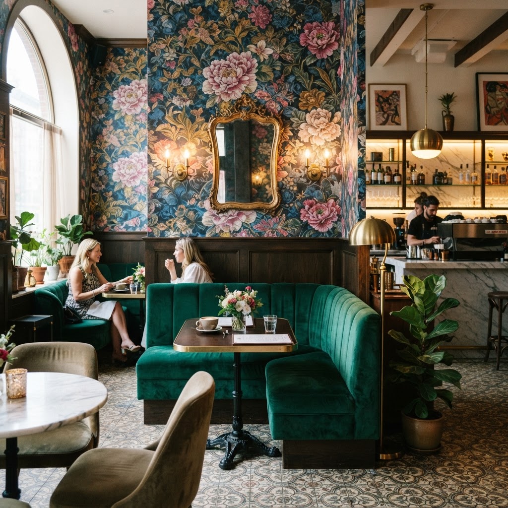
Okay, let's kick things off with the one that honestly made my jaw drop when I first saw it. Maximalism in a cafe setting. Every design textbook will tell you to keep it simple, keep it clean, give people breathing room. And look, I get it. But these spaces are out here proving that theory completely wrong, and doing it with confidence.
The maximalist cafe approach stacks patterns on patterns, mixes vintage furniture with contemporary art, layers textiles you would never expect to see together, and somehow the whole thing reads as intentional rather than chaotic. The secret, if you can even call it that, is curation. There's a difference between maximalism and just hoarding stuff. The best maximalist interiors have a very deliberate hand behind them. Every object has been chosen, placed, and considered. Nothing lands on a shelf by accident.
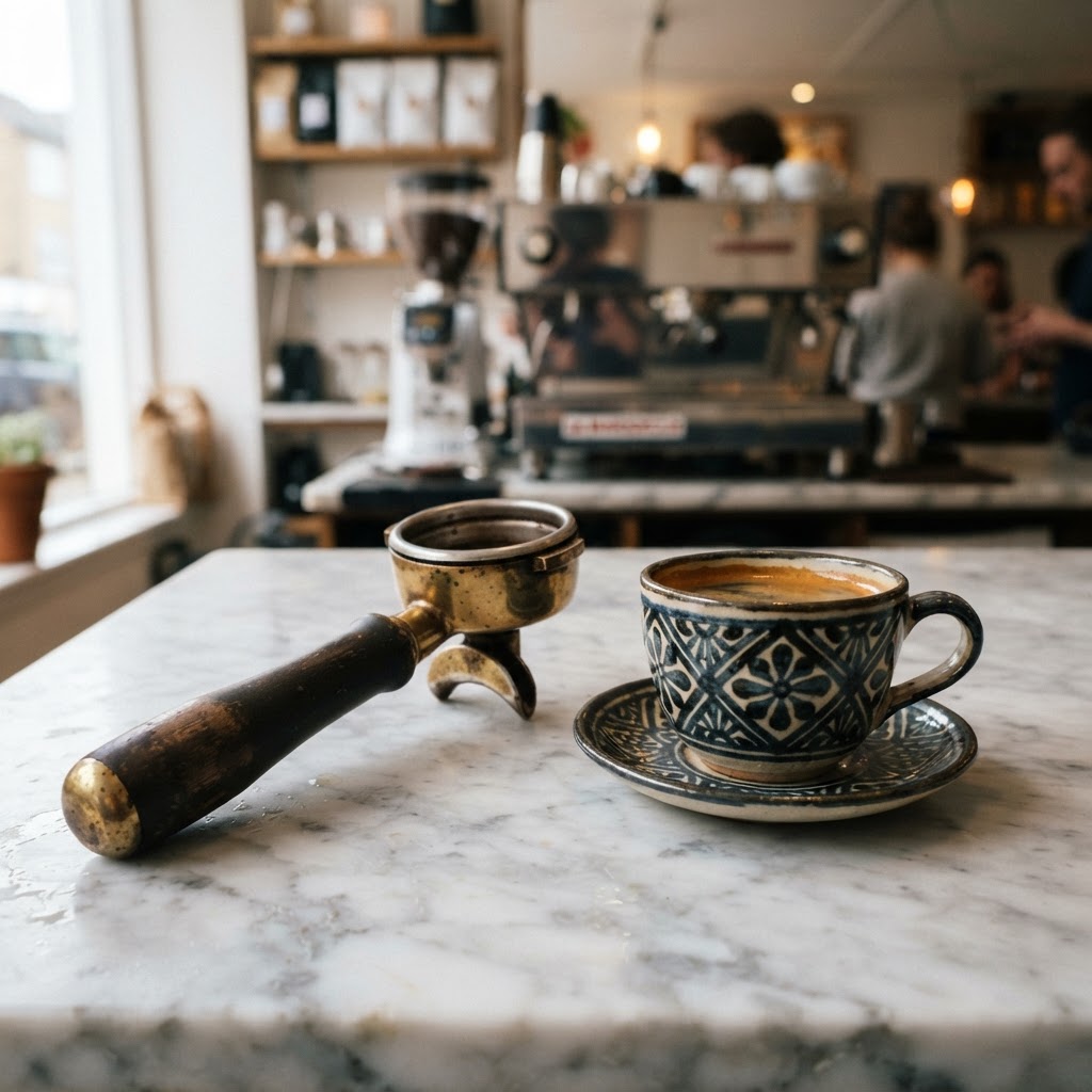
What really gets me about this style is how comfortable it feels. You walk in and there's so much to look at that you forget to feel self-conscious. You're not sitting in a sterile white box worrying if you're taking up too much space. You're surrounded by stuff, by life, by color, and it wraps around you like a worn-in jacket. Trust me on this, there's a reason these cafes have some of the best dwell times in the industry. People genuinely do not want to leave.
- Layered textiles: Think velvet cushions over rattan chairs, patterned rugs under raw wood tables.
- Collected art: Not a curated gallery wall, but more like someone's grandmother's living room if their grandmother had exceptional taste.
- Mixed lighting: Pendant lamps, table candles, neon signs, vintage sconces all coexisting without apology.
- Unexpected color pairings: Mustard yellow with forest green, cobalt blue with terracotta, none of the safe beige-on-beige you see everywhere else.
Real talk, if you're a cafe owner who has been told to "keep it minimal for the Instagram aesthetic," I want you to look at these maximalist spaces and reconsider. Minimalism photographs well, sure. But maximalism creates stories, and stories are what bring people back.
Industrial Brutalism Reimagined
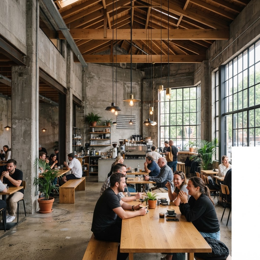
Here's the thing about brutalism. It got a bad reputation for decades because people associated it with oppressive government buildings and cheerless housing blocks. Cold, gray, impersonal. And in those contexts, honestly, fair enough. But when a thoughtful designer takes those same principles, that love of exposed materials and honest structure, and brings them into a hospitality setting, something genuinely interesting happens.
The cafes doing this right are not just slapping exposed concrete on a wall and calling it industrial. They're going deeper. They're celebrating the actual bones of a building. Unfinished ceilings that reveal ductwork and beams. Floors that show their age and wear without embarrassment. Structural columns that become design features rather than things to hide. And then, crucially, they're softening it all just enough with warmth. A single hanging plant. Wooden stools with thick cushions. A hand-lettered menu board that looks like someone actually stood there and wrote it.
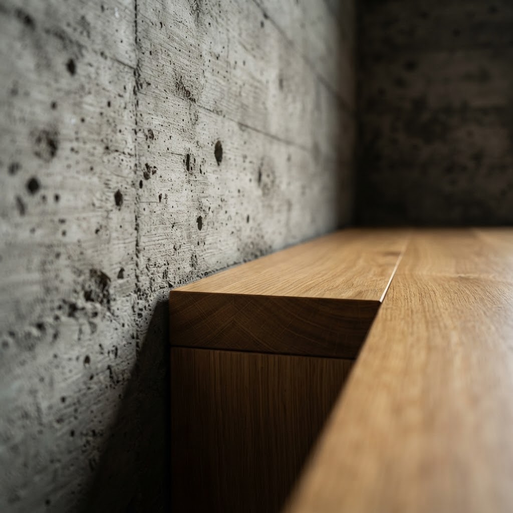
The design rule being broken here is the old idea that commercial hospitality spaces need to feel welcoming in a traditional, soft, warm-toned way. That approachability has to come through plush seating and ambient lighting. These brutalist cafes are redefining what welcoming means. They're saying: we trust you to find beauty in raw things. And visitors are responding to that trust in a big way.
"The best brutalist interiors don't ask you to be comfortable immediately. They ask you to stay long enough to discover the comfort that's already there."
What I love about this trend is how honest it is. There's no pretense. No trying to look like something you're not. The building is what it is, and the designer's job was to reveal that rather than cover it up. In a world of faux-aged finishes and peel-and-stick brick wallpaper, that kind of authenticity is genuinely refreshing.
The Pastel Dreamscape
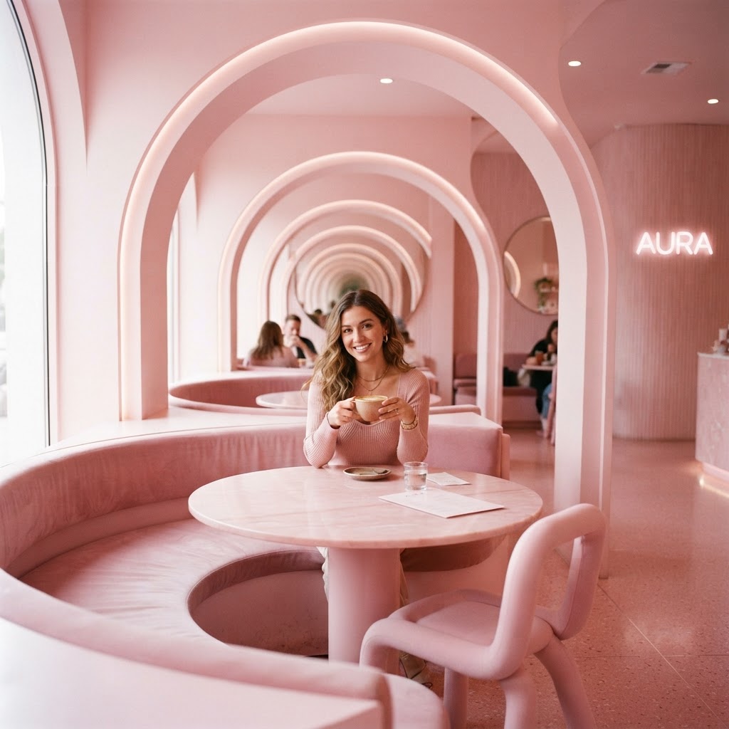
I know what you're thinking. Pastel cafes? That's nothing new. And you're right that the blush-and-gold thing had a massive moment a few years back and then got completely run into the ground. But the pastel dreamscape cafes I'm talking about here are doing something much more interesting than just painting the walls pink and calling it a day.
These spaces are using pastel as a full language. Blush ceilings that make everyone look like they're glowing. Mint green tiles that create a depth and rhythm across an entire wall. Lavender booths that feel somehow both retro and completely forward-thinking. The color isn't an accent, it's the architecture. And that's the rule being broken here. The conventional wisdom is that you use neutrals as your base and add color through accessories. These cafes flipped that completely and built the entire spatial experience out of color itself.
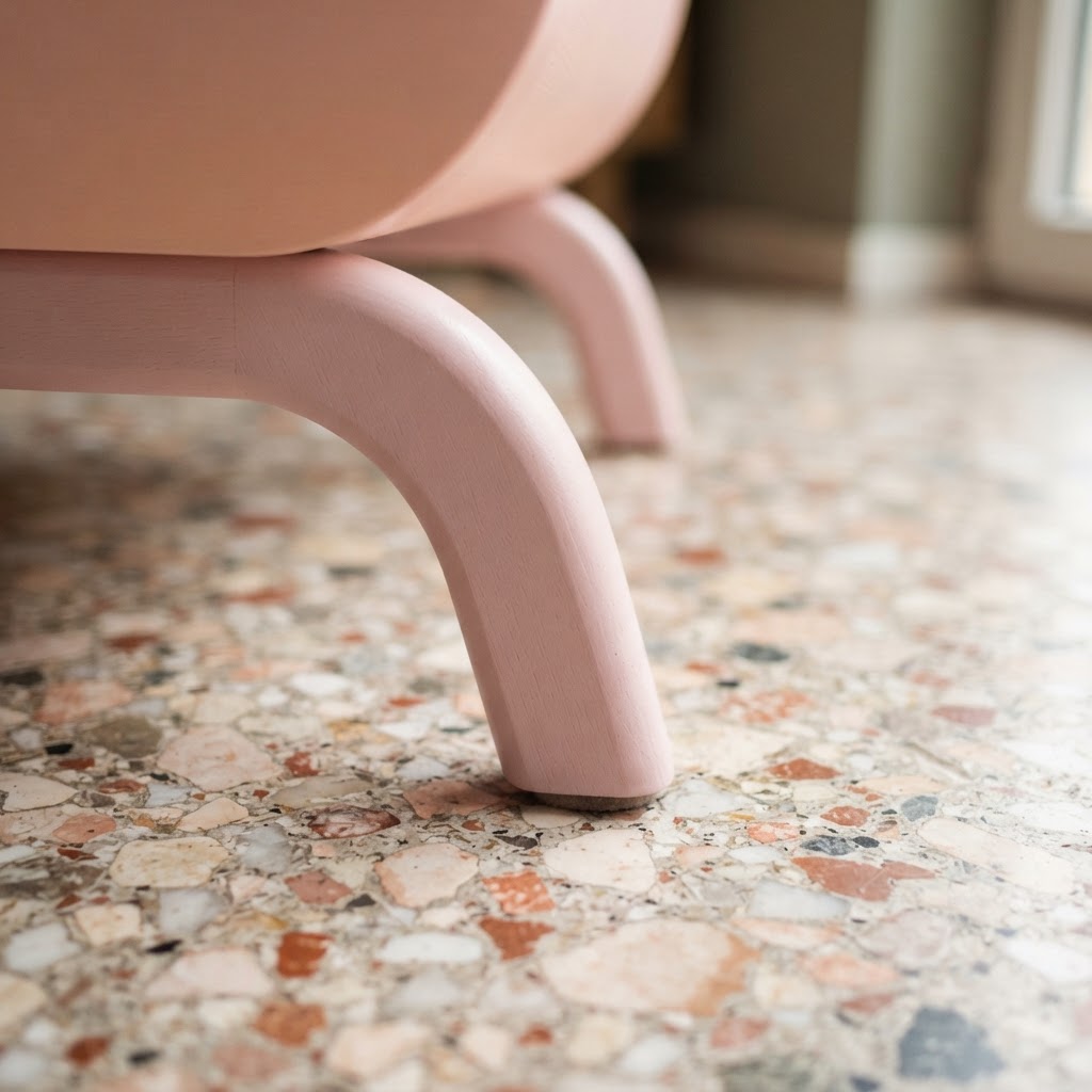
And honestly, the psychological effect is real. Studies on color and mood in hospitality environments consistently show that soft, cool pastels reduce stress and increase the perception of spaciousness. So there's actual science behind what looks like pure aesthetic whimsy. These cafe owners aren't just following a vibe, they're creating an environment where people feel genuinely good, and good-feeling customers buy more coffee and come back more often. Smart design always has function underneath the beauty.
- Tonal layering: Using multiple pastels from the same family creates depth without visual noise.
- Material choices: Matte finishes absorb light softly, which keeps the space feeling dreamy rather than clinical.
- Furniture as part of the palette: Chairs, tables, and even the espresso machine casing are chosen to match or complement the color story.
- Natural light maximization: Pastel spaces need good light to sing. Sheer curtains, big windows, and reflective surfaces are non-negotiable.
Look, I was skeptical too. But walk into one of these spaces on a grey Tuesday morning and tell me you don't immediately feel a little better. I dare you.
Sustainable Earthy Organic
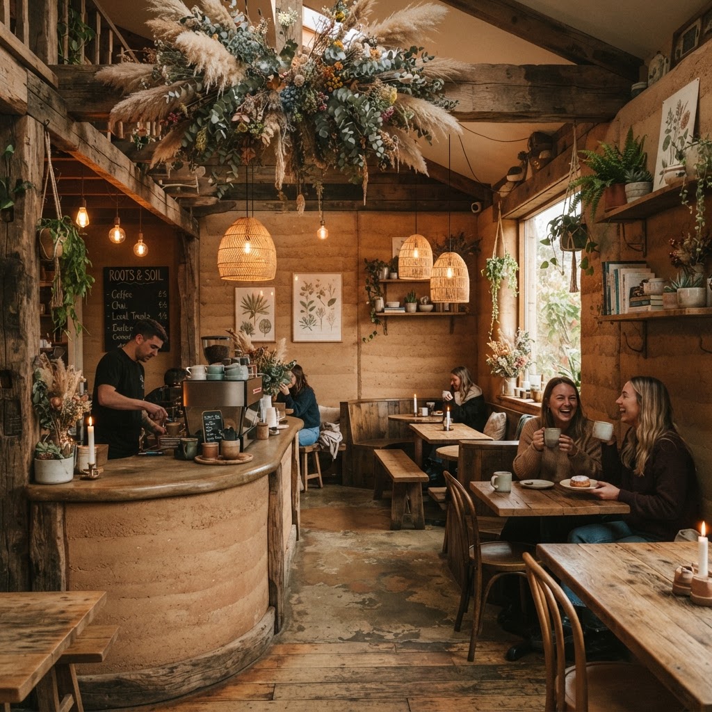
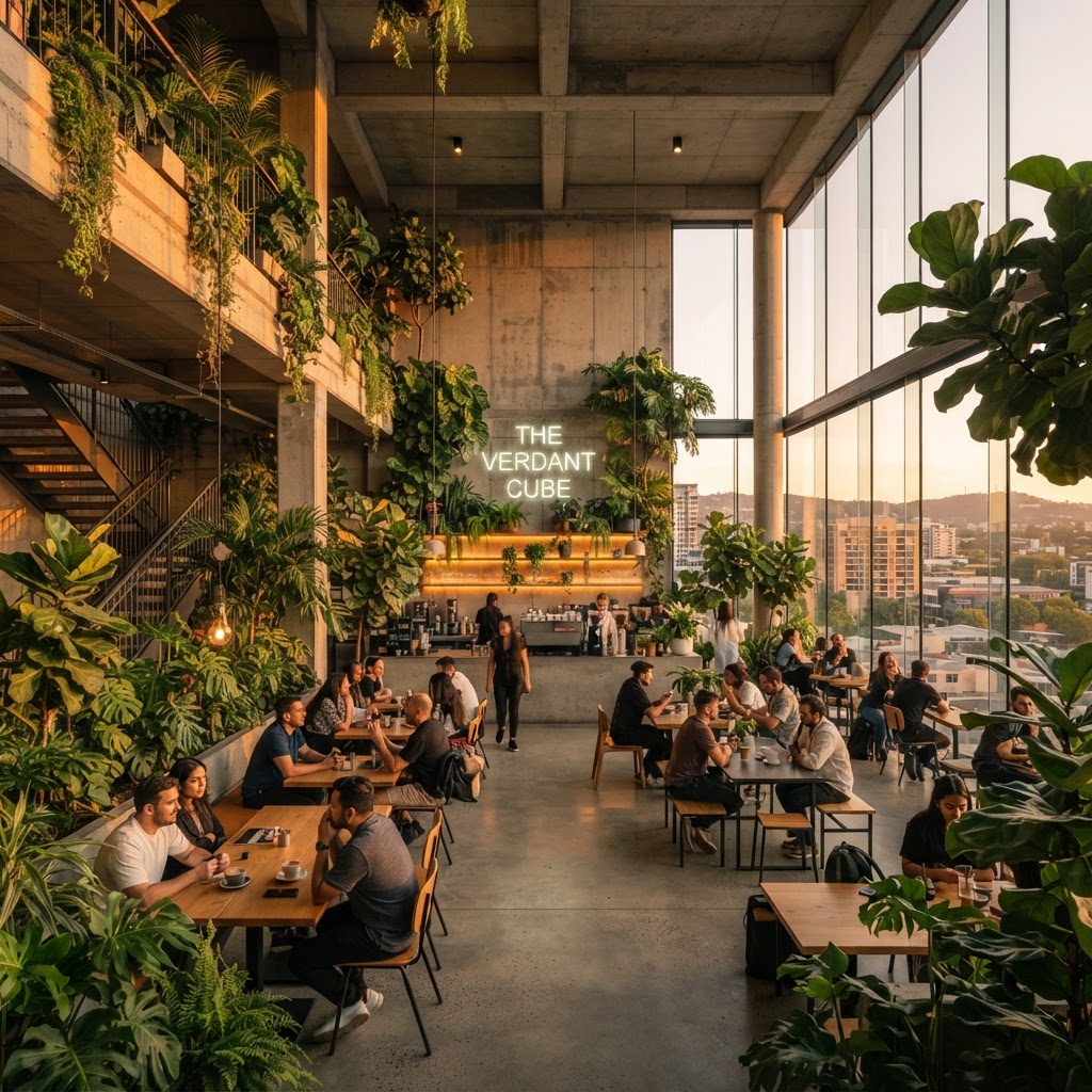
Here's where things get really interesting. Sustainable design in commercial spaces used to mean, and I say this with love, kind of bland. Recycled materials that looked recycled. Earthy tones that tipped into dull. A general aesthetic that communicated "we care about the planet" in a way that was admirable but not exactly exciting. Those days are genuinely over, and the cafes leading this next wave are some of the most beautiful commercial spaces I've ever seen.
The designers working in this space now are treating sustainability not as a constraint but as a creative brief. What can you do with reclaimed timber that you can't do with new wood? A lot, it turns out. The grain is richer, the history is visible, the imperfections become character. Walls built from locally sourced stone. Furniture shaped from materials that would have otherwise ended up in a landfill. Living walls that aren't just decorative but actually improve air quality. Every element in these spaces has a reason to exist beyond just looking good.
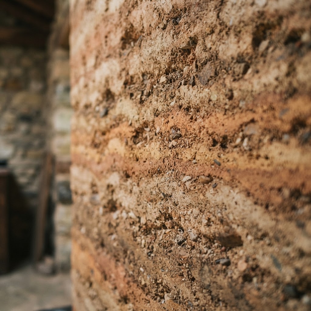
The design rule being challenged here is the assumption that premium commercial spaces require premium new materials. That a high-end cafe needs to feel sleek and polished in that specific modern way. These earthy organic spaces are saying something else entirely. They're saying that age is value. That texture is luxury. That a table with a history is worth more than one that came flat-packed last week.
"The organic cafe interior doesn't just look good. It makes you feel like the world might be okay after all, and right now, that's worth a lot."
Customers are noticing too. There's a growing appetite for spaces that feel genuine and grounded, especially among younger coffee drinkers who are deeply conscious of environmental impact. A cafe that walks the talk, not just in its sourcing but in its very walls and floors, creates a level of trust with its community that no amount of marketing can buy. This is sustainable design working on every level simultaneously, and it's thrilling to watch.
Art Deco Revival
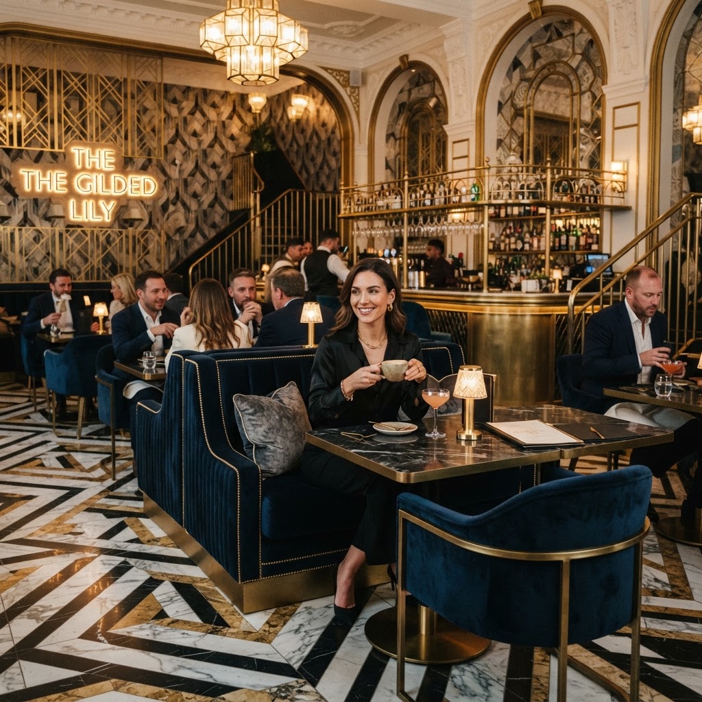
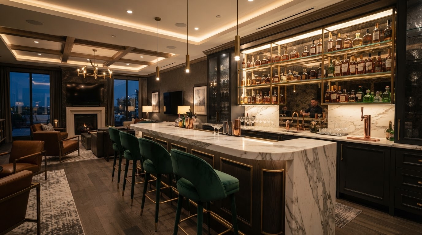
Art Deco had a revival in high-end hotel lobbies and cocktail bars a few years back, and most people thought it would stay there. Too formal, too opulent, too much geometric gold for a neighborhood coffee shop. And look, I understand that instinct. But some seriously talented designers decided to take Art Deco somewhere it had never been before and bring it into the everyday cafe, and the results are frankly stunning.
What makes this work is restraint. Full Art Deco in a small cafe would be overwhelming, all sunburst motifs and lacquered surfaces and brass everywhere you look. The cafes doing this well are cherry-picking. They're taking the geometric boldness of the style and pairing it with much more relaxed materials. A deep green tile wall with unmistakable Deco patterning behind a simple wooden counter. A curved ceiling detail picked out in warm brass over seating that's actually comfortable. A mosaic floor that references the 1920s without feeling like a museum exhibit.
The rule being broken here is that historical design styles belong in formal settings. That you can't bring genuine architectural elegance into a casual, everyday space without making people feel underdressed or out of place. These cafes are proving that elegance and approachability are not opposites. They're just two things that most designers haven't figured out how to combine yet.
- Geometric tile work: Even a small section of authentic Deco patterning anchors an entire room and does the heavy lifting visually.
- Curved forms: Art Deco loved a curve, and curved seating or curved counter edges immediately signal the style without being heavy-handed.
- Warm metals: Brass and bronze details on fixtures, shelving, and mirror frames reference the period beautifully against contemporary backgrounds.
- Bold contrast: Deep jewel tones against cream or ivory is a very Deco move, and it translates brilliantly into cafe design.
- Typography: Deco lettering on menus and signage ties the whole concept together without requiring massive structural investment.
Honestly, sitting in one of these spaces with a good espresso feels genuinely special. Not stuffy, not pretentious. Just special. Like the space is treating you as someone who deserves a beautiful environment as part of their daily routine. And honestly, isn't that exactly what great cafe design should do?
Final Thoughts
What all five of these cafe interiors have in common is courage. The courage to ignore the trend reports, step away from the safe formula, and make a real design decision. Maximalism, brutalism, pastels, sustainability, and Art Deco revival don't have much in common on the surface, but they all come from the same place: a designer or owner who had a genuine point of view and committed to it fully.
The cafes that become beloved community institutions, the ones people actually mourn when they close, are never the generic ones. They're the ones that feel like someone's personality made physical. That's not a coincidence. And if you're in the business of creating commercial spaces, or you're just someone who thinks hard about why certain places feel right and others don't, these five interiors are worth studying carefully.
Design rules exist for good reasons, and knowing them matters. But knowing when to break them, and how to break them well, that's where the really interesting work happens. These cafes are living proof of that, and I hope they inspire whatever you're working on next.
More in Commercial
Stay Inspired
Subscribe for new essays on architecture, design, and the spaces that shape us.