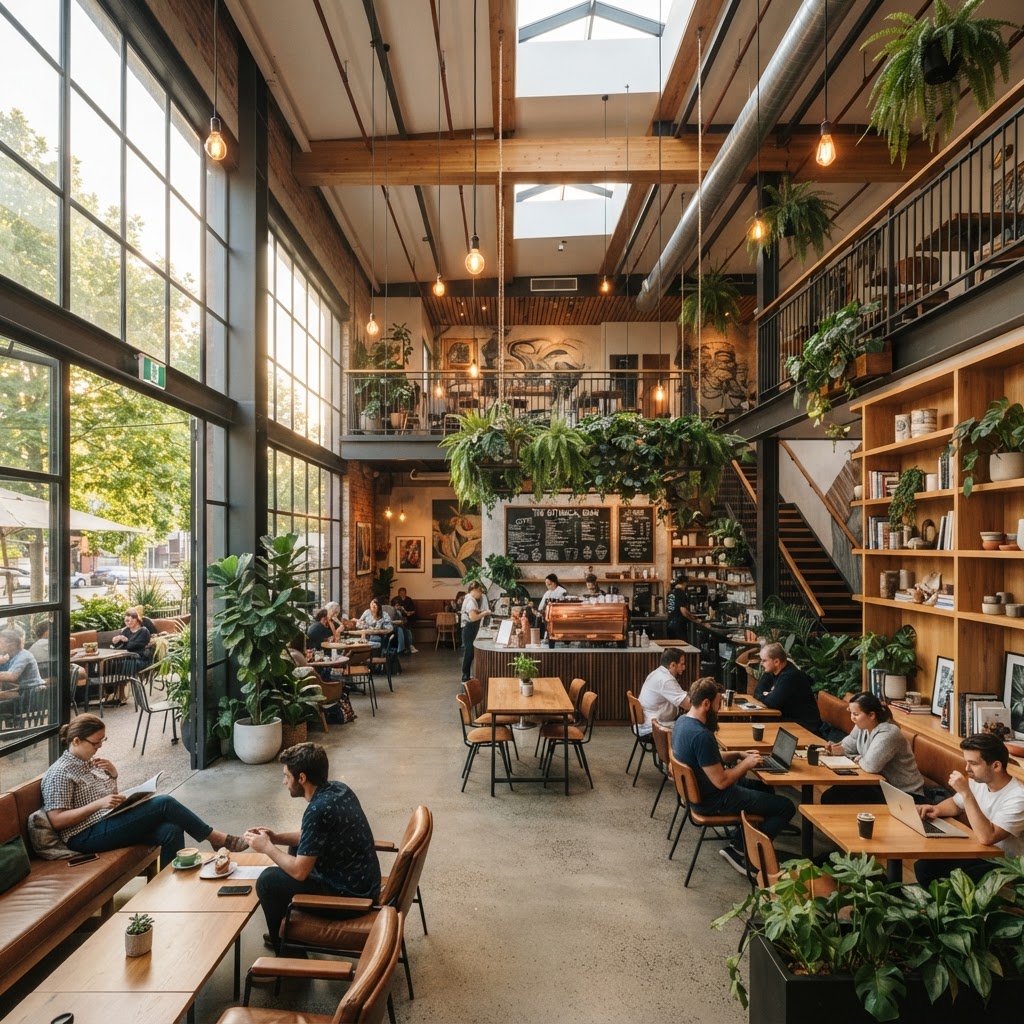
5 Coffee Shops Doing Things Differently With Their Interior Design
Are you tired of the same industrial aesthetic in every local cafe? We are exploring five unique coffee shop designs that break the mold through bold architecture and thoughtful styling.
The Biophilic Sanctuary
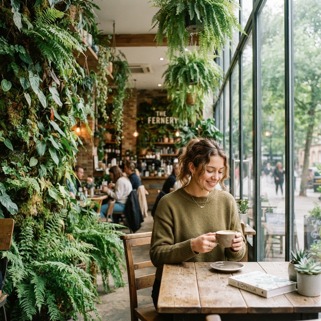
Honestly, walking into a biophilic coffee shop feels less like ordering a flat white and more like stepping into a greenhouse that also happens to serve excellent espresso. This design trend has been gaining serious momentum over the past few years, and it's not hard to see why. People are craving nature in their daily routines, especially in dense urban environments where green space is hard to come by. Smart coffee shop owners have figured out that if you bring the outside in, people will stay longer, spend more, and keep coming back.
What separates the truly great biophilic cafes from the ones that just stuck a few potted ferns near the counter is intentionality. We're talking about living walls that span entire surfaces, natural wood so raw and unfinished you can still see the grain and knots, and water features that create ambient sound without being distracting. Some of the best examples use moss installations that require zero watering because they've dried and preserved naturally. It's low maintenance and stunning. The lighting plays a huge role too, with warm, diffused natural light filtering through skylights or large floor-to-ceiling windows that make the whole space feel like it's breathing.
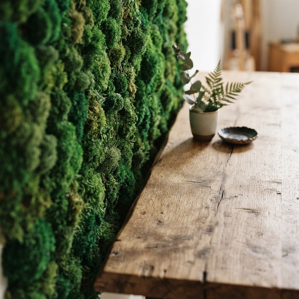
Here's the thing about biophilic design that a lot of people overlook: it's not just about aesthetics. There's actual science backing this up. Studies have shown that exposure to natural elements, even simulated ones, reduces cortisol levels and improves focus. Coffee shop owners who lean into this are essentially creating a wellness experience, not just a caffeine stop. That's a completely different value proposition, and it's working.
The material palette in these spaces tends to follow a predictable but deeply satisfying formula. Think rattan, jute, reclaimed timber, stone, and ceramics in earthy tones. Nothing too polished, nothing too perfect. The imperfection is actually the point. And the plants? They're not decorative afterthoughts. They're structural elements. Hanging trailing plants from exposed ceiling beams, tucking ferns into alcoves, using tall indoor trees as natural room dividers. It all creates this layered, textured environment that no flat-pack furniture store could ever replicate.
If you're a designer or a cafe owner reading this, the key takeaway is simple: commit fully. Half-hearted biophilic design looks sad. But when you go all in, the result is a space that genuinely feels like a refuge. And in 2024, a refuge is exactly what people are looking for in their coffee shop.
Minimalist Geometry and Concrete
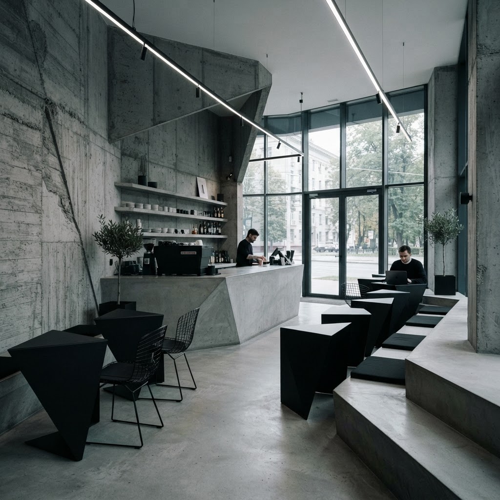
Look, concrete gets a bad reputation. People hear it and immediately think cold, sterile, uninviting. But the coffee shops that are doing concrete and minimalist geometry right are proving that assumption completely wrong. When you pair raw concrete with deliberate, thoughtful geometry and warm accent lighting, the result is something that feels genuinely sophisticated without being pretentious about it.
The shops leaning hardest into this aesthetic are usually found in cities with strong architectural cultures, places like Copenhagen, Tokyo, and Melbourne. And while the look might seem simple at first glance, there's an enormous amount of precision required to pull it off. Every angle matters. Every surface texture is chosen carefully. The countertops are often poured concrete, hand-finished to create subtle variation in tone. The walls might be exposed concrete block or smooth plaster left in its raw state. Furniture is typically low-profile and monochromatic, with clean geometric silhouettes that echo the architecture around them.
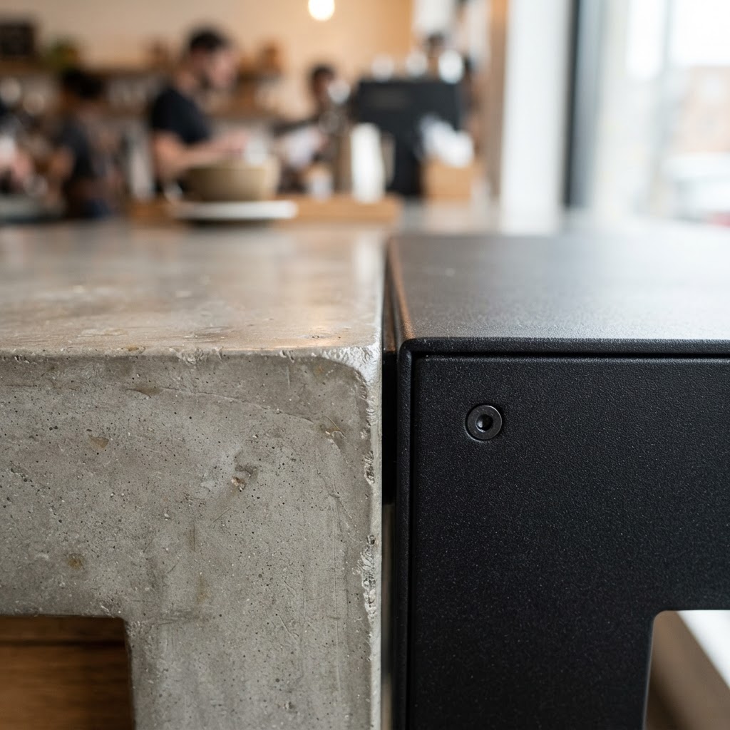
What I find genuinely fascinating about this approach is how much the lighting has to do the heavy lifting. In a space stripped of decorative clutter, light becomes the main design element. Pendant lights with angular shades casting precise pools of warm light onto concrete surfaces. Recessed strip lighting at floor level that gives everything a slight glow. Sometimes a single dramatic skylight that floods the center of the room at midday. These aren't accidents. Every light source is calculated.
- Texture contrast is everything in minimalist concrete spaces. Rough walls paired with smooth counters, matte floors against glossy ceramics.
- Negative space is used deliberately. Empty walls and uncrowded surfaces are design decisions, not oversights.
- Warmth comes through accents like a single timber shelf, a row of ceramic cups, or a leather-padded stool.
- The coffee itself becomes part of the visual experience when it's served in carefully chosen vessels against a neutral backdrop.
Real talk, this style is harder to execute than it looks. It's easy to tip from "architecturally minimal" into "feels like a parking garage." The difference is usually in the details. A good designer working in this space knows that restraint requires confidence. You're not hiding behind decoration, so everything you do include has to earn its place. When it works, it absolutely works.
Playful Maximalism and Color
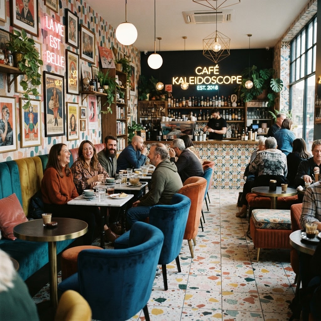
And then there are the shops that said forget restraint entirely, let's just have fun. Maximalist coffee shops are having an absolute moment right now, and I think it's at least partly a reaction to years of Scandinavian minimalism dominating the design conversation. People want color. They want pattern. They want to walk into a space that makes them feel something immediately, before they've even ordered.
The best maximalist cafes are not chaotic. This is the misconception. They're actually incredibly curated, just in a different direction. Instead of editing things out, the designer is editing things in, choosing which patterns to layer, which colors to clash intentionally, which vintage pieces to mix with contemporary ones. There's usually a clear color story running through the space, even if it's a loud one. Maybe it's terracotta and cobalt blue with unexpected pops of chartreuse. Maybe it's deep jewel tones with mismatched vintage furniture and gallery walls crammed with art prints and mirrors in every shape imaginable.
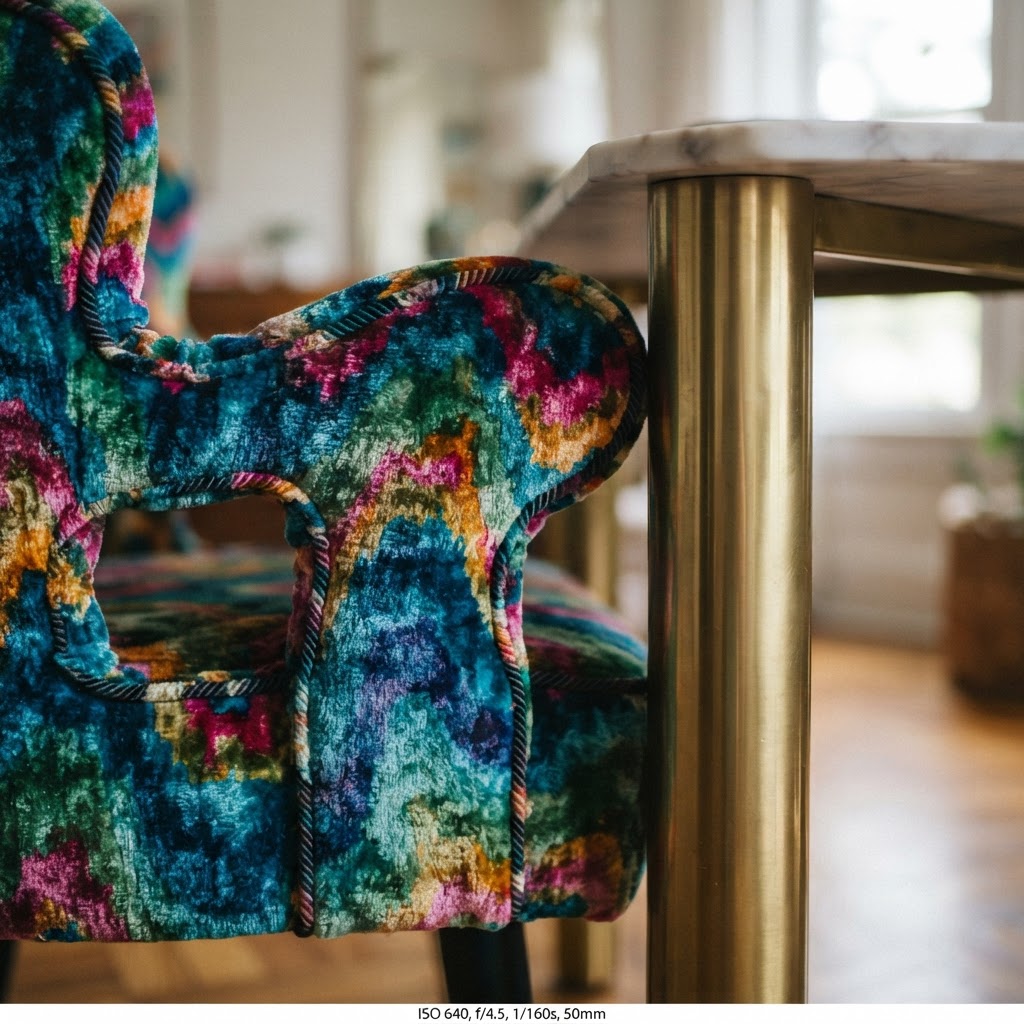
From a commercial standpoint, maximalist cafes are absolute social media gold. Every corner is a potential photo. Every booth is a backdrop. And honestly, that's not a shallow thing to say, it's a legitimate business consideration in 2024. If your space is visually compelling, your customers become your marketing team. They post, their friends see it, they want to go. It's a flywheel that starts with good design.
What makes this style truly successful is personality. The cafes that do it best feel like they were designed by someone with a very specific point of view, a real human being who collects things and has opinions about color and isn't afraid to take up space visually. It often reflects the owner's actual personality, which gives the whole place an authenticity that customers can feel. You can't manufacture that. Well, you can try, but people can tell the difference.
Trust me on this: a maximalist space done with genuine heart will always outperform a maximalist space done because someone thought it was trendy. The energy of intention shows up in the room.
The Adaptive Reuse Warehouse
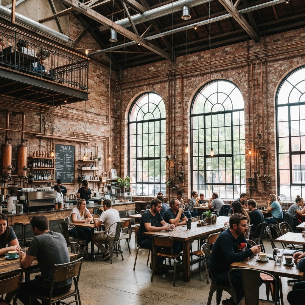
There is something deeply satisfying about a building that gets a second life. Adaptive reuse, the practice of taking old industrial or commercial buildings and repurposing them for new uses, has produced some of the most memorable coffee shop interiors in the world. Old warehouses, former factories, decommissioned print shops, converted churches. The bones of these buildings carry a history that no new-build can replicate, and the best designers know how to honor that history while making the space feel current and functional.
The warehouse conversion is probably the most common version of this, and honestly, it never gets old. There's something about those soaring ceilings, exposed steel beams, original timber floors worn smooth by decades of foot traffic, and massive industrial windows that just works perfectly for a coffee shop. The scale creates a drama that immediately tells you this is not a corporate chain experience. You're somewhere with a story.
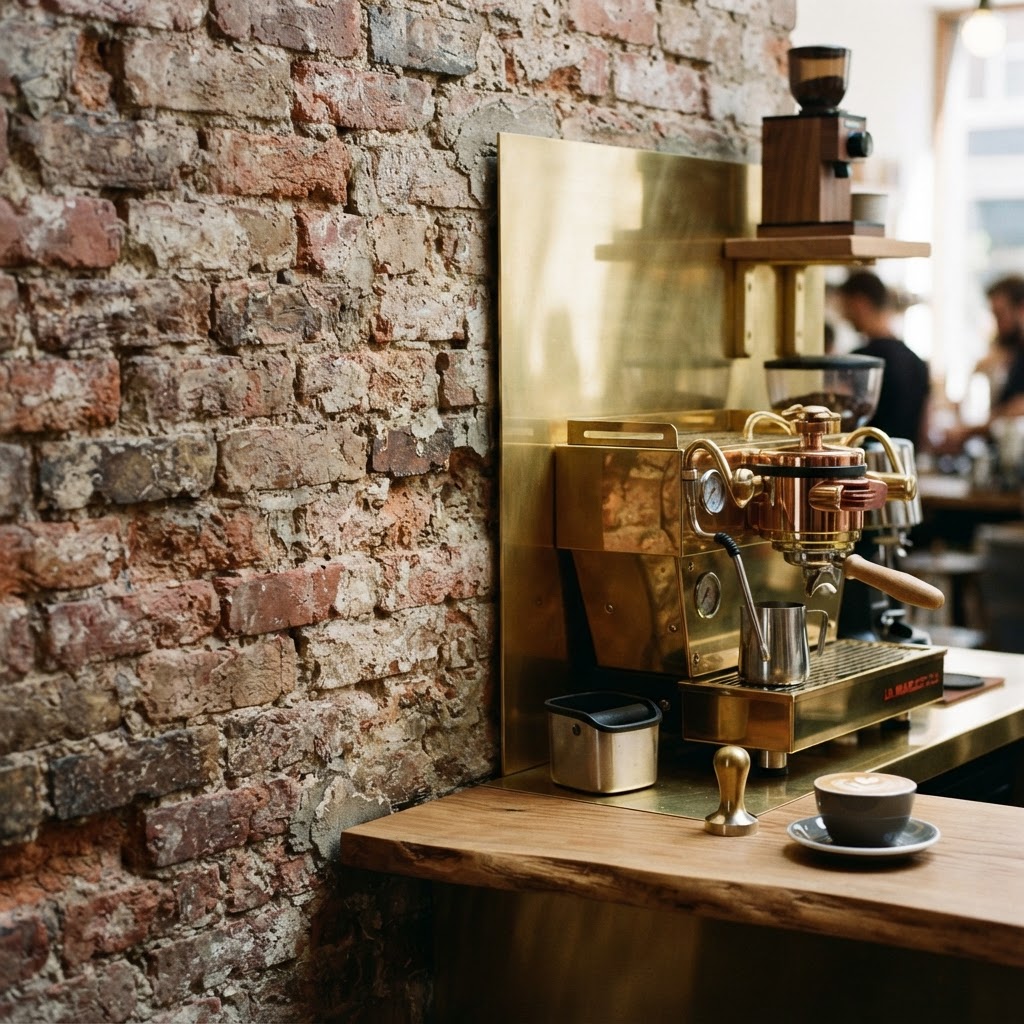
The design challenge in these spaces is always about scale and warmth. A 5,000 square foot warehouse can feel incredible or it can feel lonely and uncomfortable. Getting it right means zoning the space thoughtfully, creating intimate areas within the larger volume using furniture arrangement, rugs, lighting drops, and partial partitions. The material choices matter too. Keeping original features, exposed brick, old machinery repurposed as display elements, factory windows left intact, alongside carefully chosen new additions creates a dialogue between past and present that feels rich rather than contrived.
- Acoustic treatment is genuinely critical in high-ceiling warehouse spaces. Hard surfaces everywhere creates an echo chamber. Soft furnishings, rugs, and acoustic panels save the experience.
- Zoning with lighting helps break a vast floor plate into human-scaled areas without building walls.
- Retaining original features like loading dock doors, freight elevator shafts, or painted signage adds irreplaceable character.
- The bar placement needs to create a natural anchor point so the space doesn't feel directionless.
And here's the thing about adaptive reuse that goes beyond aesthetics: it's also the most sustainable approach to commercial design. You're not demolishing an existing structure and building from scratch. You're extending the life of materials and embodied carbon that already exist. For a coffee industry that's increasingly aware of its environmental footprint, that story resonates with customers in a meaningful way.
Soft Organic Curves
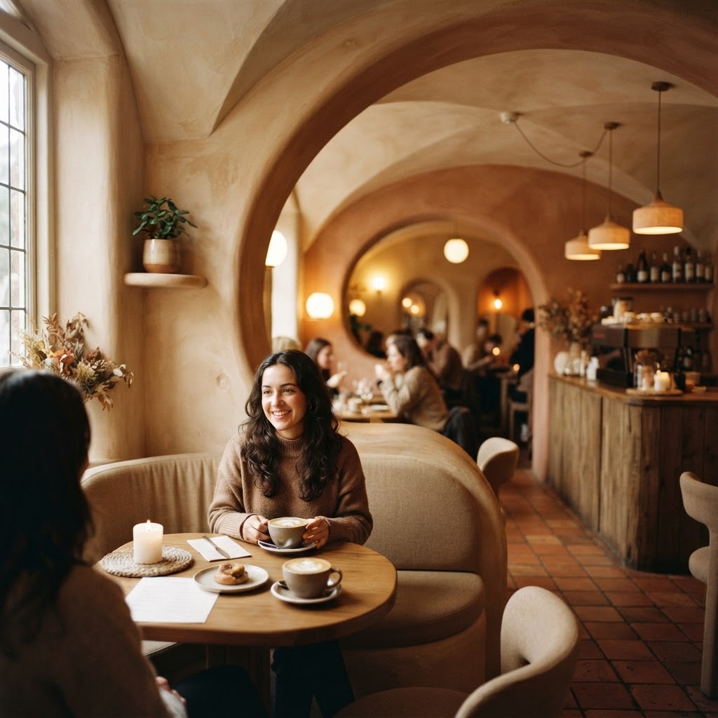
If the geometry section was about precision and angles, this one is the complete opposite. The curve movement in interior design has been one of the most talked-about shifts in commercial spaces over the past couple of years, and coffee shops have been some of the earliest and most enthusiastic adopters. And look, it makes complete sense when you think about it. Curves feel safe. They feel welcoming. There are no sharp edges to knock into, no corners that feel aggressive. Curved spaces invite you to relax in a way that right angles simply don't.
The cafes executing this style best are working with curved everything. Arched doorways that soften transitions between spaces. Counters with rounded edges and gently undulating fronts. Booths built into curved alcoves that feel almost like cocoons. Even the ceilings get involved, with undulating plaster forms or vaulted arches that reference historical architecture while feeling entirely contemporary. The color palette in these spaces tends to be soft and warm, creams, warm whites, sandy tones, blush, terracotta, because harsh colors would fight with the gentle forms rather than complement them.
What's particularly interesting from a design perspective is how curves affect the acoustic experience of a space. Curved surfaces scatter sound differently than flat ones, which can actually improve the acoustic comfort of a room in certain configurations. It's one of those happy accidents where the aesthetic choice and the functional outcome align perfectly. The space looks soft and it feels soft, in every sense.
Materially, you'll often see curved spaces using lime plaster, which has a beautiful matte depth and can be applied to create seamless curved surfaces without visible joins. Terrazzo floors in rounded shapes, upholstered seating in bouclé or velvet that reinforces the tactile softness of the environment, and handmade ceramic vessels on the counter that echo the organic forms in the architecture. Every detail is speaking the same visual language.
And honestly, there's something almost nostalgic about organic curves, they evoke mid-century Italian design, ancient Mediterranean architecture, and the natural shapes of the world around us. When a coffee shop commits to this vocabulary completely, the result is a space that feels timeless rather than trendy. That's the real goal, isn't it? Design that lasts beyond the moment it was created.
Final Thoughts
What all five of these design directions have in common is intentionality. None of them happened by accident. Every single one represents a deliberate set of choices, made by people who understood that the physical environment of a coffee shop is as important as what's in the cup. Customers today are sophisticated. They notice. They feel the difference between a space designed with care and one thrown together from a catalog.
The most successful commercial interiors tell a story. They have a point of view. Whether that's the quiet calm of a biophilic sanctuary, the bold confidence of a maximalist color explosion, or the honest rawness of a warehouse conversion, there's a coherent vision behind every great space. And that vision is what keeps people coming back, not just for the coffee, but for how the place makes them feel.
If you're planning a commercial project, honestly, take inspiration from what these coffee shops are doing. Study the ones that move you. Figure out why they work. And then have the courage to commit to your own version of that, fully and without compromise. That's where the magic is.
More in Commercial
Stay Inspired
Subscribe for new essays on architecture, design, and the spaces that shape us.