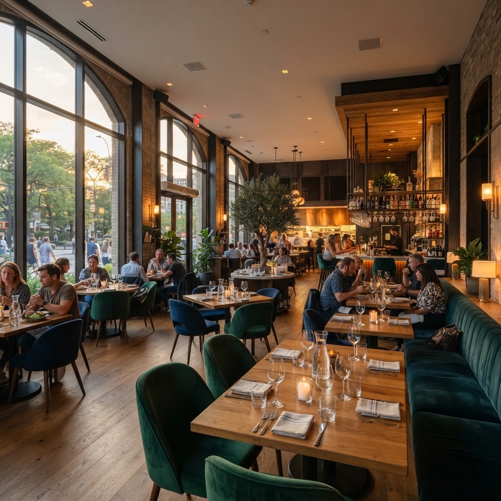
6 Design Secrets That Keep Restaurant Customers Coming Back
Great food brings people in but thoughtful design is what keeps them coming back for more. Discover how lighting layout and texture influence guest loyalty and turn your space into a repeat destination.
The Power of First Impressions
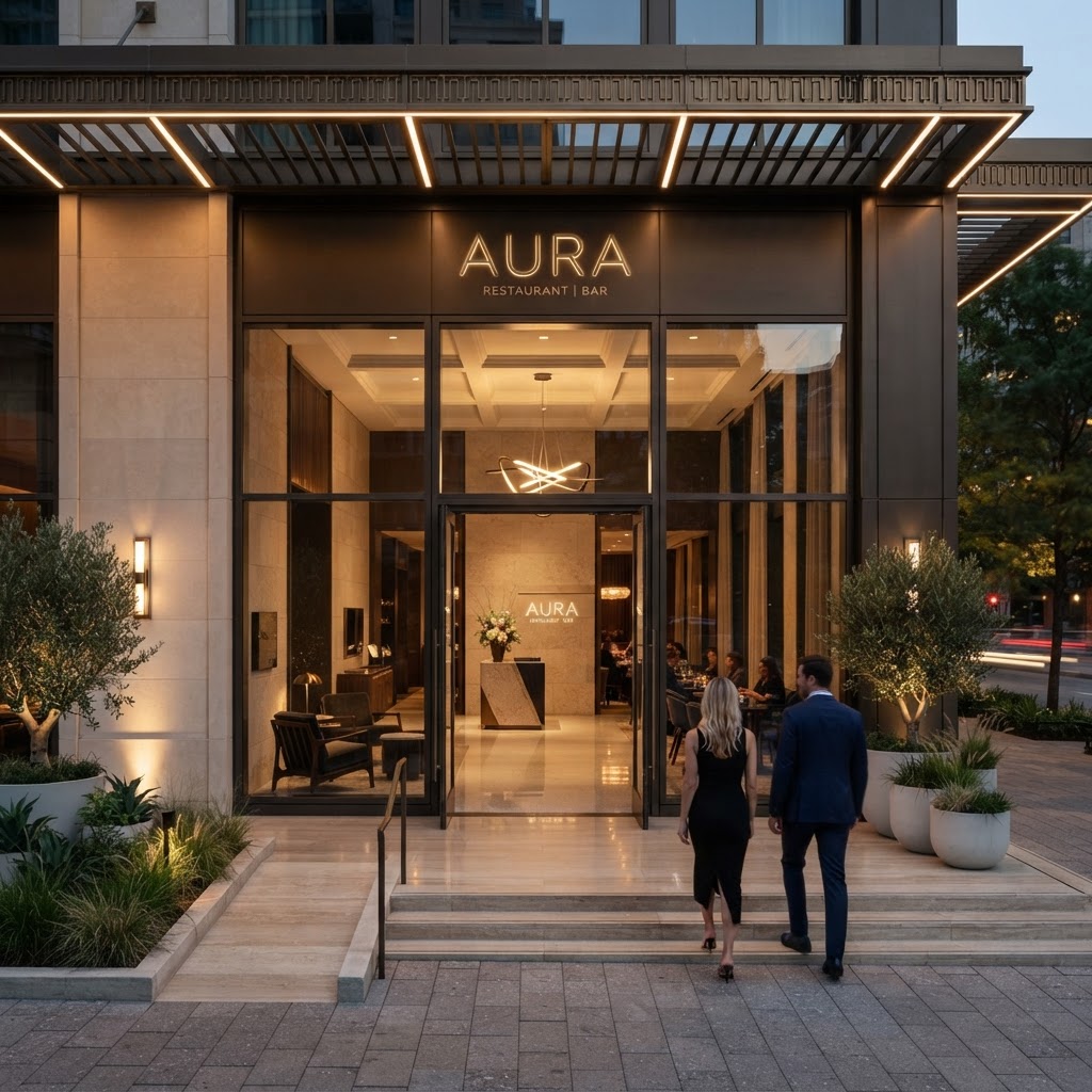
Look, I know we always say "don't judge a book by its cover," but honestly, when it comes to restaurants, that first impression is everything. The moment a guest walks up to your front door, they're already forming an opinion. Before they've tasted a single bite of food, before they've spoken to a single server, the design of your entrance has already told them a story. And that story either makes them lean in with excitement or quietly wonder if they should have picked somewhere else.
The entrance experience is about so much more than a pretty facade. It's about the transition from the outside world into your world. Thoughtful restaurant designers talk a lot about threshold design, which is essentially the intentional crafting of that entry zone where guests shift from street-mode to dining-mode. This can be achieved through a change in flooring material, a drop or raise in ceiling height, a wash of warm light, or even just a curated scent that hits them as the door opens. These small cues do enormous psychological work.
Real talk, some of the most beloved restaurants in the world have relatively modest food programs but absolutely nail this arrival sequence. Think about the host stand placement, the waiting area, the visual axis you see the moment you step inside. Designers often place something visually compelling directly in that sightline, whether it's a dramatic floral installation, an open kitchen, or a gorgeous backlit bar. You're giving guests a reason to feel excited immediately.
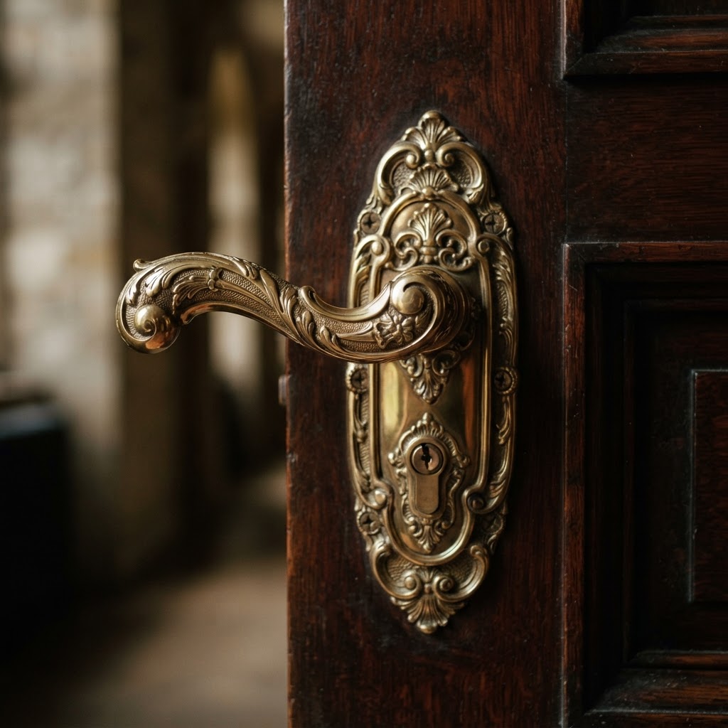
Here's the thing about curb appeal too: your exterior is working for you even when you're closed. Passersby form opinions. Signage, lighting at night, the style of your windows and door hardware, even your planters if you have them. All of it contributes to a brand perception that either builds curiosity or blends into the background. Don't let your restaurant blend into the background. That's the one design sin I can't forgive.
Layered Lighting for Every Mood
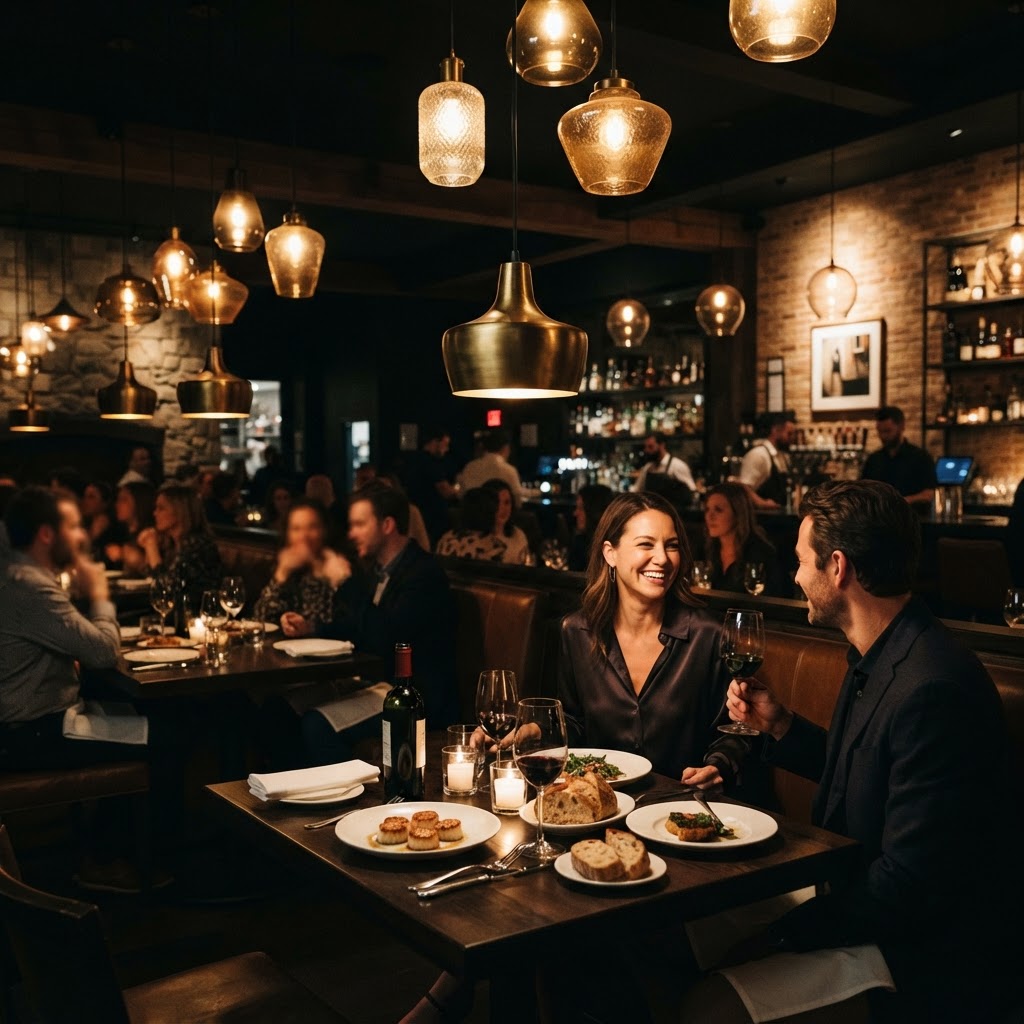
If there's one thing I wish every restaurant owner truly understood before opening their doors, it's this: lighting is not decorative, it's structural. Lighting is the single most powerful tool in a designer's arsenal when it comes to shaping how a space feels, and honestly, most restaurants get it wrong. Either everything is too bright and feels like a hospital cafeteria, or it's so dark that guests are squinting at their menus and sneaking out their phone flashlights. Neither is acceptable.
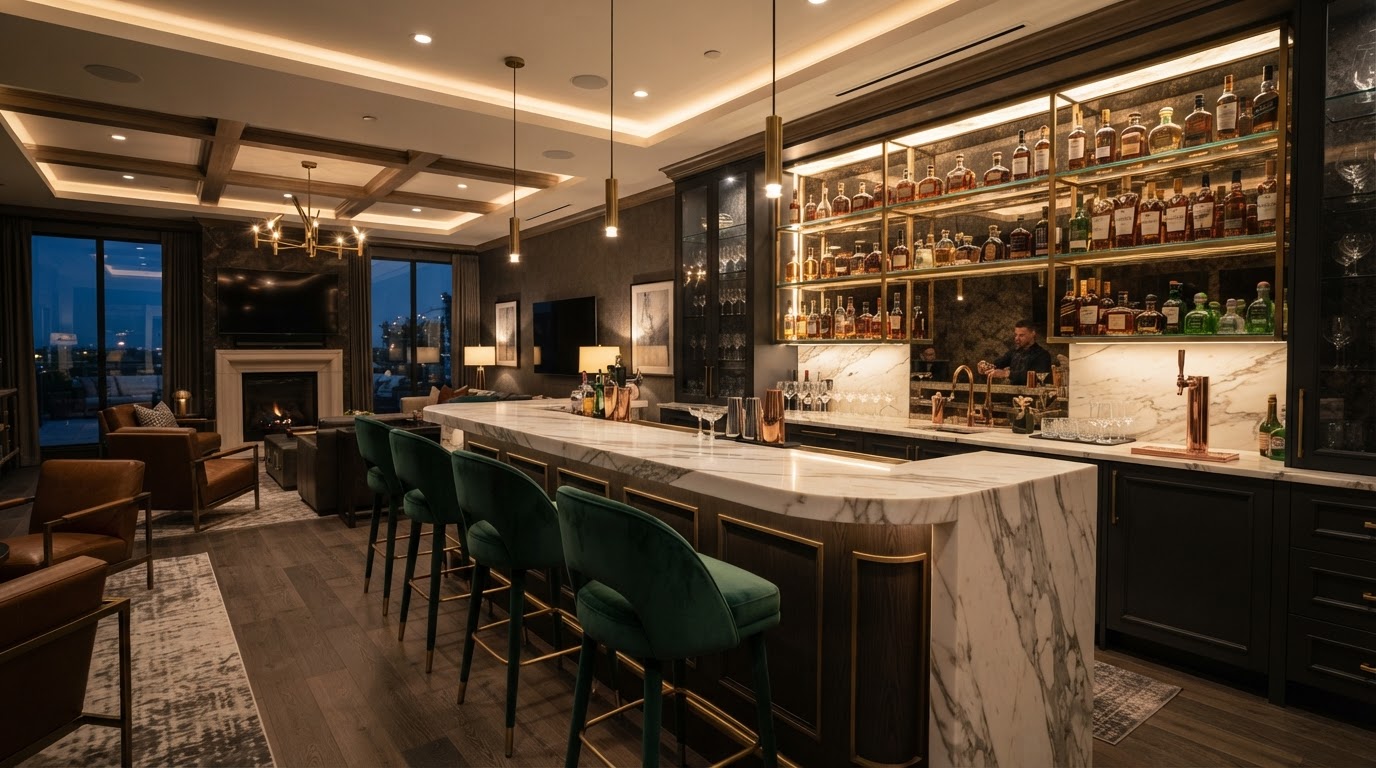
The secret is layering. A well-lit restaurant uses at least three distinct layers working together. You've got your ambient light, which is the overall fill light that eliminates harsh shadows and makes the room feel safe and comfortable. Then you've got your task lighting, which is the functional stuff directly over tables so guests can actually see their food and menus. And then, the layer most people forget, accent lighting that highlights architectural features, artwork, or design moments that give the space personality and depth.
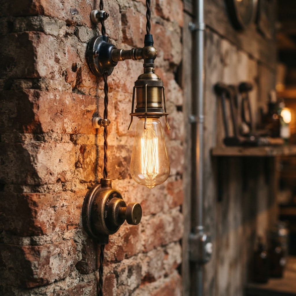
Color temperature matters enormously here. Warm light, in the 2700K to 3000K range, is almost universally flattering and creates that golden, intimate feeling people associate with great evenings out. Cool light above 4000K tends to feel clinical and kills the vibe fast. Trust me on this one. Spend the money on a good dimming system too, because a restaurant that feels perfect at 7pm dinner service should also feel welcoming at 12pm lunch, and those are very different lighting needs.
One underrated move I love is candlelight or candlelight-adjacent lighting at table level. Even if you're not using actual candles, low-level warm light sources right at the table create intimacy in a way that overhead lighting simply cannot replicate. It makes guests feel like they're in their own private bubble, which is exactly how you want them to feel when they're deciding whether to order dessert and another bottle of wine.
Designing for Comfortable Flow
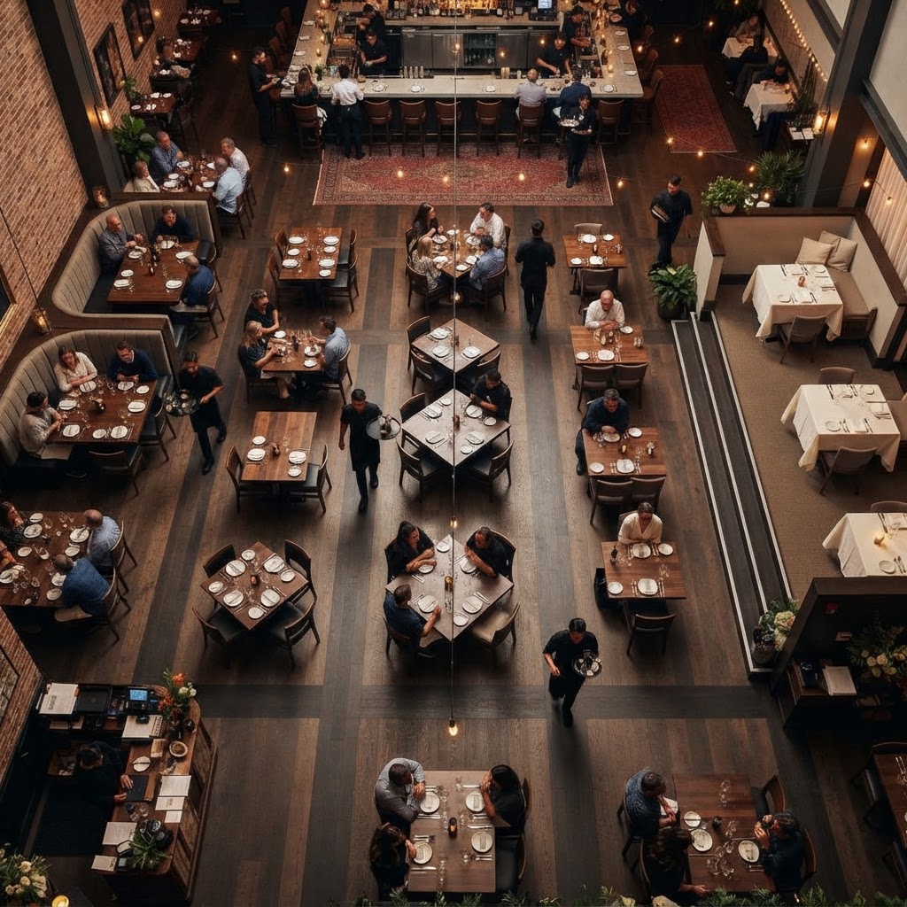
Here's the thing about restaurant flow that most people don't realize until they've sat through a dinner where it's broken. Bad flow is invisible when it works and absolutely excruciating when it doesn't. You know that feeling of being seated right next to the kitchen door, getting bumped by servers every five minutes? Or sitting in a spot where you have a direct sightline to the bathroom hallway? That's a flow problem, and it's a design problem.
Good flow design starts with understanding the three separate circulation paths that exist in any restaurant simultaneously: the guest path, the service path, and the kitchen-to-table delivery path. When these overlap too frequently or create conflict points, the whole experience degrades. Smart designers map these paths out before a single piece of furniture is placed, ensuring that servers can move efficiently without constantly weaving through guest zones and that guests can reach restrooms without feeling like they're backstage.
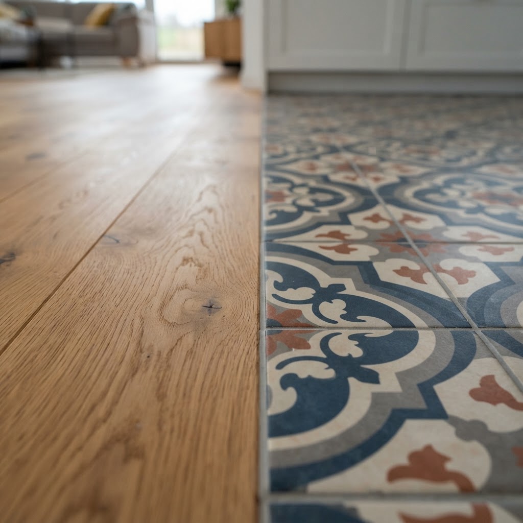
Table spacing is a huge part of this conversation too. Honestly, the temptation to cram in as many covers as possible is understandable from a revenue standpoint, but it's a false economy. Guests who feel crowded don't linger, don't order that second round, and don't come back. The research on this is pretty clear. A little more space per table translates to better guest experience, longer dwell times, and higher average spend. You're not losing money by spacing things out. You're making more of it.
- Primary circulation aisles should be at least 5 feet wide to allow two people to pass comfortably.
- Secondary aisles between tables can be narrower, around 18 to 24 inches, but shouldn't feel cramped.
- Booth seating is a flow designer's best friend because it anchors guests in a defined zone without requiring staff to navigate around chair backs constantly.
- Service stations should be positioned to minimize back-of-house traffic crossing through prime dining areas.
Textured Finishes and Tactile Experiences
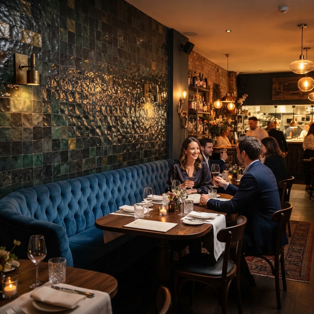
This one is a secret that good hospitality designers have known forever but that clients often push back on initially. Texture sells the experience before the food even arrives. When a guest runs their hand along a warm timber table edge, sinks into a velvet banquette, or notices the rough plaster wall catching the light in an interesting way, they are receiving sensory information that tells them this place was designed with care. And care is what creates loyalty.
The most memorable restaurant interiors I've ever encountered share one quality: they reward close attention. There's always something interesting happening at every scale. A beautiful woven pendant light, a handmade ceramic tile detail, a leather menu cover with visible stitching. These are not expensive line items individually, but together they create an atmosphere of richness and intentionality that guests can feel even if they couldn't articulate exactly why they love the place.
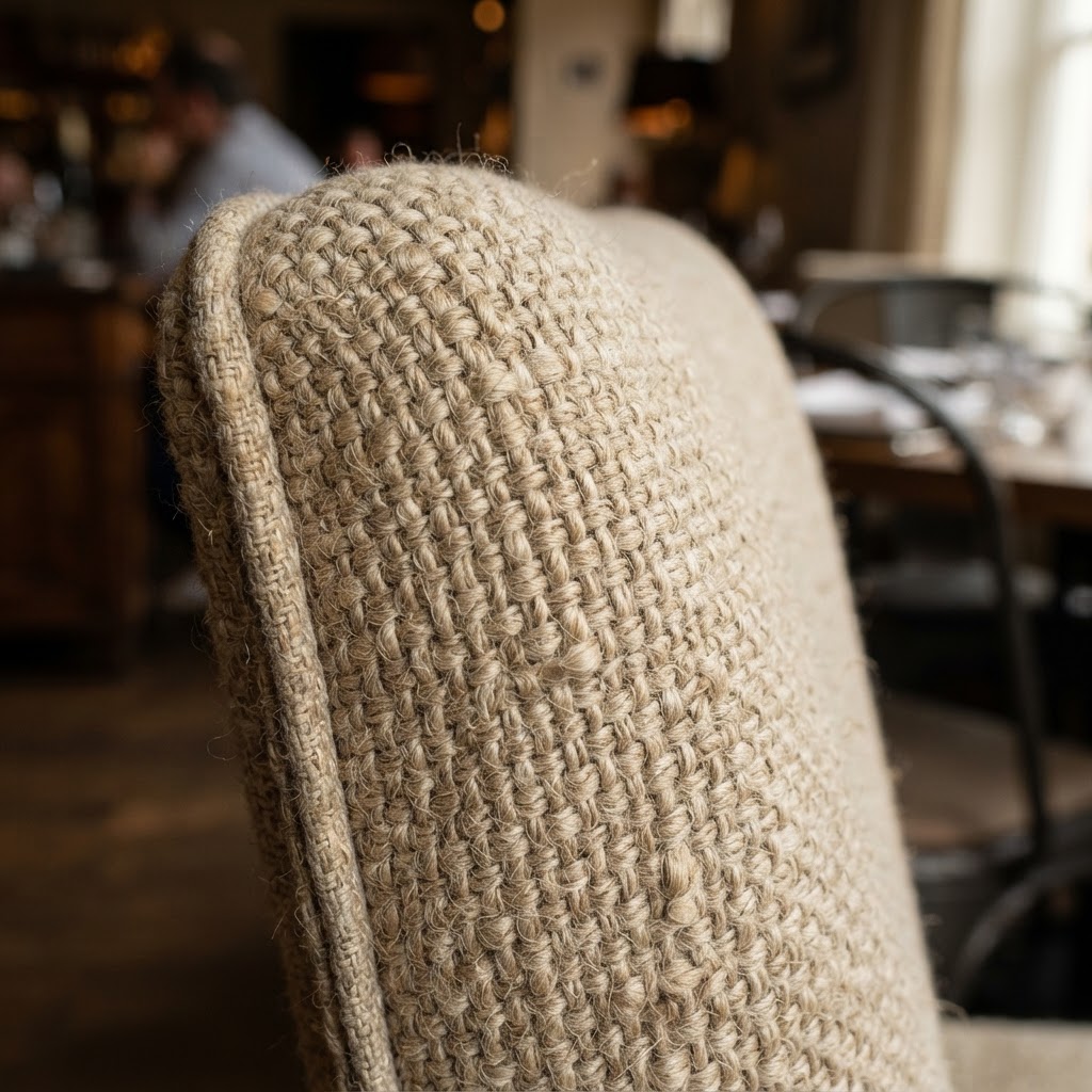
Contrast is the key principle here. You want smooth against rough, warm against cool, matte against gloss. A dining room that's entirely one texture, even a beautiful one, reads as flat and forgettable. But layer a polished concrete floor with a rough brick feature wall, upholstered chairs, and a smooth marble bar top, and suddenly you've got a space that feels genuinely alive. The eye and hand have somewhere to travel, and that keeps guests engaged and comfortable in a way they can't quite put their finger on.
Don't overlook the table itself as a texture opportunity. So many restaurants invest heavily in walls and floors and then plop down generic rental tables with cheap linens. The table is the thing your guests will be touching for an hour or two. A beautiful raw wood surface, a handsome stone top, or even a well-chosen tablecloth says a lot about how much you respect the dining experience you're offering.
Curating an Intimate Acoustic Environment
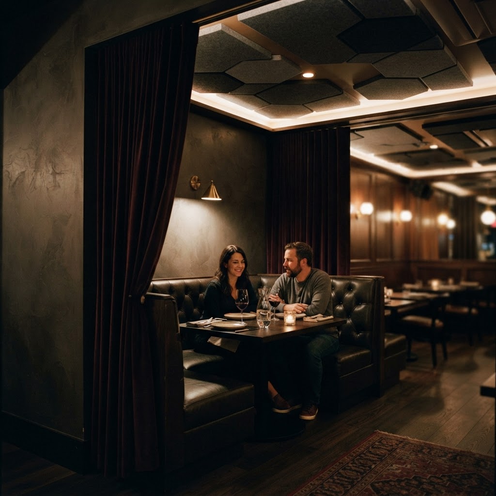
Okay, real talk: acoustics might be the most underestimated element in restaurant design, and it might also be the one that kills more return visits than any other single factor. Think about the last time you left a restaurant feeling exhausted, a little hoarse, and unable to fully remember your conversation. That was an acoustic failure. You were essentially fighting noise pollution for two hours straight, and your nervous system noticed even if your conscious mind didn't.
The modern trend toward hard surfaces everywhere, exposed concrete, glass, bare wood, open kitchens, has created a generation of restaurants that are genuinely unpleasant to spend time in from a sound perspective. These materials reflect sound rather than absorbing it, and the cumulative effect in a full dining room is a wall of noise that forces everyone to speak louder, which creates more noise, which forces everyone to speak louder still. It's a vicious cycle and it's entirely preventable.
Here's the thing about acoustic design: it doesn't require ugly solutions. Acoustic panels have come an enormous way in recent years and can be integrated beautifully into the design language of a space. Upholstered ceiling baffles, fabric wall panels, heavy drapes, plush seating, even a well-placed bookshelf or a living plant wall, all of these absorb and scatter sound waves in ways that bring noise levels down to something conversational and comfortable. The goal isn't silence. A restaurant with no ambient noise feels weird and clinical. The goal is controlled warmth, a sound level where guests can speak at a normal volume and feel comfortable in their conversation.
"The best acoustic environments feel effortless. Guests never think about sound at all. They just leave feeling relaxed and energized, not drained, and they can't quite explain why this place always feels so good to be in."
Music programming is part of this equation too, and it's criminally overlooked. The volume, genre, and tempo of background music has been studied extensively in the context of dining behavior. Slower tempo music encourages guests to linger and spend more. Music that matches the brand identity of the restaurant reinforces the overall experience. And music that's too loud, regardless of genre, actively drives guests toward the exit. Invest in a proper sound system with zoned control, and hire someone who actually knows what they're doing with the programming. It matters more than you think.
Final Thoughts
Running a successful restaurant is one of the hardest things a person can do, and honestly, the food is only part of the battle. The design environment you create either supports your food program and your team or it works against them. These five design principles, first impressions, layered lighting, thoughtful flow, rich texture, and smart acoustics, are not luxury considerations. They are the baseline of a dining experience that people want to return to.
Guests can't always tell you why they love a space. They'll say the food was great, or the service was warm, and those things are true. But underneath all of it, the reason they feel good there, the reason they book again and bring their friends, is that every element of the environment was designed to make them feel welcome, comfortable, and cared for. That's the real secret. Design isn't decoration. It's hospitality made physical.
More in Commercial
Stay Inspired
Subscribe for new essays on architecture, design, and the spaces that shape us.