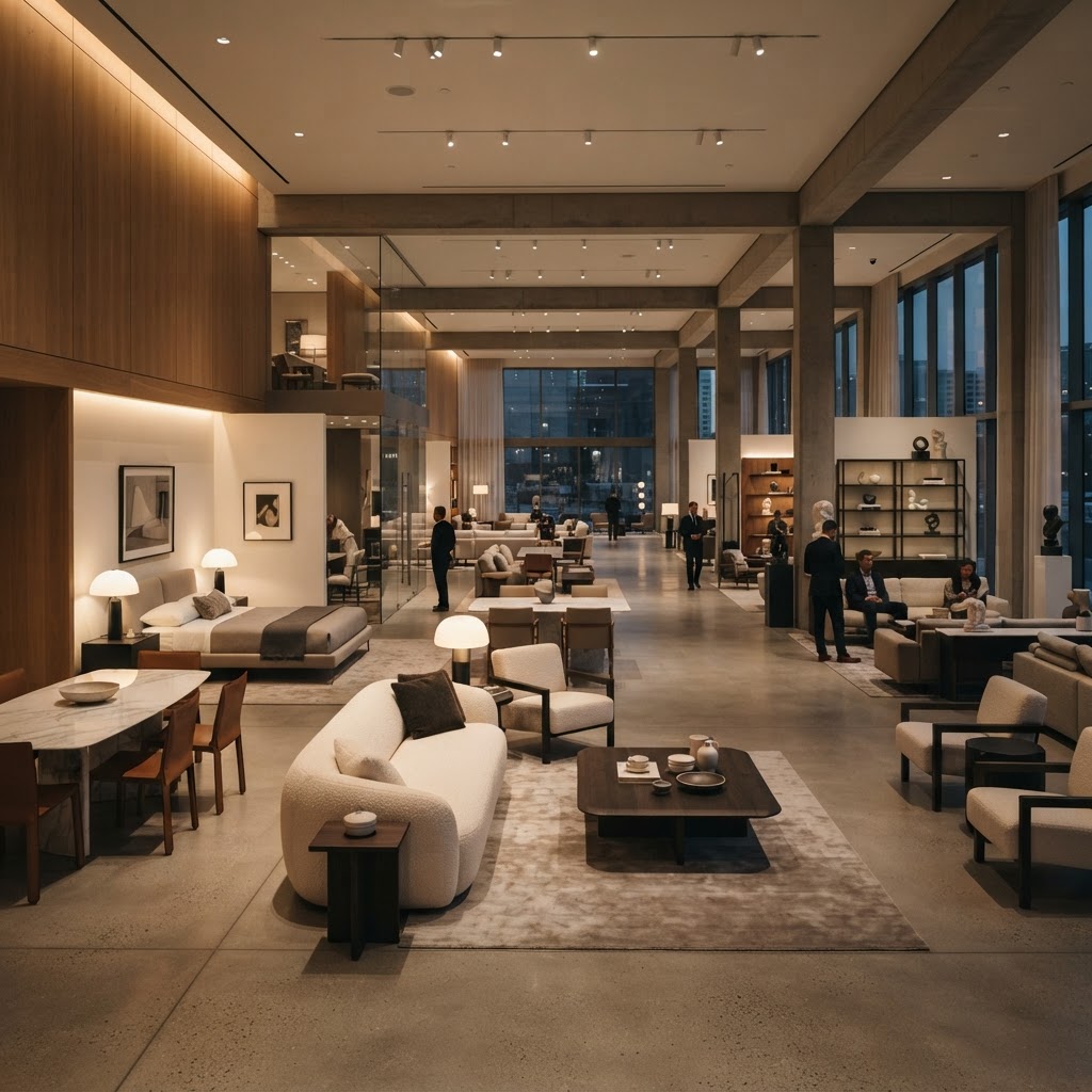
How to Design a Showroom That Actually Closes Deals
Creating a professional showroom requires more than just displaying products. We break down the architectural strategies that guide your customers through an experience that turns browsers into buyers.
Crafting the Customer Journey
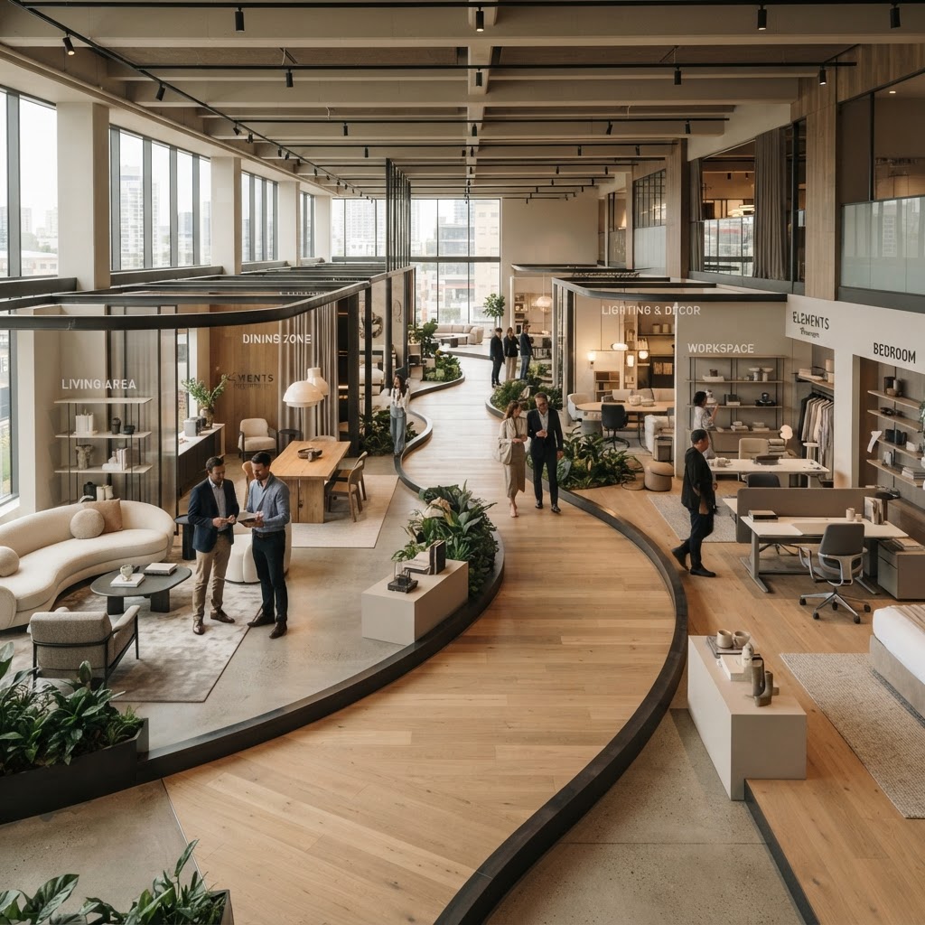
Here's the thing about showrooms that most people get completely wrong: they treat them like storage units with nice lighting. Products lined up in rows, price tags dangling, and a sales associate hovering nearby hoping something clicks. And then they wonder why foot traffic doesn't convert. The truth is, a showroom isn't a warehouse. It's a story. And if you don't control how that story is told, your customer writes their own version, which usually ends with them walking out the door.
The customer journey is literally everything. Before a single product is placed, you should be asking yourself: where does someone's eye go the moment they walk in? What do they feel in the first ten seconds? Where do they naturally want to walk next? These aren't abstract design questions, they're sales questions. And honestly, the best showrooms I've ever walked into felt almost inevitable, like every step I took was exactly the step I was supposed to take. That doesn't happen by accident.

Think about your entrance as an emotional decompression zone. People are coming in from a busy street, a noisy parking lot, or a hectic afternoon. They need a beat to reset. A slightly elevated threshold, a change in flooring material, a focal piece that draws the eye inward, these are all design tools that say "you're somewhere different now." Retailers like Apple figured this out years ago, and it's time showrooms in the furniture, tile, kitchen, and automotive worlds caught up.
Map your space into zones: discovery, exploration, and decision. Discovery is near the entrance, it should be visually exciting but not overwhelming. Exploration is the middle of the floor where your range shows its breadth. Decision is closer to your consultation area, and we'll get into that in a later section. The point is that movement through your space should feel like natural progression, not a random wander through a maze. Use flooring changes, subtle ceiling drops, lighting shifts, and even fragrance to signal transitions between zones.
- Start with a hero moment: One stunning focal display right at the entrance sets the tone for everything that follows.
- Use sightlines deliberately: Position your most aspirational product at the end of a natural sightline so it pulls people through the space.
- Avoid dead ends: Every path should loop back naturally. Dead ends create anxiety and cut journeys short.
- Signal transitions: Use flooring, ceiling height, or lighting to tell the brain "we're in a new chapter now."
And honestly, the biggest mistake I see is cramming too much in too early. Save something for the middle of the journey. If a customer sees everything in the first thirty feet, there's no reason to keep going. Tease. Build. Reveal. That's the rhythm of a showroom that actually sells.
Strategic Lighting Design
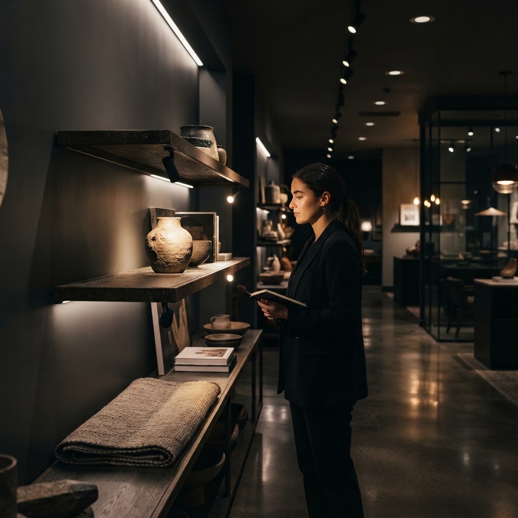
Real talk: lighting is the single most underinvested element in commercial showroom design, and it is absolutely wild how often I walk into spaces where millions of dollars of product is sitting under flat, buzzing fluorescent panels. Good lighting doesn't just make things look pretty. It directs attention, creates mood, communicates quality, and yes, it closes deals. A beautifully made piece of furniture under bad light looks cheap. A mediocre piece under perfect directional lighting looks like something you need in your life. That's not manipulation, that's just smart design.
The layered lighting approach is your best friend here. You want three layers working together: ambient lighting to establish the overall mood and baseline visibility, accent lighting to spotlight specific products or vignettes, and task lighting for areas where customers and staff need to see clearly, like sample review stations or consultation desks. These three layers should never fight each other. They should feel like a well-rehearsed ensemble, each one knowing its role.
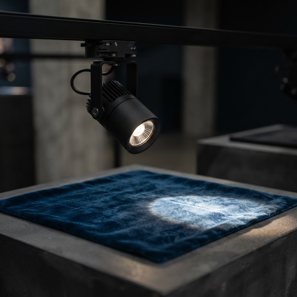
Color temperature matters enormously and most showrooms get this wrong. Warm white light, around 2700K to 3000K, makes wood tones, upholstery, and organic materials look rich and inviting. Cooler light, around 4000K, works well for contemporary spaces with metals, glass, and stone. The mistake is mixing temperatures randomly across the floor without intention. Pick a dominant temperature that suits your brand and product range, then use slight variations to create contrast and hierarchy.
Dimming capability is non-negotiable. Trust me on this. A showroom that can shift its lighting mood throughout the day, or even adjust per product zone, is working so much harder than a static setup. Morning shoppers often want clarity and energy. Evening visitors might respond to a warmer, more atmospheric setting. Smart lighting systems have become genuinely accessible in terms of cost, and the return on investment in terms of atmosphere and customer dwell time is significant.
"Light is not just illumination. In a showroom context, it is literally the difference between a product that reads as premium and one that reads as forgettable."
One more thing: don't neglect the ceiling. Exposed track systems can look industrial and intentional when done well, but they can also look like an afterthought. Recessed lighting, cove lighting, or even integrated LED strips within shelving or display structures can create a polish that makes the whole space feel curated rather than thrown together. The ceiling is your fifth wall. Use it.
Creating Immersive Vignettes
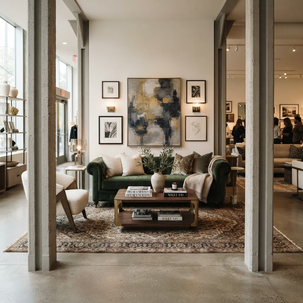
If there's one design tool that separates a good showroom from a great one, it's the vignette. Not a product on a pedestal. Not a shelf of options. A scene. A moment. Something that makes a customer stop and think, "I want my life to look like this." That emotional response is worth more than any spec sheet or sales pitch, and it's completely achievable through thoughtful vignette design.
A vignette is basically a curated mini-environment that shows a product in context. A sofa isn't just a sofa, it's a corner of a living room with a throw, a side table, a lamp, a stack of books, and a plant that ties the whole thing together. A kitchen tap isn't just hardware, it's part of a beautifully styled sink area with ceramic vessels, a linen cloth, and a sprig of greenery. Context sells. People don't buy products in isolation, they buy the version of themselves that owns those products. Your vignettes need to speak to that aspiration.
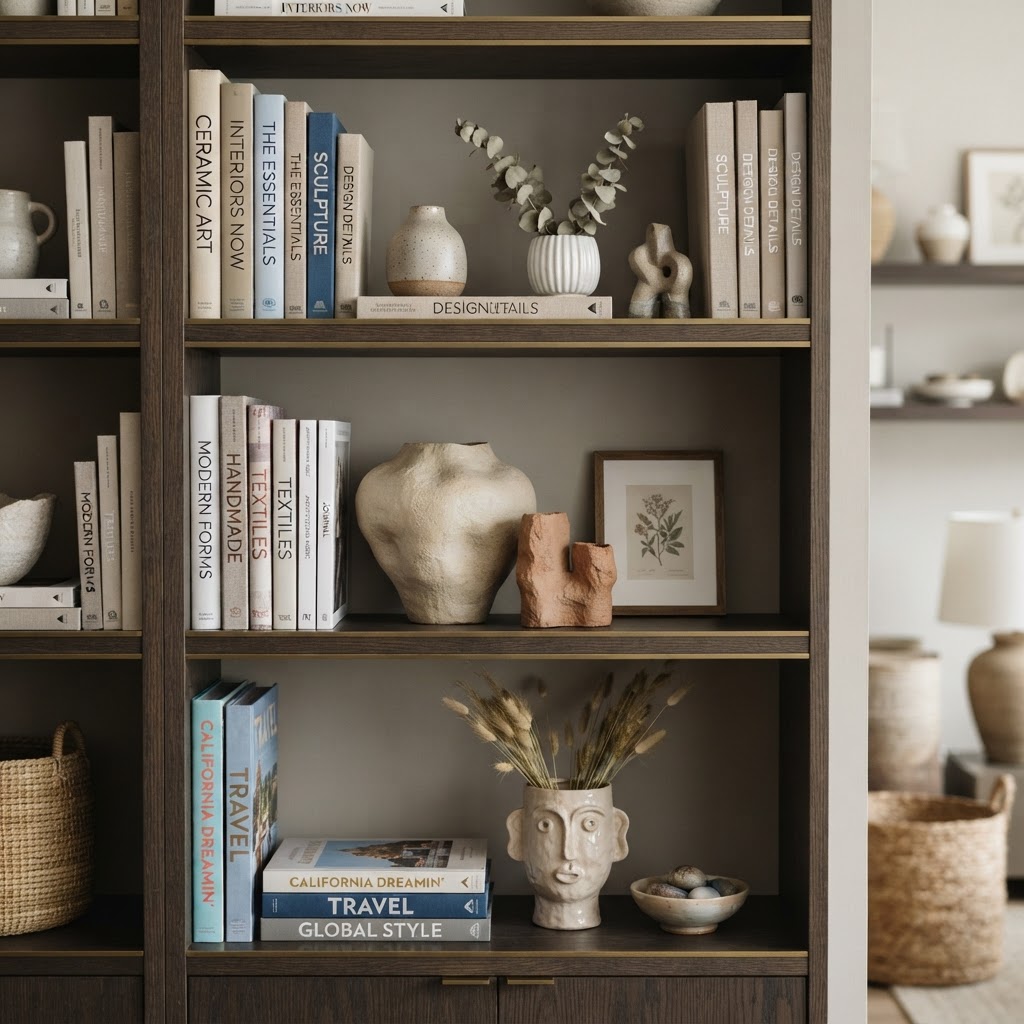
Depth is everything in a vignette. Flat arrangements feel like window displays from 1995. You want foreground, midground, and background elements working together to create visual richness. Vary the heights. Mix textures. Use odd numbers of objects because even numbers feel symmetrical and static, while odd groupings feel alive. And here's a tip that sounds counterintuitive: include something slightly unexpected in every vignette. A vintage object among contemporary pieces, an unusual color accent, or an element from a different product category. That little surprise makes people look longer.
- Tell a specific story: Every vignette should represent a real lifestyle moment, not a generic "nice room."
- Use the rule of three: Groups of three objects almost always feel more balanced and interesting than pairs or fours.
- Vary scale dramatically: A mix of large, medium, and small elements creates visual tension and interest.
- Refresh regularly: Returning customers need new reasons to stop and look. Rotate seasonal elements to keep vignettes feeling current.
- Make them photographable: In 2024, if it doesn't work as an Instagram shot, you're leaving marketing on the table.
And honestly, the best vignettes I've seen have a slightly imperfect quality. A chair pushed back slightly from a desk, a book left open, a coffee cup on a side table. Real life has mess in it. Sterile perfection can actually make people feel like they'd ruin the scene by touching anything, which is the exact opposite of what you want. Make it liveable. Make it feel like someone just stepped out of the room.
The Power of Negative Space
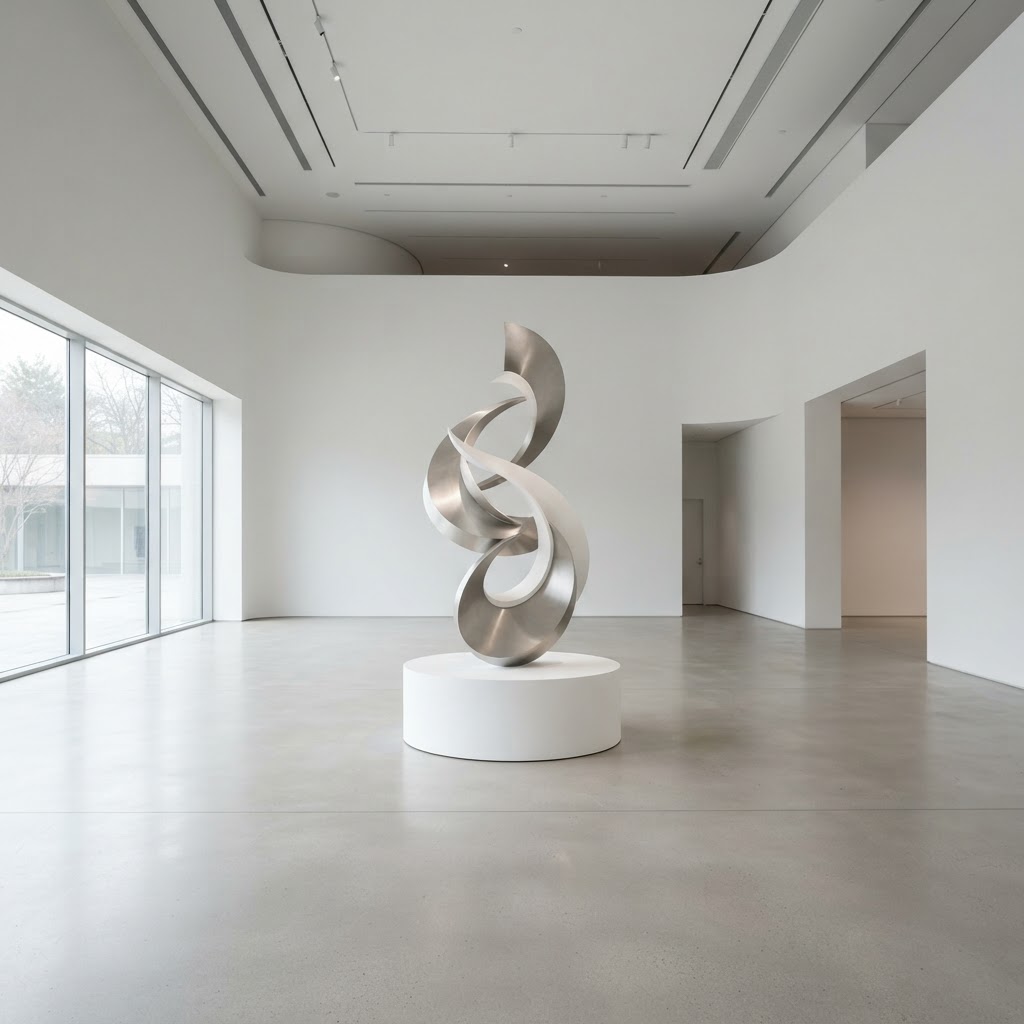
Look, I get it. Square footage costs money. Every inch of your showroom floor represents real overhead, and the instinct is to fill it. More products means more choices, more choices means more sales, right? Wrong. This is genuinely one of the most damaging myths in retail and showroom design, and it's costing businesses real revenue. The research on this is pretty consistent: when people have too many options in too dense an environment, they get overwhelmed and they leave without buying anything. It's called choice paralysis, and your crowded floor plan is causing it.
Negative space is the empty air around and between objects, and it is an active design element, not just an absence of stuff. When you give a product generous space around it, you're communicating that it's special, that it's worth your full attention. Luxury brands have known this forever. Walk into a Rolex boutique or a high-end furniture gallery and notice how little is actually on the floor. That emptiness isn't waste, it's strategy. It says, without a single word, "everything here is worth your time."
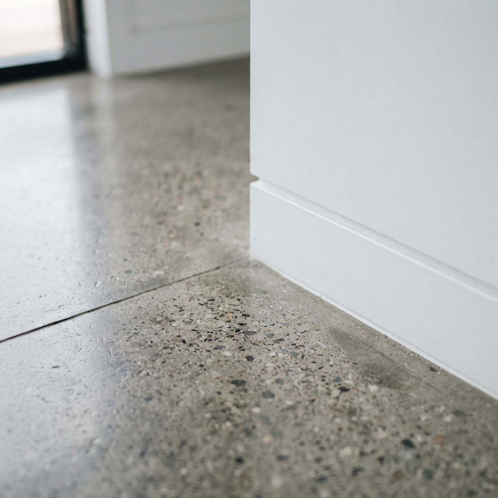
This doesn't mean your showroom has to feel sparse or cold. There's a real difference between intentional negative space and just having an underpopulated room. The key is density contrast. Pack some areas with layered vignettes and rich detail, then let the path between those moments breathe. Wide aisles, open floor areas, uncluttered wall sections, these give the eye and the brain a chance to rest before the next visual hit. It's the same principle as music: the pauses between notes are part of the composition.
From a purely practical standpoint, negative space also makes navigation easier. People need to be able to move through your space comfortably, including those with strollers or mobility aids. Tight floor plans create stress, and stressed customers don't linger. They find the nearest exit. Aim for a minimum of 1.2 to 1.5 meters of clear circulation space on your main pathways, and give yourself even more room around your hero displays. That physical ease of movement translates directly into emotional comfort, and emotionally comfortable people stay longer and spend more.
"The most powerful thing in your showroom might be the space you chose not to fill."
Designing Functional Consultation Zones
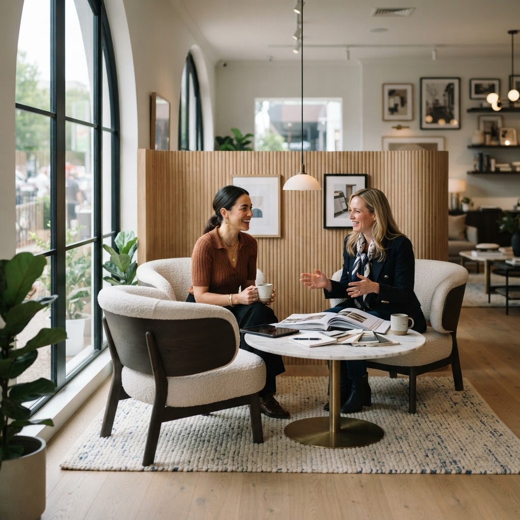
Everything we've talked about so far, the journey, the lighting, the vignettes, the breathing room, it all leads to one moment: the conversation where a customer decides to buy. And honestly, so many showrooms completely drop the ball at this exact point. They invest everything in the display floor and then sit people down at a folding table with a printed spec sheet and a coffee from a Nespresso machine that's been there since 2018. The consultation zone is where deals close. It deserves serious design attention.
The physical setup of your consultation area sends a message before anyone sits down. A cluttered desk with piles of samples and a computer monitor facing away from the customer says "I'm busy and you're an interruption." A clean, well-lit table with carefully curated samples, comfortable seating on both sides, and a setup where customer and consultant can look at things together says "we're partners in this." The difference in how a customer feels in those two scenarios is enormous, and it absolutely affects their willingness to commit.
Think carefully about seating. Side-by-side seating at a slightly angled table is almost always better than face-to-face across a desk. Face-to-face setups feel like job interviews or confrontations. Side-by-side feels collaborative. You're both looking at the same problem together rather than at each other across a barrier. Pair this with a large screen or a well-organized sample library within arm's reach, and you're creating a physical environment that supports good conversation and confident decision-making.
- Position for privacy: Consultation zones should feel somewhat removed from the main floor traffic, not tucked away, but not in the middle of the action either.
- Invest in the seating: Comfortable chairs that customers actually want to sit in for thirty minutes make the whole interaction feel more relaxed and less pressured.
- Design sample access thoughtfully: Samples should be organized, accessible, and beautifully presented, not stuffed in a drawer or stacked in a corner.
- Control the acoustics: Soft furnishings, rugs, and acoustic panels in the consultation area reduce ambient noise and help clients feel focused and heard.
One thing I feel strongly about: the consultation zone should reflect the same design standard as the rest of your showroom. I've seen gorgeous display floors that lead into what feels like a back office. That tonal drop is jarring, and it subtly undermines the premium impression you've been building for the previous twenty minutes of the customer's visit. Carry your design language through to the very end of the experience. The consultation zone is the final chapter of the story you've been telling, and you want it to end with the customer feeling confident, excited, and ready to say yes.
Final Thoughts
Designing a showroom that actually closes deals isn't really about any one design trick or clever spatial move. It's about understanding that every single element, from the threshold people cross when they walk in to the chair they sit in when they're making a final decision, is either working for you or against you. There's no neutral ground in commercial design.
The showrooms that consistently convert are the ones built around the customer's emotional experience, not around the convenience of displaying the maximum amount of product. They tell a story. They guide without being pushy. They create desire through context, light, and breathing room. And they seal that desire with a consultation environment that makes saying yes feel like the most natural thing in the world.
Start with the journey. Layer in the lighting. Build vignettes that make people feel something. Resist the urge to fill every inch. And invest properly in the space where the actual conversation happens. Do those five things well, and your showroom won't just be a beautiful space. It'll be a genuinely effective business tool.
More in Commercial
Stay Inspired
Subscribe for new essays on architecture, design, and the spaces that shape us.