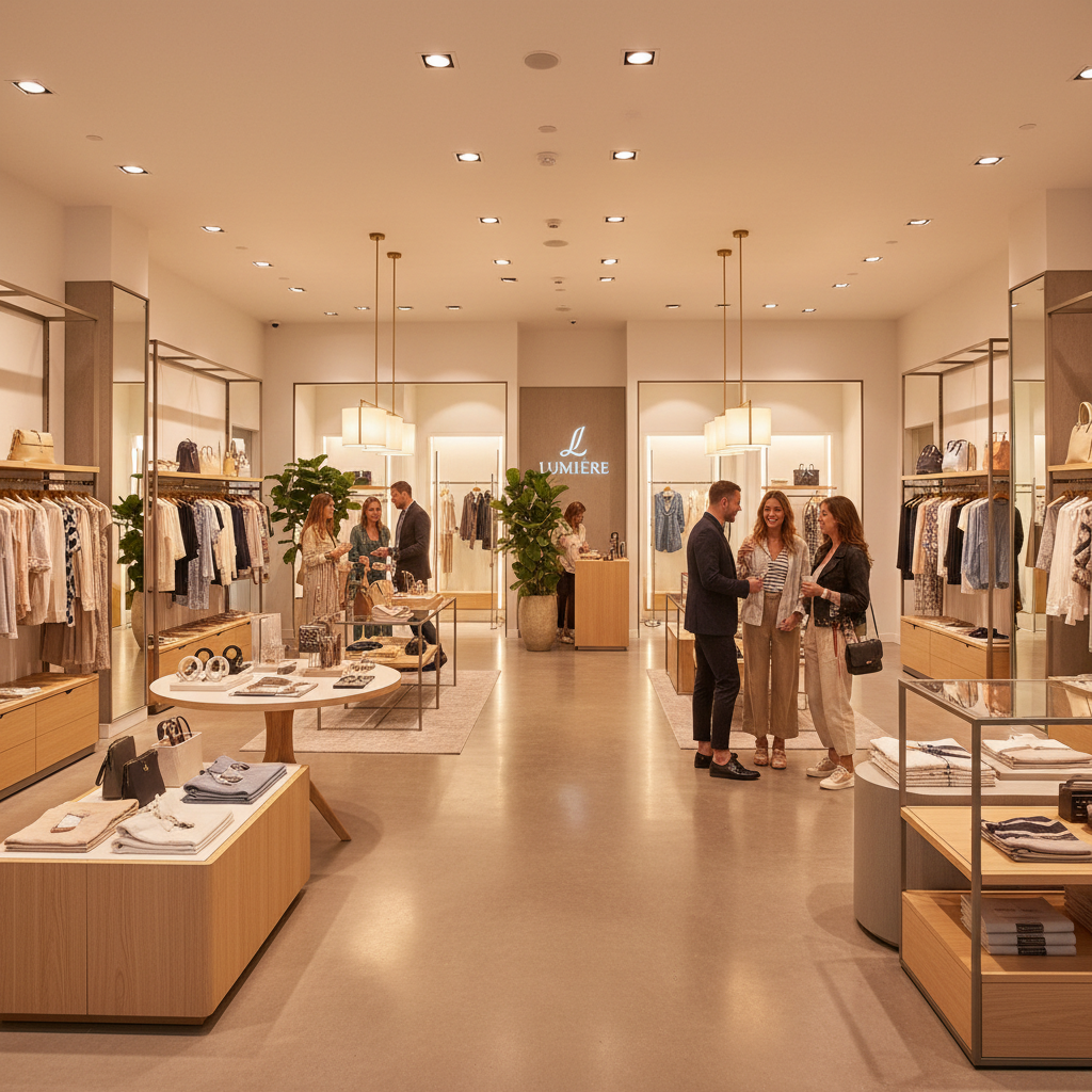
Unleashing Retail Potential: How Smart Store Design Can Boost Your Sales
Discover how effective retail store design can transform your space into a customer magnet. In this post, we explore elements that not only beautify the environment but also enhance the shopping experience, ultimately driving sales.
Creating a Welcoming Entrance
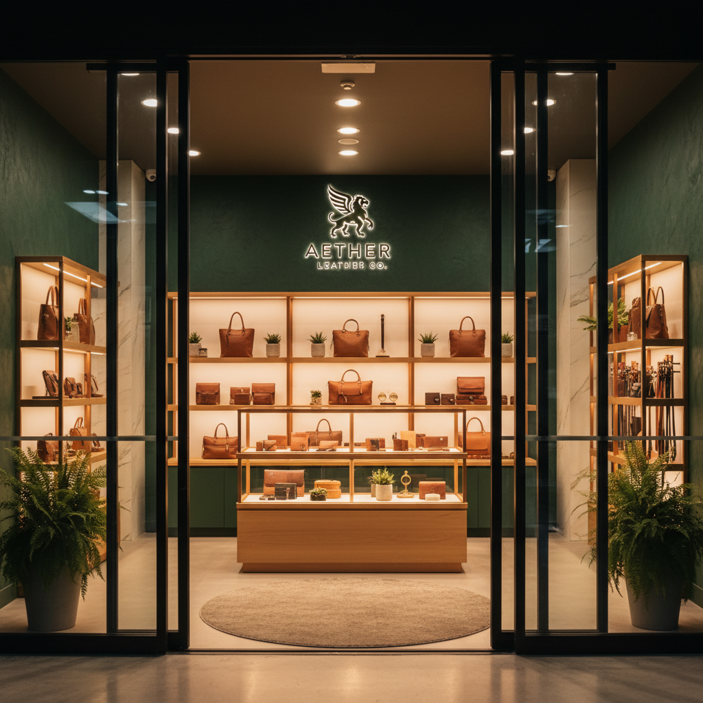
Honestly, your store entrance is doing more work than you probably realize. It's not just a door. It's a first impression, a promise, and a silent pitch to every single person who walks past. I've seen gorgeous products completely ignored because the entrance to the store felt cold, cluttered, or confusing. And I've seen pretty average merchandise fly off shelves because the store drew people in before they even consciously decided to enter.
There's a concept in retail design called the "decompression zone," and it's one of the most underutilized ideas in small to mid-size retail. Basically, it's the first few feet inside your entrance where customers transition mentally from the outside world to your store's world. If you cram that space with product displays and sale signs, you're overwhelming people right at the moment they need to breathe. Keep it relatively open. Use it for atmosphere, not inventory.
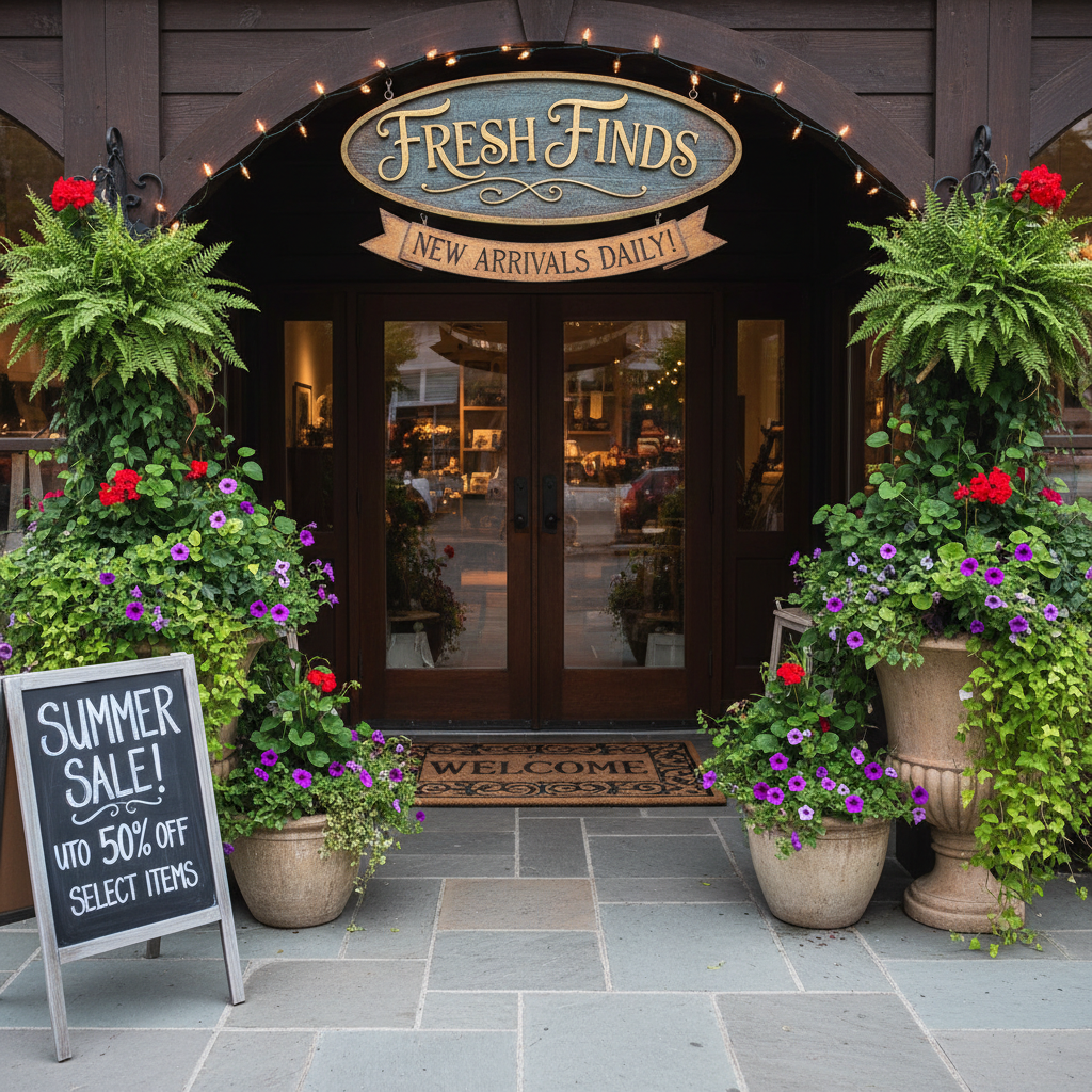
Look, the details matter more than people admit. Scent, sound, temperature, and even floor texture all communicate something to your customers the second they step in. A warm, slightly elevated temperature in winter tells someone they can relax and stay a while. A signature scent that isn't overpowering creates memory and brand association. These aren't luxury details reserved for big brands with massive budgets. They're intentional design decisions that any retailer can make.
Your signage at the entrance should be clear, confident, and reflective of your brand personality. Not a laundry list of promotions, not tiny text that nobody reads. One strong visual statement that tells people exactly who you are and why they belong inside. Think about the entrances of stores you genuinely love walking into. There's almost always a clarity to them, a sense that someone thought carefully about what you'd feel in that moment.
And please, keep your entrance clean and unobstructed. I know that sounds obvious, but you'd be surprised how many stores sabotage themselves with messy window displays, sticky doors, or a greeter desk blocking natural flow. The entrance should invite, not obstruct. Get that right and you've already won half the battle.
Strategic Layout for Maximum Flow
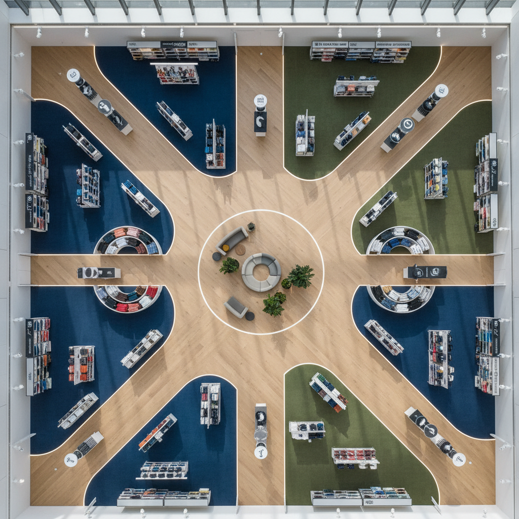
Here's the thing about store layout: most retailers think about it once, when they first open, and then never revisit it. That's a huge missed opportunity. The way customers move through your space directly determines what they see, what they touch, and ultimately what they buy. Getting your layout wrong means money walking out the door, literally.
The most common layout types in retail are the grid, the loop, and the free-flow. Each has its place. Grocery stores and pharmacies thrive on the grid because efficiency and ease of navigation are the priority. Boutiques and lifestyle stores tend to use free-flow or loop layouts because they want exploration and discovery to be part of the experience. Real talk, there's no one-size-fits-all answer here. The right layout depends entirely on your product type, your target customer, and the story you want your store to tell.
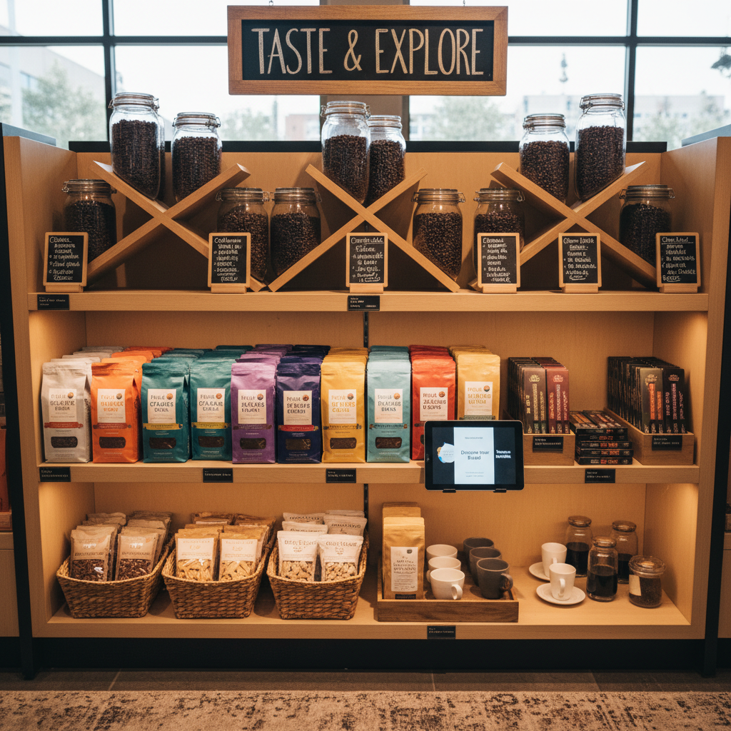
One principle I always come back to is the power wall: the wall directly opposite your entrance, or the first major wall a customer sees when they turn. This is prime retail real estate. It should hold your most visually compelling, highest-margin, or most brand-defining product. If that wall is beige and boring, you're wasting an enormous opportunity to stop people in their tracks.
Aisle width is another thing that retailers underestimate. Too narrow and customers feel uncomfortable, especially if the store gets busy. People literally avoid touching merchandise when they feel like they might bump into someone behind them. Give your customers room to breathe, room to browse, room to bring a friend or a stroller. Comfort translates directly into dwell time, and dwell time translates directly into sales.
- Place high-demand items toward the back so customers pass through more of your store to reach them.
- Use end caps and corner displays to highlight new arrivals or promotional items.
- Keep checkout near the exit, not the entrance, to maximize the amount of store customers experience before paying.
- Create natural pause points with seating, displays, or interactive elements that slow people down in a good way.
Think of your store layout like a story. There's a beginning, a middle, and an end. Every step a customer takes should feel intentional, interesting, and rewarding. When you get the flow right, people don't just shop. They explore.
Engaging Visual Merchandising
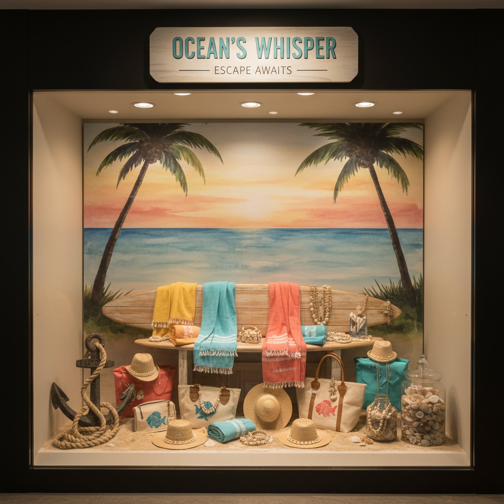
Visual merchandising is honestly one of the most creative and impactful parts of retail design, and it's also the part most prone to becoming invisible over time. When you look at your displays every single day, you stop seeing them. Your customers, however, are seeing them fresh. And if what they see is uninspiring, they move on fast.
Great visual merchandising does several things at once. It showcases the product, yes, but it also communicates lifestyle, aspiration, and context. When you see a beautifully styled kitchen display with the cookware in use alongside matching linens and a cookbook, you're not just looking at a pot. You're imagining your own kitchen, your own Sunday mornings. That's the magic of good merchandising. It sells the life, not just the object.

Here are some fundamentals that I always recommend revisiting regularly:
- Use the rule of three when grouping items. Odd numbers create visual interest and feel less rigid than pairs.
- Vary heights constantly. Flat, uniform displays are visually boring. Stack, hang, elevate, and layer.
- Tell a story with color. Whether you work with tonal palettes or bold contrasts, keep it intentional and consistent.
- Rotate displays frequently. Even small changes signal freshness to returning customers and give them a reason to look again.
- Use negative space deliberately. A crowded display suggests discount and desperation. White space suggests value and confidence.
And honestly, don't underestimate the power of touch. Products that customers can pick up, feel, test, or interact with sell better. Full stop. If your merchandising keeps everything behind glass or at an awkward height, you're creating distance between the customer and the sale. Bring things to hand level, make them accessible, and watch what happens.
Lighting That Sells
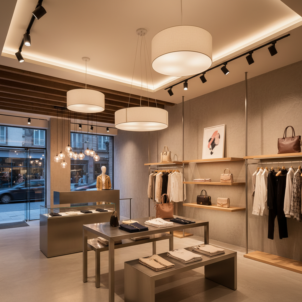
If there's one area where I see retailers chronically underinvest, it's lighting. And it genuinely baffles me because good lighting is one of the highest-return investments you can make in your store. Bad lighting makes great products look mediocre. Good lighting makes ordinary products look extraordinary. Trust me on this one.
The first thing to understand is that retail lighting isn't a single layer. It's a system with at least three components working together: ambient lighting (the overall base light that fills the space), accent lighting (directional light that highlights specific products or areas), and task lighting (functional light at checkout, fitting rooms, or service counters). When all three work in harmony, the result is a store that feels intentional, warm, and professional. When you rely on one flat layer of fluorescent overhead light, everything looks flat, sterile, and frankly a little depressing.
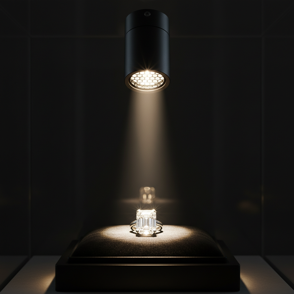
Color temperature matters enormously depending on what you're selling. Warm white light (around 2700K to 3000K) works beautifully for clothing, home goods, and food because it's flattering and inviting. Cooler light (4000K and above) suits electronics, automotive, and tech products because it feels precise and modern. Getting the color temperature wrong for your product category creates a subtle but real disconnect that customers feel even if they can't articulate why.
Fitting rooms deserve a special mention because they're the last thing between a customer and a purchase decision. Harsh overhead lighting in fitting rooms is basically a sales killer. Invest in flattering, adjustable lighting that mirrors natural daylight. Customers who feel good in the fitting room buy more. It's not complicated, but so many retailers get it wrong.
And if budget is a concern, start with accent lighting on your hero products and power wall. Even one well-directed spotlight on a key display can transform the feel of an entire section. Layer from there as your budget allows.
Incorporating Technology for Interaction
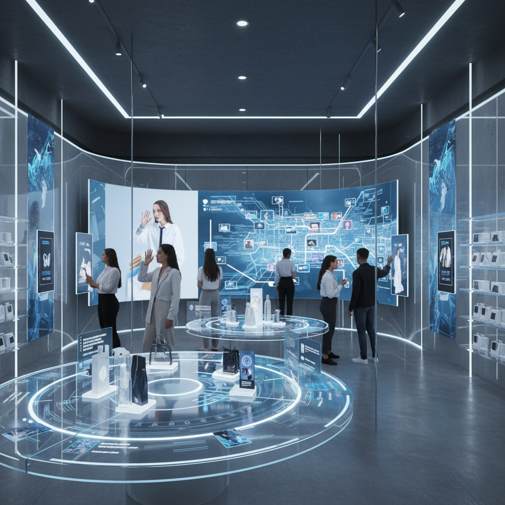
Look, technology in retail gets a bad reputation sometimes because it's often done badly. Screens that nobody looks at, apps that customers don't download, digital price tags that malfunction. But when technology is integrated thoughtfully into your store design, it becomes something genuinely powerful. It bridges the gap between the physical and digital worlds and it creates the kind of memorable experiences that people talk about.
Interactive touchscreens and digital kiosks work best when they solve a real problem for the customer. Think product configuration tools for furniture or custom products, size and fit guides for apparel, or ingredient and origin information for food retailers. The technology should answer a question or solve a frustration, not just exist for the sake of looking modern.
Smart mirrors in fitting rooms are one of the best examples of technology adding genuine value. Customers can request different sizes without getting dressed again, see how an item looks in different colors, or share a photo to get a friend's opinion. These aren't gimmicks. They reduce friction at a critical point in the purchase decision and they make the experience genuinely more enjoyable. That matters.
- Digital displays near your entrance can communicate promotions, new arrivals, or brand stories in a dynamic, eye-catching way.
- QR codes on product tags let curious customers dive deeper without requiring more floor staff.
- Mobile point of sale systems allow staff to check out customers anywhere in the store, eliminating the dreaded checkout queue.
- Loyalty program integrations tied to in-store behavior can personalize the experience in ways customers genuinely appreciate.
The key principle is that technology should serve people, not the other way around. If a customer has to work hard to figure out how to use something, it's failing. If a piece of technology makes a staff member's job harder, it's failing. When it's working right, the customer barely notices the tech itself. They just notice that the experience feels smooth, effortless, and surprisingly personal.
And honestly, you don't need to deploy everything at once. Start with one or two touchpoints where technology genuinely addresses a gap in your current customer experience. Measure how it performs, adjust, and build from there. Retail technology works best when it's iterative, not a one-time installation you set and forget.
Final Thoughts
Here's what I want you to take away from all of this: smart store design isn't about spending a fortune on a trendy renovation. It's about being intentional with every element of the space your customers inhabit. From the first breath they take at your entrance to the last interaction at checkout, every detail either builds the sale or undermines it.
The retailers who thrive, especially in a world where online shopping is just a phone tap away, are the ones who give people a reason to be in a physical space. That reason isn't always about price or selection. More often, it's about how the space makes people feel. Welcomed. Inspired. Seen. That's what great retail design delivers, and it's absolutely within reach for any store, at any budget, with the right approach.
Start with one section from this list. Fix your entrance flow, rethink your lighting, refresh a tired display. Small changes compound fast in retail environments, and your customers will notice even when they can't explain exactly why your store suddenly feels so much better to be in.
More in Commercial
Stay Inspired
Subscribe for new essays on architecture, design, and the spaces that shape us.