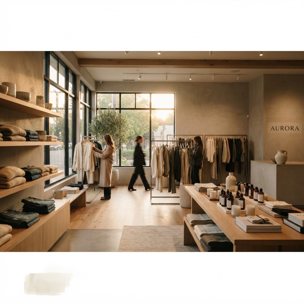
6 Genius Retail Store Design Tricks That Actually Boost Your Sales
Great store design is about more than just looking pretty. These tactical layout and visual merchandising strategies will help you guide customers through your space and encourage them to purchase more.
The Power of the Decompression Zone
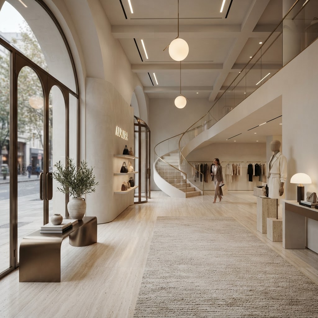
Here's the thing most retailers completely overlook: the first five to fifteen feet inside your store entrance are basically dead space to your customers. Not because they don't care, but because their brains are still catching up. They've just come in from the street, maybe they were on their phone, maybe they were arguing with a parking meter. Whatever the case, they need a moment to transition. This little stretch is what retail designers call the decompression zone, and honestly, understanding it could change everything about how your store performs.
Paco Underhill, the retail anthropologist who literally wrote the book on this stuff, documented how customers in the decompression zone almost never pick up promotional materials, rarely notice signage, and tend to walk right past products without registering them. It's not that your signage is bad. It's that their brains are still in "outside mode." So if you've been piling your best deals and loudest displays right at the entrance, you're basically throwing money away.
So what should you actually put there? Think of it as a landing pad. Keep it relatively open, visually calm, and use it to set the tone of your brand without demanding immediate action. A beautiful material display, some lush greenery, a textured wall, a subtle scent diffuser. You want customers to breathe in and feel something before they start shopping. Some of the best retail spaces I've walked into use this zone for brand storytelling, not selling. And paradoxically, that makes people far more likely to buy something once they move deeper into the store.
Practically speaking, keep your decompression zone clean, uncluttered, and easy to move through. Do not put checkout counters here. Do not block it with racks. Give people room to arrive. Once you start treating this zone with intention, you'll notice customers slowing down, looking around, and actually engaging with your space instead of blowing past everything on autopilot.
Mastering the Right Hand Turn
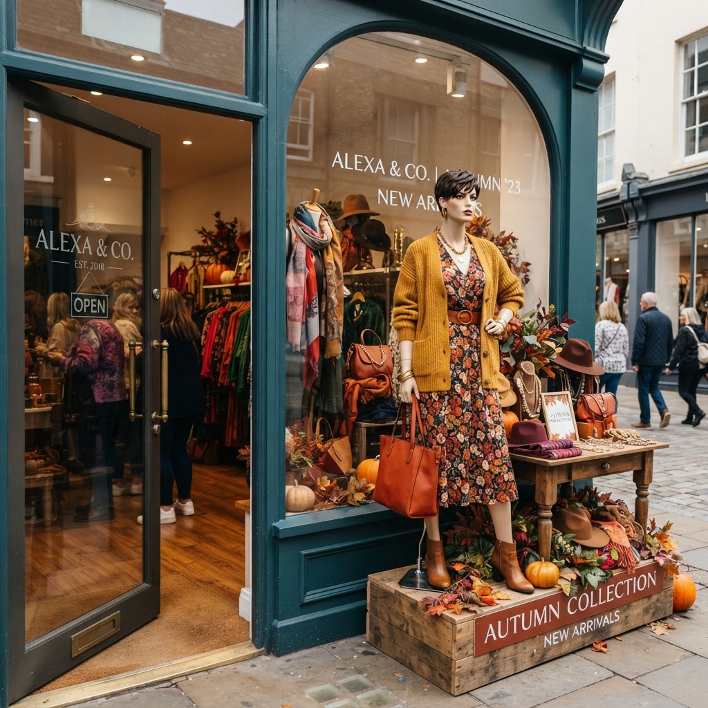
Real talk: if you haven't designed your store around the natural right-hand bias of your customers, you're leaving serious money on the table. Study after study in retail behavior confirms that the overwhelming majority of shoppers, after clearing that decompression zone, instinctively turn right and move counterclockwise through a store. It's not a conscious choice. It's just how most of us are wired, likely because most people are right-handed and we naturally orient toward that direction.
This means the right wall of your store is arguably your most valuable piece of real estate. Retailers call it the power wall. It's where you want your newest arrivals, your most visually striking products, your seasonal highlights. Whatever you need customers to notice first, that's where it goes. And yet, I walk into so many stores where the right wall is an afterthought, some mediocre display or worse, just a blank wall with a few hooks on it. It's almost painful to see.
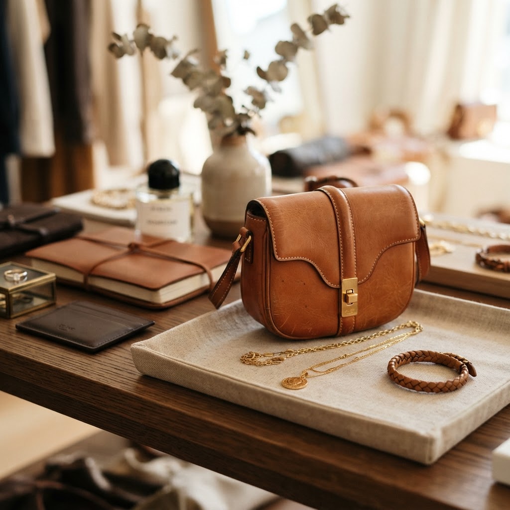
Beyond just the right wall, think about designing a natural counterclockwise path through your entire floor plan. Grocery stores have been doing this for decades, and it's not an accident. When you guide people on a loop, they cover more ground, they see more products, and they're far more likely to make unplanned purchases. Use fixtures, flooring transitions, and even lighting to subtly nudge people in the right direction without it ever feeling forced or weird.
Here's a practical tip: walk your own store from the customer's perspective. Enter through the front, and let yourself move naturally. Where do your feet take you? What do you see first? What feels awkward or confusing? You'll often discover that what you thought was a great layout actually has some frustrating pinch points or dead ends that send people backtracking instead of exploring. Fix those, and watch your average transaction value climb.
Strategic Sightlines and Focal Points
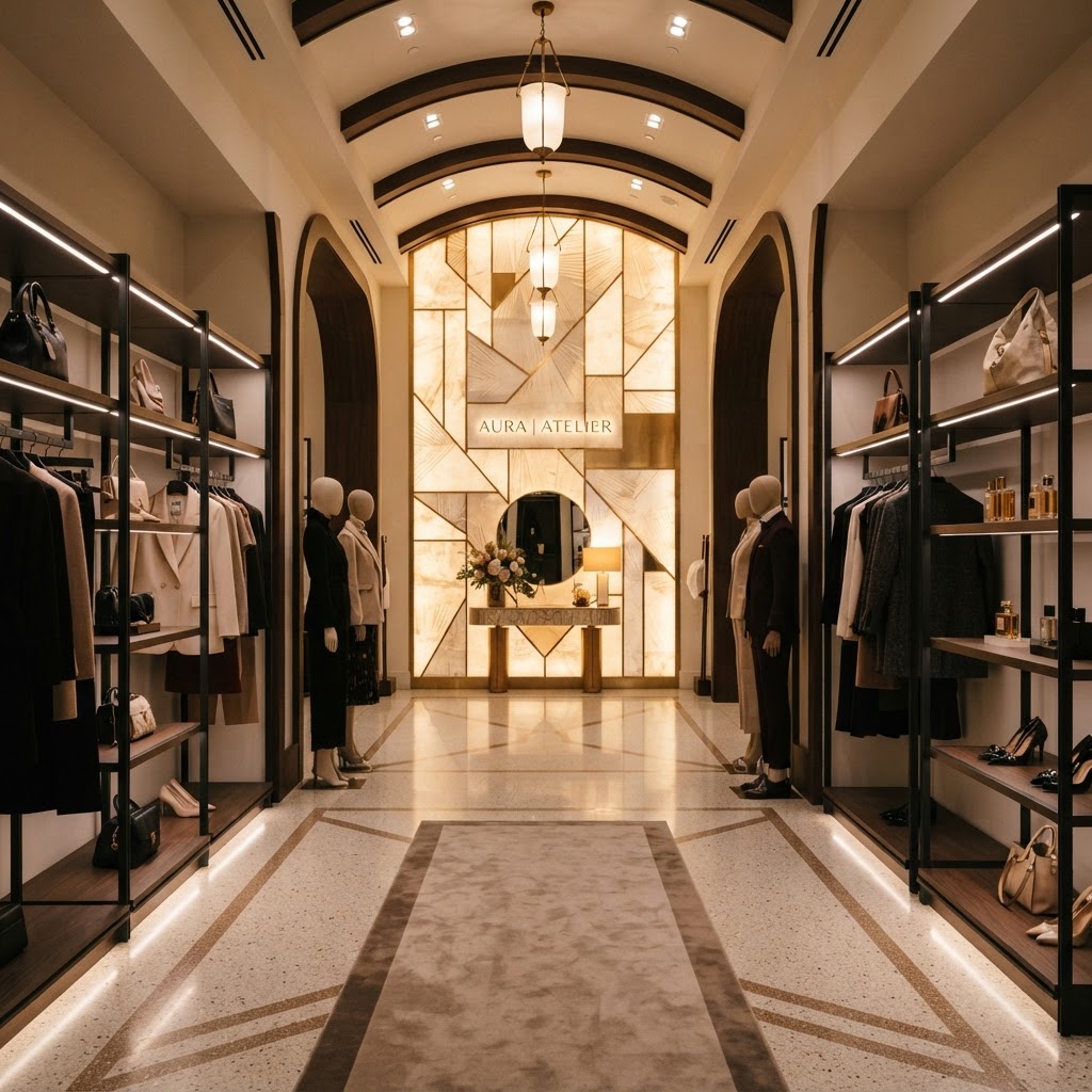
Honestly, this is one of my favorite topics in retail design because it's so visual and so immediately impactful. The idea is simple: from the moment a customer enters your store, their eyes are scanning the space, looking for something interesting to move toward. If you give them a clear focal point, a beautifully merchandised display, a dramatic product arrangement, even a piece of art, they will walk toward it. And everything they pass along the way? That's your opportunity to sell.
Good sightlines are about intentional depth. You want the back of your store to feel inviting, not distant. One incredibly effective trick is to place your most visually compelling or aspirational items at the back. Luxury brands do this constantly. The thing you really want is always just a little further in. That's not an accident. That's design doing exactly what it's supposed to do: pulling people through the space.
You also need to think about fixture heights carefully. If everything is the same height, the space feels flat and confusing. Vary your display heights to create visual rhythm. Keep lower fixtures in the center of the floor so sightlines remain open across the space. Use taller displays along walls where they frame the room rather than blocking views. This creates what designers call a landscape effect, where the eye can travel freely and always finds something interesting to land on.
- Place your most dramatic visual displays at natural sightline endpoints
- Keep center-floor fixtures low to preserve open views across the space
- Use color blocking and texture contrast to create visual magnets
- Avoid cluttered back walls, they make the store feel closed off and uninviting
- Rotate focal points seasonally to give repeat customers something fresh to discover
Trust me on this: even small tweaks to your sightlines can produce noticeable results within weeks. A display repositioned, a wall cleared of clutter, a single statement piece installed at the back of the store. These are low-cost, high-impact changes that make a real difference in how long customers stay and how much they spend.
Creating Frictionless Checkout Experiences
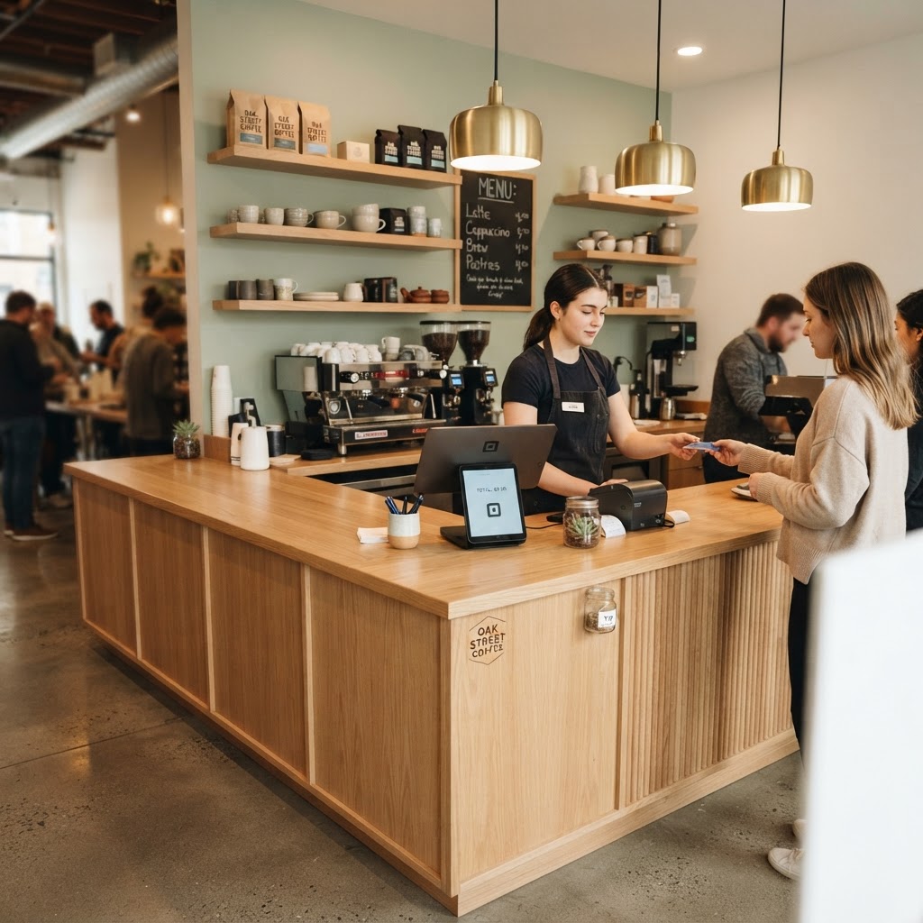
Look, the checkout area is where so many otherwise well-designed stores fall apart. You've done everything right, you've pulled the customer in, guided them through the space, they've got items in hand, and then they hit a confusing, cramped, poorly designed checkout situation and the whole experience deflates. Abandoned purchases happen more often than retailers like to admit, and a lot of them happen right here, in those final moments before the sale is completed.
First, location matters more than most people think. Your checkout counter should be positioned in a way that feels like a natural endpoint to the shopping journey, not something you stumble across by accident. It should be visible from multiple points in the store so customers always know where they're headed. And it absolutely should not be crammed into a corner where two people waiting in line make the whole area feel chaotic and claustrophobic.
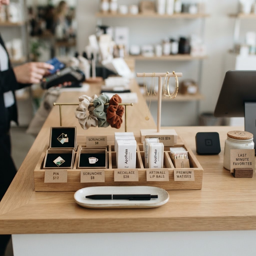
The space immediately around the checkout is also prime real estate for impulse purchases. Small, low-commitment items that complement what you sell. Think travel-sized products, accessories, seasonal items, anything that doesn't require a lot of decision-making. The customer is already in buying mode. You just need to make it easy for them to add one more thing. Keep these displays tidy and curated though, a messy grab-and-go bin looks cheap and actually deters purchases rather than encouraging them.
"The checkout experience is the last impression your store leaves on a customer. Make it easy, make it pleasant, and make it worthy of a return visit."
And please, give your staff enough room to work comfortably behind the counter. Nothing kills a checkout vibe faster than watching an employee squeeze past each other or fumble around in a too-small space. A well-designed checkout area communicates professionalism and makes the whole transaction feel smoother, for everyone involved.
Using Lighting to Direct the Customer Journey
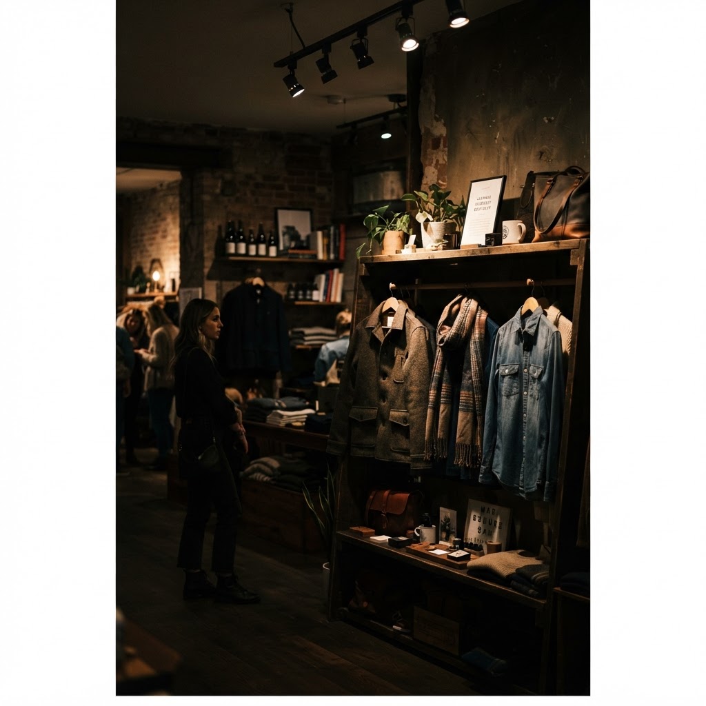
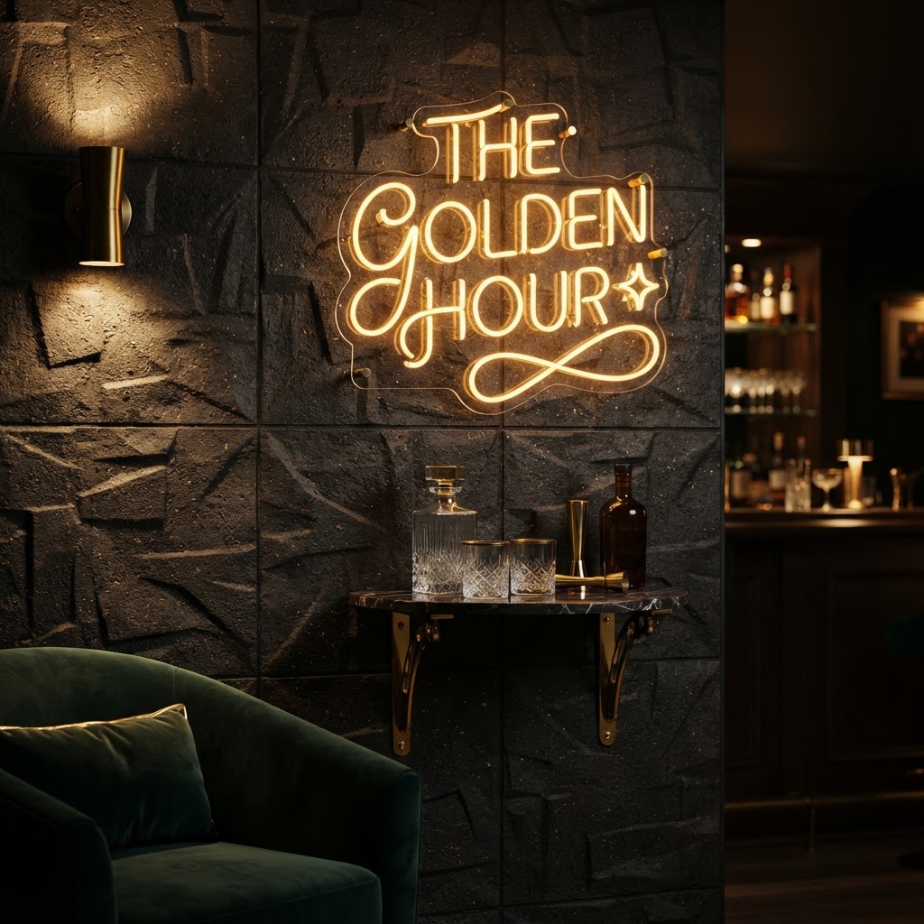
And honestly, this might be the single most underestimated design tool in retail. Lighting is not just about making a space bright enough to see. Done right, lighting literally directs human behavior. It tells people where to look, where to go, what's important, and how to feel. I've seen mid-tier products sell like luxury goods simply because the lighting around them was extraordinary. And I've seen genuinely beautiful products sit ignored because the lighting made them look flat and forgettable.
The foundational concept here is the contrast ratio between ambient light and accent light. Your ambient lighting should be comfortable and even, enough to see clearly without feeling harsh or institutional. Then your accent lighting, those directional spots and focused beams, should be noticeably brighter on the products and displays you most want customers to notice. A contrast ratio of about three to one is a good starting point, meaning your accents are roughly three times brighter than your ambient. This creates visual hierarchy without making anything feel weirdly dark or dramatic.
Think about the temperature of your light too. Warmer tones, around 2700 to 3000 Kelvin, create a cozy, intimate atmosphere that works beautifully for apparel, home goods, and lifestyle brands. Cooler, crisper light in the 4000 Kelvin range reads as clean and precise, great for tech, beauty, and anything where clarity and detail matter. Mixing these temperatures strategically within the same store can even help differentiate zones without any physical partition.
- Use accent lighting at three times the intensity of ambient to create clear visual hierarchy
- Light your focal points and power wall displays more brightly than surrounding areas
- Avoid flat, uniform ceiling grids, they flatten products and kill atmosphere
- Use warmer tones in fitting rooms and lifestyle sections where mood matters
- Consider lighting transitions between zones to signal a shift in product category
One thing I always tell clients: walk your store at night when it's closed and only the retail lighting is on. No natural light, no overhead fluorescents bleeding in. Just your designed lighting system. What you see is exactly what your customer sees at 7pm on a Tuesday. If something looks dull or washed out or weirdly shadowy, that's the problem to solve. Good lighting is invisible in the best possible way. When it's working, customers just feel good in your space without knowing exactly why.
Final Thoughts
Here's what I want you to take away from all of this: great retail design isn't about having a huge budget or hiring a famous architect. It's about understanding how people actually move, think, and feel inside a space, and then designing around that reality instead of ignoring it. The decompression zone, the right-hand turn, your sightlines, your checkout, your lighting. These are not abstract concepts. They are practical, implementable tools that real stores use every single day to convert browsers into buyers.
You don't have to overhaul everything at once. Pick one thing from this list, implement it thoughtfully, and watch what happens. Then do the next one. Retail design is iterative, and honestly, the stores that win long-term are the ones that keep paying attention to how their customers are experiencing the space, not just how it looks in photos.
Your store is not just a container for products. It's an experience, a conversation, a feeling. Design it that way, and your sales numbers will start to reflect it.
More in Commercial
Stay Inspired
Subscribe for new essays on architecture, design, and the spaces that shape us.