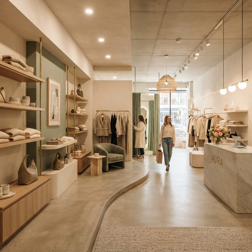
6 Genius Store Design Secrets That Will Make Your Customers Buy More
Designing your retail space is about more than just aesthetics. Discover how strategic layouts and intentional design choices can guide shoppers through your store and boost your bottom line.
The Power of the Decompression Zone
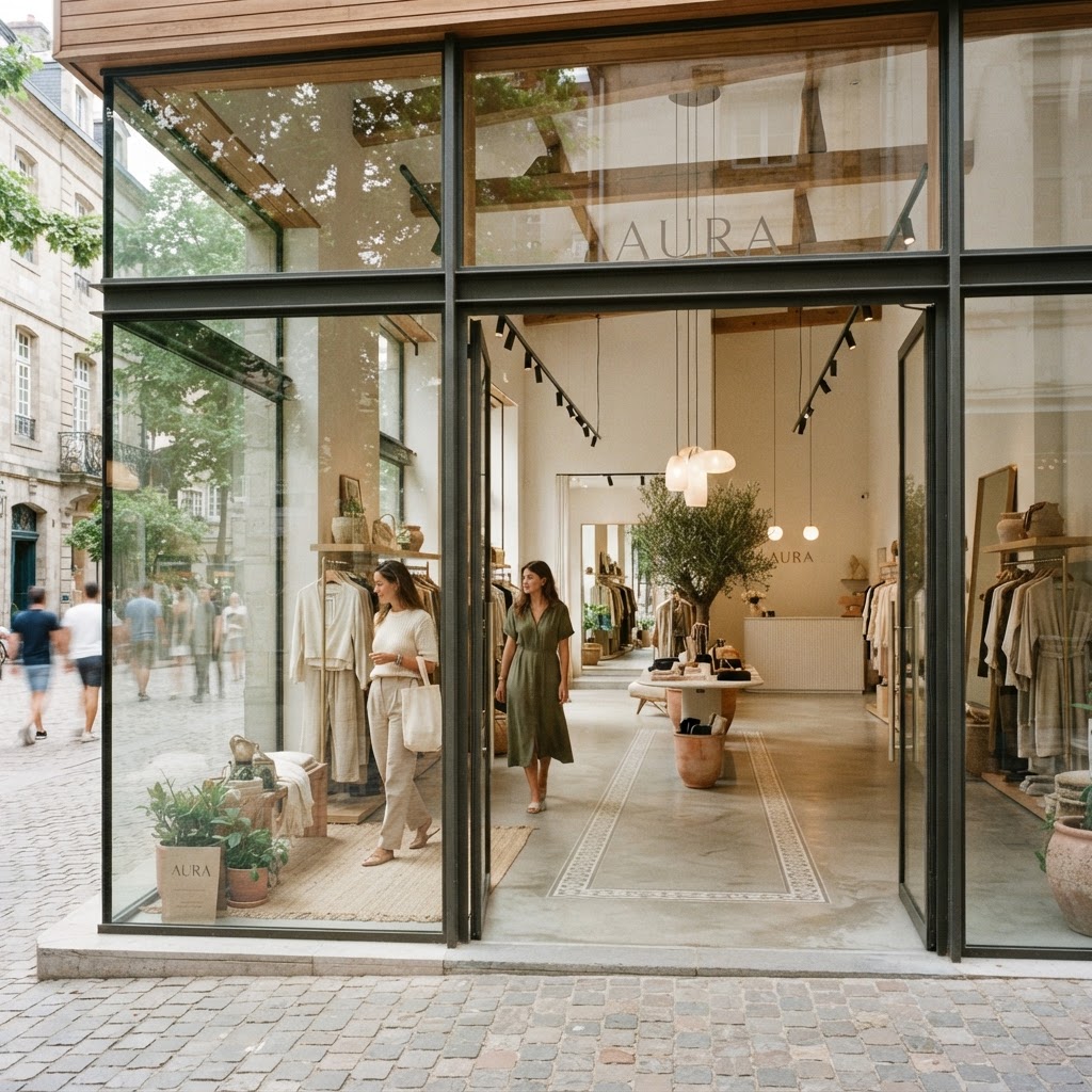
Okay, let's start with something that a lot of store owners completely overlook, and it genuinely baffles me every time I walk into a shop and feel immediately assaulted by products. The decompression zone is the first few feet of your store, right after the entrance, and honestly, it might be the single most important real estate you own. Not because you can pile it with your best stuff, but because you absolutely should not.
Here's the thing: when someone walks in from the street, their brain is still processing a million things. Traffic noise, their phone, whatever was stressing them out five minutes ago. They are not ready to shop yet. Studies in retail psychology, including work done by the legendary Paco Underhill in his book "Why We Buy," consistently show that customers almost never register products placed in the first five to fifteen feet of a store. They just blow right past them. So if you've crammed your entrance with promotional signage and sale items, you're essentially wasting that space and money.
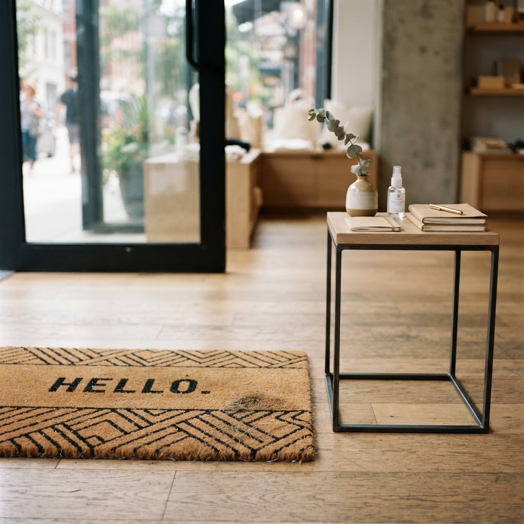
What you want to do instead is use this zone to create a sensory transition. Think open floor space, great lighting, a signature scent maybe, or a single striking visual display that says "welcome, you're somewhere special now." Apple does this masterfully. You walk into an Apple Store and there's this moment of calm before you even see a product properly. That's intentional design, not an accident. The decompression zone should slow your customer down, signal your brand's identity, and basically whisper to their nervous system that it's okay to relax and browse.
Practically speaking, keep this zone clear of clutter, avoid placing shopping baskets right at the door (people don't grab them until they're mentally in buying mode anyway), and resist the urge to hang banners or stack promotional displays here. Instead, use a beautiful material change in the flooring, a subtle shift in ceiling height, or a curated single display that acts more like art than merchandise. Trust me on this, the payoff in actual conversion deeper in your store will be worth the "wasted" space up front.
Creating a Strategic Path to Increase Dwell Time
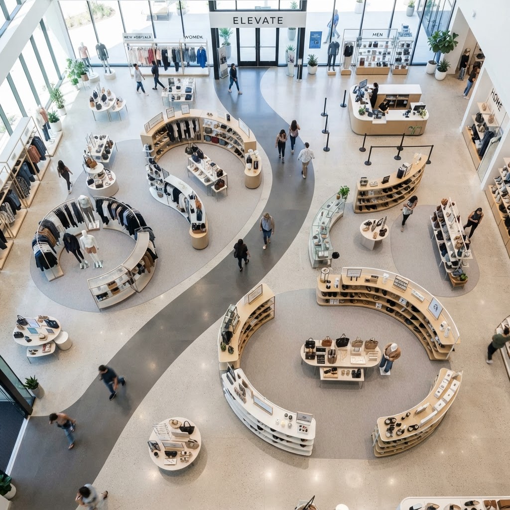
Real talk, the longer someone stays in your store, the more they spend. That's not a guess, that's a well-documented retail truth. The average customer spends something like 40% more when their dwell time increases by just a few minutes. So designing a path that naturally encourages exploration is one of the highest-return investments you can make in your store layout.
Most stores default to a grid layout because it's easy and efficient for stocking. And sure, grocery stores can get away with it because people are on a mission to grab milk and leave. But for most retail, especially lifestyle, fashion, home goods, or specialty stores, you want a loop or a free-flow layout that guides people through the space without them feeling corralled. The idea is to create a journey. Think about it like a story. You want a beginning, a middle, and an end, with interesting things to discover at every turn. Furniture placement, partial walls, height variations in shelving, and strategic product "magnets" placed at the back of the store all serve to pull customers further in.
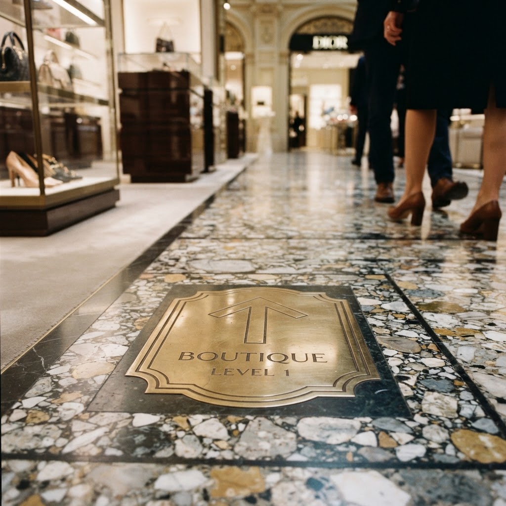
One technique I absolutely love is what designers sometimes call "speed bumps." These are small, unexpected moments placed along the customer path that slow people down and pull their attention. It could be a lifestyle vignette, a small seating area, a demonstration table, or even just a beautifully styled corner that makes someone stop and look. Every time a customer stops, there's a window of opportunity to make a sale.
- Place destination products at the rear of the store to draw customers through the full space.
- Use angled fixtures to naturally guide foot traffic without obvious signage.
- Create moments of discovery with styled vignettes that break up the predictable retail rhythm.
- Avoid dead ends that force customers to backtrack, which disrupts the flow and feels frustrating.
- Use flooring changes to subtly signal transitions between departments or zones.
And honestly, one of the most overlooked tools for extending dwell time is comfortable seating. Not just for companions waiting around, but as an invitation to linger. A well-placed bench or a couple of chairs near a product display sends a subconscious message that it's okay to hang out. That permission to be comfortable translates directly into more time spent, more products considered, and more purchases made.
The Art of Eye Level Product Placement
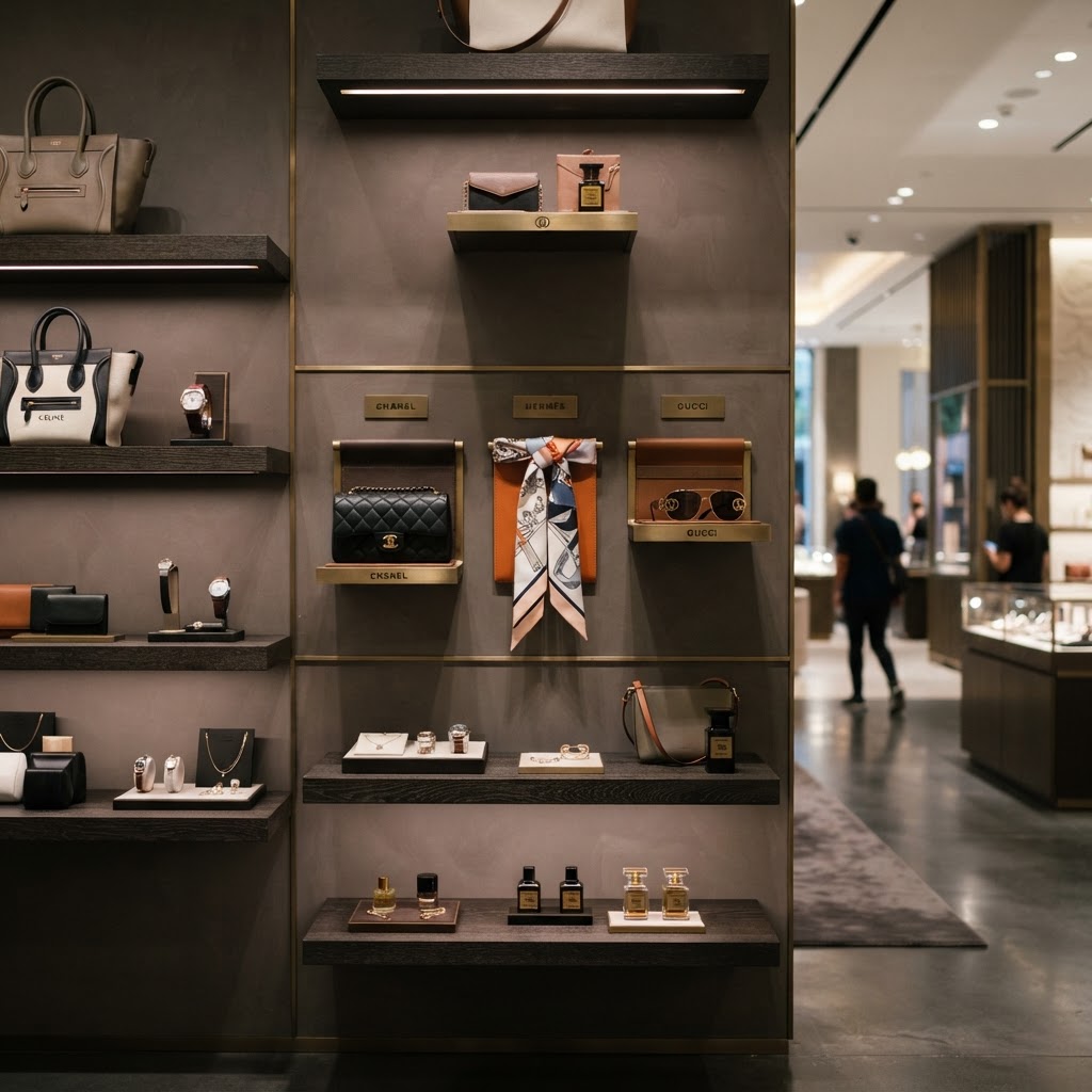
There's a reason the grocery industry coined the phrase "eye level is buy level." It's one of those retail truths that sounds almost too simple, but the data behind it is genuinely remarkable. Products placed at eye level, which is typically between 4.5 and 5.5 feet from the floor for the average adult, sell significantly better than the exact same products placed on lower or higher shelves. We're talking anywhere from 35% to 63% better, depending on the category and study you look at.
Here's the thing though, most store owners know this principle but fail to apply it strategically. Eye level isn't just about stacking your most expensive items up high. It's about understanding who your customer is and what they're most likely to reach for impulsively. Your highest-margin products, your newest arrivals, and your best-reviewed items should be living at eye level. Full stop. The stuff customers will seek out anyway, like staples or replenishment items, can afford to live lower or higher because people will look for them regardless.
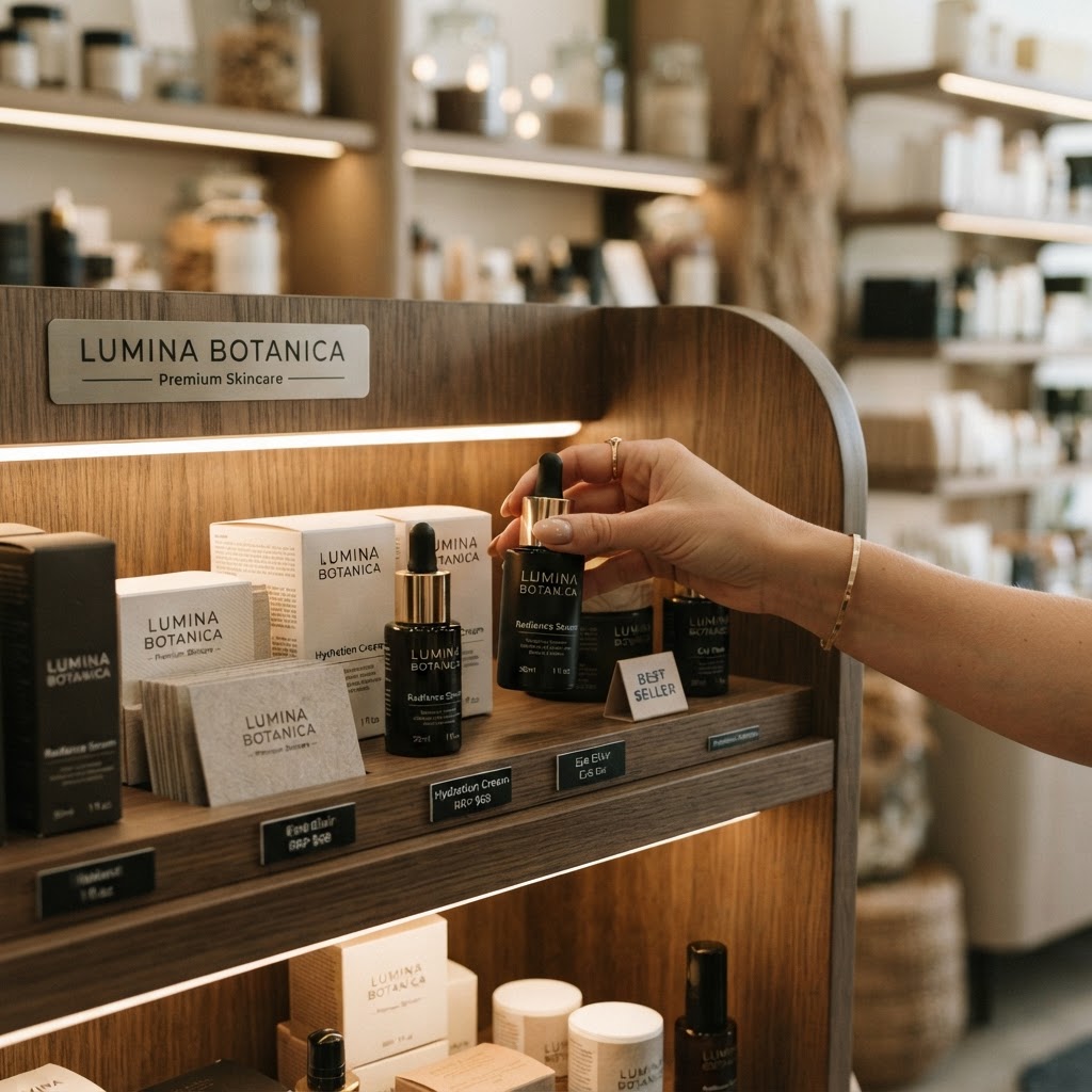
Also, don't forget to consider the eye level of your actual demographic. A children's boutique should be merchandising its most appealing, grab-worthy products at kid height, because kids are absolutely the influencers in that shopping experience. A store aimed at older customers might need to recalibrate its shelving heights entirely to avoid making people bend or stretch uncomfortably. Honestly, spending an afternoon in your own store at the eye level of your actual customers, whether that means sitting in a chair or crouching down, is one of the most illuminating exercises you can do.
Beyond shelving, think about what's happening at eye level on your walls, your display tables, and your window displays. Every surface has a visual hierarchy and the zone that aligns with human eye level will always command the most attention. Use it wisely, rotate it regularly, and never let that prime real estate go stale with old or underperforming product.
Using Lighting to Highlight Your Hero Items
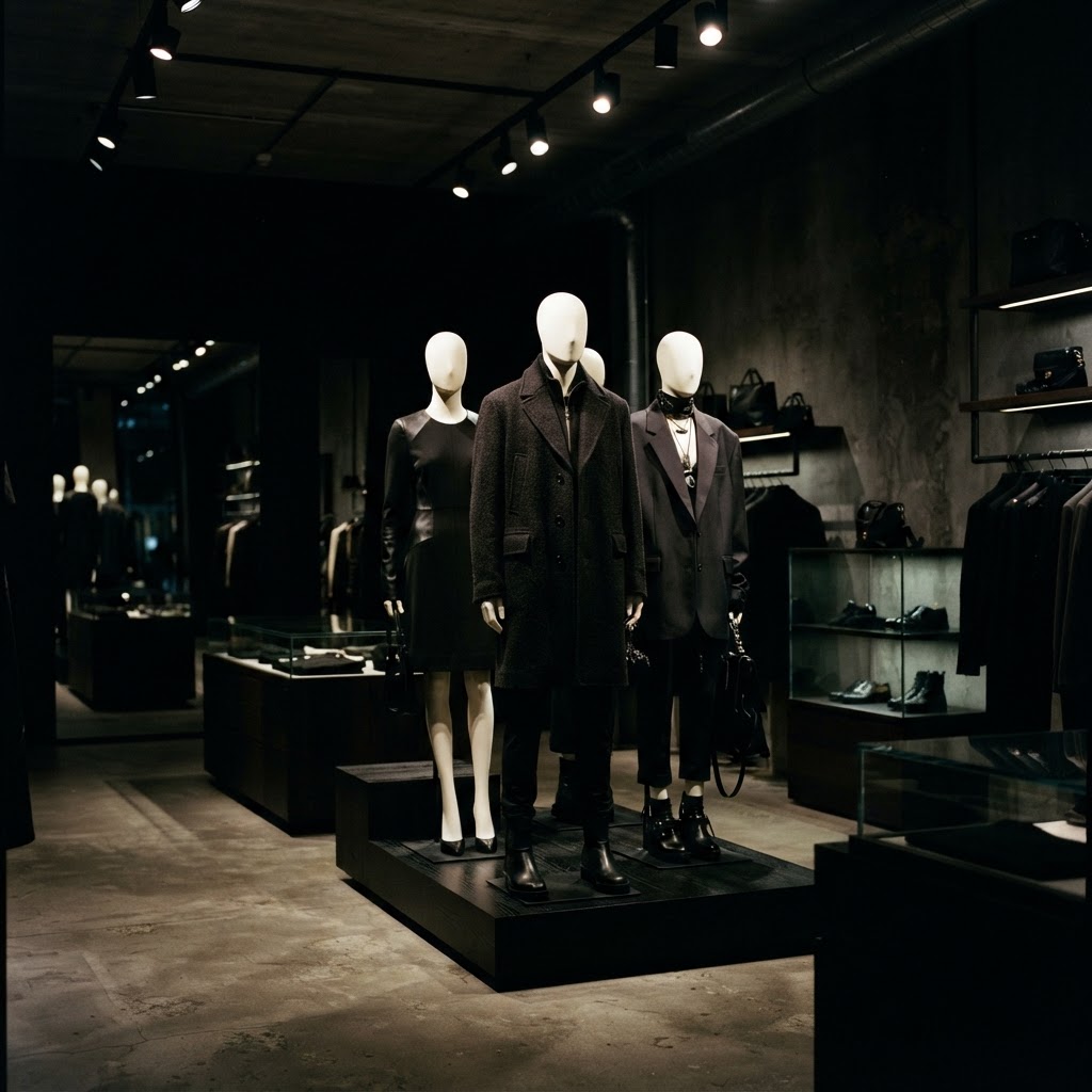
Lighting is one of those design elements that people think they understand but actually underestimate constantly. Bad lighting doesn't just make a store look ugly. It literally suppresses purchasing behavior. Customers in harshly lit or poorly lit environments feel rushed, uncomfortable, or just generally uninspired. Good lighting, on the other hand, creates atmosphere, communicates brand values, and physically directs the customer's eye to wherever you want it to go.
The concept of layered lighting is where most successful retail spaces start. You want three layers working together: ambient lighting that sets the overall mood of the space, task lighting that makes it practical and easy to see products clearly, and accent lighting that specifically highlights your hero items and key displays. That accent layer is where the magic happens. A single track light or recessed spotlight aimed at your featured product can increase that item's perceived value almost instantly. It's the difference between a product sitting on a shelf and a product being presented like it matters.
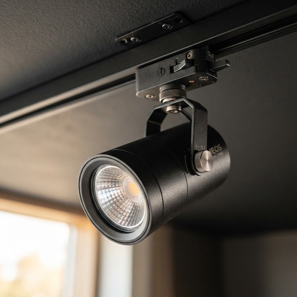
Color temperature is another thing worth obsessing over. Warmer light in the 2700K to 3000K range tends to make spaces feel inviting and cozy, which works beautifully for lifestyle, fashion, and food environments. Cooler, brighter light around 4000K to 5000K signals precision and cleanliness, which suits technology or medical-adjacent retail. Getting this wrong can make your products look completely different from how they do in natural light, which leads to returns and disappointed customers. Look, it's a technical detail but it makes an enormous difference.
And please, I'm begging you, invest in dimmable and adjustable fixtures so you can evolve your lighting as your store layout changes. Track lighting systems are genuinely worth the upfront cost because they give you flexibility. As your hero products rotate, your lighting should rotate with them.
The Psychology of the Point of Sale Area
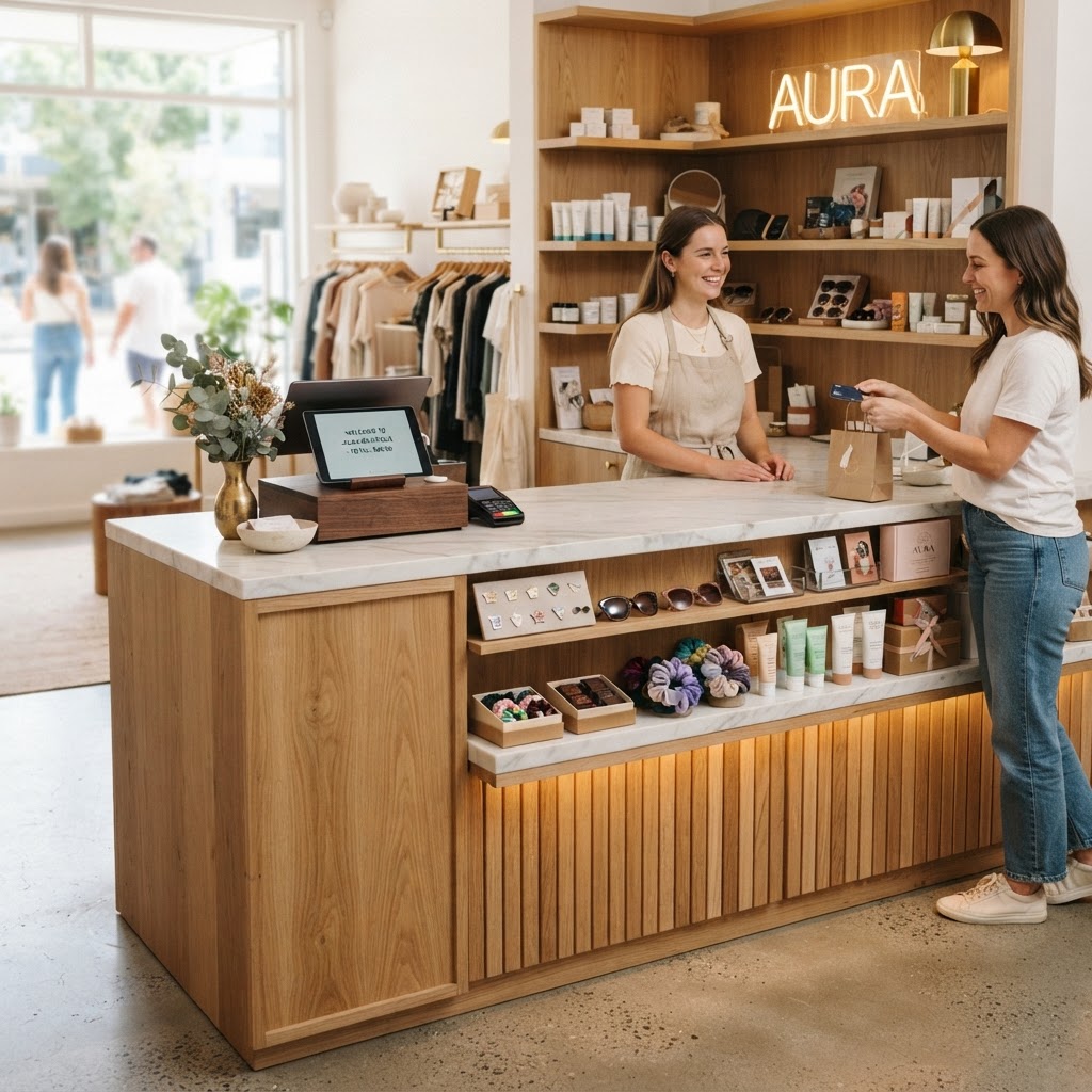
The point of sale area, meaning your checkout counter and everything around it, is your absolute last chance to influence a purchase decision. And honestly, most stores treat it like an afterthought. A cluttered counter, a bored-looking cashier, a pile of impulse products shoved into a spinner rack that looks like it hasn't been touched since 2009. This is a missed opportunity on a massive scale. Your checkout zone should be one of the most intentionally designed spaces in your entire store.
Think about the customer's mindset at this point. They've already decided to buy something. Their wallet is mentally open. They're standing in one place for anywhere from thirty seconds to a few minutes. That is an incredibly captive audience. What you place within arm's reach of that person should be carefully curated, low price point, high perceived value, and directly relevant to what they're already buying. This is not the place for random overstock. This is the place for your most charming, giftable, impulse-friendly products that genuinely feel like a little treat.
Beyond product placement, the design of the counter itself matters enormously. A beautifully designed checkout counter communicates care and quality to the customer right at the moment they're completing a transaction. It reinforces their purchasing decision and leaves them with a positive emotional impression of your brand. Contrast that with a beat-up laminate counter covered in tape marks and random papers, and you can see how the environment either confirms or undermines the customer's good feeling about buying from you.
- Keep the counter surface clean and curated, with only intentional items on display.
- Use tiered or elevated displays behind the counter to draw the eye to high-margin add-ons.
- Incorporate your brand identity into the counter design through materials, color, and finishes.
- Position loyalty program sign-ups or QR codes here, where customers are already engaged and stationary.
One last thing about the checkout experience that people rarely talk about: the line or queue area, if you have one. If customers are waiting, that whole stretch of space is an opportunity. Low shelving along a queue creates what the industry calls "queue merchandising," and it works incredibly well for small, affordable, interesting items. But the design of that area also affects how long the wait feels. Good lighting, interesting things to look at, and a sense of movement all make a three-minute wait feel like one minute. Uncomfortable, poorly designed queue areas make thirty seconds feel like forever, and that negative feeling gets associated with your brand.
Final Thoughts
Honestly, great store design isn't about spending a fortune on a fancy fit-out. It's about understanding how people actually behave, how they move, what they notice, and what makes them feel comfortable enough to slow down and spend money. Every single one of these principles, from the decompression zone to the checkout counter, is rooted in real human psychology. And the best part is that you can apply most of them with relatively small changes.
Start by walking your own store the way a customer would. Come in through the front door, follow the natural path, notice what catches your eye and what doesn't. Crouch down to your customer's eye level. Stand at the checkout and look around. You'll probably see your space completely differently, and that shift in perspective is where all the good ideas come from.
The stores that get this right don't feel manipulative or gimmicky. They feel like places people genuinely want to be. And when people want to be somewhere, they stay longer, they explore more, and yes, they buy more. That's not a trick. That's just good design doing its job.
More in Commercial
Stay Inspired
Subscribe for new essays on architecture, design, and the spaces that shape us.