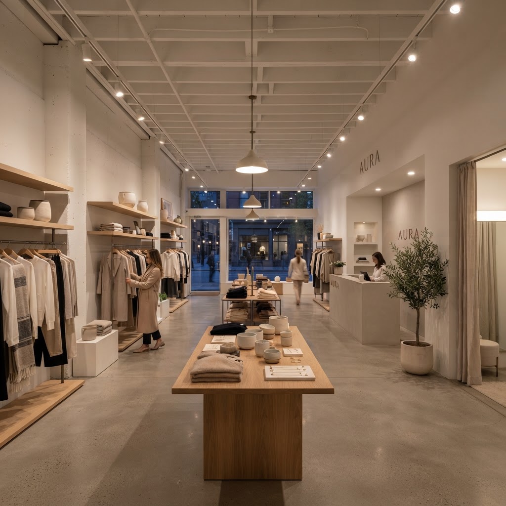
6 Genius Store Layout Secrets That Will Actually Skyrocket Your Sales
Discover how the strategic placement of your products and the flow of your floor plan can influence customer behavior. We walk you through simple design tweaks that convert window shoppers into loyal customers.
The Power of the Decompression Zone
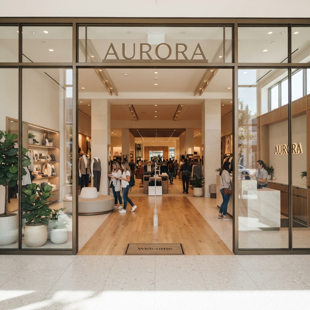
Okay, so let's start with the one thing most store owners completely overlook, and honestly, it might be the most important real estate in your entire shop. The decompression zone, sometimes called the transition zone, is that first 5 to 15 feet customers walk through after they enter your store. It sounds simple. It sounds almost too basic to matter. But trust me on this, getting this space wrong can tank your sales before a single product even gets noticed.
Here's the thing: when people walk in from outside, their brains are still processing everything they just left behind. The traffic, the noise, the mental checklist of errands. They're not ready to shop yet. They're decompressing, literally. Studies by retail anthropologist Paco Underhill showed that shoppers almost never stop to look at products, signage, or displays placed in this entry zone because they're moving too fast and their brains are still catching up. So if you're putting your best promotional displays or your highest-margin products right at the entrance, you're basically invisible to your customers right when they arrive.
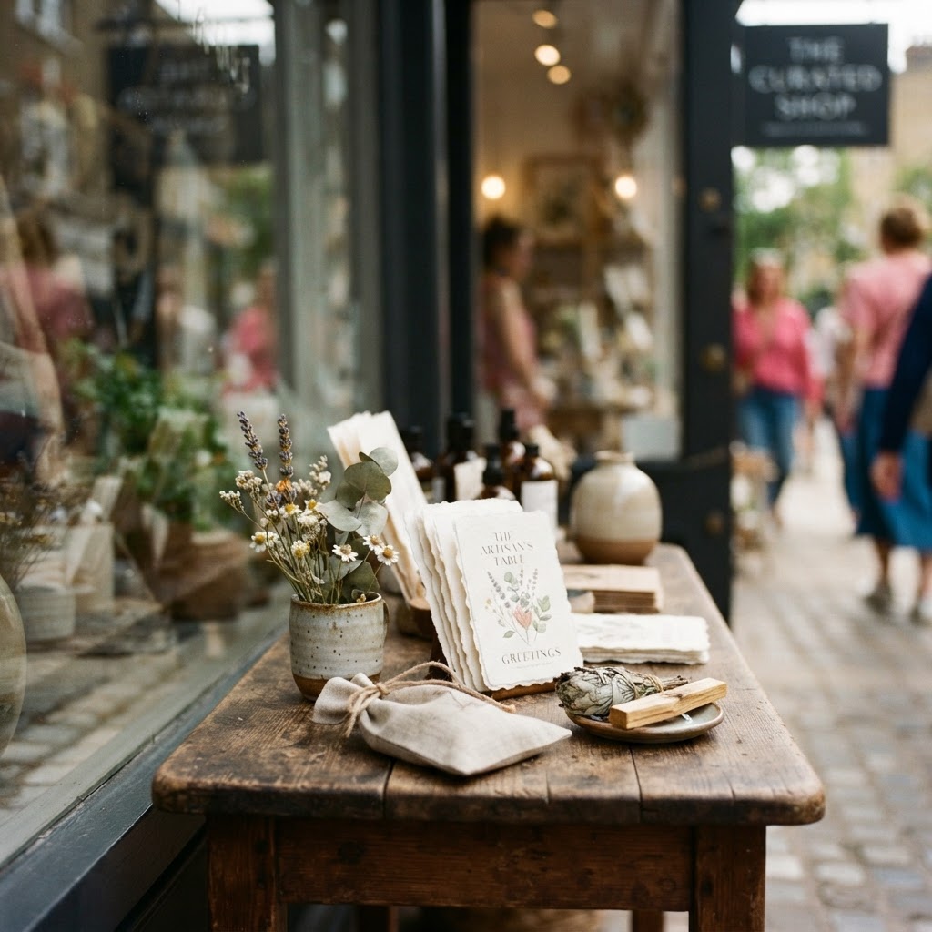
What should you put in the decompression zone then? Keep it open, welcoming, and uncluttered. Think of it as a visual exhale. A beautiful display, some greenery, a low-profile fixture that signals the vibe of your brand without demanding immediate attention. Apple stores nail this. The moment you walk in, there's space. There's air. You feel calm. And that calmness is what gets customers into a receptive, browsing mindset before they even realize it's happening.
Real talk: I've walked into small boutiques where the owner crammed promotional signage and clearance racks right at the door because they thought more visibility meant more sales. The opposite is true. Overcrowding the entry creates a psychological friction that makes people want to turn around. Keep it light. Keep it breathable. Let the decompression zone do its quiet, powerful work of transitioning your customers from the chaos of the outside world into the carefully curated experience you've built for them.
Mastering the Right Hand Rule
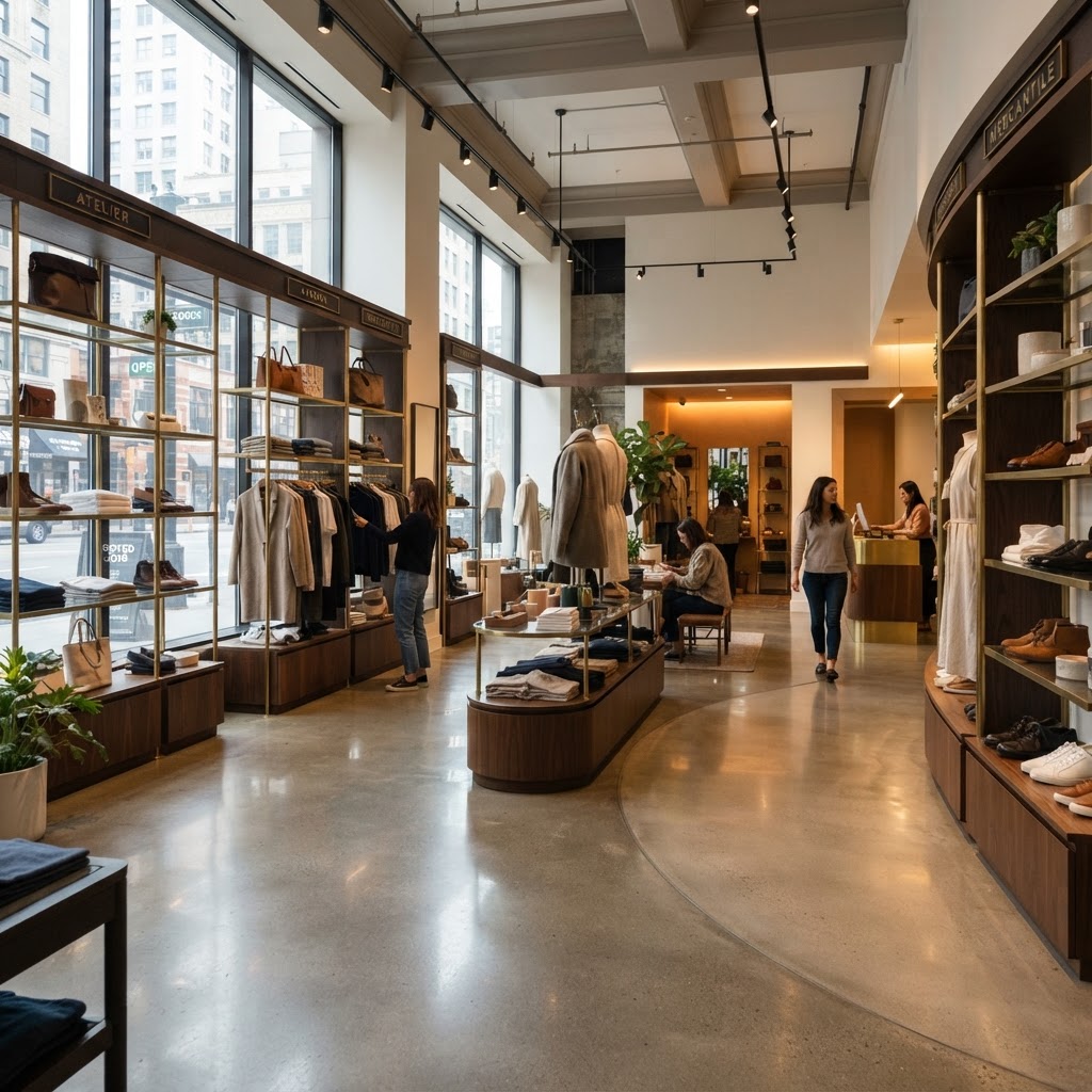
Here's a fun fact that will genuinely change how you think about your floor plan. The overwhelming majority of shoppers in Western countries, once they've passed through that decompression zone, will instinctively turn right and move counterclockwise through a store. It's not a choice they're consciously making. It's hardwired behavior. And honestly, the retailers who understand this are quietly printing money while everyone else wonders why certain areas of their store feel like dead zones.
The right-hand wall is prime real estate. Full stop. This is where your most important products should live. Your bestsellers, your new arrivals, your highest-margin items, whatever you most want customers to engage with, it needs to be on that right wall and in the first section they encounter after entry. Big box retailers figured this out decades ago. That's why grocery stores almost always put fresh produce on the right side near the entrance. It's not a coincidence. It's strategy baked into the architecture.
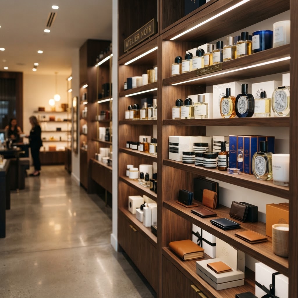
Now, this doesn't mean you abandon the left side of your store entirely. Honestly, it just means you have to work a little harder to draw people over there. Use lighting, signage, or an eye-catching display to pull traffic leftward. Some retailers will put something experiential on the left, a demo station, a tasting counter, a seating area, something that rewards the customer who ventures that direction. It creates a discovery moment that shoppers genuinely love.
The counterclockwise loop also means customers tend to end up near the back left of your store before heading back toward the exit. This is a great spot for staple items that people are already planning to buy, the things they came in for. Because here's the thing: if you make people walk through your whole store to get to the basics, they're going to encounter a lot of things they weren't planning on buying along the way. That's not being sneaky. That's just good retail design working exactly as intended.
Create Forced Paths for Maximum Exposure
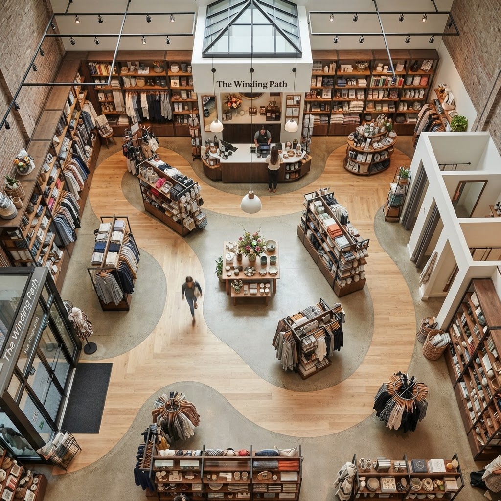
Look, I know the phrase "forced path" sounds a little manipulative. But every successful retail environment in the world does this, from IKEA's legendary one-way maze to the winding aisles of your favorite local bookstore. Forced paths are not about trapping customers. They're about making sure your customers actually see what you have to offer before they decide what they want. There's a big difference between manipulation and thoughtful curation.
IKEA is the absolute gold standard here, and it's worth studying them obsessively. Their single-path layout means that whether you came in for a desk lamp or a full kitchen renovation, you're walking past the bedding, the rugs, the bathroom accessories, and the kids' section before you get anywhere near checkout. Their average transaction value is staggering, and a huge part of that is path design. You see things you didn't know you needed, and suddenly you need them.
For smaller stores, you don't need a full one-way system. Instead, use fixtures, display tables, and product groupings to naturally slow customers down and guide them through different zones of your shop. Think about the path like a story with chapters. Your entry zone sets the scene. The right wall delivers the hook. Then a mid-store display creates a moment of discovery. Then a feature wall or focal point pulls them deeper. Every step of that journey should feel intentional, warm, and interesting, never like a maze they're trying to escape.
- Use gondolas and mid-floor fixtures to break up straight sight lines and encourage wandering rather than beelining to one section.
- Place high-interest or seasonal items at natural turning points in the path to keep momentum going.
- Keep pathways wide enough that customers don't feel cramped. The "butt-brush effect," where people avoid areas that feel too tight, is very real and very costly.
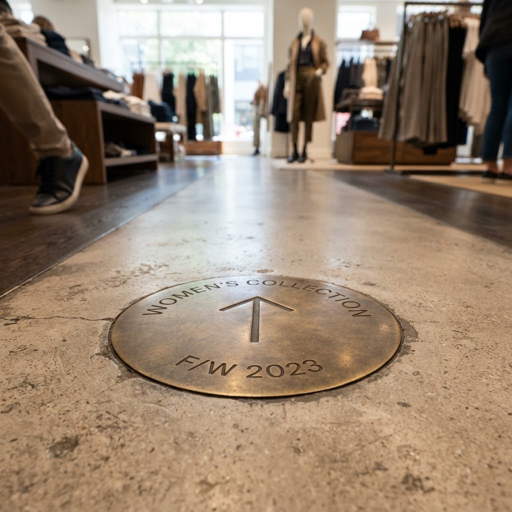
- Use rugs or flooring changes to subtly signal transitions between zones and guide movement without a single word of signage.
The goal is that by the time a customer reaches the back of your store, they've encountered a meaningful slice of your entire inventory. Not every product, but enough to spark ideas, create associations, and generate those beautiful unplanned purchases that turn a decent sales day into a great one.
Designing the Perfect Checkout Experience
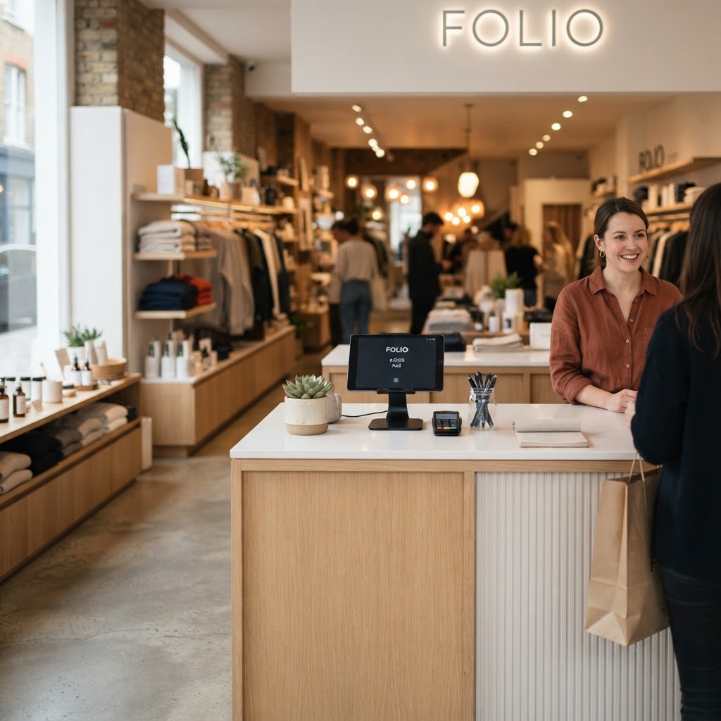
Honestly, the checkout area is one of the most underestimated spaces in retail design. Most stores treat it like an afterthought, a functional corner where transactions happen and then customers leave. But here's the thing: the checkout zone is your final impression, your last handshake, and one of the highest-converting spots in the entire store if you design it right.
Let's start with placement. Your checkout counter should ideally be on the left side of the store near the front, because remember, customers are moving counterclockwise. Putting it on the right near the entrance means you're essentially greeting people with "okay, time to pay" before they've even started shopping. The left-front placement catches them as they naturally complete their loop, at a moment when they've already made decisions and their wallets are mentally open.

The area immediately around the checkout counter is prime impulse-buy territory. And I mean that in the best possible way. Small, affordable, easy-to-grab items placed here convert at remarkably high rates because customers are already in a "yes" mindset and they're standing still, which means they have time to notice things. Think about the products that make sense here: gift cards, small accessories, seasonal treats, branded merchandise, travel-size versions of popular items. The key is keeping the selection tight and relevant, not cramming every low-cost product you carry into a chaotic pile.
Beyond the products, think about the experience itself. Is your checkout counter at a comfortable height for both your staff and your customers? Is there a place for people to set down their bag or purse while they pay? Is the lighting flattering and warm? These seem like tiny details but they add up to a feeling, and that feeling is what determines whether customers leave your store wanting to come back or just feeling relieved to be done. Make the checkout feel like a warm send-off, not a tollbooth.
Lighting That Commands Attention
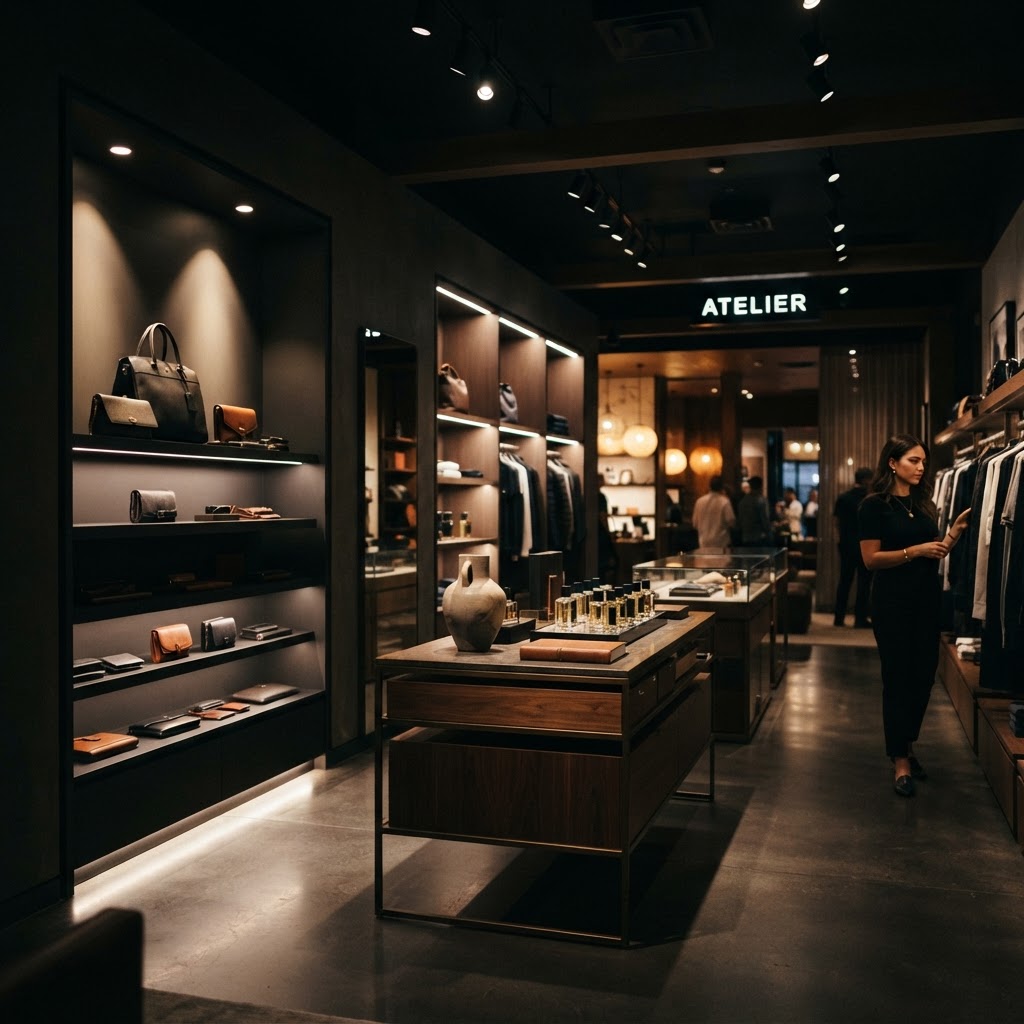
Real talk: lighting might be the single most powerful design tool you have in retail, and it's also the one that most small and mid-size store owners get spectacularly wrong. Bad lighting doesn't just make a space look unattractive. It literally affects what products customers notice, how long they linger, and how premium or budget-tier your entire brand feels. You can have the most thoughtfully curated product mix in the world and flat, fluorescent overhead lighting will make it all look like a clearance bin.
The key principle to understand is the difference between ambient lighting and accent lighting. Ambient is your overall room illumination, the base layer that lets people see where they're going and feel comfortable in the space. Accent lighting is the directed, focused light that you use to say "hey, look at this." Track lighting, spotlights, and display cabinet lighting all fall into this category. And honestly, accent lighting is where the magic happens. A product that's lit with a warm, focused spotlight at twice the intensity of the ambient lighting will receive significantly more customer attention. Our eyes are wired to go toward the brightest point in a room. That's just biology.
Here are some lighting principles worth committing to memory:
- Use warmer color temperatures (around 2700K to 3000K) in lifestyle and apparel environments to create a cozy, flattering atmosphere that makes customers feel good.
- Go cooler and brighter (4000K and above) in technical, electronics, or food retail environments where clarity and cleanliness are the priority.
- Highlight your hero products with accent lighting that's at least three times brighter than your ambient level. This is called the contrast ratio, and it's what makes luxury retail feel luxurious.
- Light your vertical surfaces, not just your floors and tables. Wall-washing techniques make small stores feel much larger and draw the eye upward, increasing the perceived sense of space.
- Avoid harsh downlighting directly over mirrors in fitting rooms. Flattering light in fitting rooms is a direct contributor to conversion rates. This is not a small thing.
And let's talk about the exterior for a second. Your window lighting is basically a free billboard, and most stores underutilize it completely. If your window display goes dark at night, you're missing hours of passive advertising every single day. Invest in proper window lighting that makes your display pop from the street, because a well-lit window is what turns a casual passerby into a curious customer who decides to push open the door.
"Light is not just a utility in retail. It's a selling tool. Used correctly, it directs attention, sets mood, and communicates the quality of everything it touches."
Final Thoughts
Here's what I want you to take away from all of this: great retail design isn't about spending a fortune on a fancy interior architect, though that can certainly help. It's about understanding how people actually behave in physical spaces and designing with that behavior in mind rather than against it. The decompression zone, the natural rightward drift of shoppers, the power of guided paths, a checkout experience that feels like a warm ending rather than a transaction, and lighting that makes everything feel intentional and premium. These five principles work together as a system.
You don't have to implement everything at once. Start with your lighting, because honestly, that's the highest-impact, lowest-effort change most stores can make right now. Then look at your entry zone and clear out the clutter. Then audit your traffic flow and see if your layout is working with your customers' instincts or fighting them. Small, thoughtful changes compound over time into significantly better sales performance and a noticeably better customer experience.
The stores that get this stuff right feel effortless to shop in. That's not an accident. It's design doing its quiet, invisible work. And now that you know what to look for, you'll never walk into a retail space the same way again.
More in Commercial
Stay Inspired
Subscribe for new essays on architecture, design, and the spaces that shape us.