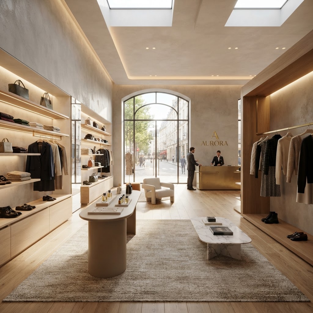
7 Store Layout Secrets That Actually Increase Your Sales
Designing your retail space is about more than just aesthetics. Discover how strategic layout choices can guide customer movement and naturally boost your conversion rates.
The Power of the Decompression Zone
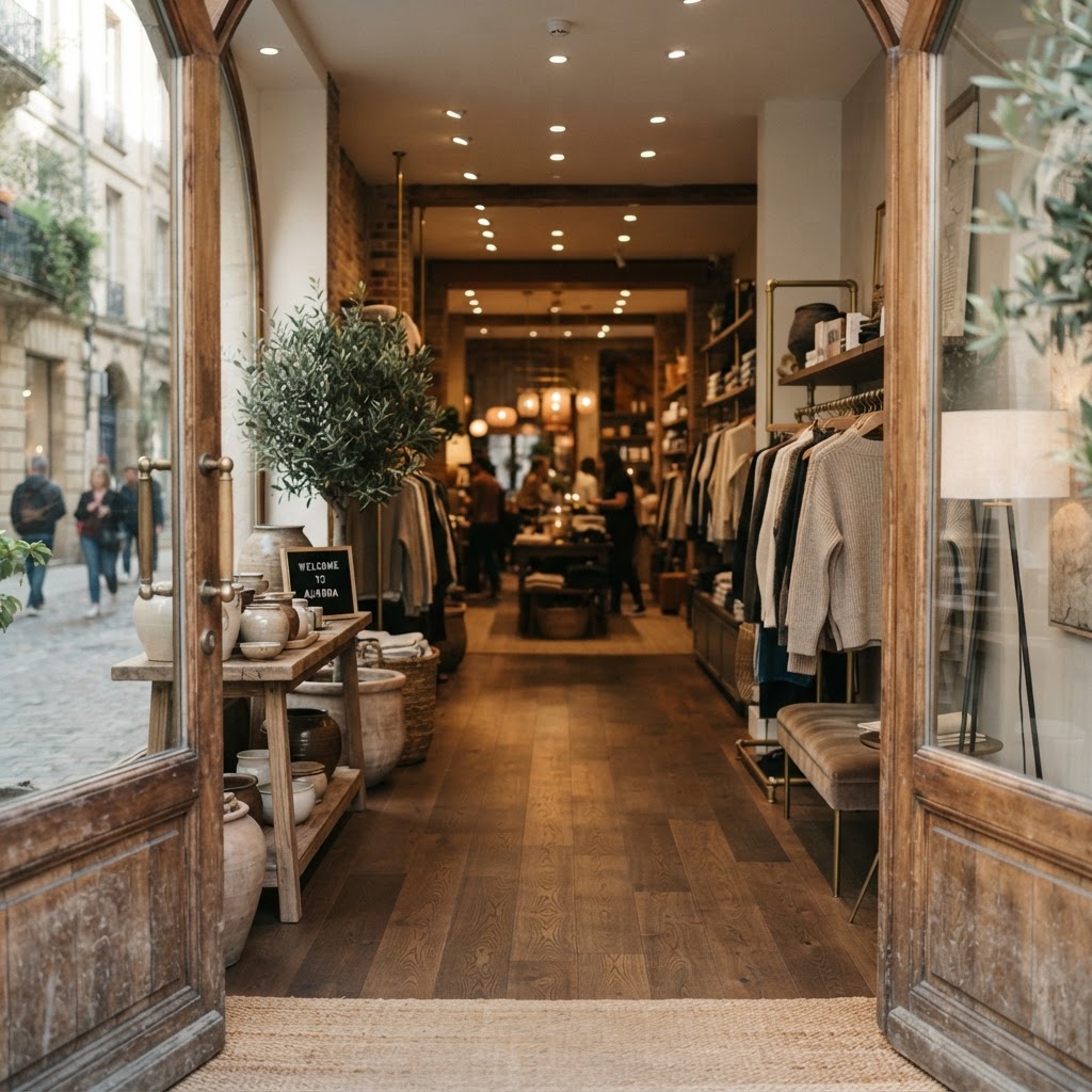
Okay, let's start with something that honestly blew my mind when I first learned about it. You know those first few feet inside any store entrance? That little zone right after the doors? Most retailers completely waste this space, and it's costing them real money. Retail anthropologist Paco Underhill coined this idea years ago, and trust me on this, it's one of the most important pieces of real estate in your entire store.
Here's the thing: when a customer walks through your front door, their brain is still transitioning. They're coming in from the outside world, adjusting to the lighting, the temperature, the noise level. They're not ready to shop yet. If you cram product displays, signage, or promotional material right at the entrance, customers literally don't register it. Studies have shown that items placed in the decompression zone get handled far less frequently than items placed just a bit deeper into the store. It's not a layout choice, it's a psychology choice.
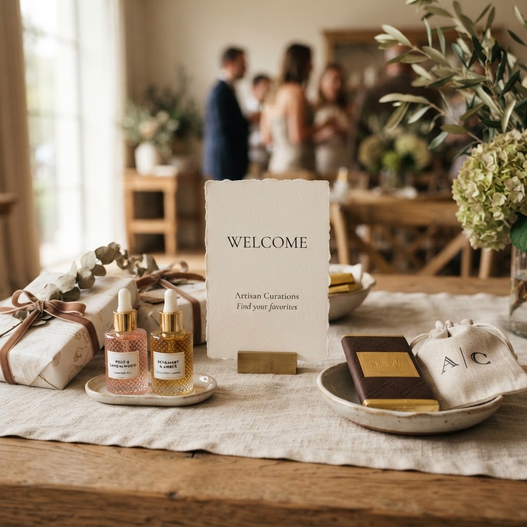
So what should you put there instead? Keep it open. Use it for brand storytelling, a beautiful visual display, maybe a seasonal focal point that draws the eye inward. The goal is to welcome, not to sell. Think of it like a foyer in a really well-designed home. It's not where you keep the furniture you want to show off, it's the space that makes you feel good about being there and curious to explore further.
- Keep the first 5 to 10 feet relatively clear of heavy merchandising
- Use this space for signage that communicates your brand story, not promotions
- Good lighting and a welcoming sensory experience should be the priority here
- A hero product or visual statement piece works well to draw customers deeper into the store
Real talk, I've walked into boutiques that absolutely nail this, and the difference in how you feel as a shopper is immediate. You slow down, you look around, you feel curious rather than assaulted by promotions. That emotional state is what you want your customers in before they encounter your actual merchandise.
Leading Customers Through the Right Turn
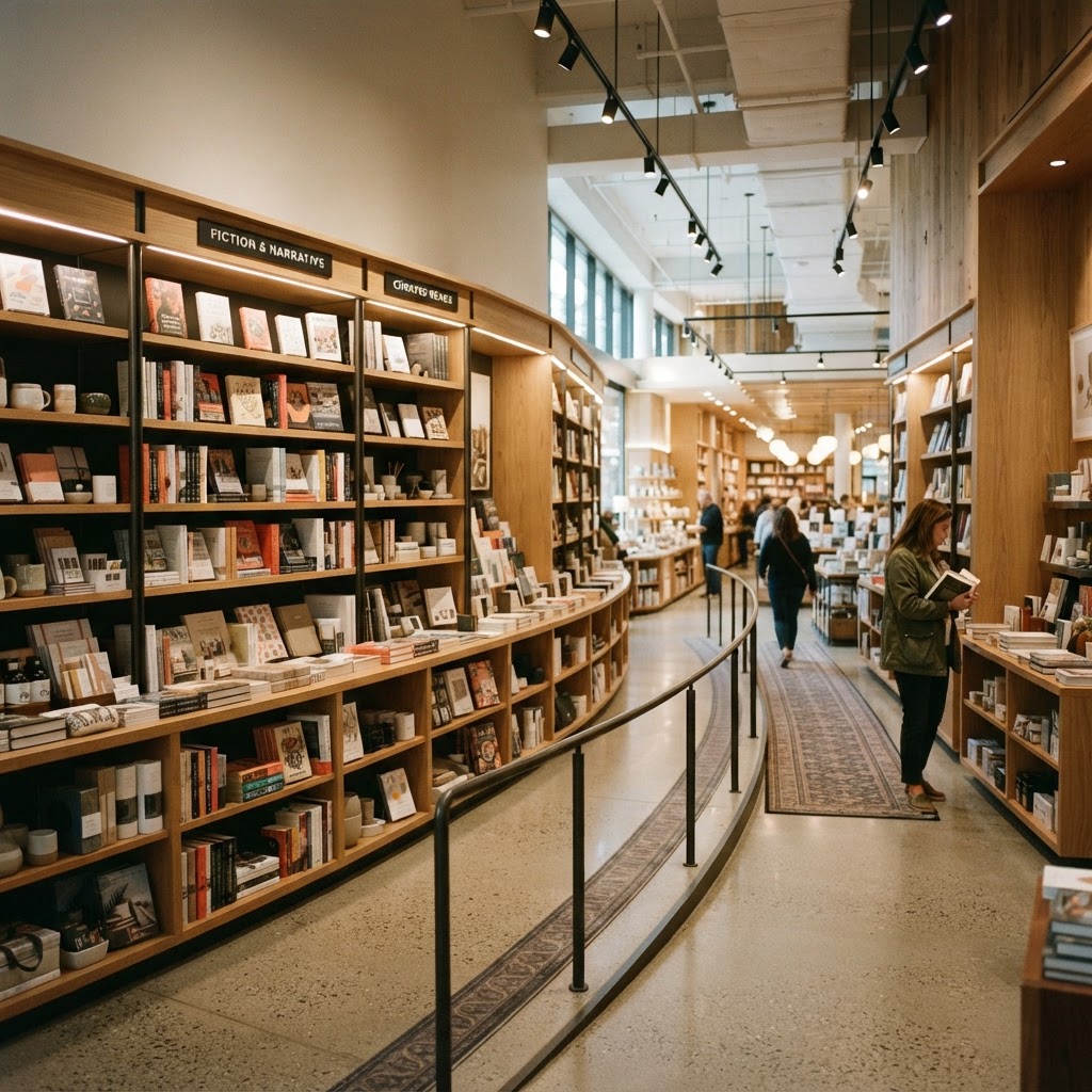
This one is so simple and yet so many store owners completely ignore it. The vast majority of customers in Western countries, something like 90 percent, naturally turn right when they enter a store. It's instinctive. It mirrors how we drive, how we walk on sidewalks. And if your store layout doesn't account for this, you're working against your customers' natural flow instead of with it.
Honestly, this is one of those things where the data and the design solution are perfectly aligned. You want to place your highest-margin items, your most visually compelling displays, and your newest arrivals on the right side of the store, relatively close to the entrance but past the decompression zone. That's where eyes land first. That's where attention is freshest. Major retailers have known this for decades, but smaller boutiques and specialty stores often overlook it entirely.
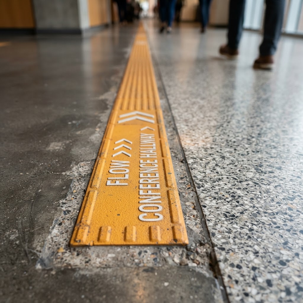
Beyond just the initial right turn, think about how you create a natural loop through your store. The best layouts guide customers in a counterclockwise direction, meaning they turn right and then spiral inward and around, hitting different product categories as they go. This isn't about being manipulative. It's about creating a journey that feels intuitive and satisfying. When customers feel lost or confused in a store, they leave. When they feel like the space just makes sense, they stay longer and spend more.
Look, I've consulted on retail spaces where simply rearranging the main flow from left-dominant to right-dominant increased average transaction values noticeably within the first month. The product didn't change. The pricing didn't change. The traffic pattern changed. That's the power of working with human instinct rather than against it.
Creating Frictionless Product Displays
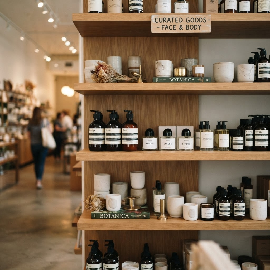
Here's the thing about friction in retail: every tiny barrier between a customer and a product is a reason not to buy. This sounds dramatic, but it's genuinely true. If someone has to ask for help to access something, if the packaging is hard to read, if the display is cluttered and overwhelming, or if items are stacked so neatly that touching them feels like vandalism, you've created friction. And friction kills conversions.
Frictionless displays are ones where the product does the talking, where touching and interacting feels natural and encouraged, and where the customer can self-educate without needing to flag down a staff member. Think about the way Apple stores work. Every device is accessible, charged, and ready to use. There's no glass case, no "please ask for assistance." The whole environment says, go ahead, pick it up. That approach translates across categories, from beauty to apparel to home goods.
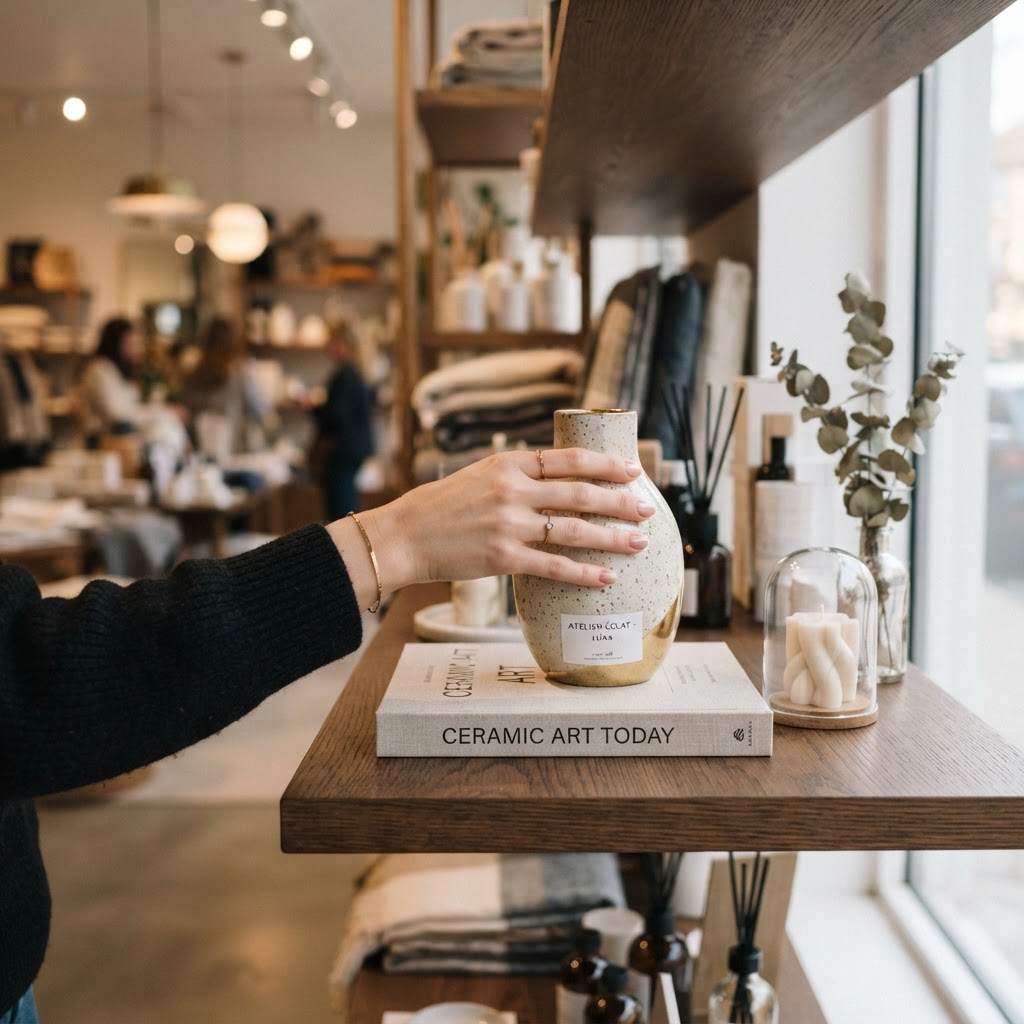
Display height matters more than most people realize too. The prime real estate on any fixture is between eye level and waist level. Items below knee height get significantly less attention, and items above eye level are nearly invisible to many shoppers. Put your best sellers and highest-margin products in that sweet spot. Use the lower shelves for bulk or backup stock, and reserve eye level for the items you most want customers to discover.
- Avoid overcrowding displays, white space gives products room to breathe and feel premium
- Use clear, minimal signage that answers the most common customer questions right at the display
- Ensure lighting is focused on the product, not just the ceiling
- Rotate displays regularly so repeat customers always discover something new
- Make it physically easy to pick up and hold products
And honestly, the neatness obsession that a lot of store managers have is actually working against them. A display that looks like no one has ever touched it sends a subconscious message: no one wants this. A display that's slightly touched, where a few items have been moved around, signals popularity and social proof. Let it breathe a little.
Using Sightlines to Drive Discovery
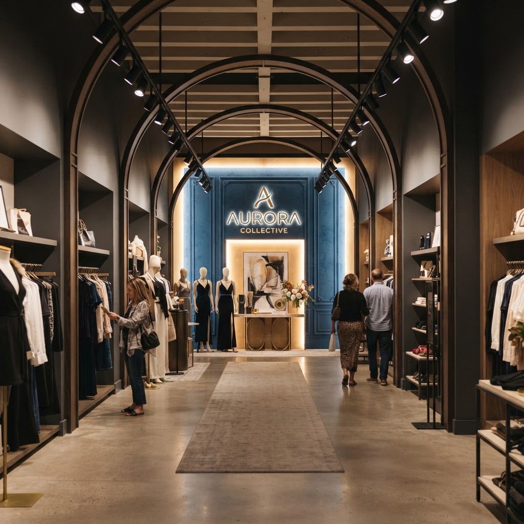
Sightlines are one of those things that great store designers think about obsessively and most store owners never think about at all. A sightline is basically what a customer can see from any given point in your store. And where their eyes go, their feet tend to follow. This is not a metaphor. It's documented shopper behavior. If someone can see something interesting across the room, they'll walk toward it. If their view is blocked by a tall fixture or a cluttered display, they'll stay where they are or leave.
The rule of thumb I always come back to is this: from your entrance, a customer should be able to see at least one compelling focal point deep inside the store. It could be a beautiful display, a piece of signage, a window, a color pop, anything that creates visual intrigue and pulls them forward. This is sometimes called the "vista point" and it's used brilliantly in everything from museum design to hotel lobbies. Retail is no different.

Fixture height plays a huge role here. A common mistake is using uniformly tall fixtures throughout a store. This creates a maze-like experience where customers feel enclosed and can't see where they're going. Mixing low, mid, and tall fixtures creates a landscape that's visually interesting and allows customers to orient themselves, spot departments or product categories from a distance, and feel confident navigating the space.
Look, think about the best stores you've ever been in. I'd bet that in all of them, you could stand near the entrance and already feel excited about what you'd discover as you walked through. That excitement comes from sightlines. It comes from the promise of something worth seeing around the next corner. You can engineer that feeling with smart fixture placement, strategic lighting, and intentional focal point design. It's one of the highest-leverage things you can do for your layout.
Optimizing the Checkout Experience
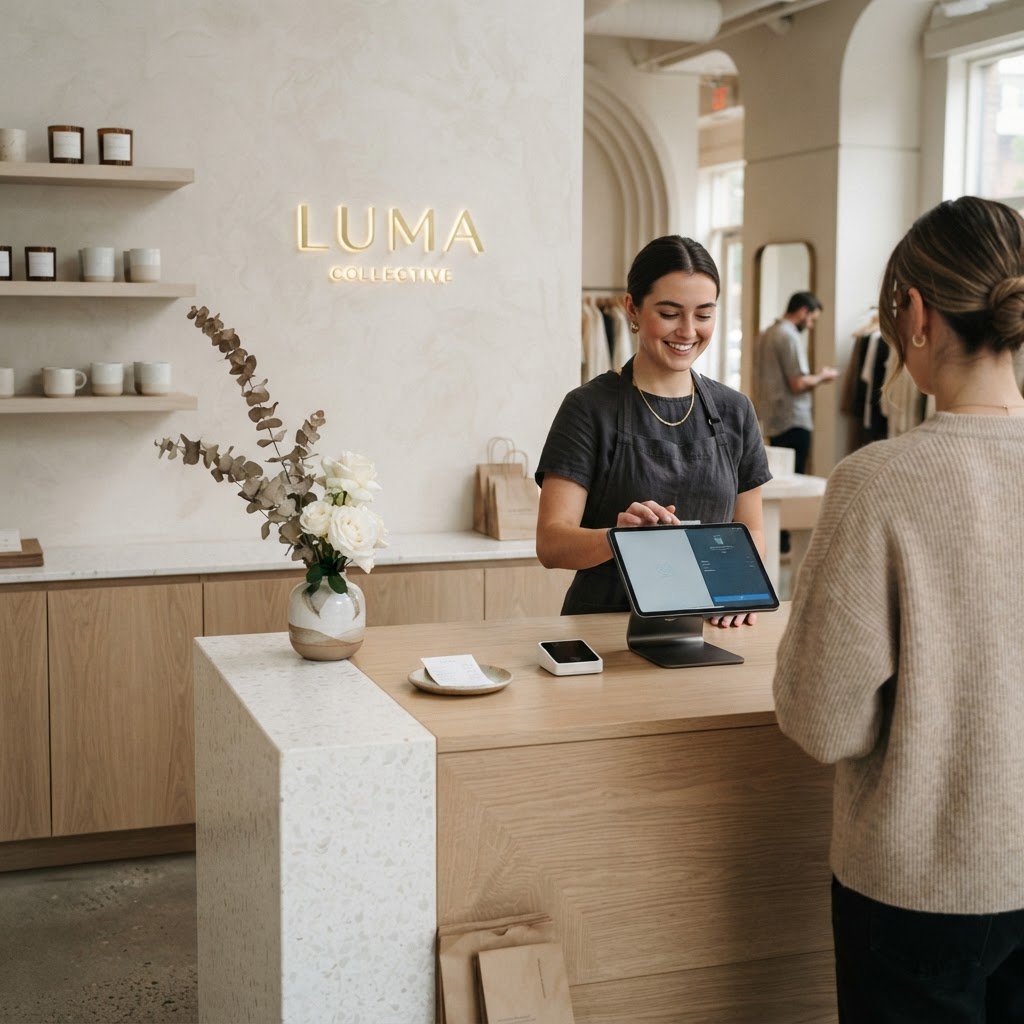
The checkout zone is criminally underestimated by most retailers. By the time a customer reaches the register, they've already decided to spend money in your store. That's a fundamentally different mindset than when they walked in. And yet so many stores treat the checkout as a purely functional afterthought, a place to process transactions and nothing more. Real talk, this is leaving serious money on the table.
The impulse buy is real and it's powerful. The products you place near the checkout should be low in price, high in impulse appeal, and easy to understand without much consideration. Think small accessories, travel-sized versions of popular products, gift items, seasonal add-ons. The customer's mental math has already been done, they've committed to spending, and a five or ten dollar add-on feels like a small decision at that point. Done right, a well-curated checkout area can meaningfully increase your average order value across thousands of transactions per year.
But it's not just about the add-on products. The checkout experience itself shapes how customers feel about your store when they leave. And how they feel when they leave determines whether they come back and whether they tell friends. A cramped, poorly lit, disorganized checkout area sends them out with a slightly negative taste. A clean, thoughtfully designed, friendly checkout experience sends them out feeling good. That emotional exit is what gets you repeat business.
- Keep the checkout counter clean and uncluttered, visual chaos at payment time creates anxiety
- Curate impulse items carefully, quality matters even at low price points
- Make sure the queue area feels comfortable and not rushed or cramped
- Use this space for loyalty program sign-ups, social media prompts, or other low-friction relationship building
And honestly, if you have a long queue during busy periods, that queue line itself is a merchandising opportunity. Think about how grocery stores handle this. Every inch of that wait is filled with things to look at and things to buy. The key is curation, not cramming. Choose items that genuinely make sense as last-minute additions and present them well.
Final Thoughts
Look, store layout is one of those disciplines that sits right at the intersection of psychology, design, and business strategy. And the beautiful thing is that most of these principles aren't expensive to implement. You don't need to gut your store or hire a famous architect. A lot of this is about understanding how people actually behave in spaces and then making intentional choices that work with that behavior rather than against it.
Start with one thing. Maybe it's clearing out your decompression zone. Maybe it's moving your best product to the right side of the entrance. Maybe it's rethinking your checkout area. Small changes in retail layout can have outsized effects on sales, and you'll often see the impact within weeks. Trust the psychology, trust the data, and most importantly, spend time in your own store as a customer would experience it. Walk in through the front door, turn right, and see what you actually see. That exercise alone will probably tell you everything you need to know.
The stores that get this right feel effortless to shop. And that feeling of effortlessness? It's entirely engineered.
More in Commercial
Stay Inspired
Subscribe for new essays on architecture, design, and the spaces that shape us.