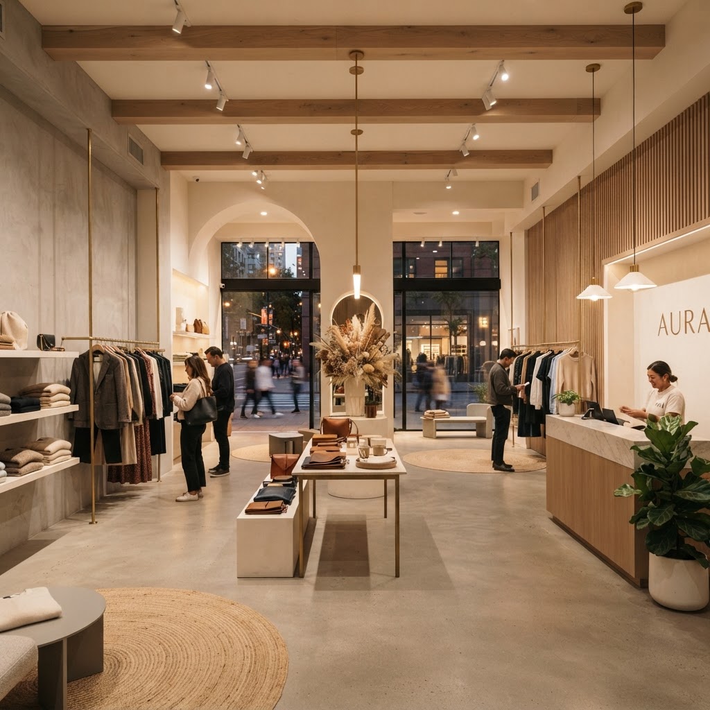
7 Store Design Secrets That Actually Turn Browsers Into Buyers
Transforming your shop into a high performing retail space is easier than you think. Learn how strategic layout and sensory design choices can influence customer behavior and boost your bottom line.
Mastering the Decompression Zone
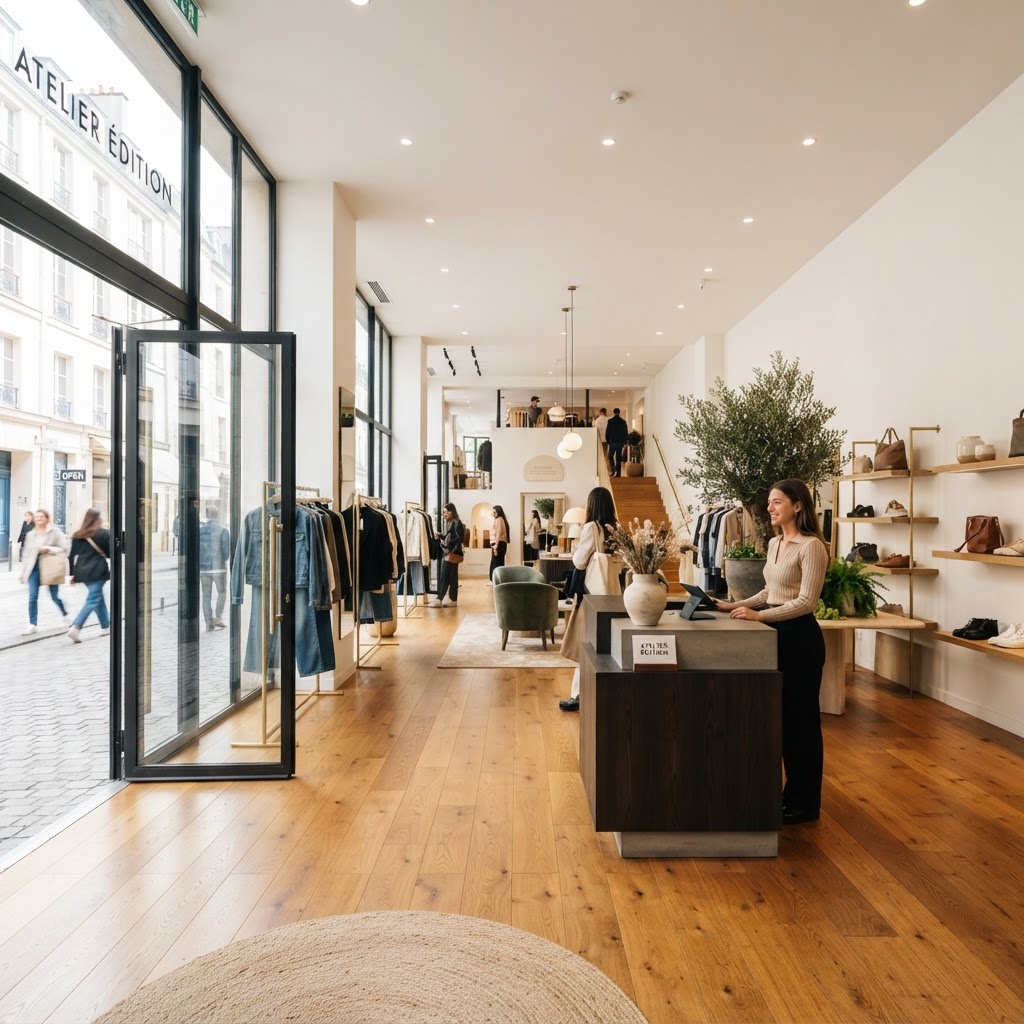
Here's the thing most store owners get completely wrong from the very start: they pack product right up against the front door. I get it, every square foot costs money and you want to maximize your selling floor. But honestly, this is one of the biggest mistakes you can make in retail design, and it's costing you sales without you even realizing it.
The decompression zone is the area just inside your entrance, roughly the first five to fifteen feet depending on your store's total footprint. Customers who've just walked in from the street are still mentally transitioning. They're adjusting to the new lighting, the temperature, the sounds. Their brains are literally shifting gears. Anything you put in that zone is essentially invisible to them. Studies have shown that shoppers rarely pick up, read, or even notice products placed in this transitional space. So if your big promotional display is sitting right at the door, you're wasting your best real estate.
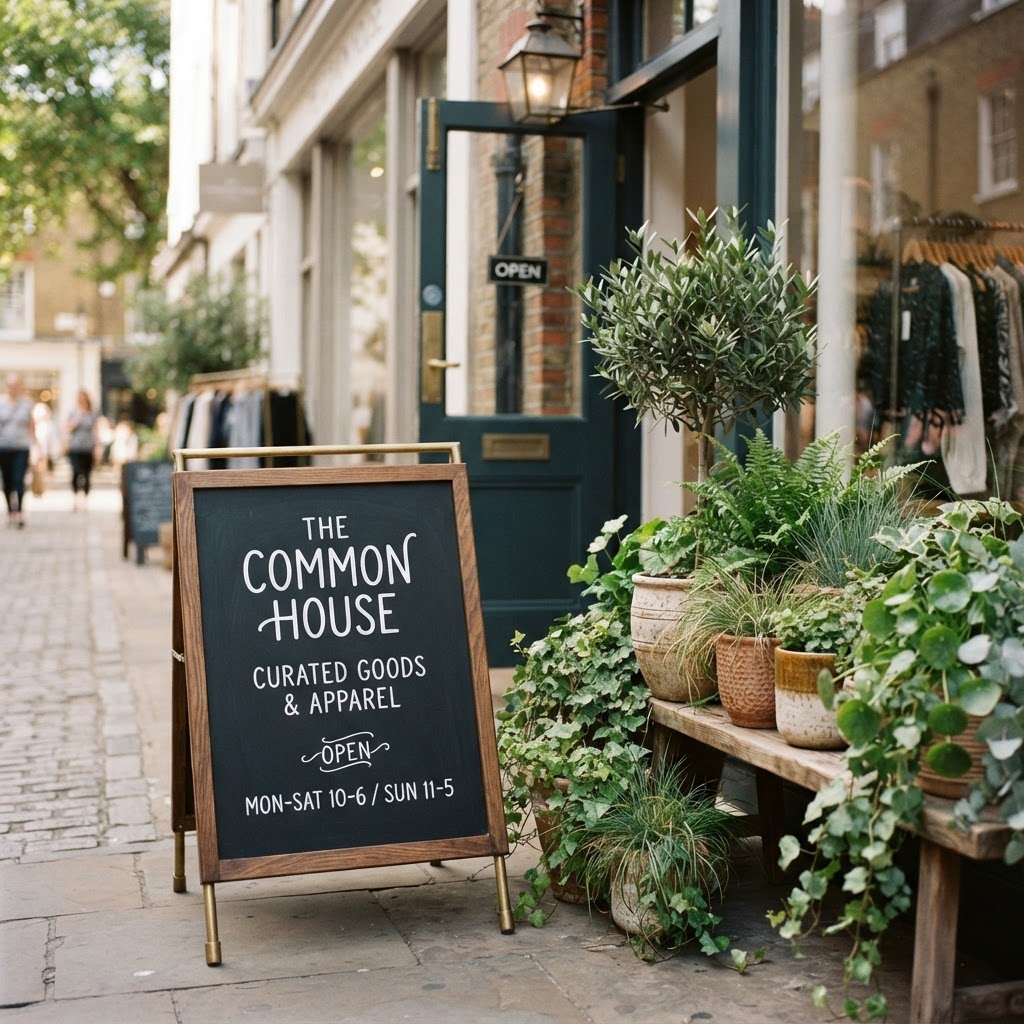
What should you put there instead? Keep it clean. Keep it open. Use this space to set the mood and communicate your brand identity with visuals, textures, and maybe a single strong statement piece. Think of it less as selling space and more as a first impression. You're not selling here, you're seducing. A beautiful floral installation, a piece of branded signage, or even just a well-lit open floor creates an unconscious sense of welcome that primes shoppers to spend more once they do engage with your products.
Real talk, the brands that nail this consistently, think Apple, Anthropologie, even well-designed independent boutiques, all use this principle. Their entrance areas feel curated and calm. You walk in and immediately feel like you belong. That feeling translates directly to dwell time and, ultimately, to revenue. Give your customers fifteen feet of breathing room and watch what happens to your conversion rate.
The Power of the Right Hand Rule
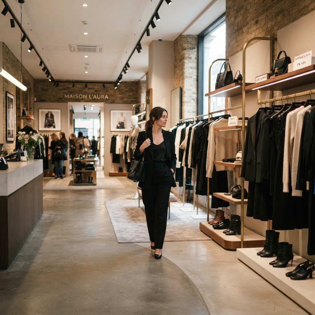
This one is rooted in genuine behavioral science, and honestly once you know it, you'll start noticing it everywhere. The vast majority of shoppers in Western countries, around 90 percent, instinctively turn right when they enter a store. It's not a conscious decision, it just happens. This means the area immediately to the right of your entrance, just past that decompression zone we talked about, is prime real estate. Some retail designers call it the "power wall" or the "landing zone," but whatever you call it, it needs to be working hard for you.
Here's what I'd recommend placing in that right-hand zone: your newest arrivals, your highest-margin items, or whatever you most want customers to engage with first. This is not the place for your clearance rack. Think of it as your store's handshake. It sets expectations and creates a narrative for the rest of the shopping journey. If someone turns right and immediately sees something exciting, well-priced, and beautifully displayed, they're already in a buying mindset before they've even explored half your floor.
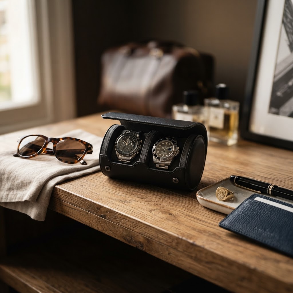
The right hand rule also has implications for how you design your overall traffic flow. Ideally, you want to create a counterclockwise path through the store, because that's the natural direction shoppers drift when they turn right at the entrance. Your layout should support that movement, not fight it. Fixtures, signage, and product categories should all work together to gently guide people through the entire store rather than letting them cut straight to one section and leave.
- Feature your highest-margin or newest products on the right-hand wall immediately past the entrance.
- Design your floor plan to encourage counterclockwise movement through the space.
- Use sightlines and visual anchors to draw customers deeper into the store.
- Avoid placing checkout counters on the right side near the entrance, as this can short-circuit the full shopping journey.
Trust me on this: even small adjustments to your floor layout based on natural traffic patterns can have a meaningful impact on average basket size. You're not tricking anyone, you're just working with how people naturally move and think.
Creating Frictionless Checkout Points
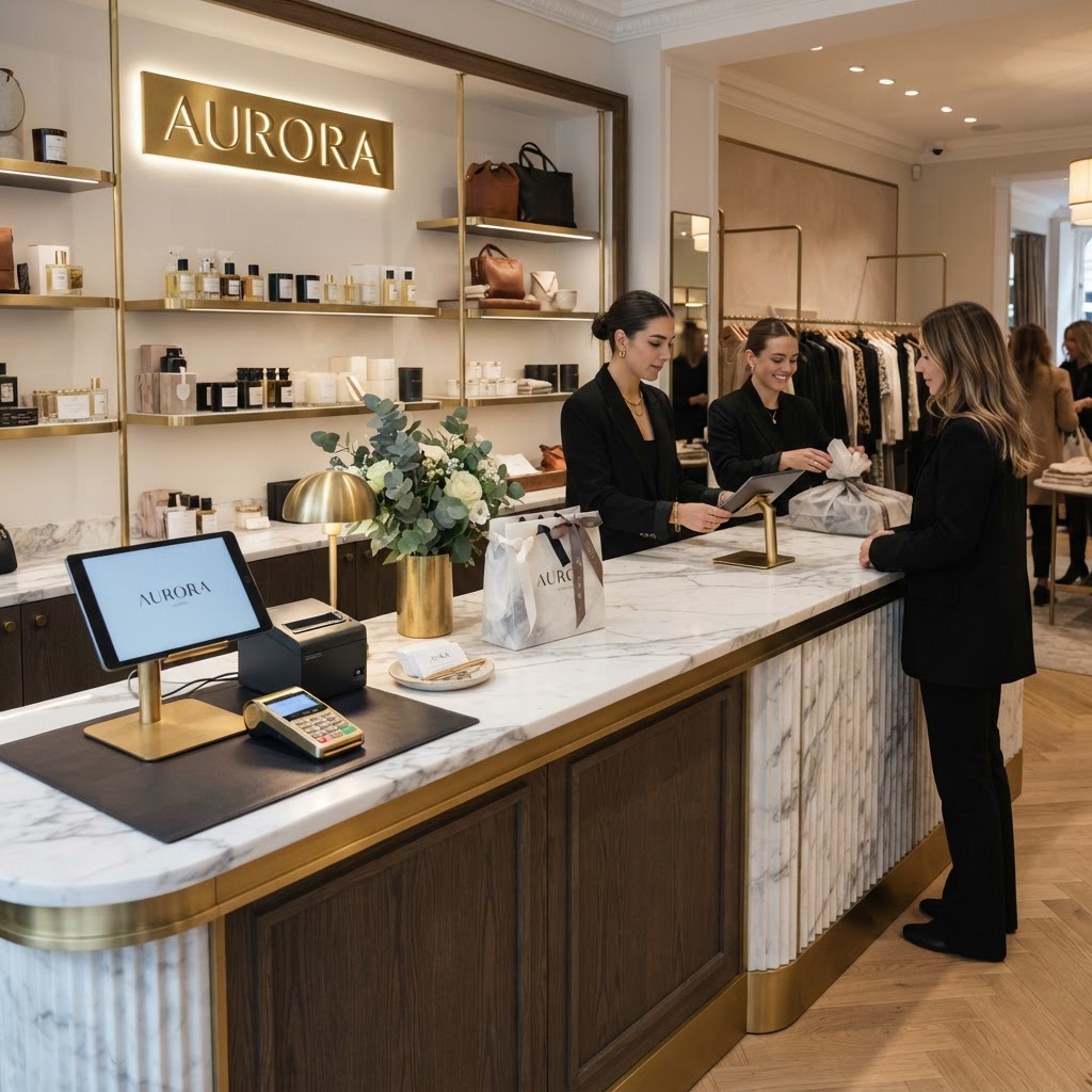
Look, you've done all the hard work. A customer has spent time in your store, picked up items, gotten excited. And then they walk up to the checkout and the experience falls apart. Long lines, a cluttered counter, nowhere to set their basket, a payment terminal that faces the wrong direction. It sounds small but this stuff matters enormously. The checkout is the last impression your store makes, and a bad one can actually undermine the goodwill you've built throughout the entire visit.
Frictionless checkout design is about removing every possible point of hesitation or annoyance in the final transaction. Start with the physical layout. Your checkout counter should be easy to find, which means positioning it somewhere visible but not intrusive. Many designers recommend placing it near the back left of the store since customers tend to end their counterclockwise journey there naturally. The counter itself should be clear of clutter, with enough surface area for customers to comfortably set down their items.
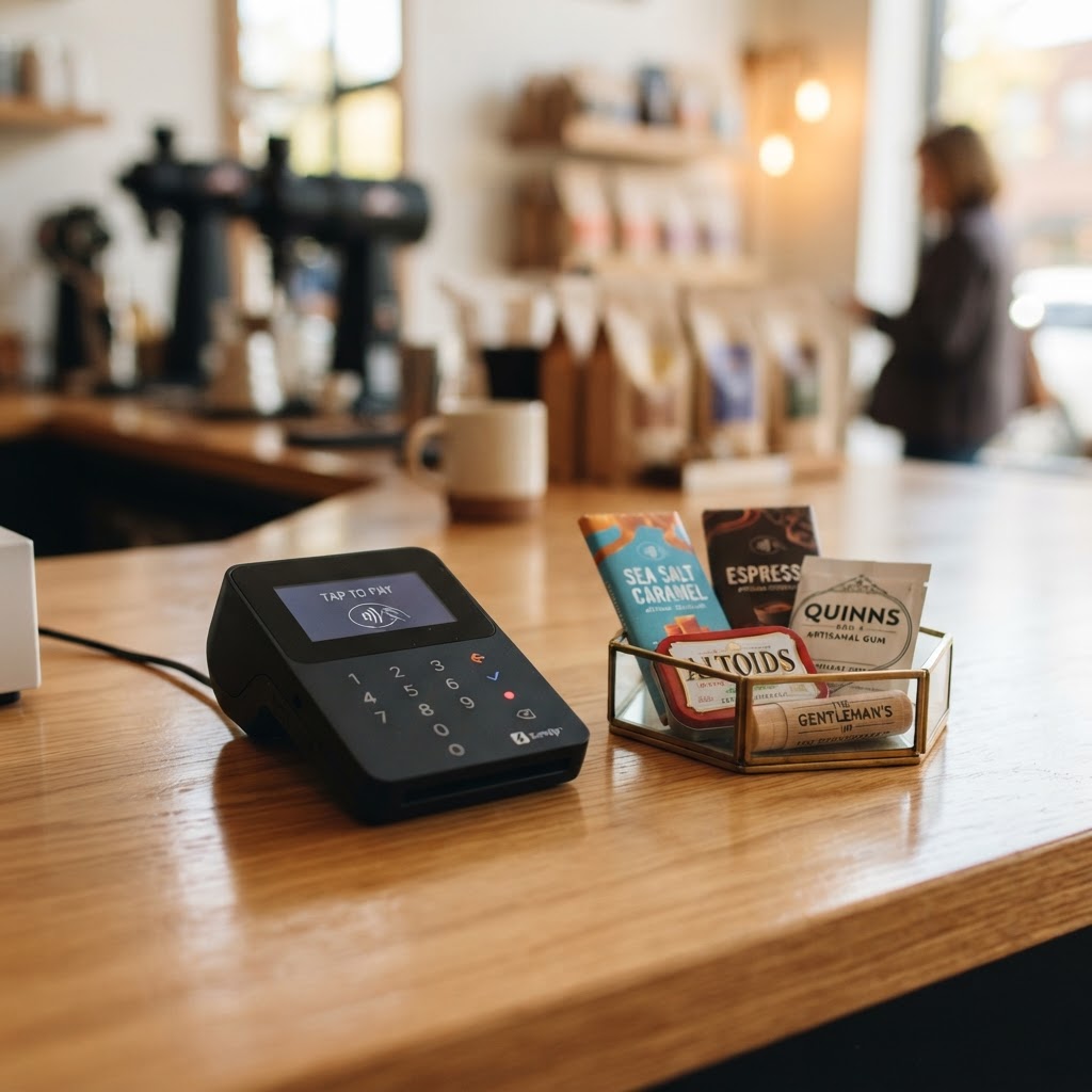
And honestly, the checkout area is also one of your best opportunities for incremental sales. Small, low-cost impulse items placed right at eye level near the register work incredibly well because customers are already in a purchasing mindset. They've already said yes to spending money. A well-curated selection of accessories, travel sizes, gift add-ons, or seasonal items can genuinely move the needle on your average transaction value without any additional marketing spend.
One more thing worth mentioning here: the checkout queue itself. If your store gets busy enough to create lines, think carefully about how you design that queue. Keep customers engaged with things to look at and touch while they wait. Make the wait feel shorter by giving people something to do. The longer someone feels like they're waiting, the more likely they are to abandon their purchase, and that's a heartbreaking outcome after everything else has gone right.
Lighting That Highlights Your Best Sellers
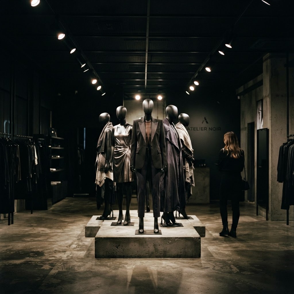
I could honestly talk about retail lighting all day. It's one of those design elements that most people don't consciously notice, but that absolutely everyone responds to on an emotional level. Bad lighting makes your products look cheap, your staff look tired, and your store feel like somewhere you want to leave. Great lighting does the exact opposite. It makes products look irresistible, creates atmosphere, and can even make customers feel more attractive, which is a remarkably effective way to drive purchases in fashion and beauty retail.
The key concept here is layering. You need at least three types of lighting working together: ambient lighting for overall visibility, task lighting for functional areas like the checkout counter and fitting rooms, and accent lighting to specifically highlight featured products or displays. Most budget retail spaces only invest in ambient lighting, which is why they look flat and uninviting. It's the accent lighting that creates the drama, the focal points that draw customers' eyes and feet toward specific merchandise.
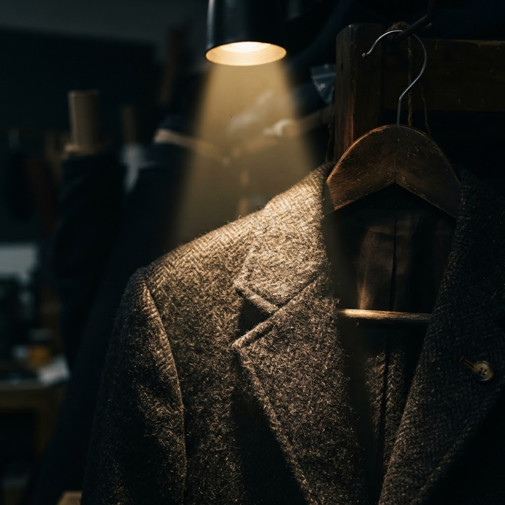
For your best-selling or highest-margin products, consider using directional spotlights or track lighting to create a halo effect. You're essentially telling customers where to look without saying a word. Luxury retailers have been doing this forever, and it works just as well in an independent boutique as it does in a high-end department store. The goal is to create visual hierarchy, making certain products feel more important and more desirable through the simple power of light.
Color temperature matters too, and it's worth getting right. Warm white light in the 2700K to 3000K range works beautifully for fashion, home goods, and food retail. Cooler light around 4000K suits electronics and hardware better. Get this wrong and your products will look off-color, which creates a subtle but real subconscious discomfort in shoppers. A good lighting designer is worth every penny, but even a thoughtful DIY approach using these principles will make a significant difference.
Utilizing Sensory Merchandising
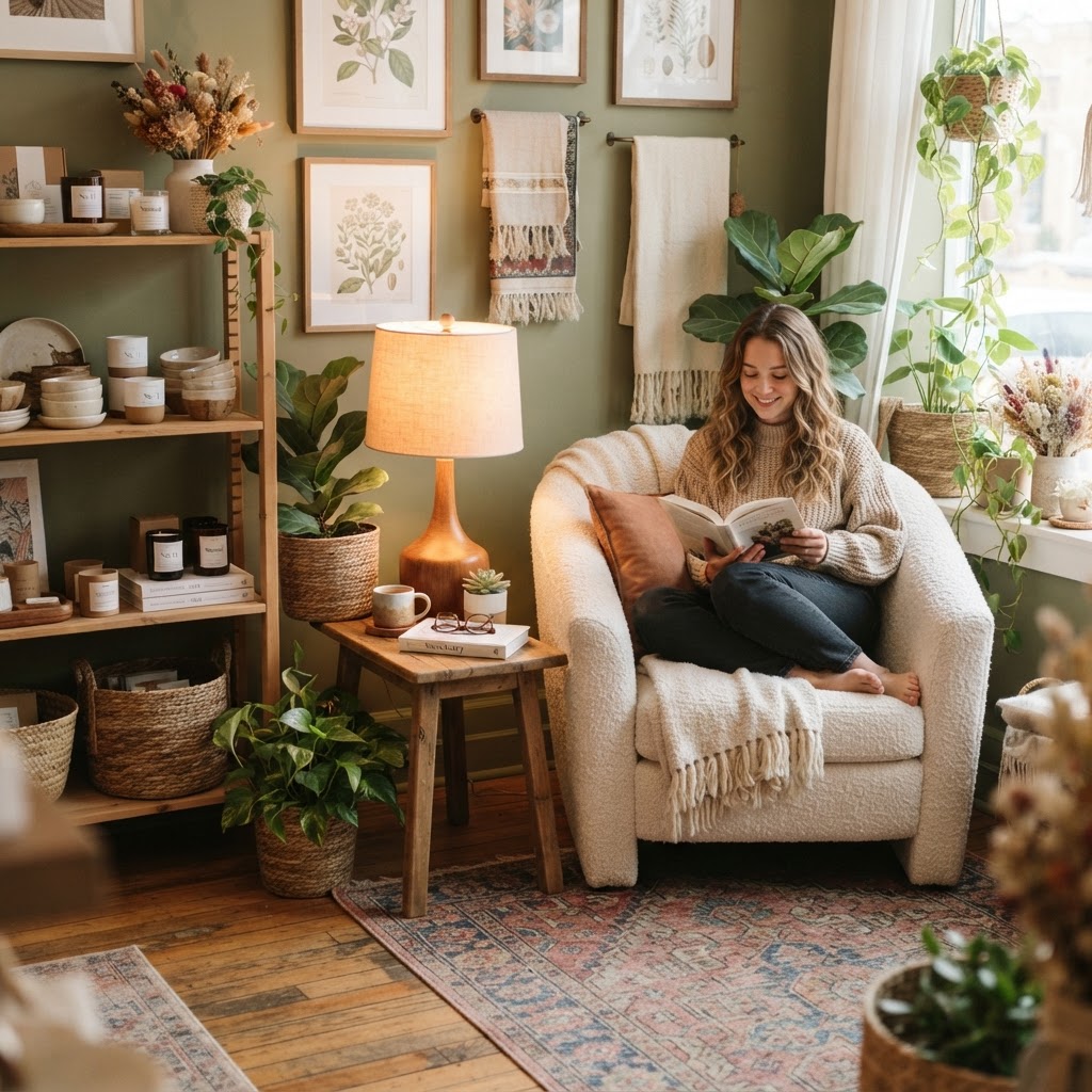
Here's the thing about sensory merchandising: it sounds fancy, but at its core it's really just about being intentional with every element of the experience your store creates. Scent, sound, texture, temperature, all of these things are working on your customers whether you're managing them or not. The question is whether they're working for you or against you.
Let's start with scent because it's probably the most powerful and most underutilized tool in retail. Smell is the only one of our senses with a direct neural pathway to the emotional and memory centers of the brain. A well-chosen scent can make a store feel luxurious, fresh, cozy, or energizing. Many major retailers pump signature scents through their HVAC systems. You don't need to go that far, a quality diffuser or even fresh flowers can work beautifully in a smaller space. Just make sure the scent is subtle. Nothing clears a store faster than an overwhelming fragrance.
Sound is equally important and equally neglected. A lot of independent stores either play music that's too loud, too soft, too random, or use generic streaming playlists that feel impersonal. Your music choices communicate your brand identity loudly and clearly. Tempo matters too: slower music encourages people to browse and spend more time in the store, while faster music can increase transaction speed during busy periods. Curating your store's playlist is a genuine business decision, not just background noise.
- Use a signature scent that aligns with your brand identity, keeping it subtle and consistent.
- Curate music playlists that match the mood you want to create and the pace you want shoppers to move.
- Make products touchable wherever possible, because tactile engagement dramatically increases purchase likelihood.
- Control the temperature of your space, overly warm or cold environments drive customers out faster.
- Use texture in your fixtures and displays to create visual and physical interest.
And don't forget about touch. Retail environments where products are freely touchable and discoverable consistently outperform those where merchandise is locked away or kept pristine behind glass. When someone picks up a product, holds it, feels its weight and texture, they've already begun to psychologically own it. That ownership feeling is a powerful purchase driver. Design your displays to invite handling, not just viewing.
"The best retail spaces don't feel designed at all. They feel like they were made specifically for you, and that's exactly the point."
Final Thoughts
None of these principles are magic, and none of them work in isolation. The stores that really convert browsers into buyers consistently are the ones that think about all of these elements together, as a system rather than a checklist. Your decompression zone sets the tone. Your traffic flow guides the journey. Your lighting tells the story. Your sensory elements create the emotional connection. And your checkout closes the deal without friction.
Honestly, you don't have to overhaul everything at once. Pick one of these areas, focus on it, measure the results, and then move to the next. Even small improvements in how customers experience your physical space can translate into real, measurable differences in your conversion rates and average transaction values. The physical retail environment is one of your most powerful selling tools, and most businesses are leaving enormous potential untapped simply by not paying enough attention to it.
Start with what you can change today and build from there. Your store has way more selling power than you're currently unlocking.
More in Commercial
Stay Inspired
Subscribe for new essays on architecture, design, and the spaces that shape us.