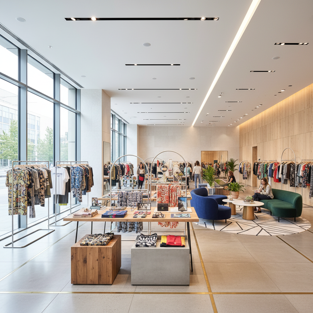
Transforming Retail Spaces: Design Strategies That Boost Sales
Let’s dive into the world of retail store design and explore how the right layout and aesthetics can significantly drive sales. Discover clever strategies that transform your store into an engaging experience for customers.
The Psychology of Space: Creating an Inviting Atmosphere
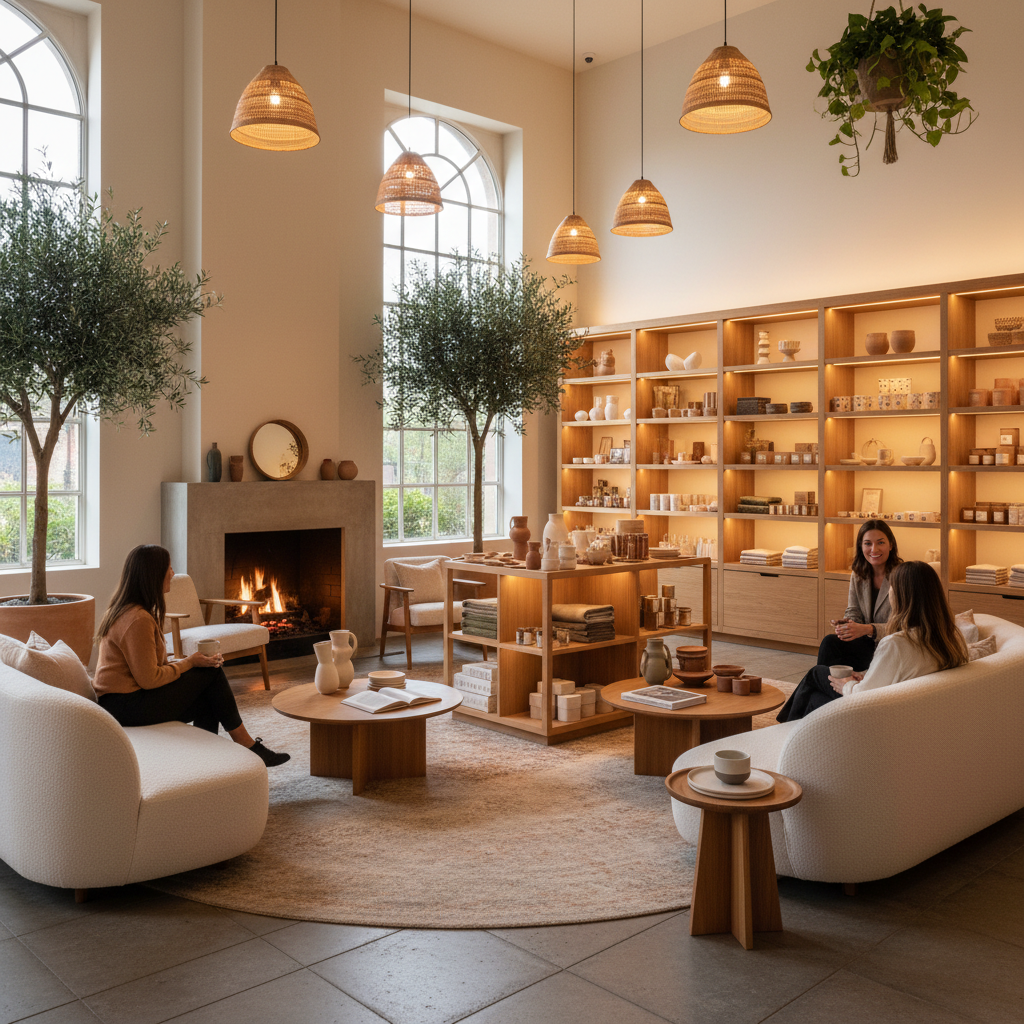
Honestly, before you worry about product placement or lighting fixtures, you need to understand one fundamental truth: people feel spaces before they think about them. The moment a customer steps through your door, their brain is making rapid, mostly unconscious judgments about whether they want to stay or bolt. That split-second gut reaction? It's almost entirely driven by spatial psychology, and if you get this wrong, nothing else you do really matters.
Here's the thing about retail environments that a lot of designers, and frankly a lot of business owners, miss completely. Space isn't just the physical square footage you have to work with. It's the relationship between ceiling height and floor area, the way traffic flows naturally through a room, the subtle cues that tell a shopper where to go next without a single sign pointing the way. Great retail spaces feel intuitive. You just sort of... move through them, and somehow you end up seeing everything the store wants you to see.
One of the most powerful tools in the spatial psychology toolbox is what researchers call decompression zones. This is the area just inside the entrance, typically the first five to fifteen feet, where customers transition mentally from the outside world to your retail environment. Look, I know the temptation is to cram product right up to the doorway because that's prime real estate, right? Resist that urge. Customers who feel immediately overwhelmed when they enter a store are far more likely to leave quickly and spend less. Give them room to breathe, to slow down, to arrive.
Ceiling height is another factor that deserves way more attention than it usually gets. Higher ceilings tend to encourage abstract thinking and broader exploration, which is great for stores selling lifestyle products, fashion, or anything that benefits from aspiration. Lower, more intimate ceilings create a sense of coziness and focus, which works beautifully for specialty boutiques or concept stores where discovery and intimacy are part of the brand promise. Neither is inherently better. It's about matching the architecture to the shopping psychology you want to create.
And real talk, don't underestimate the power of scent and sound as part of the spatial experience. Studies from consumer behavior research consistently show that congruent sensory environments, where the smell, sound, and visuals all tell the same brand story, increase dwell time significantly. A spa boutique that smells faintly of eucalyptus and plays soft ambient music creates a coherent spatial story. That coherence makes people comfortable. Comfortable people browse longer. Longer browsing almost always means higher spend. It really is that direct a relationship.
Maximizing Product Visibility: Layout Tips That Work
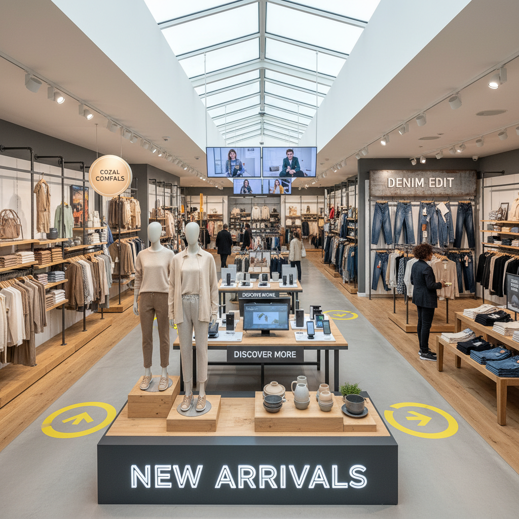
Layout is where the rubber meets the road in retail design. You can have the most beautiful store in the world, but if the layout is fighting against natural human movement patterns, you're losing sales every single day. Trust me on this, because I've walked through enough poorly laid out retail spaces to know exactly how fast customer attention evaporates when the flow feels off or confusing.
The most successful retail layouts are built around an understanding of how people actually move, not how designers or store owners think they move. Most people, upon entering a store, instinctively drift to the right. This is well-documented in retail anthropology, and it means your right-hand side as customers enter is premium real estate. High-margin items, new arrivals, or featured collections belong there. Not your most practical or everyday items, but your wow pieces, the things that stop someone in their tracks and set the tone for the entire shopping experience.
Here's a layout framework worth considering for almost any mid-sized retail space. Think of your store in three zones. The first zone is that decompression area we talked about, transitional and lightly merchandised. The second zone is your primary shopping floor, where the bulk of your product lives and where most browsing happens. The third zone is your back wall, and this one is criminally underused in most stores. The back wall should display your most impactful, visually arresting merchandise because it draws customers through the entire space. If your back wall is boring, you're shortening every shopper's journey through your store.
Fixture height matters enormously for visibility too. A common mistake is going too tall with shelving because it feels like you're maximizing storage. But tall fixtures create a claustrophobic maze effect that discourages exploration and makes it genuinely hard for customers to see what's around the next corner. A good rule of thumb is to keep most fixtures below eye level, around 54 to 60 inches, so shoppers can see across the store and feel oriented. Save taller fixtures for perimeter walls where they anchor the space without blocking sightlines through the floor.
And honestly, don't forget about negative space in your product layout. This is a lesson borrowed directly from fine art and museum curation. Products surrounded by breathing room look more valuable and are perceived as more desirable. Cramming shelves and tables with merchandise might feel efficient, but it reads as discount or overwhelming. Curated, spaced-out displays signal quality and invite touch. And in retail, touch is enormously important. The more customers physically engage with products, the more attached they become, and the more likely they are to buy.
The Power of Color: Choosing a Palette That Sells
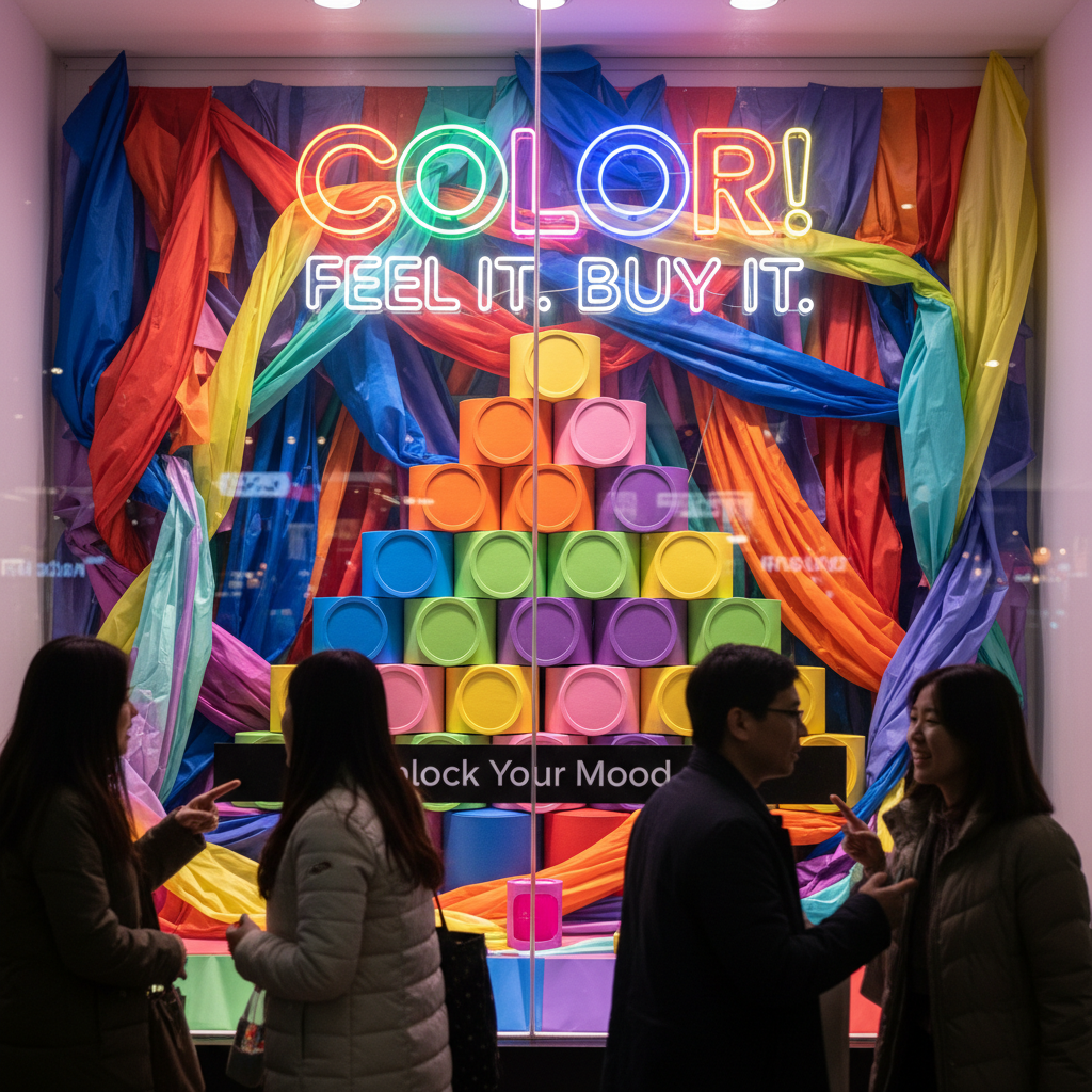
Color is probably the most talked-about element in retail design, and somehow it's still one of the most misunderstood. There's a lot of oversimplified advice floating around out there, the "red creates urgency, blue builds trust" stuff, and while those generalizations aren't completely wrong, they're nowhere near the full picture. Color in retail is nuanced, contextual, and deeply tied to your specific customer demographic and brand identity.
Let's start with the background. Your walls, floors, and ceilings create the stage on which your products perform. Neutral backgrounds, think warm whites, soft greys, muted taupes, are popular in retail for good reason. They let the merchandise be the star. But neutral doesn't have to mean boring. A textured plaster wall in warm white hits very differently than a flat painted drywall in the same color. The depth and dimension of a surface changes how color reads in a space entirely. This is something worth investing real thought and budget into.
Accent color is where you inject personality, and this is honestly where a lot of retailers either nail it or completely blow it. Your accent colors, used in fixtures, signage, feature walls, or display elements, should amplify your brand story. A children's toy store can absolutely pull off bold, saturated primaries because that palette aligns with joy and play. A luxury jewelry boutique using those same colors would undermine every other signal of exclusivity they're trying to send. Color communicates price point and brand values before a single product is even noticed.
Lighting color temperature is a piece of the color puzzle that gets overlooked constantly. The warmth or coolness of your light sources fundamentally changes how every color in your space reads. Warm lighting, in the 2700 to 3000 Kelvin range, makes reds, oranges, and warm neutrals sing, and creates a cozy, welcoming atmosphere that tends to slow people down. Cool lighting, around 4000 Kelvin and above, makes blues and greens pop and creates an energetic, modern feel that can actually speed up shopping pace, which is great for fast-fashion but not ideal for considered purchases.
One practical tip I always give clients: build a color mood board for your store that includes actual material samples under the lighting you plan to install. Paint chips and fabric swatches look completely different under warm halogen versus cool LED, and the number of retailers who discover this discrepancy only after construction is genuinely painful. Do the work upfront. Test your palette in context. Your sales numbers will thank you later.
Textures and Materials: Enhancing the Shopping Experience
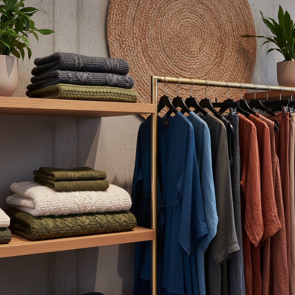
Here's something that doesn't get nearly enough airtime in retail design conversations: texture is a sensory language. It communicates without words, and it does so constantly, in the floor under your customers' feet, the counter surface under their hands, the wall finish their eyes graze across. In a world where so much shopping has moved online, physical retail's greatest competitive advantage is the ability to create a rich, multi-sensory environment. And texture is central to that advantage.
Think about the materials you choose as a vocabulary for your brand. Raw concrete says something very specific, industrial, democratic, modern, slightly edgy. Warm walnut timber says something completely different, craftsmanship, warmth, quality, heritage. Polished marble says luxury, permanence, seriousness. None of these are right or wrong in the abstract. What matters is whether your material vocabulary is consistent with the story your brand is telling and the customer you're trying to attract. Mixing materials without a coherent strategy creates visual noise that customers feel as anxiety or confusion, even if they can't articulate why.
Flooring deserves special attention because it's literally the foundation of the experience and often the most underdesigned element in retail spaces. The type of flooring affects acoustics, which affects the feel of the space. Polished concrete or tile creates a louder, more energetic environment. Carpet absorbs sound and creates intimacy. Hardwood sits somewhere beautifully in between. Beyond acoustics, flooring can be used strategically to define zones within a larger space, creating an implicit map of your store that customers read instinctively.
Fixture materials carry enormous weight in signaling product value. A garment hanging on a raw pipe rack communicates a very different message than the same garment on a brushed brass fixture with velvet-lined hangers. If your product is premium, your fixtures need to match that promise. This is where I see retailers leave serious money on the table, investing in beautiful product with meager margins, then displaying it on cheap, flimsy fixtures that undermine the perceived value of everything around them. The fixture is part of the product presentation. Full stop.
Layering textures is an art form worth learning. The most compelling retail environments tend to combine hard and soft materials, rough and refined surfaces, matte and reflective finishes. This kind of layering creates visual richness that rewards closer inspection and makes a space feel curated rather than generic. A marble counter with a woven textile runner, rough-hewn wooden shelving with smooth ceramic accessories, these combinations create the kind of tactile interest that makes people slow down and look more carefully, which is exactly the behavior you're designing for.
Technology Integration: Smart Solutions for Modern Retail
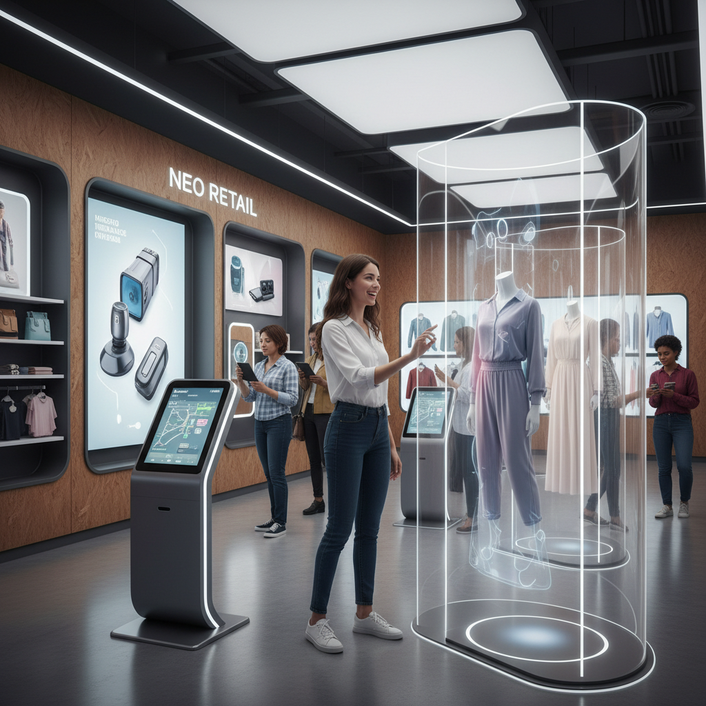
Look, technology in retail is a topic where it's very easy to get carried away. Not every store needs a digital mirror or an augmented reality fitting room. But completely ignoring technology's potential to enhance the retail environment in 2024 is equally shortsighted. The key, as with most things in design, is intentionality. Technology should serve the experience, not perform for its own sake.
Lighting control systems are probably the highest-impact, most universally applicable piece of technology you can invest in for a retail space. The ability to program different lighting scenes for different times of day, different seasons, or different promotional moments gives you extraordinary flexibility without requiring physical changes to your space. Morning shoppers might respond better to cooler, energizing light. Evening shoppers often prefer warmer, more intimate lighting that encourages lingering. Smart lighting systems let you make these adjustments effortlessly and consistently, which matters more than most people realize.
Digital signage, done well, is genuinely powerful. Done poorly, it's visual pollution that cheapens the environment. The distinction usually comes down to integration. Digital screens that feel like afterthoughts, bolted onto walls or sitting on generic stands, fight against the design of the space. Digital displays that are built into the architecture, flush with surfaces, scaled appropriately, and programmed with content that matches the brand aesthetic, those feel like part of a coherent design vision. If you're going to invest in digital signage, invest in the integration as much as the hardware itself.
Customer data tools like heat mapping technology and traffic counters give retailers invaluable insight into how people actually move through their space versus how they designed it to work. This kind of data is incredibly useful for iterating on layout and display strategies over time. You don't have to guess whether that new fixture placement is working if you have movement data telling you exactly how customer flow has changed. For serious retailers, this kind of feedback loop between design and analytics is becoming a genuine competitive advantage.
And honestly, the most underutilized technology in retail right now is audio. Not just background music, but thoughtfully programmed, brand-aligned soundscapes that are controlled with the same intentionality as lighting. Tempo, genre, volume and the relationship between these factors and shopping behavior is extensively researched. Slower tempo music increases dwell time. Music that matches the customer demographic's preferences increases sales. Getting your audio strategy right isn't complicated or especially expensive, but it requires treating sound as a design element with the same seriousness you'd give to your visual choices.
Final Thoughts
Transforming a retail space into a high-performing sales environment is genuinely one of the most multidisciplinary challenges in commercial design. You're working simultaneously with psychology, architecture, branding, technology, and human behavior, trying to create something that feels effortless to the customer while actually being enormously considered and strategic. That's a tall order, and anyone who tells you there's a simple formula is selling something.
What I hope you take away from this is that the details matter, and they compound. The right spatial flow combined with smart color choices, appropriate material selection, and well-integrated technology creates a retail environment that's genuinely greater than the sum of its parts. Each element supports every other element, and together they create the kind of shopping experience that builds loyalty, encourages return visits, and yes, reliably boosts sales.
The best retail spaces feel like they weren't designed at all. They feel inevitable, like the space simply couldn't have been any other way. That's the standard worth chasing, and with the strategies outlined here, it's genuinely within reach.
Whether you're building from the ground up or refreshing an existing space, start with the psychology, nail the fundamentals of flow and visibility, make deliberate choices about color and material, and use technology to amplify rather than replace human connection. Get those pieces right and the sales will follow. I've seen it happen enough times to believe it completely.
More in Commercial
Stay Inspired
Subscribe for new essays on architecture, design, and the spaces that shape us.