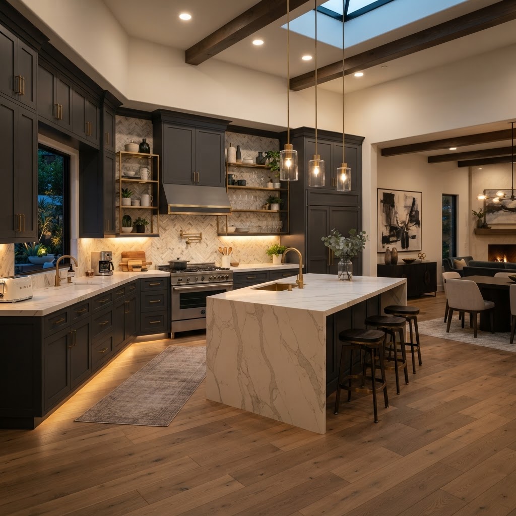
5 Moody Kitchen Designs That Prove Dark Is The New Neutral
Move over all white kitchens because dark and moody palettes are taking over the design world. These five stunning spaces demonstrate how to embrace deep tones to create a sophisticated and cozy atmosphere in your home.
The Matte Black Statement
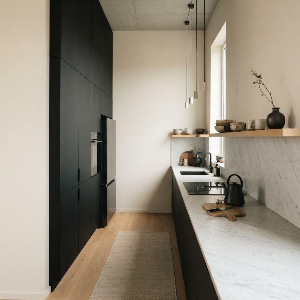
Okay, let's just start here because matte black is, without question, the most fearless choice you can make in a kitchen. It's not for the faint of heart, and honestly, that's exactly why I love it. There's something about a full matte black kitchen that just says I know what I want in a way that no beige shaker cabinet ever could.
The beauty of matte black is in the finish itself. Unlike glossy black, which can feel cold and a little too nightclub-ish, matte absorbs light in this incredibly sophisticated way. It makes the space feel intentional. Layered. Real talk, the first time I walked into a matte black kitchen, I stood there for a solid minute just taking it in. The cabinets, the hardware, the range hood all pulling in the same direction. It's cohesion at its best.
Here's the thing though: matte black works hardest when you pair it with warm counterpoints. Think butcher block countertops, raw brass hardware, or even a rough-hewn wooden open shelf or two. Those warm elements keep the space from feeling like a cave and instead give it this rich, layered quality that feels genuinely livable. You want contrast, not competition.
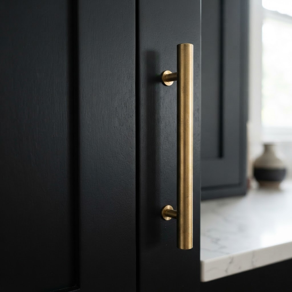
One thing people always worry about with dark kitchens is lighting, and look, that's a fair concern. But the solution isn't to abandon the dark palette. It's to get smarter about your lighting plan. Under-cabinet LED strips, a statement pendant over the island, recessed lighting with a warm color temperature around 2700K. These things work together to make a matte black kitchen feel warm and glowing rather than dim and dreary.
- Pair with brass or unlacquered bronze hardware for warmth that ages beautifully
- Use a light-toned countertop like white marble or pale quartz to break up the darkness
- Invest in layered lighting because overhead lighting alone will not cut it here
- Introduce texture through backsplash so the eye has somewhere interesting to travel
Matte black is genuinely timeless in a way that trends come and go but this one just keeps holding on. And honestly, I think it's because it taps into something deeper than just aesthetics. It feels confident. Grounded. Like whoever lives there has made a decision and they're sticking to it.
Moody Forest Green Accents
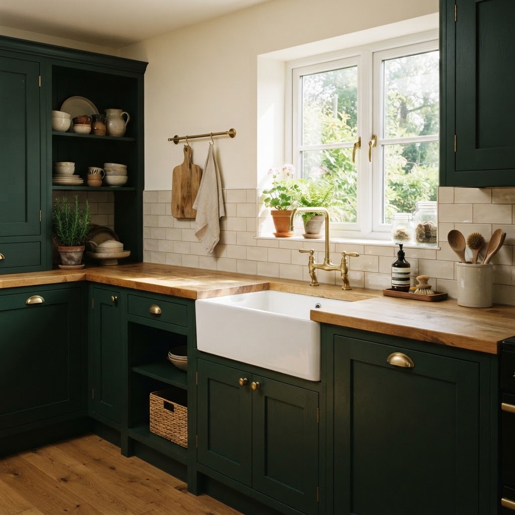
Forest green might honestly be my personal favorite on this entire list. There's a reason it exploded over the past few years and has absolutely refused to leave. It hits this perfect sweet spot between moody and organic, between dramatic and warm. It feels like the outdoors came inside and decided to stay.
The shade matters more than people realize, and this is where I see a lot of people go wrong. There's forest green, and then there's sage green, and those are two very different vibes. We're talking about the deep, saturated, almost-dark-enough-to-be-black greens here. Think hunter, emerald on the darker end, bottle green. These are the shades that make a kitchen feel like a proper moody retreat rather than a Pinterest herb garden moment.
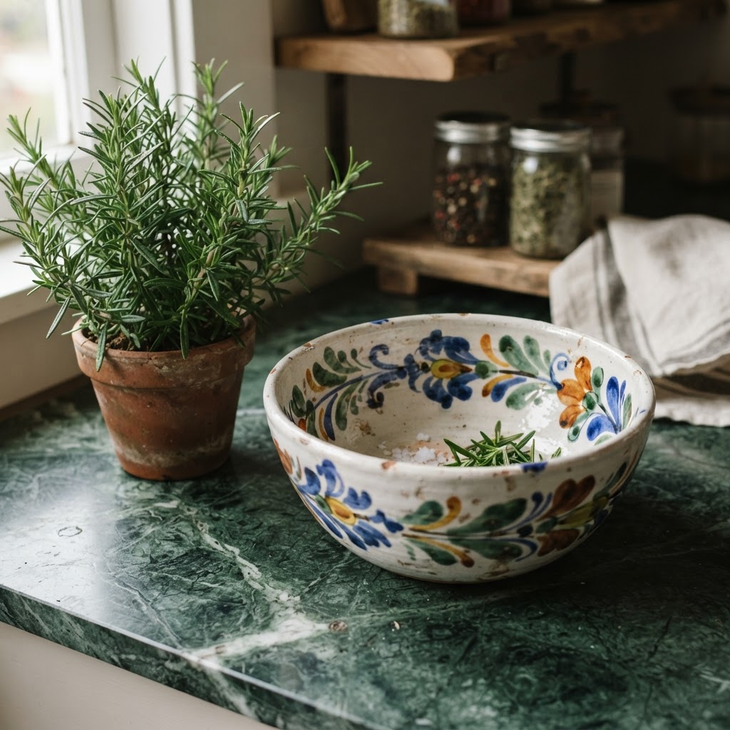
What makes forest green so special in a kitchen is how naturally it pairs with other materials. Marble countertops look absolutely stunning against it. Aged brass fixtures feel like they were always meant to be there. Even simple white subway tile takes on a whole new personality when it's framed by deep green cabinetry. And if you're feeling adventurous, a terracotta tile floor will make the whole thing feel like a sophisticated European country kitchen in the best possible way.
- Go for a flat or satin finish rather than high gloss to keep the moody feel intact
- Natural stone countertops with warm veining complement green cabinetry beautifully
- Introduce plants strategically because yes, greenery against green actually works when done right
- Warm metals like brass and copper will always be the right hardware choice here
Trust me on this: if you've been on the fence about going dark and you're a nature lover at heart, forest green is your gateway. It's moody without being intimidating, dramatic without being cold. It's the dark kitchen choice that people who claim they could never do a dark kitchen end up completely falling in love with.
Sophisticated Navy Blue Sophistication

Navy blue is the dark kitchen choice that your parents might actually get on board with, and I mean that as a total compliment. It's got this inherent classiness to it, this kind of old-world tailored quality that reads as sophisticated rather than edgy. But make no mistake, done right, a navy kitchen is deeply, beautifully moody.
The versatility of navy is genuinely impressive. It plays nicely with traditional kitchen styles, works brilliantly in transitional spaces, and can even hold its own in a more contemporary setting depending on how you style it out. And here's the thing about navy specifically: it has a blue undertone that bounces light in a unique way compared to black or green. In natural daylight, it almost glows. In evening light with warm bulbs, it retreats into this incredibly cozy depth. It's a color that actually changes throughout the day, which I find endlessly interesting.
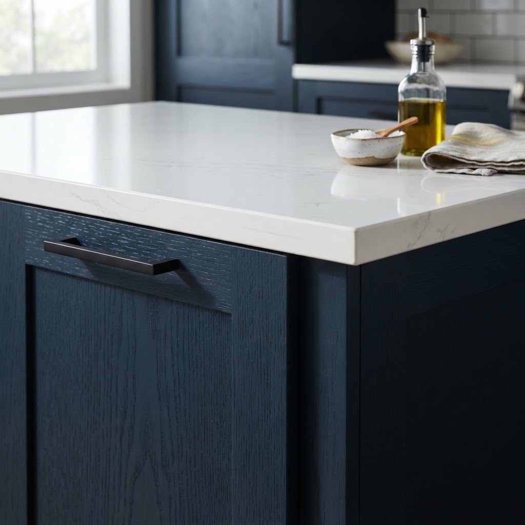
Pairing choices for navy are where you get to have some real fun. Classic white countertops give it a crisp, nautical-adjacent feel without going full coastal. Warm wood tones, especially walnut, add an earthy grounding quality that stops navy from feeling too formal. And if you want to go full luxe, a dramatic dark marble like Nero Marquina or Calacatta black will create a tone-on-tone palette that looks genuinely breathtaking.
Hardware choices with navy deserve a mention too. While brass is always a safe and gorgeous bet, navy is one of the few dark cabinetry colors that also looks incredible with polished nickel or even matte chrome. There's a crispness to silver-toned hardware against navy that feels almost nautical in the best way. Refined, clean, sharp.
- Consider two-tone cabinetry with navy lowers and white or cream uppers for balance
- A statement island in navy against lighter perimeter cabinets is a great starter approach
- Herringbone or Zellige tile backsplash adds texture that navy cabinetry really loves
- Don't fear navy in small kitchens, when done well it creates intimacy rather than claustrophobia
Charcoal Concrete Industrial Vibes
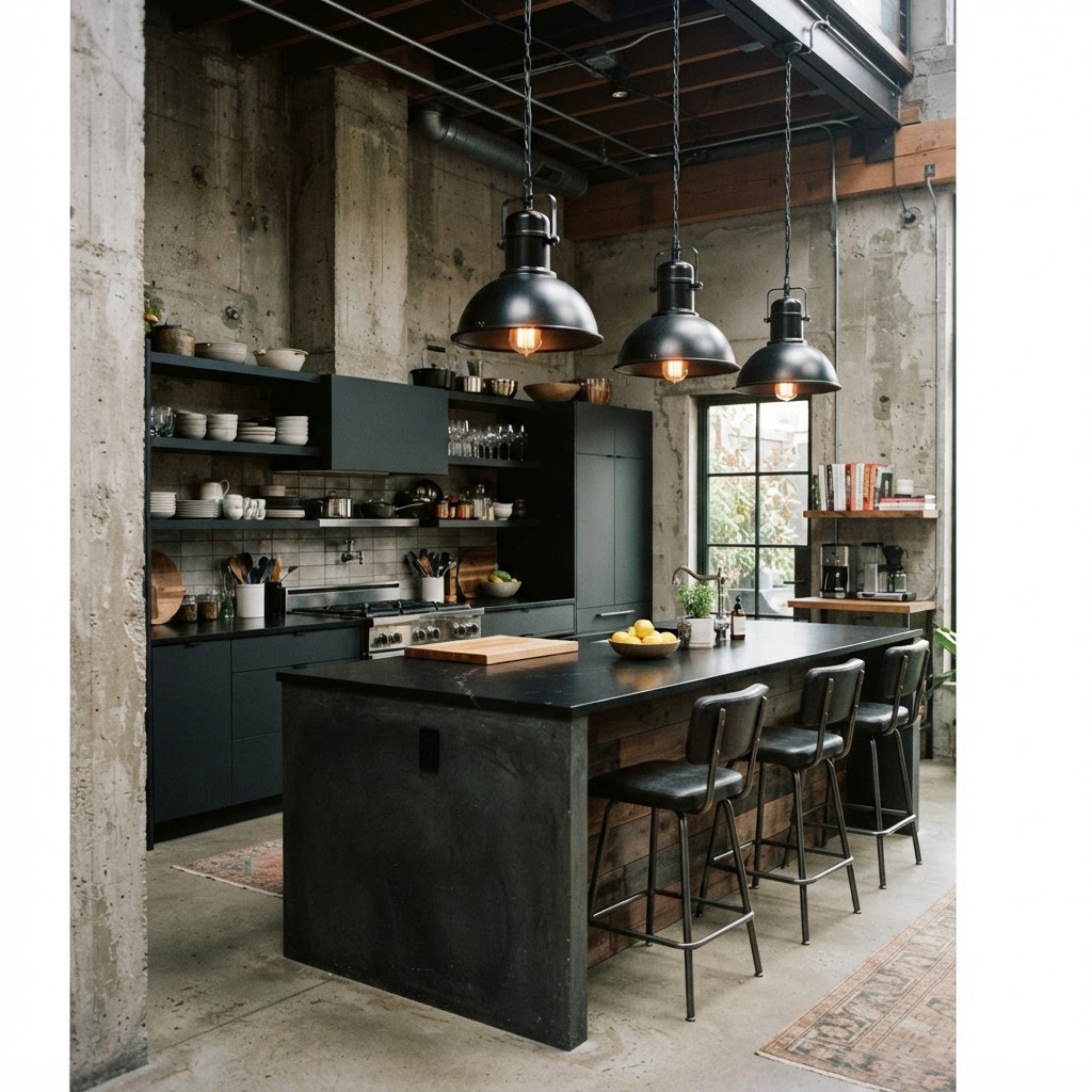
Okay, this one is for a specific kind of person and I say that with complete respect. The charcoal concrete industrial kitchen is not trying to be pretty in a conventional sense. It's trying to be raw, honest, and unapologetically utilitarian. And when it works, it really works in a way that feels unlike anything else in residential design.
Charcoal concrete brings texture to the conversation in a way that painted cabinetry simply cannot. Whether you're talking about actual poured concrete countertops, concrete-look porcelain slabs, or microcement wall finishes, this material has a tactile quality that makes you want to reach out and touch it. That rawness is the whole point. It's the opposite of precious, and honestly, in a kitchen, that's kind of a gift.
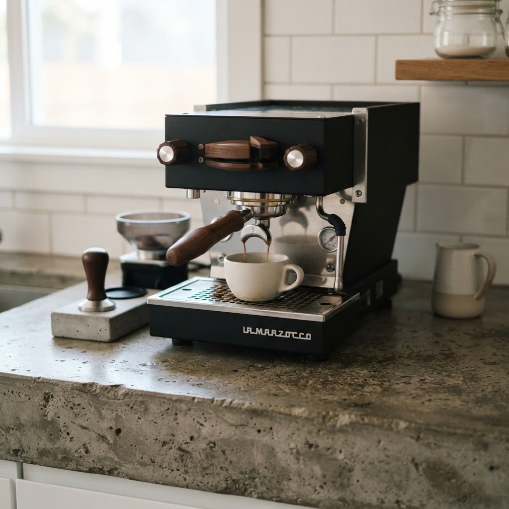
The industrial kitchen aesthetic lives and dies by its material pairings. Exposed steel shelving. Raw wood that hasn't been overly finished or polished. Matte black plumbing fixtures with visible pipe work where possible. Open shelving rather than upper cabinets, showing off utilitarian ceramics and glassware. Every element should feel like it earned its place rather than being chosen for decorative softness.
What I love about the charcoal concrete kitchen is how it handles aging. Unlike a painted cabinet that chips and looks tired, concrete and industrial materials tend to develop a patina over time that only adds to the character. Scratches and marks become part of the story. Real talk, there's a philosophy here about embracing imperfection that resonates with a lot of people who are tired of the perfectly curated home.
- Layer textures aggressively because smooth concrete needs rougher companions to feel balanced
- Open shelving is basically mandatory in this aesthetic, upper cabinets kill the vibe
- Industrial pendant lighting with Edison bulbs or cage shades are perfect companions
- Introduce one warm material, reclaimed wood or leather barstools, to keep it from feeling cold
- Let your appliances be visible because stainless steel or matte black appliances are part of the design
Earthy Espresso Wood Tones
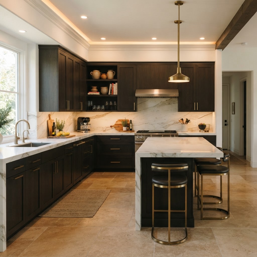
Here's where things get warm and grounded in the most satisfying way. Espresso wood tones are the dark kitchen option that feels like a hug. There's something so deeply comforting about rich, dark wood in a kitchen, and I think it connects to something almost ancestral in us, this sense of warmth and nourishment and being gathered together around something real.
The key with espresso wood is understanding the spectrum you're working within. True espresso is a very dark brown, almost chocolate, with warm undertones that shift depending on the wood species and the light conditions. Walnut, wenge, and dark-stained oak are all players here, and each brings its own grain character to the table. Honestly, the grain is everything with this look. You want visible wood character, not a flat painted finish that happens to be brown. The organic quality of the wood itself is what makes this design direction feel alive.
Pairing espresso wood with the right countertop is one of the most important decisions you'll make. White or light grey stone creates maximum contrast and keeps the space from feeling too heavy. But if you're feeling bold, a dark stone countertop in a complementary tone creates this incredibly rich, layered look that feels almost like the kitchen was grown rather than designed. Add some warm pendant lighting and you've got a space that feels genuinely incredible to cook in.
And here's something that doesn't get talked about enough: dark wood kitchens are incredibly forgiving in terms of everyday wear. Fingerprints, small scuffs, the general chaos of daily cooking life. These things show up dramatically on white cabinetry and barely register on dark espresso wood. From a practical standpoint alone, it's worth serious consideration.
- Choose wood with visible grain rather than flat-cut veneers for maximum character
- Stone or quartz countertops in lighter tones provide essential contrast
- Matte or satin finish looks more contemporary than high gloss for dark wood
- Warm ambient lighting amplifies the richness of espresso tones dramatically
- Mix with natural fibers like rattan, linen, or woven textures in accessories for a cohesive earthy feel
Final Thoughts
Look, the white kitchen is never going anywhere and I'm not here to tell anyone they're wrong for loving it. But there is something genuinely exciting happening in the world of dark kitchen design right now, and these five directions prove that moody doesn't mean depressing, dramatic doesn't mean impractical, and dark absolutely doesn't mean small-feeling.
The throughline in all of these kitchens is intentionality. Every single one of them requires you to think carefully about lighting, about material pairings, about the relationship between the cabinetry and everything else in the space. And honestly, that extra layer of thought is exactly why they end up feeling so considered and so personal. Dark kitchens don't let you be lazy with the design. They demand that you show up fully, and the result speaks for itself.
Whether you're drawn to the fearless confidence of matte black, the organic warmth of forest green, the tailored elegance of navy, the raw honesty of charcoal concrete, or the grounded richness of espresso wood, there is a moody kitchen palette out there with your name on it. The only question is which one feels most like you.
More in Interior
Stay Inspired
Subscribe for new essays on architecture, design, and the spaces that shape us.