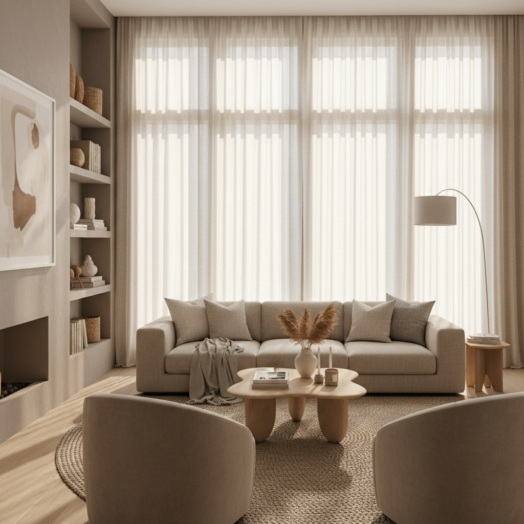
Sophisticated Serenity: The Best Neutral Paint Colors for Your Home
Looking to refresh your space with calming hues? Discover the best neutral paint colors that can transform any room into a serene sanctuary. From warm taupes to cool greys, find the perfect shade for your home that complements your style.
Why Choose Neutral Paint Colors?
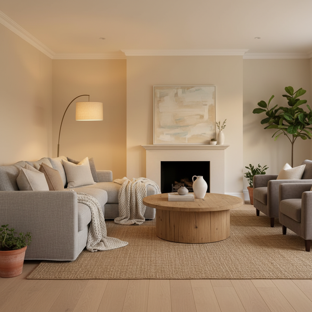
Honestly, I get it. When you're standing in the paint aisle staring at a wall of color swatches, the idea of going neutral can feel like you're playing it safe. Like you're chickening out. But here's the thing: neutrals are not boring. They're actually one of the most powerful design decisions you can make in a home, and once you understand why, you'll never look at a warm greige or a soft white the same way again.
Neutral paint colors create a visual calm that's genuinely hard to replicate with any other palette. They let the architecture of a room breathe. They let your furniture, your art, your textiles, and your personal style do the talking without competing with a loud wall color. There's a reason why every single staging expert, real estate agent, and high-end interior designer leans on neutrals constantly. It's not laziness, it's strategy.
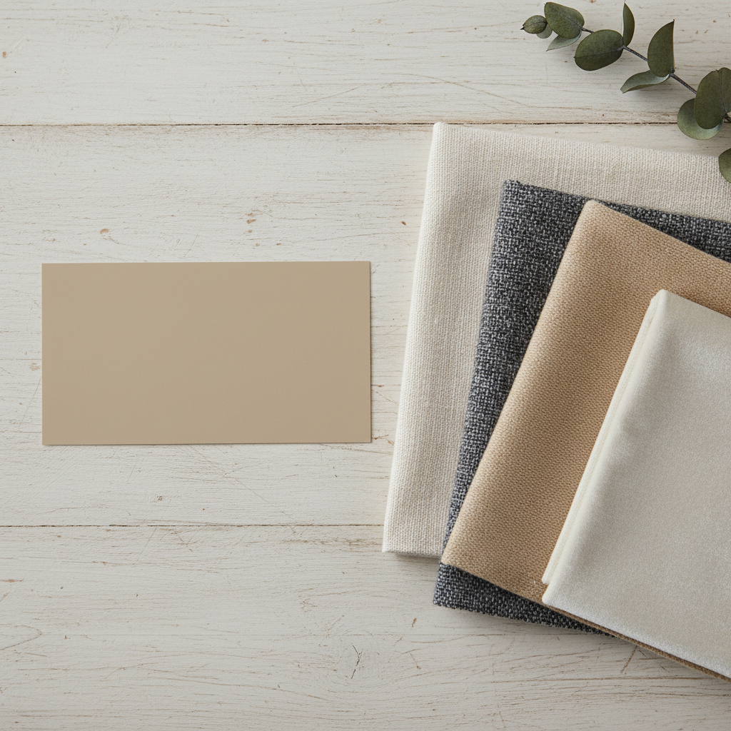
And look, there's also a deeply practical side to this. Neutrals age incredibly well. That bold teal you painted the living room in 2019? It might feel a little heavy now. A well-chosen neutral from five years ago? Still looks fresh, still looks intentional. Neutrals have staying power, and in a world where renovation costs keep climbing, that longevity matters a lot.
Beyond aesthetics, neutral spaces tend to feel more spacious and less visually cluttered. Light colors reflect more natural light, which makes rooms feel bigger and airier. If you've got a smaller apartment or a room that doesn't get great natural light, a smart neutral can genuinely transform the way the space feels to live in. That's not a small thing. That's your daily quality of life we're talking about.
So if you've been on the fence about going neutral, consider this your nudge. It's not about playing it safe. It's about creating a backdrop that's sophisticated, flexible, and built to last.
Top 5 Neutral Shades to Consider
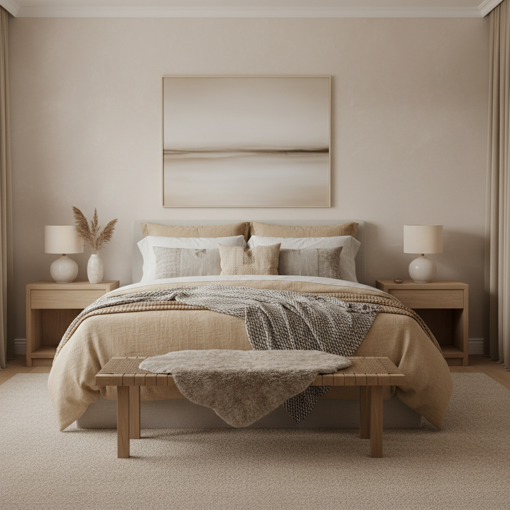
Not all neutrals are created equal, and real talk, picking the wrong one can make a room look dull, dingy, or just weirdly off. There's a whole spectrum of neutral tones out there, and the best ones for your home depend on your light, your furniture, and the vibe you're going for. Here are the five I keep coming back to, over and over again.
1. Warm White. This is the workhorse of the neutral world. A warm white, think something like Benjamin Moore's Chantilly Lace or Sherwin-Williams' Alabaster, gives you that crisp, clean look without tipping into that stark, sterile territory that cool whites can sometimes create. It works in virtually every room, pairs with everything, and photographs beautifully. If you're ever unsure, start here.
2. Soft Greige. Greige is that gorgeous hybrid of gray and beige that took the design world by storm and never really left. Something like Sherwin-Williams' Accessible Beige or Benjamin Moore's Revere Pewter sits comfortably in the warm neutral zone and works especially well in living rooms and bedrooms. It's cozy without being heavy.
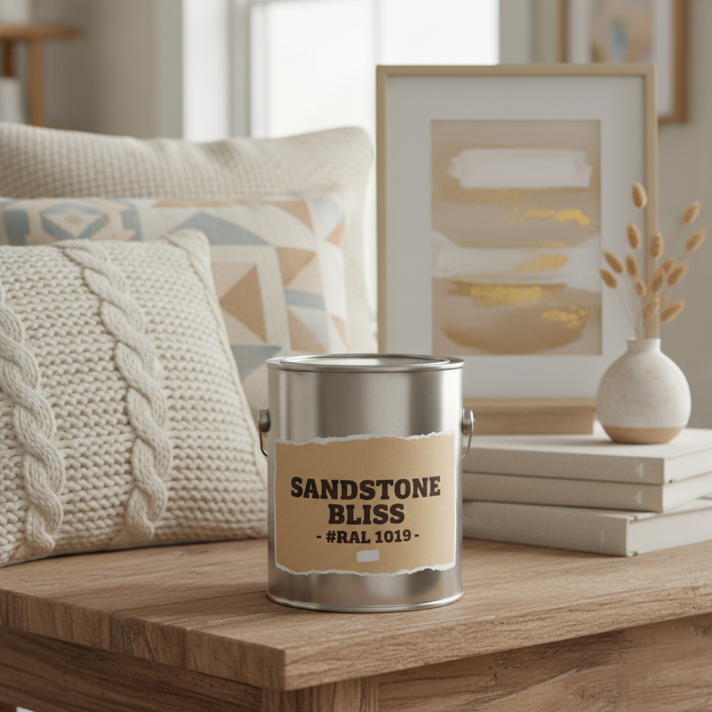
3. Cool Gray. For those who love a more modern, minimal aesthetic, a cool gray is your best friend. Something like Farrow and Ball's Elephant's Breath or Benjamin Moore's Gray Owl brings a sophisticated, almost architectural quality to a room. Works brilliantly in home offices, kitchens, and spaces where you want that clean, contemporary edge.
4. Warm Taupe. Taupe is having a major moment right now, and honestly, it deserves every bit of the attention. A deep, warm taupe like Sherwin-Williams' Antique White or a richer version like Benjamin Moore's Pale Oak feels incredibly grounded and luxurious. It's the neutral that feels intentional, like someone who really knows what they're doing chose it.
- Warm White: Versatile, bright, and pairs with everything
- Soft Greige: Cozy, timeless, works in living and sleeping spaces
- Cool Gray: Modern, crisp, great for contemporary interiors
- Warm Taupe: Grounded, luxurious, deeply sophisticated
- Creamy Off-White: Soft, inviting, perfect for older or character homes
5. Creamy Off-White. This one is underrated and I will die on that hill. A creamy off-white, something with yellow or pink undertones rather than blue or gray, feels genuinely warm and inviting in a way that other neutrals sometimes can't quite match. It's especially stunning in older homes with crown molding, wood floors, and architectural details that deserve to be celebrated rather than competed with.
How to Pair Neutrals with Other Colors
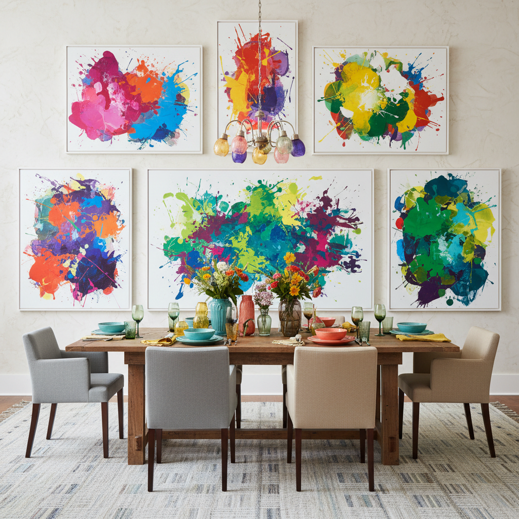
Here's where things get really fun. The beauty of a neutral base is that it becomes a canvas, and what you put on top of it is where your personality gets to come through loud and clear. But there's definitely a right way and a very wrong way to layer color onto a neutral palette. Trust me on this, I've seen both, and the difference is significant.
The first rule is to always work with your neutral's undertone. This is non-negotiable. If your wall is a cool gray with blue undertones, you want to bring in accents that have cool tones too, navy, forest green, dusty blue, charcoal. If you're working with a warm greige or taupe, lean into terracotta, rust, mustard, and warm earthy greens. Mixing warm and cool tones without intention is one of the most common design mistakes people make, and it makes a room feel subtly "off" in a way that's hard to pinpoint but impossible to ignore.
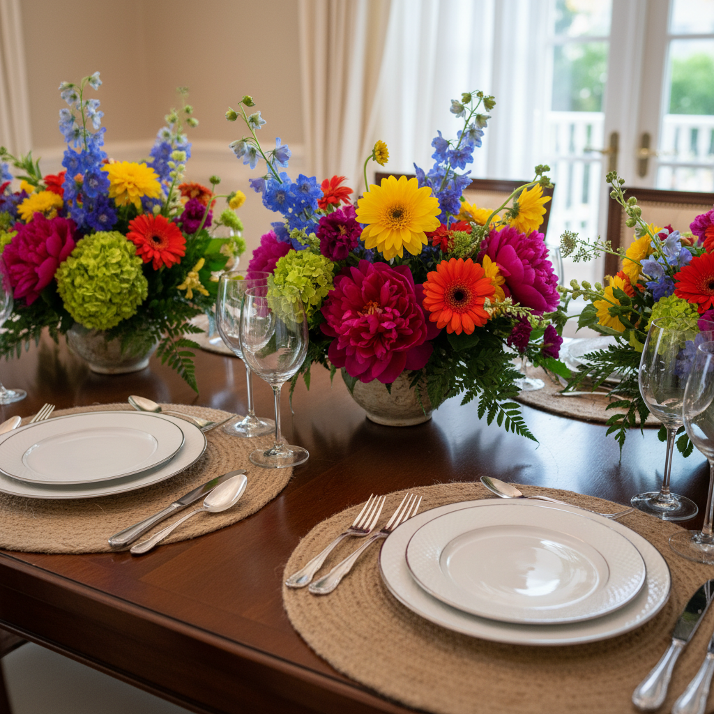
Second rule: don't be afraid of contrast. A neutral wall doesn't mean everything else has to be quiet. In fact, a muted background is the perfect place to let one bold accent color really sing. A deep emerald green velvet sofa against a warm white wall? Stunning. A terracotta linen throw against soft greige? Absolutely perfect. The neutral does the heavy lifting of keeping the room grounded while the accent color gets all the applause.
"Think of your neutral walls as the supporting cast. They make the star, which is your furniture, art, or a single bold accent color, look even better by not competing for attention."
And honestly, texture counts as color in interior design. When you're working with a neutral palette, layering different textures, linen, wool, ceramic, wood, stone, creates visual depth and interest without adding a single extra hue to the mix. A room that's all neutral but rich in texture feels layered and expensive. A room that's all neutral but flat in texture just feels empty. Keep that in mind when you're shopping for soft furnishings and decor pieces.
The Impact of Lighting on Neutral Paint
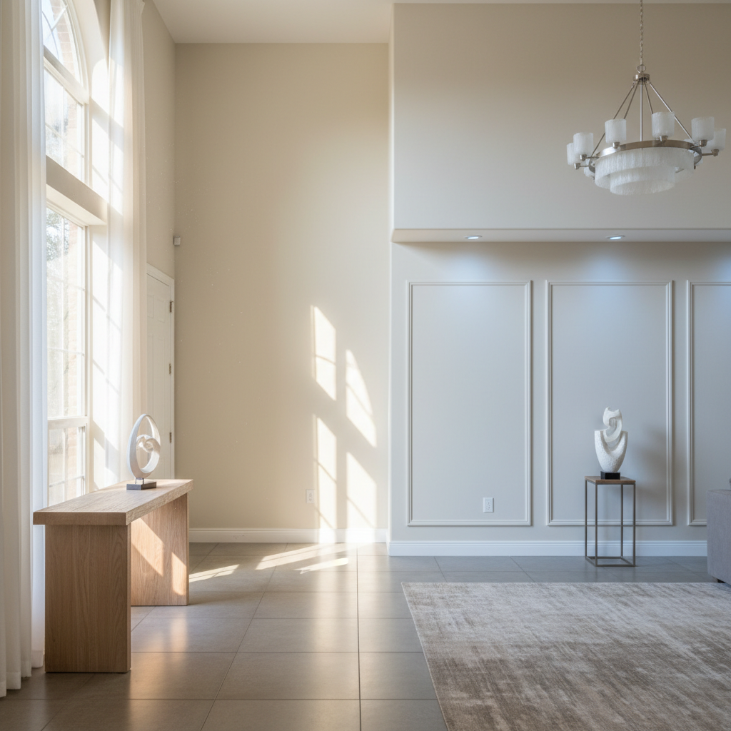
Look, this is the section that most paint guides gloss over, and I think it's genuinely the most important thing to understand before you commit to any neutral. Lighting changes everything. And I mean everything. A paint color that looks like a dreamy warm white in the showroom can look positively yellow or pink in your north-facing living room, and that same color can look completely different at noon versus 7pm. It's not a flaw in the paint. It's just physics.
Natural light direction is the first thing to consider. North-facing rooms get cool, indirect light all day, which means warm neutrals will read most accurately and prevent that cold, flat feeling. If you put a cool gray in a north-facing room, it's going to look borderline gloomy. A warm greige or a creamy white will perform much better. South-facing rooms, on the other hand, get intense, warm light for most of the day, so you have more flexibility. Cool grays and even some bluish whites can look gorgeous because the warm sunlight compensates for those cool undertones.
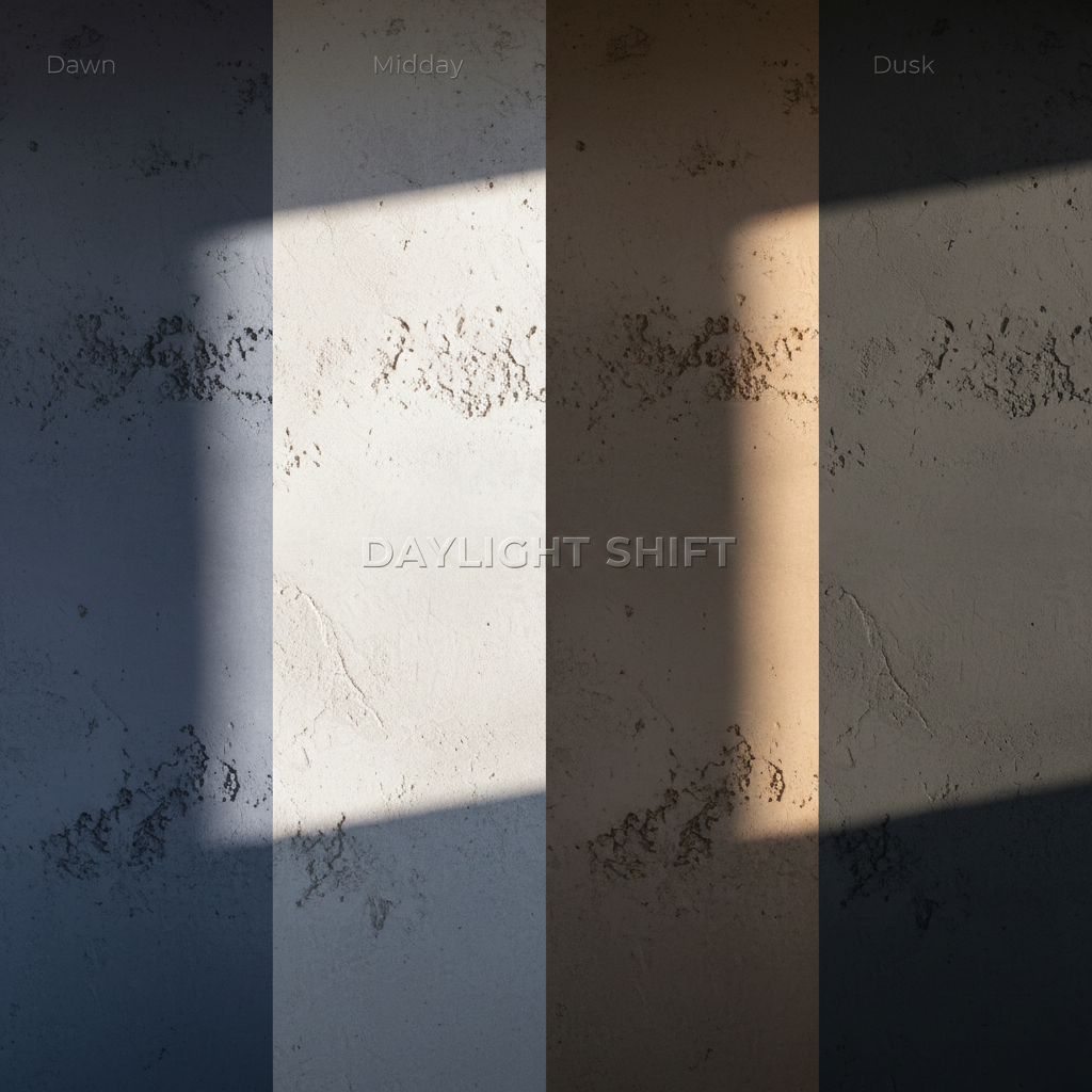
Artificial lighting is just as important. Incandescent and warm LED bulbs amplify warm tones in paint, making warm neutrals feel cozier and richer. Cool LED or fluorescent lighting pulls out the cool undertones and can make a greige look more gray than beige. This is why I always, always recommend testing a paint sample on your actual wall and living with it for at least 48 hours, looking at it in the morning, midday, evening, and under your artificial lighting at night before you commit to buying a full gallon.
The finish you choose also affects how light interacts with the color. A matte or flat finish absorbs light and makes the color look a little darker and more muted. An eggshell or satin finish reflects some light and makes the same color appear a little brighter and cleaner. For most living spaces, I recommend eggshell because it strikes that perfect balance, a little sheen without being shiny, and it's also much easier to clean than flat paint, which is worth mentioning if you have kids or pets.
Making Your Neutral Palette Stand Out
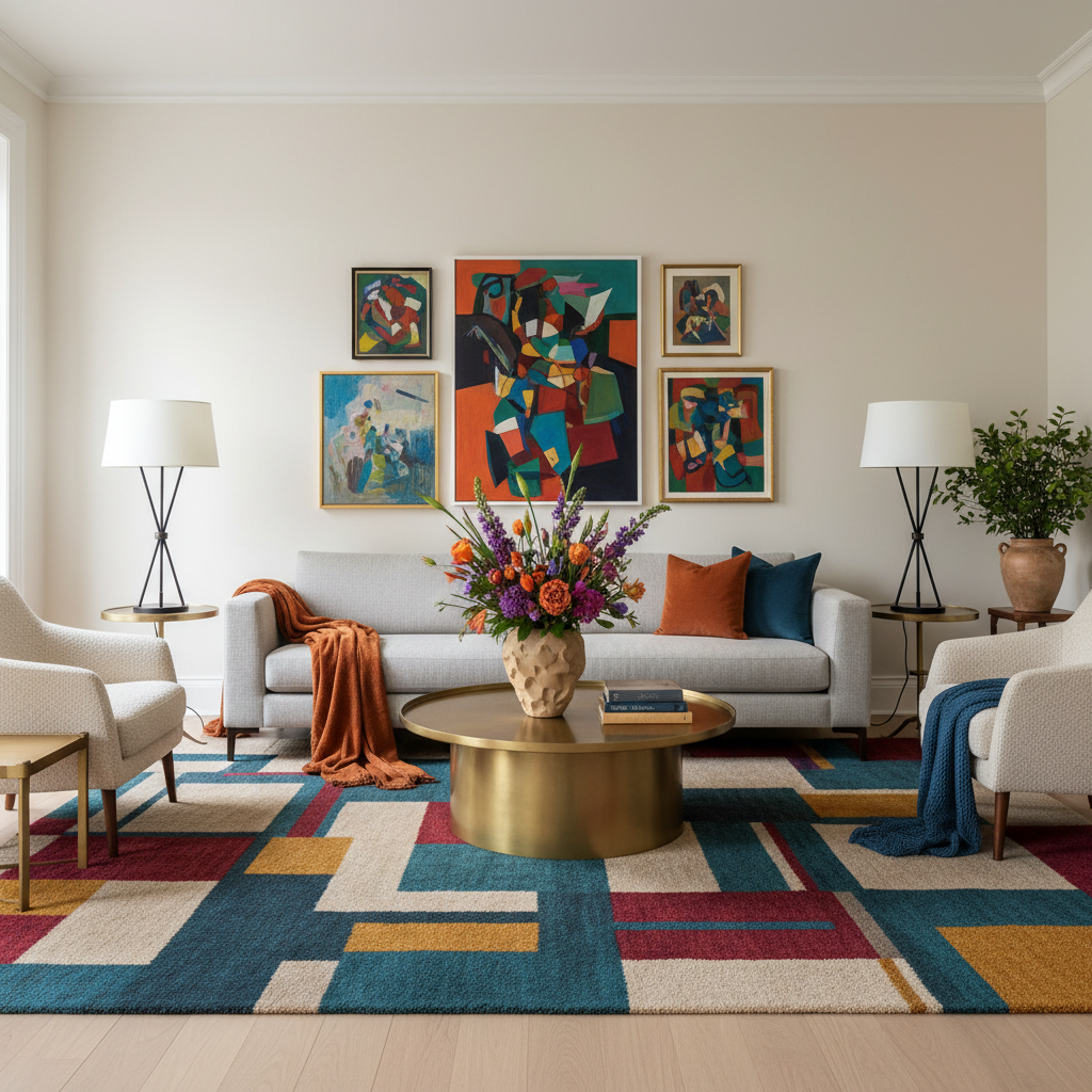
This is the question I get asked the most, and it's a fair one. How do you make a neutral room feel special and intentional rather than just... beige? How do you keep it from looking like a rental apartment that someone forgot to decorate? The answer is in the details, and once you know what to look for, you'll start seeing it everywhere in the rooms you love most.
First: invest in your trim. This is one of the most underrated design moves in the book. Painting your trim, baseboards, crown molding, and door frames in a slightly contrasting neutral, either a brighter white if your walls are warm, or a creamier tone if your walls are cool, creates a subtle but incredibly polished layering effect. It makes a room look like someone really thought about it. And that contrast, even though it's just two neutrals side by side, gives the room a sense of structure and architecture that a flat single-color approach just doesn't have.
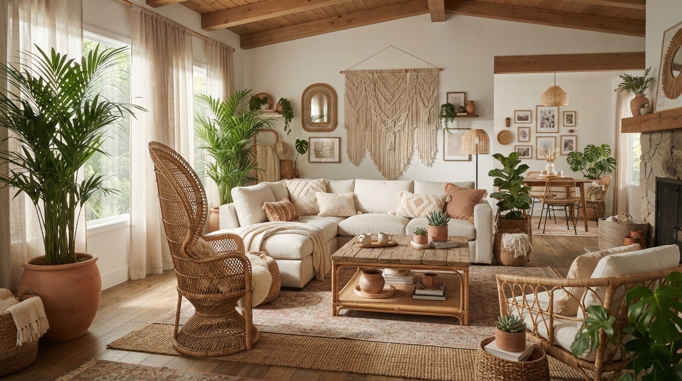
Second: layer in natural materials. Wood, linen, rattan, stone, leather. These materials bring visual warmth and depth to a neutral room in a way that nothing else can replicate. A raw oak coffee table, a jute rug, a chunky knit throw, terracotta pots on the windowsill. These elements give the eye something interesting to look at without breaking the calm, serene quality that a neutral palette is supposed to create.
- Paint trim and molding in a slightly contrasting neutral for polish
- Layer natural materials like wood, linen, and stone for depth
- Invest in one or two statement pieces rather than lots of small objects
- Use plants to add organic color and life to a neutral space
- Choose lighting fixtures that double as sculptural objects
Third, and this is something I feel strongly about: edit your stuff. A neutral room with too many small objects and tchotchkes everywhere doesn't feel serene, it feels cluttered. The magic of a neutral palette is that it creates space, visual and psychological breathing room. Honor that by being intentional about what you put in the room. A few well-chosen objects displayed with space around them will always look better than a crowded shelf of things you've accumulated over the years. Neutral doesn't mean empty, but it does mean curated.
Final Thoughts
Here's the thing about neutral paint colors: they're not a compromise. They're a commitment to creating a home that feels calm, considered, and genuinely beautiful to live in. The best neutral rooms don't happen by accident. They're the result of someone understanding their light, knowing their undertones, layering texture thoughtfully, and editing with intention.
Whether you're drawn to a whisper-soft warm white, a sophisticated greige, or a moody cool gray, there's a neutral out there that will make your home feel like the serene, sophisticated space you've been dreaming about. Start with samples. Live with them. Trust the process. And trust me on this, once you nail your neutral, the whole room will fall into place in a way that honestly feels a little magical.
More in Interior
Stay Inspired
Subscribe for new essays on architecture, design, and the spaces that shape us.