The 7 Best Neutral Paint Colors Designers Swear By For A Timeless Home
Choosing the perfect neutral paint color can feel overwhelming with so many shades of white and gray available. I have rounded up the top paint colors that professional interior designers use to create light airy and sophisticated spaces that never go out of style.
The Power of Warm Whites
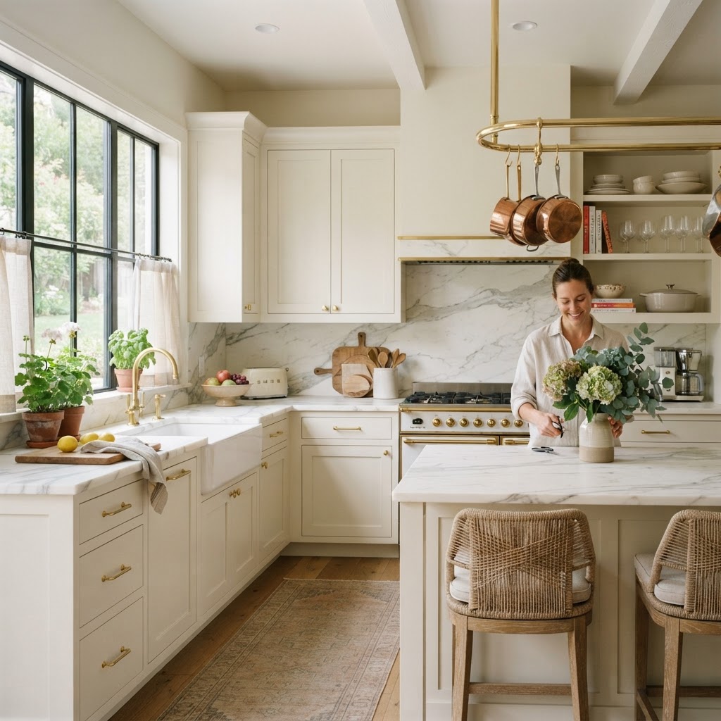
Okay, let's start here because honestly, warm whites are the backbone of so many beautiful homes and they don't get nearly enough credit. People hear "white walls" and immediately picture a sterile hospital room or a blank gallery space. But warm whites? Totally different story. They have this gorgeous, almost creamy quality that makes a room feel lived-in and welcoming from the second you walk through the door.
The two shades that designers keep coming back to again and again are Benjamin Moore's White Dove and Sherwin-Williams Alabaster. White Dove has this incredibly soft, barely-there warmth that works in north-facing rooms where you'd normally fight a cold, bluish light all day. Alabaster leans a little more yellow, which makes it perfect for open-plan spaces where you want everything to feel cohesive and sunny without looking like you painted your walls with actual butter.
Here's the thing about warm whites that nobody warns you about: the undertones are everything. A white that looks perfectly creamy in the store can suddenly look pink or peachy on your walls depending on your flooring, your furniture, and the direction your windows face. That's why designers never just slap a warm white on and hope for the best. They test it. They live with it for a few days. More on that later.
Warm whites also play incredibly well with natural materials. Think linen, raw wood, aged brass, woven baskets. If your home has any of those textures, a warm white wall is going to amplify every single one of them. It's like a great supporting actor, it makes everyone else look better without stealing the scene. If you want a home that feels timeless rather than trendy, starting with a warm white is genuinely one of the smartest moves you can make.
Sophisticated Greiges for Every Room
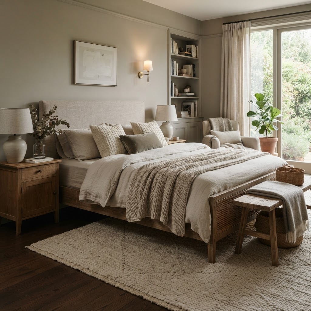
If you haven't heard the term "greige" yet, welcome to the paint color conversation you didn't know you needed. Greige is exactly what it sounds like: a blend of gray and beige that somehow manages to be better than both. It's the color equivalent of having your cake and eating it too. You get the sophisticated, modern edge of gray without any of that cold, clinical feeling, and you get the warmth and coziness of beige without veering into dated, early-2000s territory.
Agreeable Gray by Sherwin-Williams has been the most popular paint color in the country for years, and honestly, it deserves every bit of that hype. It reads differently in every room, warmer in south-facing spaces, cooler and more refined in rooms that get less light. Accessible Beige, also from Sherwin-Williams, is another one designers love because it sits just a touch warmer on the spectrum and pairs beautifully with white trim. And then there's Revere Pewter from Benjamin Moore, which is a bit deeper and moodier, perfect for rooms where you want a little more presence on the walls.
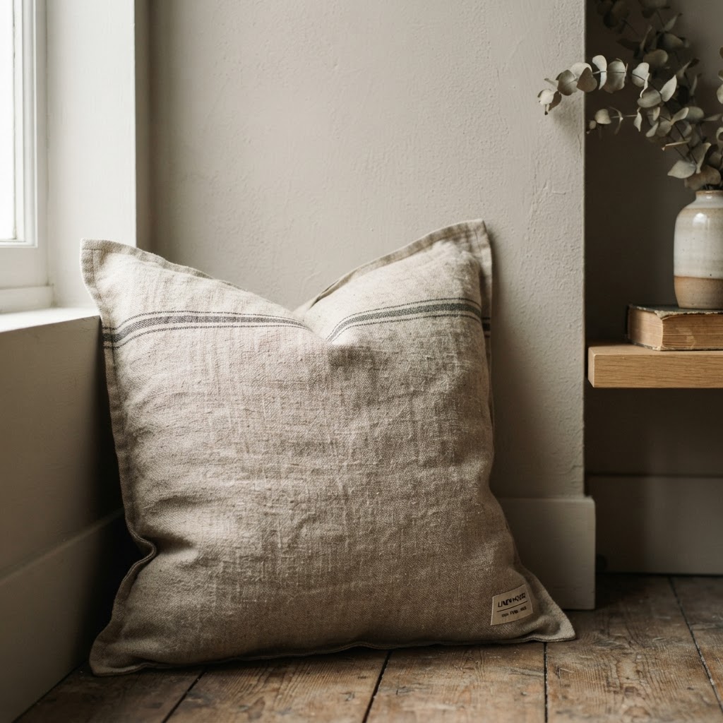
What makes greige so universally loved among designers is its flexibility. Real talk, it's nearly impossible to mess up. It works in bedrooms, living rooms, hallways, even kitchens. It doesn't fight with your furniture. It doesn't clash with your artwork. It just quietly does its job and makes everything around it look intentional and pulled together. If you're the kind of person who moves furniture around a lot or likes to swap out accent pieces with the seasons, greige is basically your best friend.
One thing to watch out for: greige can sometimes pull green in certain lighting conditions, especially if you have a lot of cool-toned artificial lighting. Always, always test your paint sample under the actual lighting conditions in your home, both natural daylight and your evening lighting setup. A color that looks perfect at noon can look completely different at 7pm under warm Edison bulbs, and you don't want any surprises after you've painted the whole room.
The other thing I love about greige is how it handles trim. Pair it with a crisp bright white trim and it feels fresh and contemporary. Pair it with an off-white or a very pale greige trim and it feels more European and layered. You have so much room to play, and that's exactly what a great neutral should give you.
Moody Neutrals for Depth

Look, not everyone wants their home to feel light and airy. Some of us want to walk into a room and feel completely enveloped, like the walls are giving you a hug. That's where moody neutrals come in, and honestly, this category has had the biggest glow-up in interior design over the last five years. Deep, complex, almost atmospheric shades that are still technically neutral but have so much going on beneath the surface.
Think of colors like Benjamin Moore's Kendall Charcoal, a deep gray with just the faintest hint of green that looks absolutely stunning in a home office or a dining room. Or Sherwin-Williams Urbane Bronze, which was their 2021 Color of the Year and is still showing up in designer projects constantly because it's just that good. It's a warm, earthy brown-gray that feels grounded and luxurious at the same time. Then there's Hale Navy by Benjamin Moore, which I know sounds like it's not neutral, but in the right space, especially paired with warm wood tones and natural textiles, it reads as a deep, sophisticated anchor rather than a bold statement.

Here's the thing about moody neutrals that surprises most people: they can actually make a small room feel bigger, not smaller. When you paint all four walls the same deep shade, including the ceiling if you're brave, the boundaries of the room disappear and it creates this incredible sense of depth and dimension. It sounds counterintuitive, but it works. I've seen tiny Manhattan apartments transformed into the most cozy, jewel-box spaces you've ever seen, all because someone had the nerve to go dark instead of playing it safe with white.
The key to pulling off a moody neutral is getting your lighting right. These colors absolutely drink up natural light, so you need to compensate with good artificial lighting. Layer your sources: overhead lights, table lamps, floor lamps, maybe even some wall sconces if the room allows it. Reflective surfaces like mirrors, glossy finishes, and metallic accents also help bounce light around the room so it doesn't feel like a cave. Done right, a moody neutral room feels like the most sophisticated, intentional space in the whole house.
Testing Your Paint Colors Like a Pro
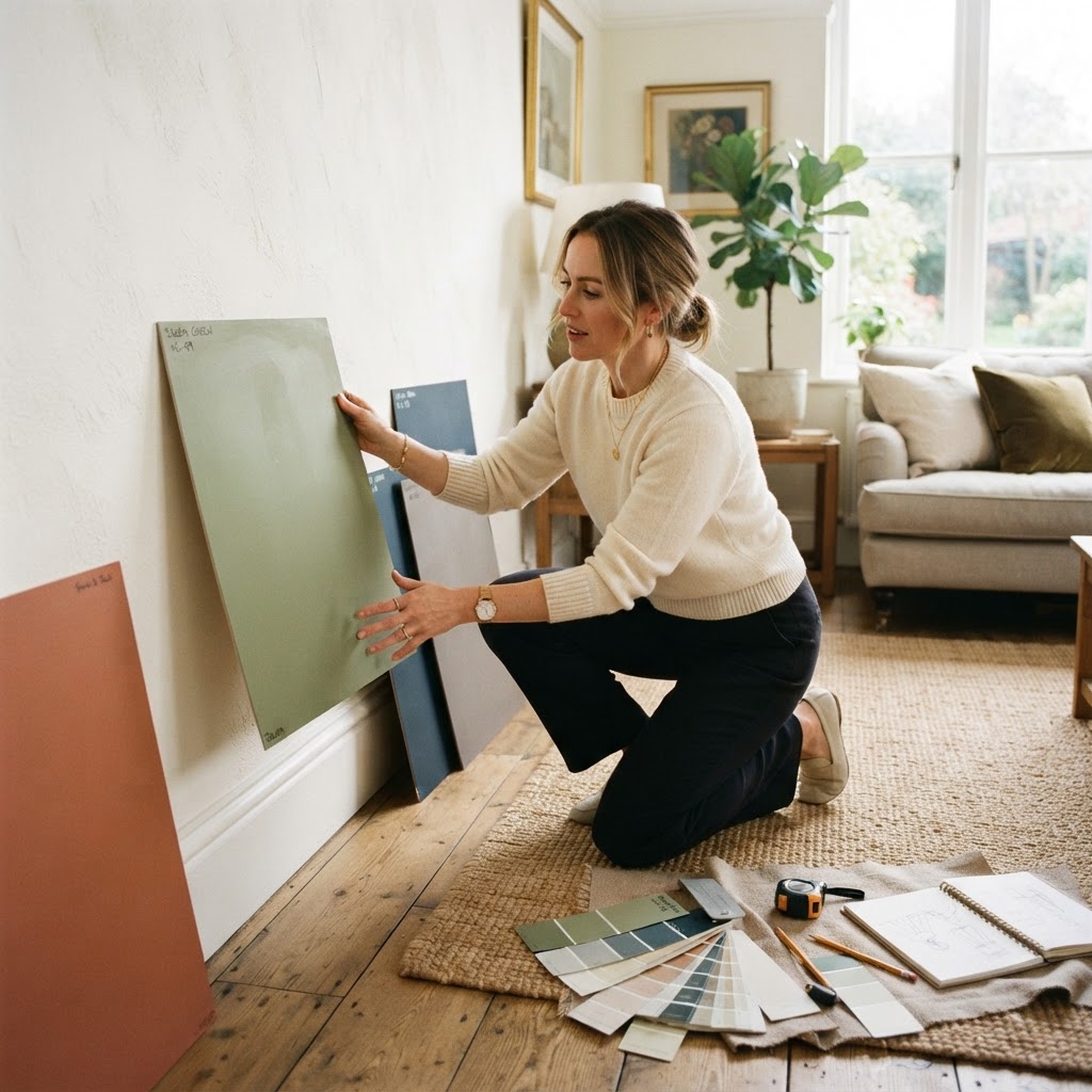
Okay, this is the section that could save you from a serious mistake, so pay attention. Even if you've fallen completely in love with a paint color online or on someone else's Instagram, you cannot skip the testing phase. I cannot stress this enough. The number of people I've talked to who painted an entire room based on a chip they saw under fluorescent store lighting and then wondered why it looked completely wrong at home is genuinely heartbreaking.
The gold standard method right now is using large peel-and-stick paint samples from companies like Samplize or just painting large swatches directly on your wall, at least 12 by 12 inches, ideally bigger. Small chips simply don't give you enough information. Colors behave differently at scale. A shade that looks perfectly neutral on a two-inch chip can suddenly reveal a very strong pink or green undertone when it covers an entire wall. Bigger swatches let you actually see what you're dealing with.
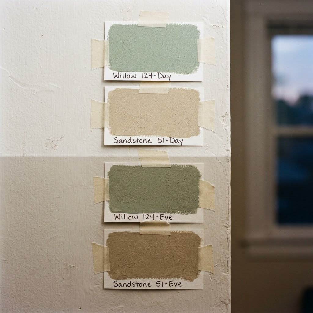
Once you've got your swatches up, here's the testing routine that designers actually follow. Check your samples at different times of day: morning light, midday, late afternoon, and evening with your artificial lights on. Notice how the color shifts and whether you're happy with all of those versions. Also look at the swatch next to your largest fixed elements: your flooring, your cabinetry if it's the kitchen, your fireplace surround. Those are the things you're not changing, so your paint needs to work with them, not fight them.
Trust me on this: also check your samples on different walls in the same room. A north-facing wall and a south-facing wall in the same room can look like two completely different colors. If you're testing a greige and one wall looks greenish while the other looks warm and lovely, that's really useful information before you commit to buying twelve gallons of paint. Live with your samples for at least three to five days. The color you love on day one might drive you a little crazy by day four, or it might grow on you in ways you didn't expect. Either way, you'll know for sure before you've made an expensive, time-consuming mistake.
- Always test on large swatches, at least 12 by 12 inches, not tiny chips
- Observe the color at multiple times of day, including morning, afternoon, and evening
- Check the color next to your fixed elements: flooring, trim, cabinetry, and countertops
- Test on multiple walls in the same room to account for different light exposures
- Live with the sample for several days before making your final decision
"The right neutral doesn't just disappear into the background. It sets the tone for everything else in the room. It's the foundation, and foundations matter."
Final Thoughts
Picking a paint color sounds like it should be simple, and in theory it is, but when you're standing in front of hundreds of swatches at the hardware store, simple goes right out the window. The truth is that the best neutral paint colors are the ones that work for your specific home, your specific light, and your specific life. Warm whites give you brightness without sterility. Greiges give you that flexible, crowd-pleasing middle ground. Moody neutrals give you depth and drama when you're ready for something with a little more personality.
The seven colors we've talked about throughout this post, White Dove, Alabaster, Agreeable Gray, Accessible Beige, Revere Pewter, Kendall Charcoal, and Urbane Bronze, are designer favorites for a reason. They've been tested in thousands of real homes under real conditions and they've proven themselves time and again. But more important than any specific color recommendation is the process: test properly, observe carefully, and trust your gut when a color feels right in your space.
Honestly, a great neutral paint color is one of the highest-return investments you can make in your home. It costs a fraction of new furniture or a renovation, and it can completely transform how a space looks and feels. Start here, get the foundation right, and everything else will fall into place so much more easily than you'd expect.
More in Interior
Stay Inspired
Subscribe for new essays on architecture, design, and the spaces that shape us.