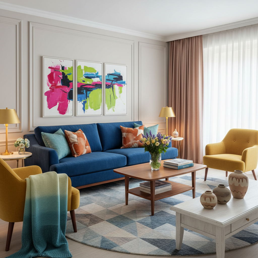
Unlocking the Palette: Your Complete Guide to Color Theory in Interiors
Discover how color influences mood and space in your home. This guide will help you understand color theory and how to apply it effectively for stunning interiors. From choosing the right hues to creating cohesive palettes, we’ve got you covered!
The Basics of Color Theory
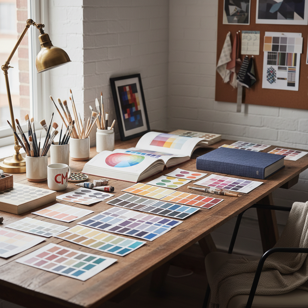
Okay, let's start at the very beginning, because honestly, so many people skip this part and then wonder why their rooms feel a little off. Color theory isn't just something art students learn and forget. It's the actual backbone of every beautiful space you've ever walked into and thought, "wow, this just works." Understanding it changes everything.
At the core of color theory is the color wheel, which organizes colors into a visual map that shows relationships between them. You've got your primary colors (red, blue, yellow), your secondary colors (orange, green, violet), and your tertiary colors, which are what you get when you mix a primary and a secondary together. Think red-orange, yellow-green, blue-violet. These are the building blocks, and knowing them gives you a shared language for talking about color choices in your home.
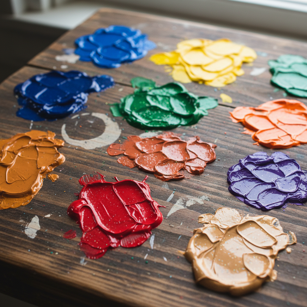
Then there's the concept of hue, value, and saturation, and trust me on this, once you understand these three things, you'll never look at a paint swatch the same way again. Hue is basically just the name of the color. Value is how light or dark it is. Saturation is how intense or muted it is. A dusty sage green and a vivid emerald are technically the same hue, but wildly different in saturation and value, and they'll create completely different feelings in a room.
Here's the thing: a lot of people think picking colors is about personal taste alone. And sure, personal taste matters. But there's actual logic underneath it all. Warm colors (reds, oranges, yellows) tend to advance visually, meaning they make walls feel closer. Cool colors (blues, greens, purples) recede, making spaces feel bigger. Neutrals sit in the middle and do a lot of heavy lifting in most interiors. Knowing this basic stuff means you can make intentional decisions instead of just hoping for the best.
Understanding Color Harmony
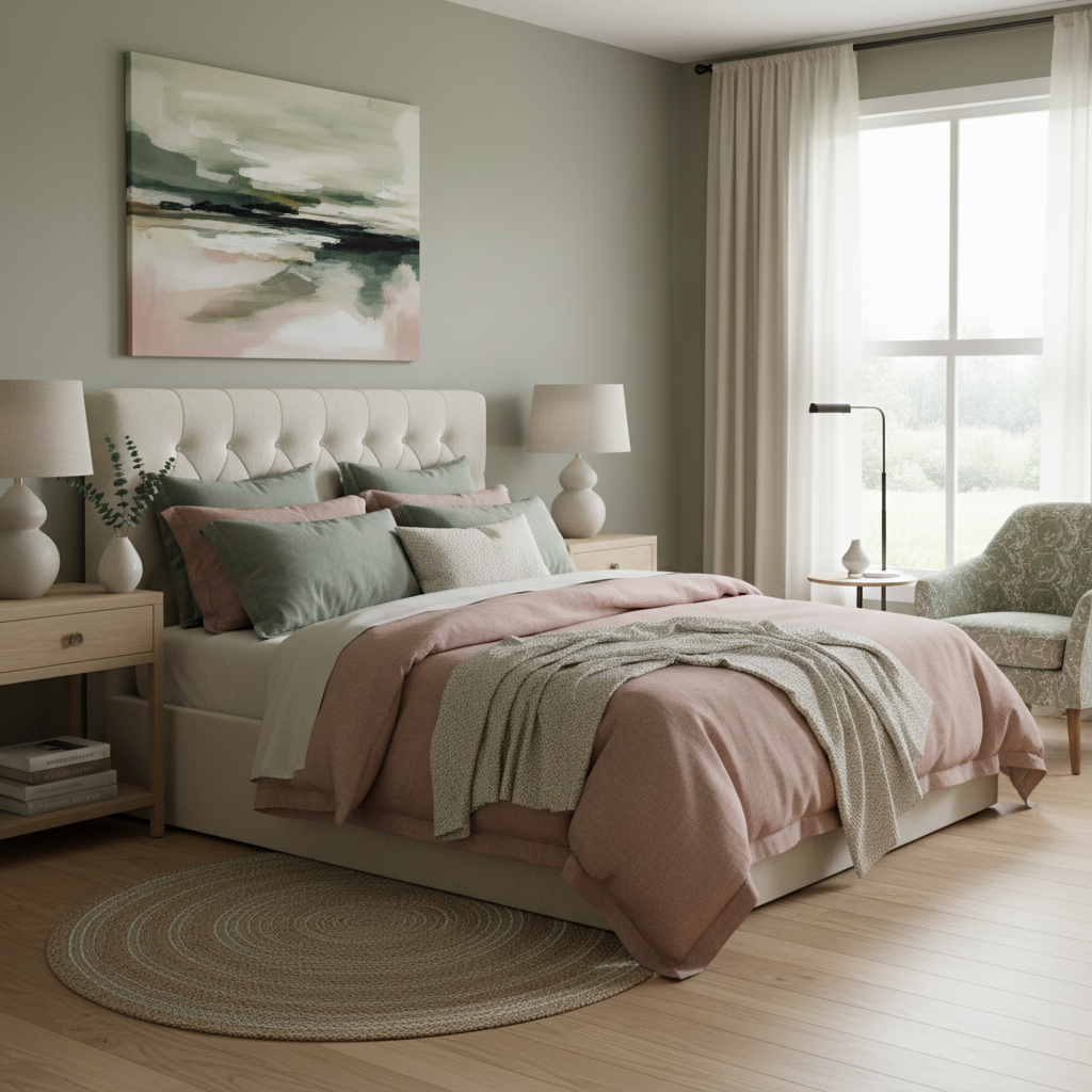
Color harmony is where things start to get really fun. This is the art of combining colors in ways that feel balanced and pleasing to the eye, and there are several tried-and-true methods for doing it. Honestly, learning these schemes is like getting a cheat code for decorating.
Let's talk about the most common ones. Complementary color schemes use two colors that sit directly opposite each other on the color wheel, like blue and orange or red and green. Used well, they're bold and energetic. Used badly, they're headache-inducing. The trick is usually to let one color dominate and use the other as an accent. Analogous schemes use colors that are next to each other on the wheel, like teal, blue, and navy. These feel naturally cohesive and calm, which is why they show up so often in spa-like bathrooms and serene bedrooms.
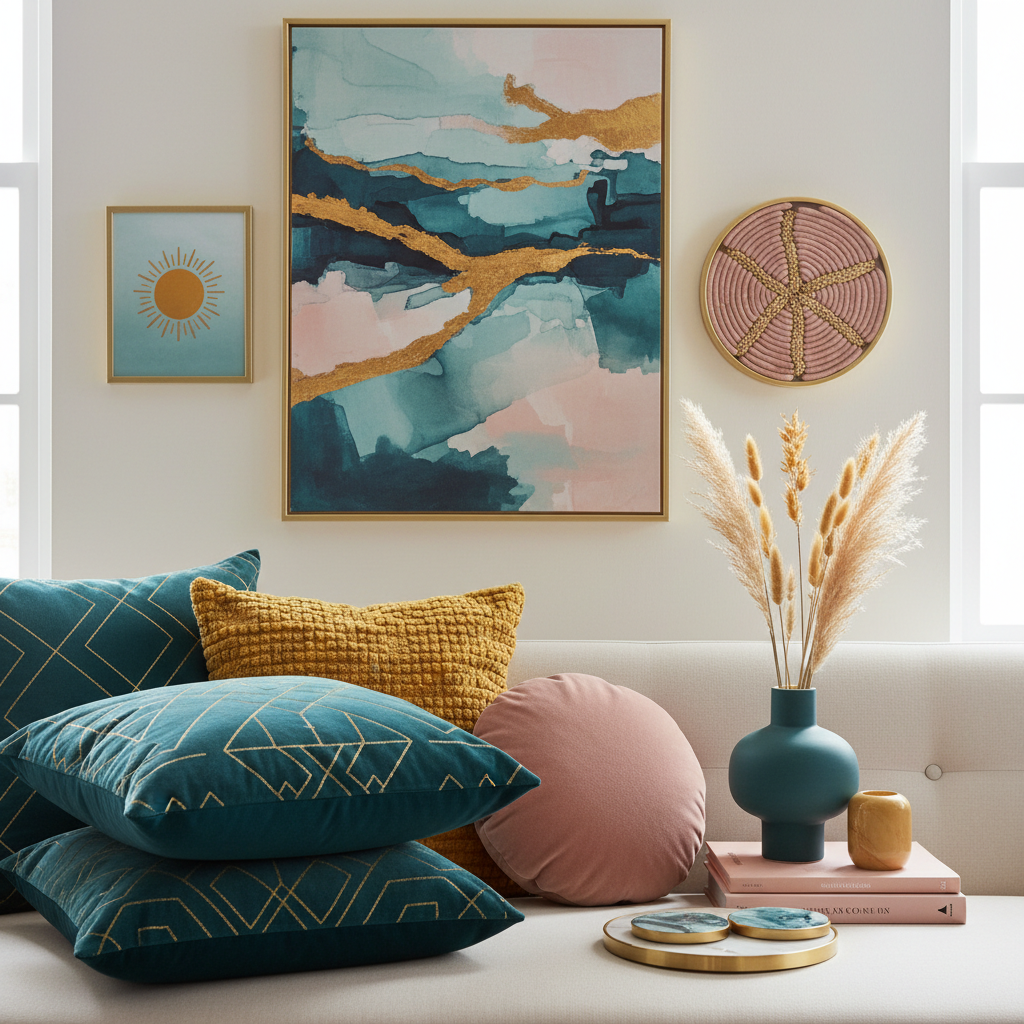
Then there's the triadic scheme, which pulls three colors that are equally spaced around the color wheel. Think yellow, red, and blue. These palettes are vibrant and playful but can be tricky to balance. And honestly, my personal favorite for interiors is the split-complementary scheme, where you take one base color and instead of using its direct complement, you use the two colors on either side of it. It gives you that contrast and visual interest without the intensity of a straight complementary pairing.
There's also the 60-30-10 rule, which is less about which colors you pick and more about how you distribute them. Sixty percent goes to a dominant color, usually your walls or large furniture. Thirty percent goes to a secondary color, often upholstery or rugs. Ten percent is your accent, showing up in pillows, artwork, and accessories. It sounds simple, but applying it consistently is what separates rooms that look designed from rooms that just look decorated.
- Complementary: High contrast, bold, best used with one dominant and one accent color
- Analogous: Cohesive, calm, naturally harmonious, great for relaxing spaces
- Triadic: Vibrant and balanced, requires careful proportion
- Split-complementary: Contrast without tension, very versatile for interiors
- 60-30-10: A distribution rule, not a color scheme, but essential for any palette
Using Color to Create Mood
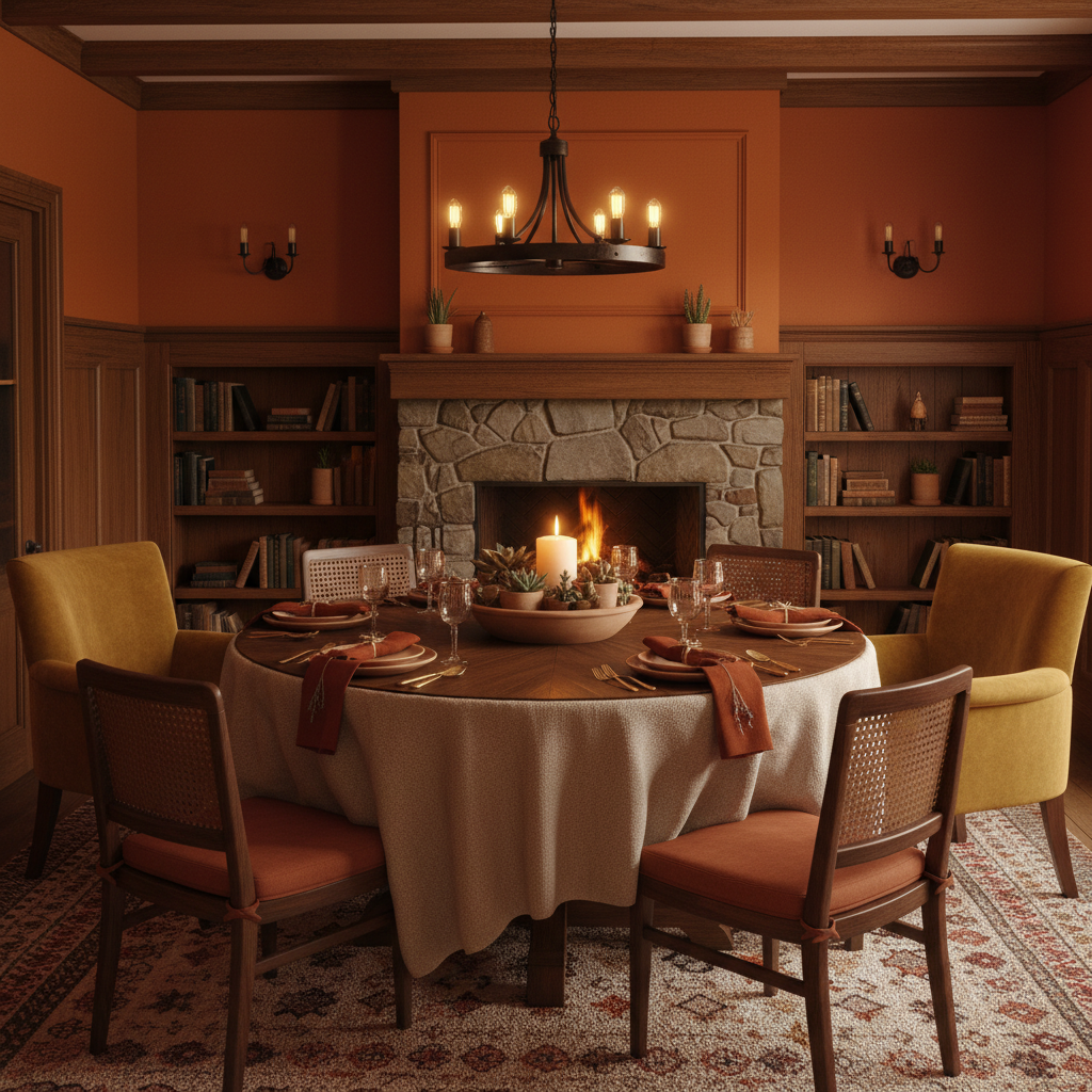
Real talk: color is one of the fastest ways to change how a room feels without touching a single piece of furniture. And this is where a lot of people get really excited, because suddenly you're not just decorating, you're actually engineering an experience. Every color you put on a wall or into a textile is sending a signal to the nervous system, whether you intend it to or not.
Let's walk through some of the most commonly used colors and what they actually do. Blues and blue-greens are reliably calming. They lower heart rate and blood pressure (there's actual research on this), which is why they dominate in bedrooms and bathrooms. Deep navy feels sophisticated and cocooning. Pale aqua feels fresh and airy. Dusty teal feels earthy and grounded. All three are blue-adjacent, all three do very different things in a room.
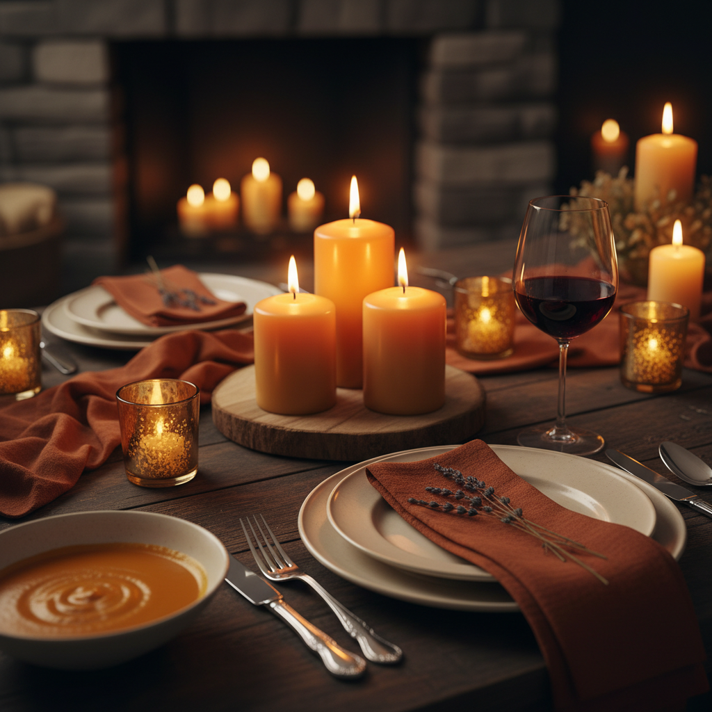
Warm tones like terracotta, rust, burnt orange, and deep red bring energy, warmth, and a sense of intimacy. They're perfect for dining rooms, living spaces where you want people to linger, or any room you want to feel like a hug. Just be thoughtful with saturation. A warm red at full intensity can feel aggressive. Dial it back to a clay or blush and it becomes welcoming.
Greens are having a massive moment right now, and for good reason. They connect us to nature, which genuinely reduces stress and mental fatigue. Olive greens, forest greens, sage, and moss all bring that biophilic quality to a space without needing to go full botanical garden. And honestly, green is one of those colors that works in almost every room in the house, which is rare.
Yellows and golds bring optimism and energy. Purples, depending on their depth, can feel either regal and moody or soft and romantic. The key is understanding that it's not just about which color you choose, but about the value and saturation you choose within that color. A pale lavender and a deep plum are worlds apart in terms of mood, even though they're the same hue family.
The Psychology of Color in Design
This is the deep cut, the stuff that separates good design from truly great design. Color psychology looks at how colors affect human behavior, cognition, and emotion, and applying it to interiors means you're designing spaces that actually serve the people living in them. Not just spaces that look good in photographs.
Take kitchens, for instance. Studies have shown that warmer colors can stimulate appetite, which is one reason why so many restaurant chains use red and yellow in their branding. In a home kitchen, you probably don't want to go full fast food, but a warm cream, soft terracotta, or buttery yellow can make the space feel more inviting and, yes, maybe get people a little more excited about eating there. On the flip side, cool blues in a kitchen can actually suppress appetite slightly, which is something to consider depending on your goals.
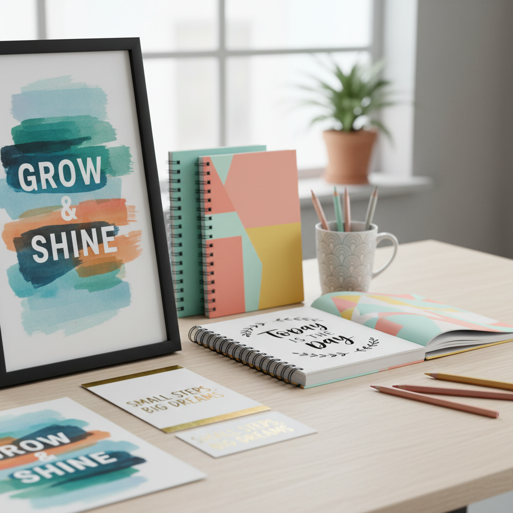
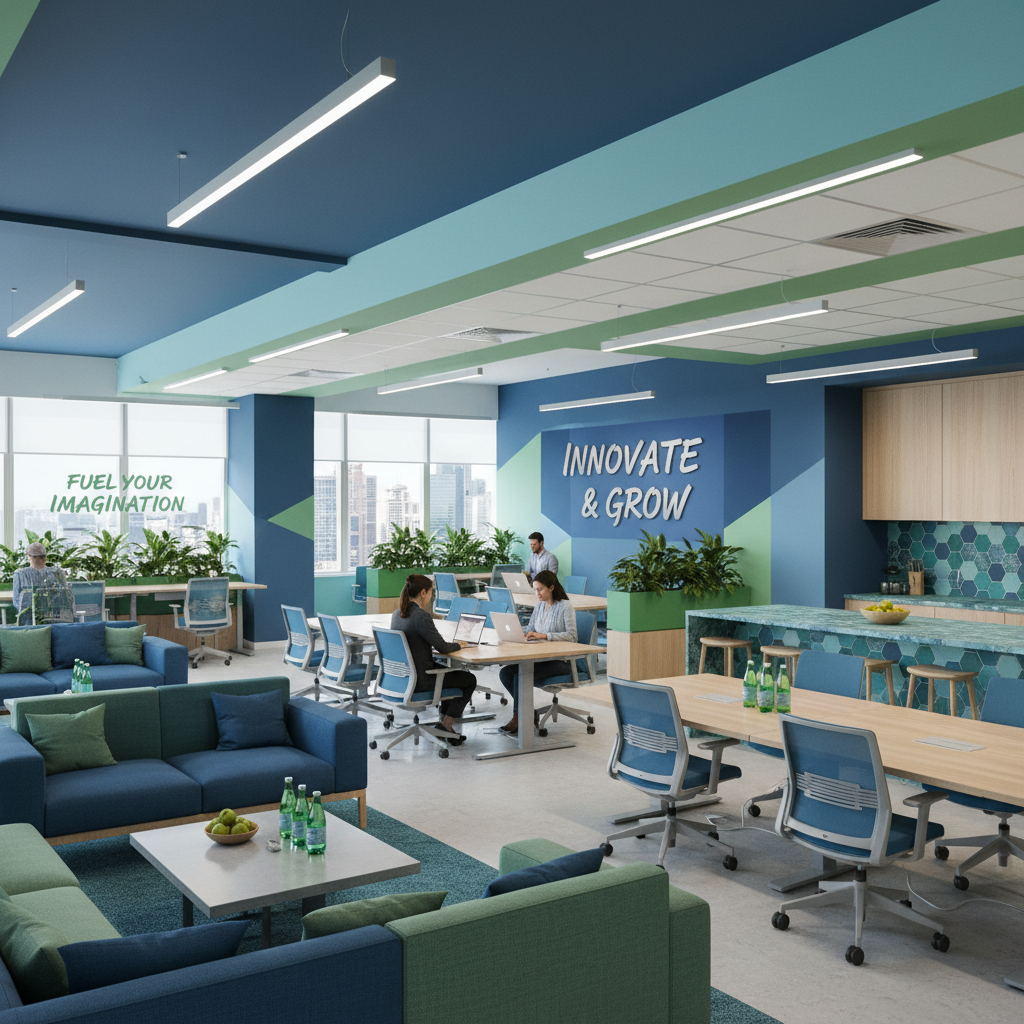
Home offices are another fascinating case. Look, if you work from home, your color choices matter more than you might think. Blues and greens tend to support focus and calm, which makes them solid choices for a workspace. But if your work is creative, some research suggests that warmer or more varied palettes can actually stimulate creativity and lateral thinking. This is why you'll see a lot of designers go with a warm neutral base in creative studios, then layer in punchy accents that keep the brain engaged.
Children's rooms are often painted in bright primaries, and while that's fine for stimulation, there's growing awareness that overly stimulating environments can make it harder for kids to wind down at bedtime. Softer versions of those same colors, a dusty blue instead of electric blue, a warm blush instead of hot pink, can give the same playful energy without the sleep-disrupting intensity. It's all about saturation, and honestly, this is one of the most practical applications of color psychology you can make in a family home.
"Color is a power which directly influences the soul. Color is the keyboard, the eyes are the hammers, and the soul is the piano with many strings.", Wassily Kandinsky
Color Trends to Watch
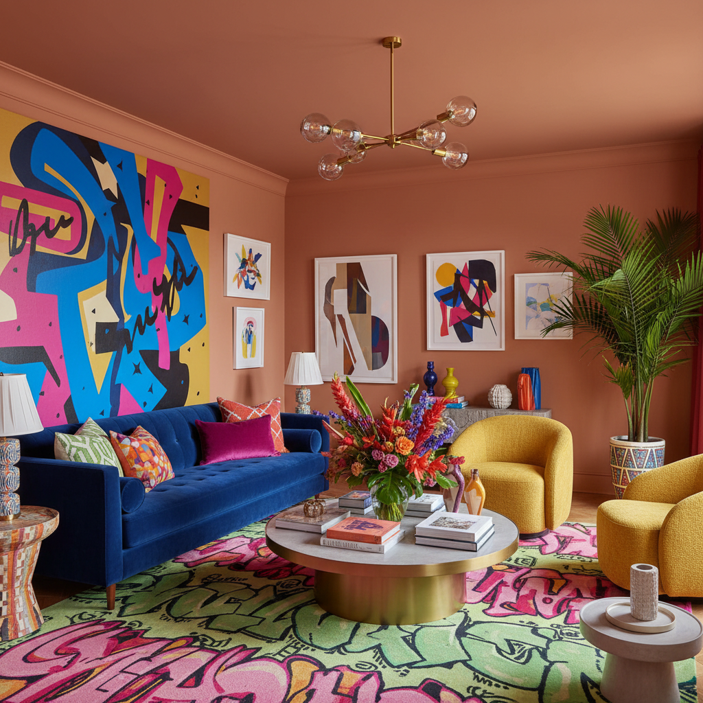
Trends come and go, and honestly, I'd always tell you to put personal taste and practicality above trend-chasing. That said, paying attention to what's happening in the design world gives you a pulse on the cultural moment, and sometimes the trends genuinely reflect a shift in how we want to live. Right now, there are a few really interesting color directions worth knowing about.
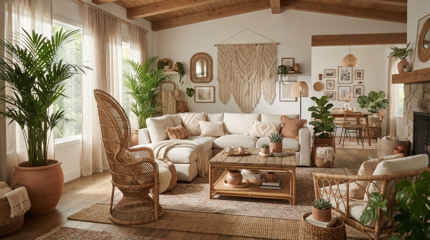
Earthy, warm neutrals have completely taken over from the cool grays that dominated the 2010s. Think warm whites, mushroom tones, camel, raw linen, and aged terracotta. These colors feel grounded and human. They photograph beautifully, they're easy to live with, and they pair well with natural materials like wood, rattan, and stone. If you're repainting any room right now, an earthy warm neutral is probably your safest, most future-proof bet.
Deep, moody greens are everywhere, from forest green kitchen cabinetry to hunter green velvet sofas to sage-painted ceilings. Green feels both contemporary and timeless, which is a rare quality in a trend color. It works in both modern and traditional spaces, it photographs well, and it ages gracefully. This one isn't going away anytime soon.
There's also a growing interest in unexpected bold accents, like electric blue, cobalt, saturated coral, and even bright chartreuse, used sparingly against those earthy neutral backdrops. One bold chair, one painted door, one striking piece of art. The contrast is intentional and the restraint is what makes it work. And finally, warm blacks and near-blacks (think charcoal, off-black, deep espresso) are being used more confidently on walls, especially in studies, dining rooms, and bedroom feature walls, creating that cocooning, intimate effect that feels luxurious without being fussy.
Practical Tips for Choosing Colors
Alright, here's where we get into the actual doing of it, because all the theory in the world means nothing if you freeze up in front of a wall of paint swatches. And look, that happens to everyone. Even designers. The options are genuinely overwhelming. So let me give you some practical, real-world guidance that actually helps.
Always test before you commit. This sounds obvious but so many people skip it. Buy a small sample pot and paint a large swatch directly on your wall, at least A4 size, ideally bigger. Look at it in morning light, afternoon light, and artificial evening light. Colors shift dramatically depending on light conditions, and what looked perfect on the chip might be a disaster on your wall. Warm yellowy light makes some colors glow and makes others look muddy. Natural north light is the most honest but also the coolest, so colors can look colder than expected.
- Start with a fixed element you can't change, a sofa, a rug, artwork, and build the palette from there
- Use the 60-30-10 rule to distribute your chosen colors intentionally throughout the room
- Don't forget the fifth wall, your ceiling, which can be painted in a tinted version of your wall color for a cohesive, enveloping feel
- Consider undertones carefully, especially in whites and neutrals, a "white" with a pink undertone will clash with a "white" with a green undertone
- Bring fabric and material samples together with your paint swatches before you decide, colors behave differently on matte walls versus shiny tiles versus fabric
Here's the thing about undertones that trips up a lot of people. Every single paint color has an undertone, even whites, even grays, even beiges. That undertone is what makes colors either clash or sing together. A warm gray with a brown undertone will fight with a cool gray with a blue undertone, even if they're at the same value. This is why rooms can sometimes feel off without any obvious reason. Getting your undertones aligned throughout a space is honestly one of the most transformative things you can do.
Also, don't underestimate the power of finish. The same color in a flat matte versus a satin versus a high gloss will look and feel completely different. Matte absorbs light and feels soft, modern, and forgiving of wall imperfections. Satin reflects a little and is practical in high-use areas. Gloss bounces light aggressively and is best reserved for trim, doors, or specific feature applications. Choosing the right finish is almost as important as choosing the right color, and it's a detail that gets overlooked constantly.
Final Thoughts
Color is one of the most accessible tools in interior design, and also one of the most underestimated. It doesn't cost a fortune to repaint a room. It doesn't require a renovation. But the right color choices can make a space feel bigger, calmer, more energetic, more luxurious, or more personal, sometimes all at once. That's a genuinely powerful thing.
The best advice I can give you is to stop being afraid of it. Yes, there's a lot of theory here, and yes, there are rules worth knowing. But the rules exist to help you, not to box you in. Once you understand why certain combinations work, you'll feel way more confident breaking them when the moment calls for it. And honestly, that's when the really interesting spaces get made.
Take your time, test everything, trust your instincts, and don't let anyone tell you there's only one right answer. Color is personal, contextual, and endlessly interesting. Welcome to the best rabbit hole in design.
More in Interior
Stay Inspired
Subscribe for new essays on architecture, design, and the spaces that shape us.