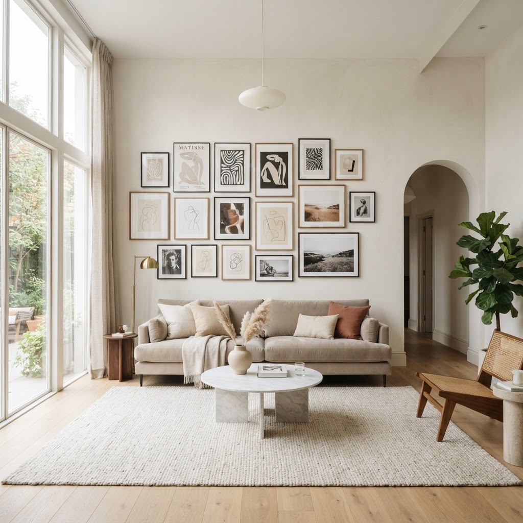
Stop Guessing: How to Arrange Wall Art Like a Pro Designer
Struggling to fill your walls without making them look cluttered or chaotic. Learn the simple grid systems and balancing techniques that interior designers use to create perfectly curated art galleries in every room.
The Golden Rule of Eye Level
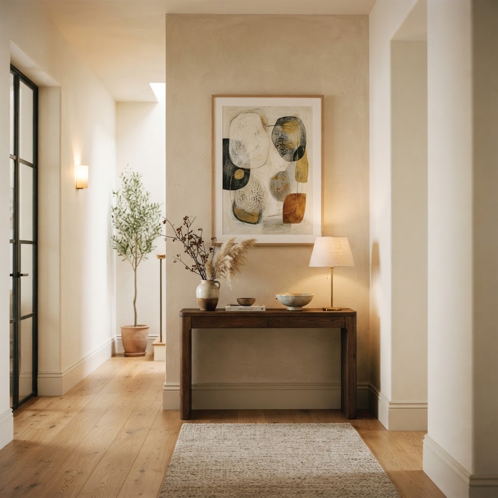
Okay, let's just start here because this is the mistake I see in literally every other home I walk into. People hang their art too high. Way too high. Like, it's up near the ceiling and your neck hurts just trying to look at it. Honestly, this one habit is responsible for more awkward-looking rooms than anything else in interior design.
The golden rule is simple: the center of your artwork should sit at roughly 57 to 60 inches from the floor. That's average eye level for most people, and it's the standard that museums and galleries actually use. There's a reason art feels so comfortable and natural in those spaces, and this is a big part of it. When art is hung at the right height, it feels like it belongs. When it's too high, it feels like an afterthought.
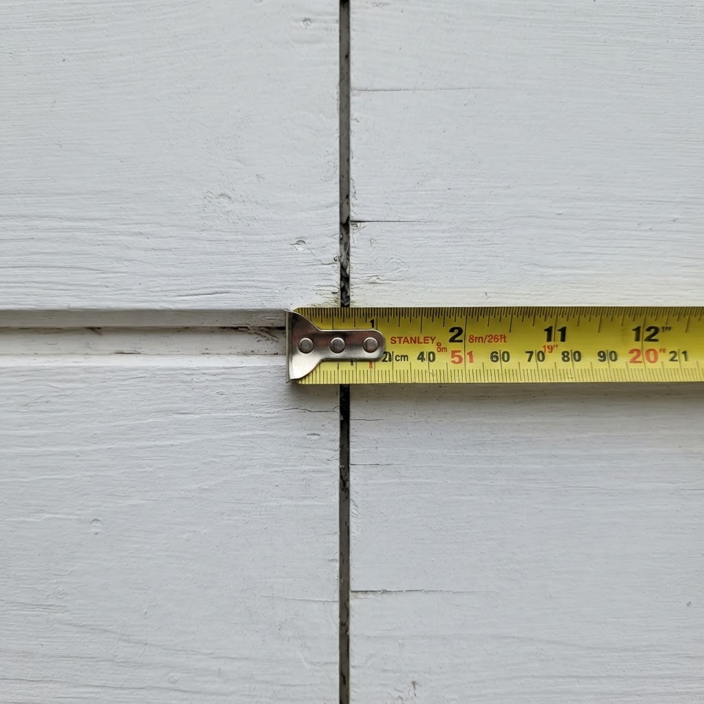
Here's the thing though: this rule has a really important exception. When you're hanging art above furniture, like a sofa or a console table or a bed, you shift your reference point. Instead of measuring from the floor, you want the bottom edge of the frame to sit about 6 to 8 inches above the top of the furniture. This creates a visual connection between the piece and the surface below it, making both feel intentional rather than random.
I always tell people to grab a sticky note, mark it at 57 inches on the wall, and just stand back and look before you ever pick up a hammer. Your gut will usually confirm it. Trust me on this, that five-minute exercise saves so many unnecessary holes in drywall. And look, if you're tall, you can nudge it up a couple of inches. If your ceilings are particularly low, come down a bit. The rule is a starting point, not a prison sentence.
The reason this matters so much goes beyond just aesthetics. It's about how humans experience space. Art hung at the right height invites you in, draws your eye naturally around the room, and makes a space feel considered. Art hung too high creates a disconnect, like the room is shouting at you instead of having a conversation with you. Get this right first, and everything else becomes easier.
Mastering the Perfect Grid
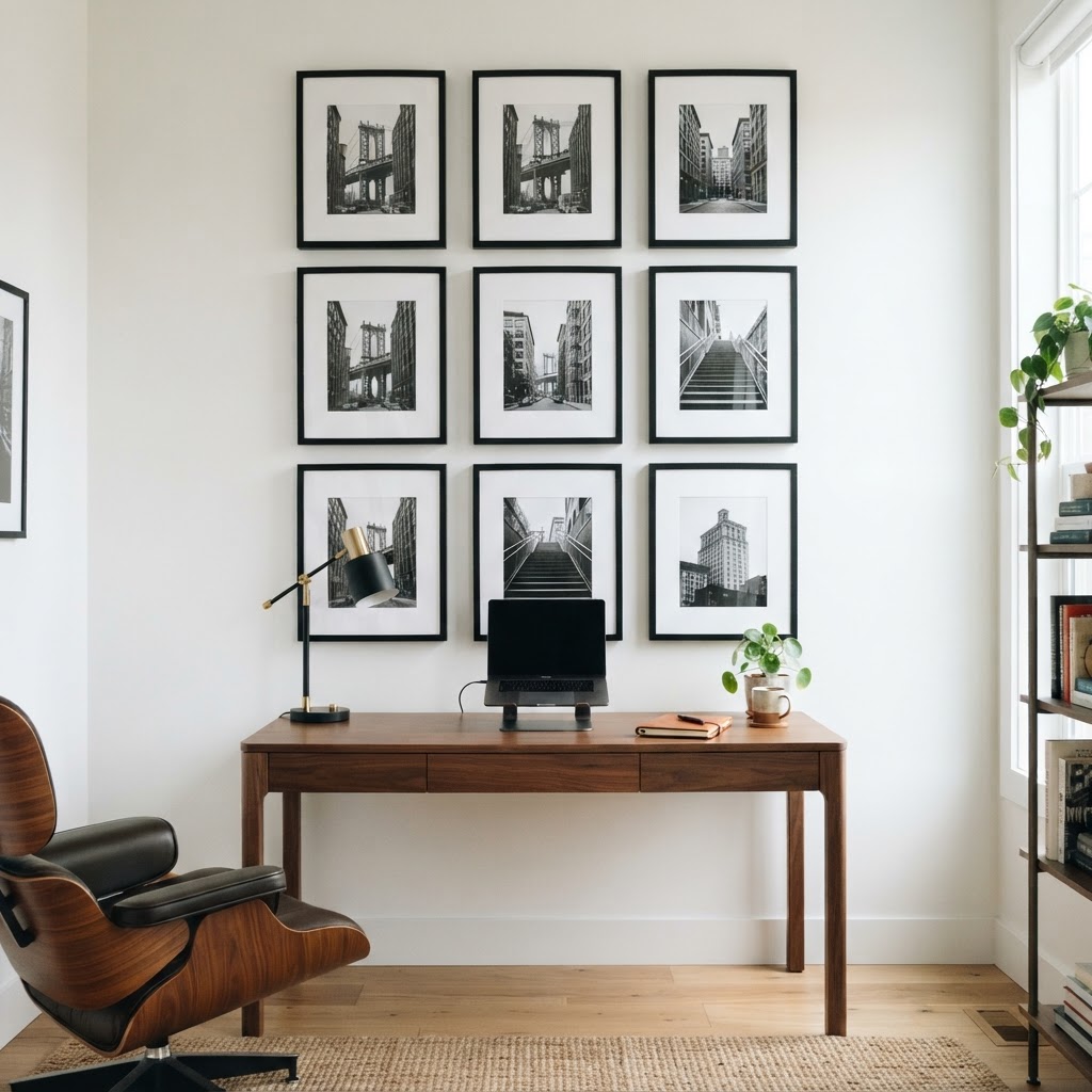
Grid arrangements look incredibly clean and polished, and honestly, they're more forgiving than people think. The key is consistency. You need matching frames, matching spacing, and a commitment to keeping everything uniform. When those three things line up, a grid wall looks like it was done by a professional. When even one of them goes off, the whole thing starts to look a little chaotic.
Start by deciding on your spacing. Two to three inches between frames is a sweet spot for most grids. Too close and it feels cramped, too far and it loses that cohesive gallery feel. Lay everything out on the floor first, I cannot stress this enough. Spend time on the floor arrangement before you even think about the wall. Take a photo of it on your phone so you have a reference. This sounds fussy but it genuinely changes the outcome.
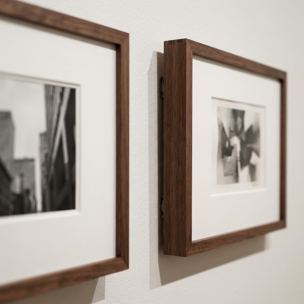
Real talk: the easiest way to execute a grid perfectly is to use paper templates. Trace each frame onto kraft paper, cut it out, label it, and tape the templates to the wall with painter's tape. You can shuffle them around, step back, adjust, and only start nailing when you're genuinely happy with it. This method takes maybe 20 extra minutes and it's the difference between a grid that looks intentional and one that looks like you were guessing.
Grids work especially well with black and white photography, botanical prints, or any collection of images that share a color palette. The repetition in the format lets the content of the images shine without the arrangement itself becoming a distraction. A four-by-two grid of family photos in matching black frames over a console table? That's a look that never goes out of style, and it's genuinely not that hard to pull off once you know the mechanics.
- Use identical frames for the cleanest result, even if the artwork inside varies.
- Keep spacing consistent, both horizontally and vertically, for a sharp, tailored look.
- Always measure from the center of the grid arrangement outward, not from one corner.
- Odd numbers like a three-by-three work beautifully, but even numbers feel more structured and formal.
Creating Balance with Asymmetry
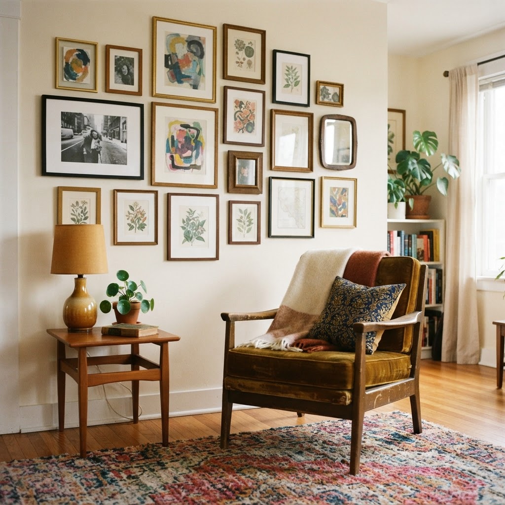
Here's where a lot of people get tripped up. They want the loose, collected, eclectic gallery wall look they see on design blogs and Instagram, but every time they try it at home it just looks messy. The difference between a beautifully balanced asymmetrical arrangement and a chaotic one is not luck. It's an understanding of visual weight.
Visual weight is basically how heavy something looks, regardless of its actual size. A dark, dramatic painting carries more visual weight than a light, airy sketch of the same physical dimensions. A large frame carries more weight than a small one. When you're building an asymmetrical arrangement, you're essentially playing a balancing game where you offset heavier pieces with clusters of lighter ones. It sounds more complicated than it is.
The practical trick I use is to anchor one side with your largest or darkest piece, then build outward and upward with progressively smaller or lighter pieces. Keep the overall shape of the arrangement roughly rectangular or slightly organic, but not spiky or jagged at the edges. Ragged edges are what make an asymmetrical arrangement look unfinished rather than intentional.
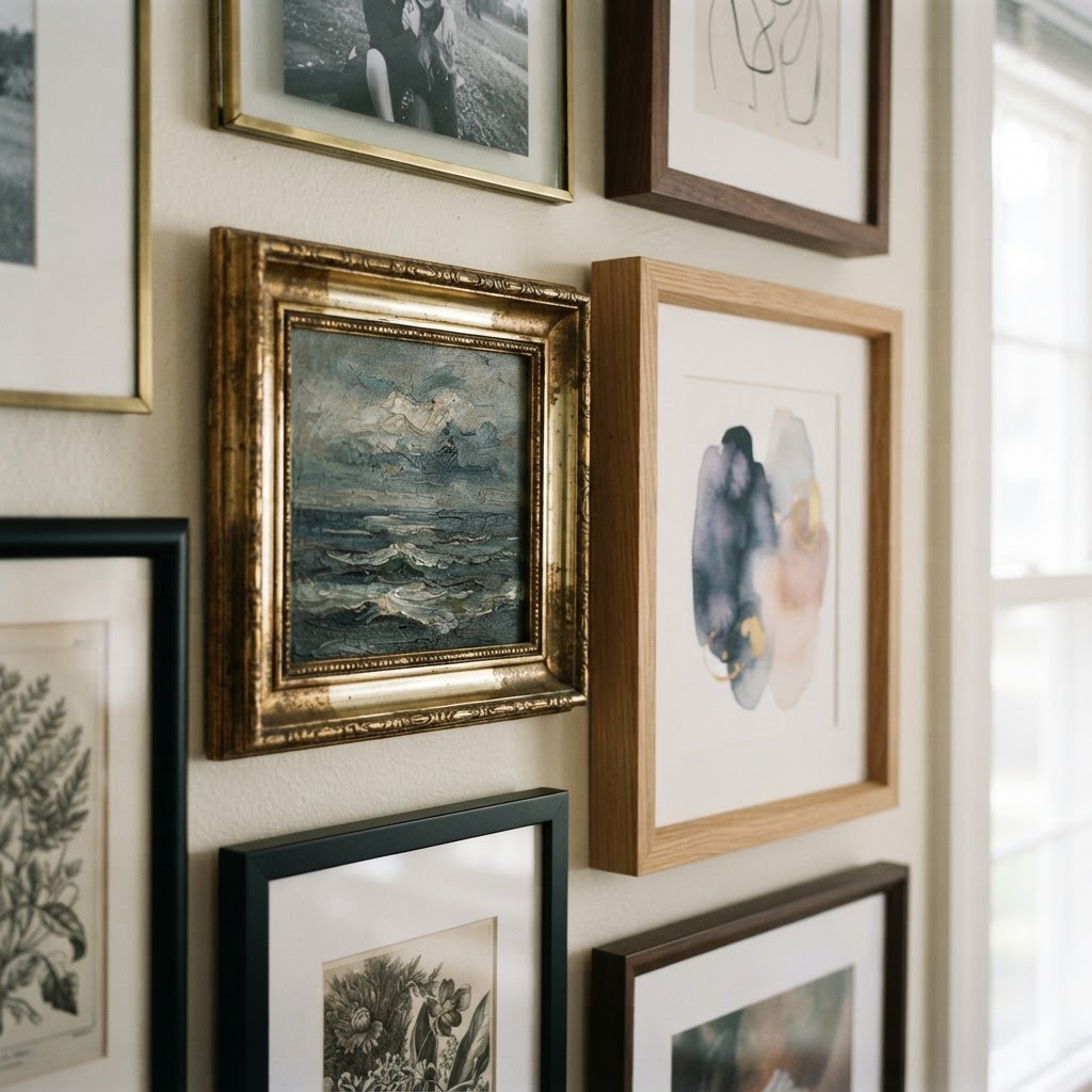
And honestly, mixing frame styles works here in a way it doesn't in a grid. You can combine wood, metal, and painted frames as long as you stick to a general color story. All warm tones, or all cool tones, or a mix that leans in one direction. What kills an eclectic arrangement is when everything is fighting for attention with no common thread connecting it. Give your eye somewhere to rest, even in the middle of variety.
"Asymmetry isn't the absence of order. It's a more sophisticated kind of order, one that rewards a slower, more attentive eye."
Choosing Your Anchor Piece
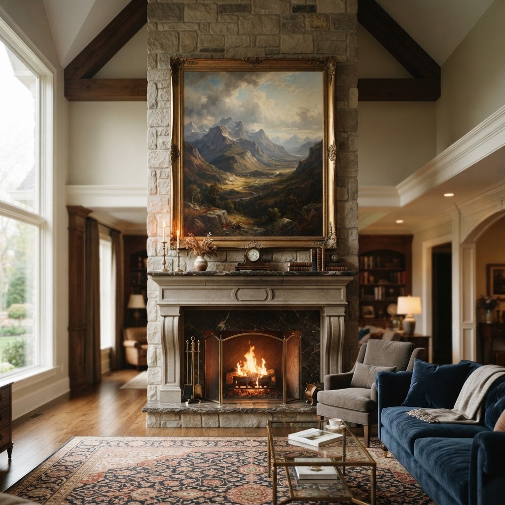
Every great wall arrangement has an anchor. One piece that's the star, the one your eye goes to first, the one that everything else orbits around. Without an anchor, you get that feeling where a wall is "busy" but somehow empty at the same time. You've felt that before in someone's home and couldn't quite put your finger on why it felt off. Nine times out of ten, it's because there's no anchor.
Your anchor piece should be the largest item in the arrangement, and it should ideally speak to the color palette or mood of the whole room. It doesn't have to be expensive. I've seen a beautiful oversized art print in a simple frame do more for a living room than a collection of small, precious originals scattered randomly. Scale matters more than price, always.
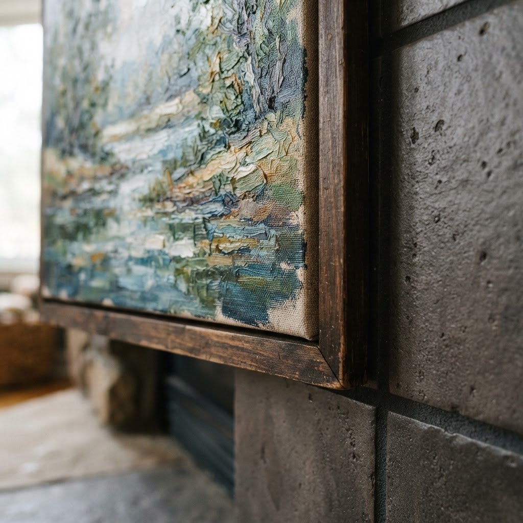
When you're positioning your anchor, place it first and build the rest of the arrangement around it. Don't try to find an anchor for a finished arrangement after the fact, it almost never works. The anchor defines the center of gravity for the whole wall, so it needs to go up first. Everything else gets positioned in relationship to it, above, below, left, right, always in conversation with that central piece.
Think about what your anchor piece is actually saying. Abstract art with bold colors brings energy and personality. Black and white photography feels timeless and calm. A large botanical print is fresh and organic. Your anchor sets the emotional tone for the whole space, so choose something you genuinely love, not just something you think you're supposed to have. Real talk: no design rule is worth living with art you don't actually respond to.
- Size matters: your anchor should be noticeably larger than the supporting pieces around it.
- Position it first before adding anything else to the wall.
- Let it connect to at least one color or texture already present in the room.
- Choose something personal because rooms with soul always have art that means something to the person living there.
- Don't overthink the style: the anchor just needs to feel right for the room, not match a trend.
Playing with Depth and Dimension
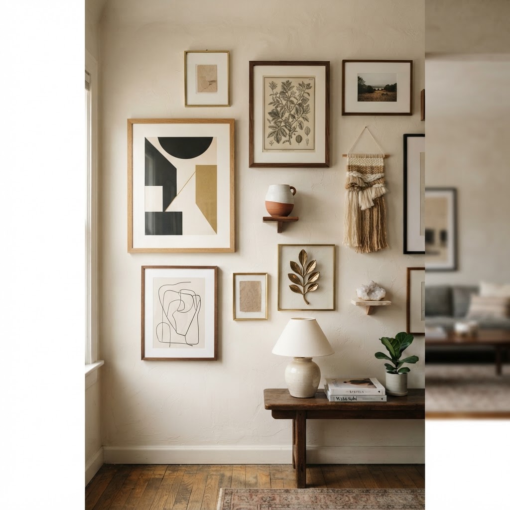
This is the step that separates a good wall from a truly great one, and it's the one most people skip entirely. Flat art is wonderful, but when you introduce depth and dimension into an arrangement, the whole thing comes alive in a way that flat art alone just cannot achieve. We're talking about mixing two-dimensional pieces with three-dimensional objects, and it's honestly one of the most fun parts of the whole process.
Think about what you can add beyond framed prints and canvases. Woven wall hangings, sculptural wall objects, ceramic plates, mirrors, shadow boxes, small shelves with objects on them. Any of these can be incorporated into a wall arrangement and they all add physical depth that creates shadow, texture, and a sense of layering that makes a wall feel truly curated rather than just decorated.
The trick is to keep the three-dimensional objects anchored visually within the arrangement, not floating off to the side or sitting at the top where they look disconnected. Treat them exactly like you would a piece of art: think about their visual weight, their color, their relationship to the pieces around them. A beautiful ceramic wall piece next to a framed print creates a conversation between the two that's genuinely compelling to look at.
Honestly, even varying the depth of your frames makes a difference. Deep box frames on some pieces, flat frames on others, floating canvas mounts alongside matted prints. These small variations in how far each piece projects from the wall create a subtle layered quality that you notice without necessarily being able to name. It's one of those things where you walk into a room and think "this feels so considered" without quite knowing why. Now you know why.
You can also layer art against architectural elements like ledges, mantels, or shelves, leaning some pieces instead of hanging all of them. Leaned art feels relaxed and easy to change, and it adds another layer of depth because pieces at the back sit further from the wall than ones leaning against them in front. This approach is especially useful if you love rearranging things seasonally, because you're not committing every change to a new hole in the wall.
Final Thoughts
Look, hanging wall art well isn't some mysterious skill that only trained designers possess. It's a handful of principles that, once you understand them, completely change how you see and approach every wall in your home. Start at eye level, decide on your arrangement style, find your anchor, and then push yourself that one step further with depth and dimension.
The biggest thing I want you to take away from all of this is that there's no single right answer, but there are definitely wrong ones, and most of them come from rushing. Slow down, lay things out, use paper templates, take photos before you commit. The homes that look the most effortlessly beautiful are almost always the result of someone who took their time and made deliberate choices at every step.
And honestly? Your taste is valid. Use these principles as a framework, not a rulebook. The best wall you'll ever create is one that reflects you, arranged with a little know-how behind it. Now go make some holes in some drywall. Confidently, this time.
More in Interior
Stay Inspired
Subscribe for new essays on architecture, design, and the spaces that shape us.