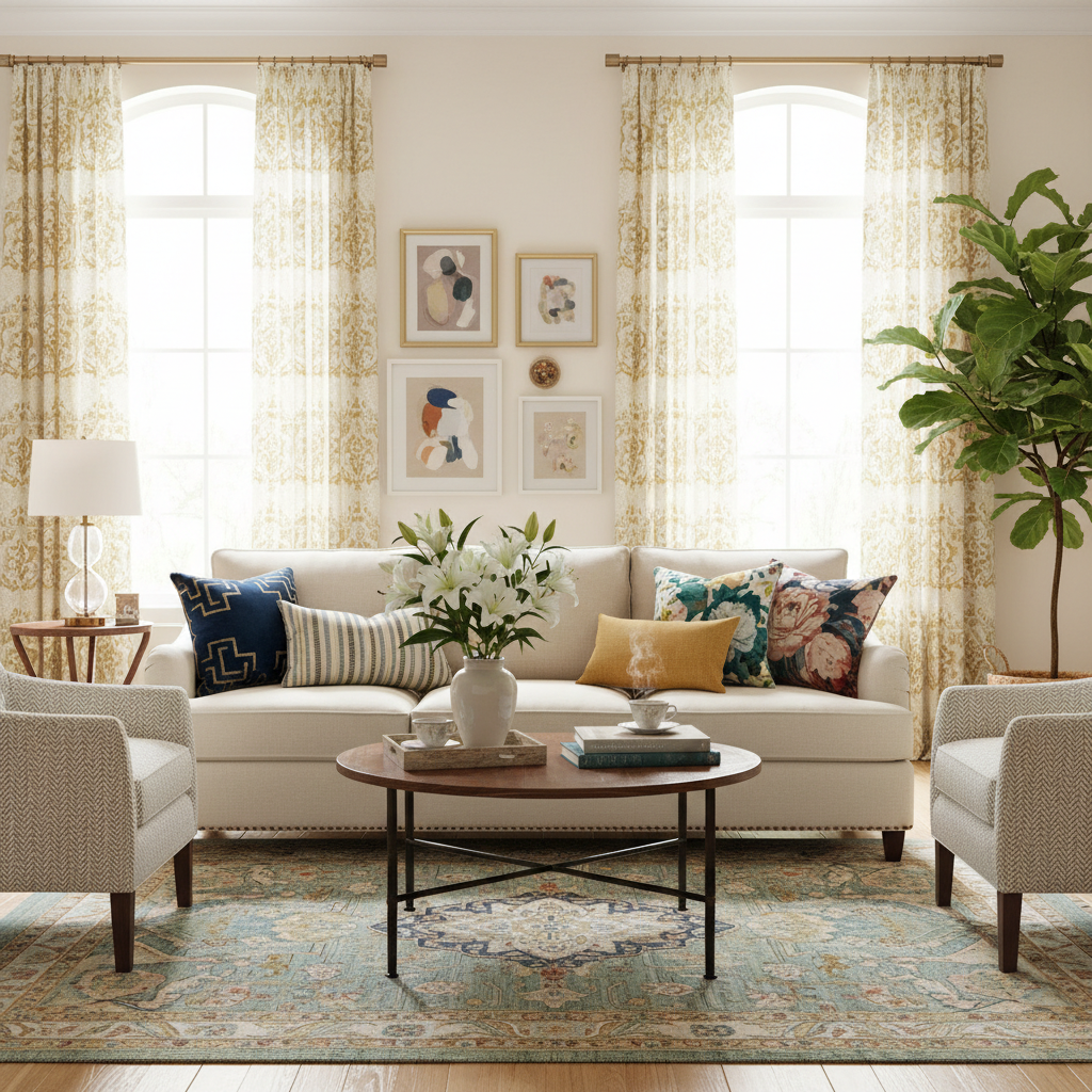
Mastering the Art of Pattern Mixing: Stylish Tips for Your Home
Struggling with how to mix patterns without creating chaos in your home? You're not alone! In this post, we'll share easy-to-follow tips that will help you achieve a harmonious and stylish look with patterns like a pro.
Understanding the Basics of Pattern Mixing
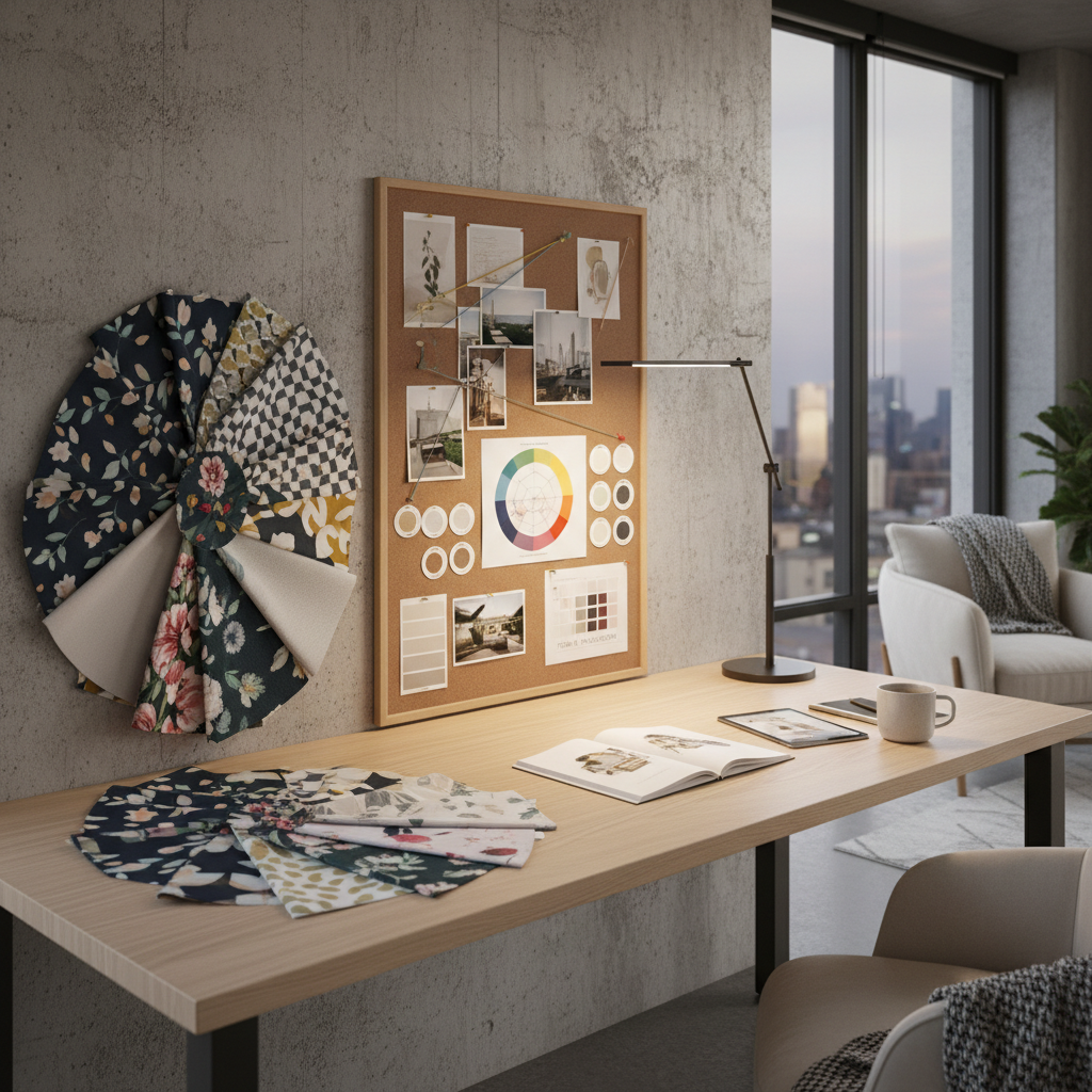
Okay, so here's the thing about pattern mixing: most people are terrified of it. They walk into a store, they see a gorgeous striped pillow sitting next to a floral cushion, and their brain immediately screams "absolutely not." I get it. It feels risky. But honestly, mixing patterns is one of the most rewarding things you can do for a space, and once you understand the basic logic behind it, it starts to feel a lot less like gambling and a lot more like playing.
The fundamental idea is that patterns are not enemies. They're more like a cast of characters in a story, and your job is to make sure they all belong in the same universe. Every room tells a story, and patterns are part of the vocabulary. Stripes, florals, geometrics, paisleys, plaids, abstracts, all of them have their own energy, their own weight. The trick is learning how to let them coexist without any one of them screaming over the others.
Let's start with the golden rule that every designer seems to agree on: vary your pattern types but keep them connected through color. That means you don't want three florals competing in the same room, but you absolutely can have a floral, a stripe, and a geometric living together happily if they share a common color thread. Think of it like a band. You don't want three lead singers. You want a drummer, a bassist, a guitarist, and then one person out front taking the spotlight.
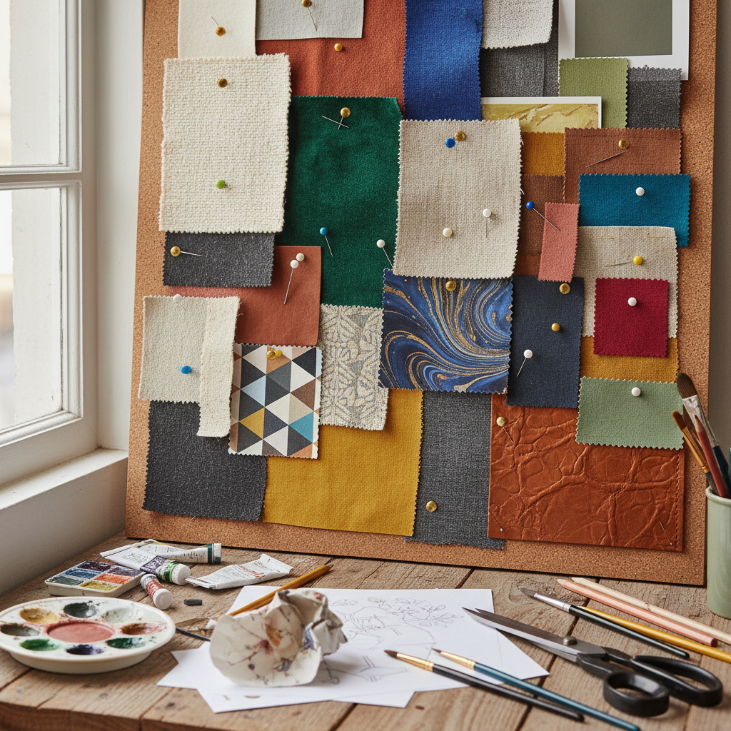
Another basic concept to wrap your head around early is the idea of visual weight. Some patterns feel heavy, bold, and dominant. A large-scale black and white check, for example, commands attention. Others are light and airy, like a tiny ditsy floral in soft pastels. Balancing these weights across a room is how you avoid chaos. If everything is screaming, nothing is interesting. Real talk, a lot of beginner mistakes come from stacking too many high-energy patterns in one place without anything to quiet them down.
And honestly, before you do anything else, I'd suggest just starting to notice patterns in spaces you love, whether that's in a magazine, a hotel lobby, or a friend's living room. Train your eye before you train your wallet. You'll start picking up on the rhythm of how good pattern mixing works almost instinctively once you pay attention to it for a while.
Choosing the Right Patterns: Scale and Style
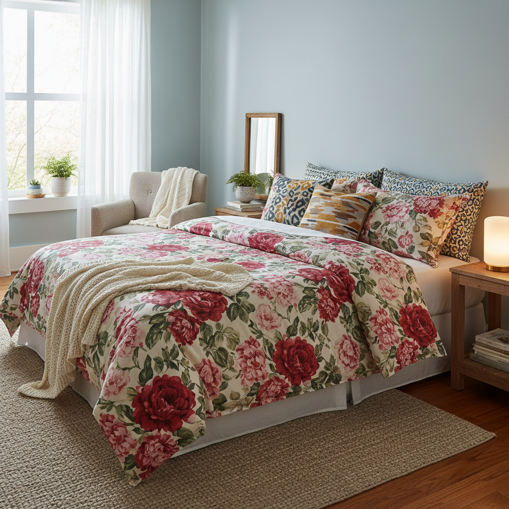
Scale is honestly the most underrated concept in the whole pattern mixing conversation. I say this because it's the one thing that can make or break a room faster than almost anything else. Get the scale right and your room feels intentional and layered. Get it wrong and it just looks confused, like someone threw everything at the wall and hoped for the best.
Here's how to think about scale: aim for at least three different pattern scales in any given room. A large-scale pattern, a medium-scale pattern, and a small or fine-scale pattern. The large one is usually your anchor, maybe it's the curtains or the area rug. The medium-scale pattern works as the bridge, often showing up on upholstered furniture or a statement throw. And the small pattern fills in the details, showing up on accent pillows, lampshades, or smaller decorative objects. When you layer them this way, the eye has places to travel and rest without ever getting overwhelmed.
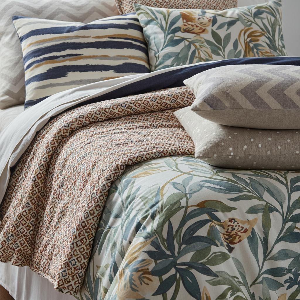
Style cohesion matters just as much as scale. Look, you can mix a ton of different patterns, but if they come from completely opposing design worlds, the room will feel incoherent. A super traditional chintz floral sitting next to a hard-edged industrial geometric can work, but it requires a deliberate hand and a strong point of view. For most of us, it's easier to mix patterns that share a similar stylistic DNA. Bohemian patterns tend to play well with other bohemian or globally inspired prints. Classic patterns like ticking stripes, houndstooth, and toile tend to get along beautifully together in a more traditional space.
That said, mixing style families is not off limits. It's just a higher difficulty level, and you need to be confident about it. The key is finding a bridge element, usually a color, a motif, or even a finish, that connects the two worlds and makes the combination feel curated rather than accidental. Trust me on this: intentionality is everything. Two wildly different patterns can work together if there's clearly a reason they're both in the room.
Color Coordination: Keeping it Cohesive
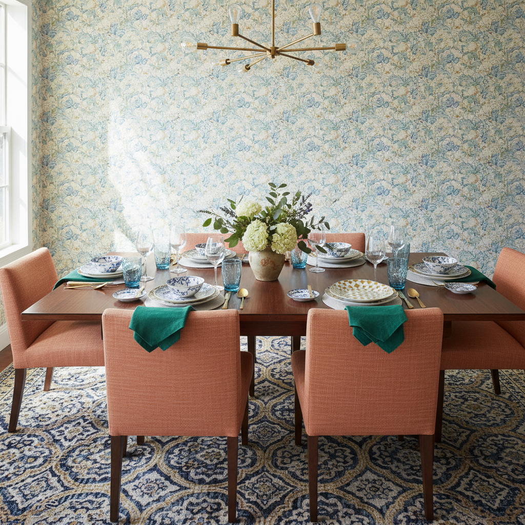
If scale is the skeleton of pattern mixing, color is the glue. This is where the magic really happens, and honestly it's also where most people overthink things and end up doing nothing at all. Let me simplify it for you. Pick a color palette first, then find patterns within that palette. It sounds obvious when you say it out loud, but you'd be amazed how many people do it backwards, picking patterns they love and then wondering why the room feels all over the place.
A good working rule is to limit yourself to three to four main colors across all your patterns. One dominant color, one or two secondary colors, and one accent that pops. When every pattern in the room pulls from this same set of colors, even wildly different prints start to feel like they belong together. It's genuinely one of those tricks that makes people say "how did you do that?" and the answer is honestly just a little bit of color discipline.
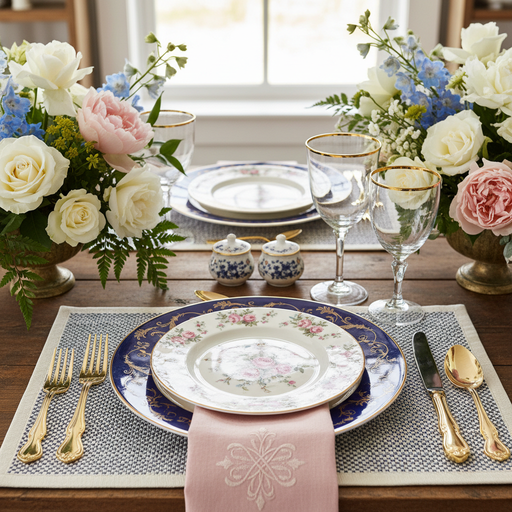
Don't be afraid of neutrals here either. Neutrals are your best friend in a pattern-heavy room. A white, cream, or linen-toned pattern, like a simple stripe or a subtle textured weave, acts as a visual breath in between more expressive prints. It lets the eye reset. Same goes for solid fabrics and surfaces. A solid-colored sofa surrounded by patterned pillows and a patterned rug is usually a smarter move than a patterned sofa trying to compete with everything else around it.
One more thing on color: pay attention to the temperature of your colors. Warm tones (reds, oranges, yellows, warm browns) and cool tones (blues, greens, grays, purples) can absolutely coexist in a room, but they need to be balanced thoughtfully across your patterns. A room where all the warmth is concentrated in one area and all the cool tones are in another will feel oddly split, almost like two separate rooms that got pushed together.
Creating Focal Points with Patterns
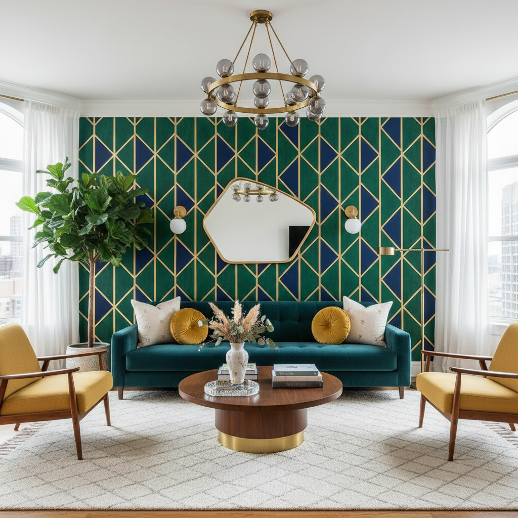
Here's something designers do that most people don't think about consciously: they use pattern to direct attention. In any well-designed room, there's a hierarchy. There's something you're supposed to look at first, then second, then third. Pattern is one of the most powerful tools for building that hierarchy because it catches the eye almost involuntarily.
Your focal point pattern should be your boldest, most visually exciting choice. This might be a large-scale wallpaper on a single accent wall. It could be a dramatic area rug with a strong geometric or organic print. It might be an upholstered headboard in an eye-catching fabric that anchors the whole bedroom. Whatever it is, this is your hero piece, and everything else in the room should support it rather than compete with it.

Once your focal point is established, the other patterns in the room take on supporting roles. These are your quieter prints, your stripes, your small-scale textures, your subtle repeats. They add depth and interest without pulling focus away from the star of the show. Think of it like staging a theater production. The lead actor needs the spotlight, and everyone else on stage makes them look better without stepping on their moment.
One technique I love is using pattern to reinforce the architecture of a space. A bold striped wallpaper in a narrow hallway can make the ceiling feel higher. A large-scale pattern on a low sectional can anchor a sprawling open-plan room and make it feel more defined. Patterns aren't just decoration, they're spatial tools, and the more you treat them that way, the more sophisticated your results will be.
Tips for Mixing Patterns Like a Pro
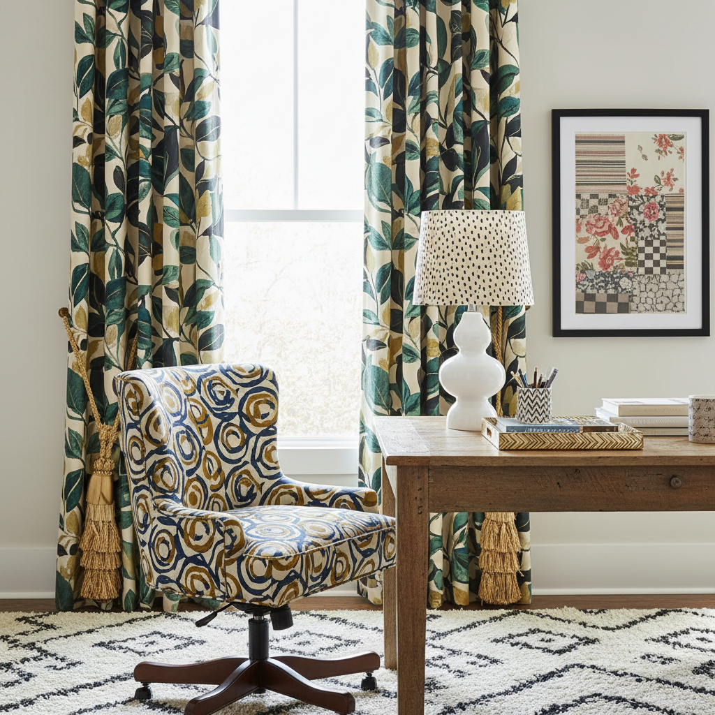
Alright, let's get into the practical stuff because this is where it gets really fun. These are the tips I find myself coming back to over and over again, and honestly, once they click, you'll start seeing pattern mixing differently in every space you walk into.
- Start small and build up. If you're new to this, don't rip out everything and start over. Add one patterned pillow to a solid sofa. See how it feels. Add another. Layer slowly and you'll know when it's enough before you've gone too far.
- Use the 60-30-10 rule as a guide. Apply it to patterns the same way you'd apply it to color. Sixty percent of your patterns should be subtle or tonal, thirty percent should be medium interest, and ten percent should be your boldest, most expressive print. This keeps the room feeling balanced rather than chaotic.
- Test your combinations in physical space. Pull fabric swatches, tear pages from catalogs, lay them next to each other on your actual floor in your actual light. What looks good in a store or on a screen can look completely different in your home, and you want to know that before you commit.
- Don't forget pattern in unexpected places. Wallpaper the inside of a bookcase. Use a patterned tile on the floor of a small powder room. Line the back of a wardrobe with fabric. These little surprises are what give a home personality and soul.
- When in doubt, go back to the classics. Stripes and florals have been mixed together since forever, and there's a reason for that. They work. So do stripes and geometrics. And plaids with paisleys. These are tried-and-true combinations that even the most hesitant decorator can lean on with confidence.
One more thing worth saying: rules are starting points, not finish lines. The best pattern mixing I've ever seen breaks at least one rule deliberately and confidently. Once you understand the logic well enough, you'll know exactly when to break it and exactly why it works. That's when you go from someone who follows design advice to someone who gives it.
Final Thoughts
Pattern mixing can feel intimidating, I completely understand that. But honestly, most of the fear comes from a lack of practice rather than a lack of talent. The more you play with it, the more intuitive it becomes. Start with what you love, work within a color palette, vary your scales, and give one pattern the spotlight while the others play supporting roles. That's really the core of it.
The homes I find most interesting, most alive, most worth lingering in, are never the ones with everything perfectly matched. They're the ones where someone made brave, joyful choices and layered things with confidence and care. Pattern mixing, done well, is one of the fastest ways to get a space to that level. So pull out those swatches, trust your gut, and go for it.
More in Interior
Stay Inspired
Subscribe for new essays on architecture, design, and the spaces that shape us.