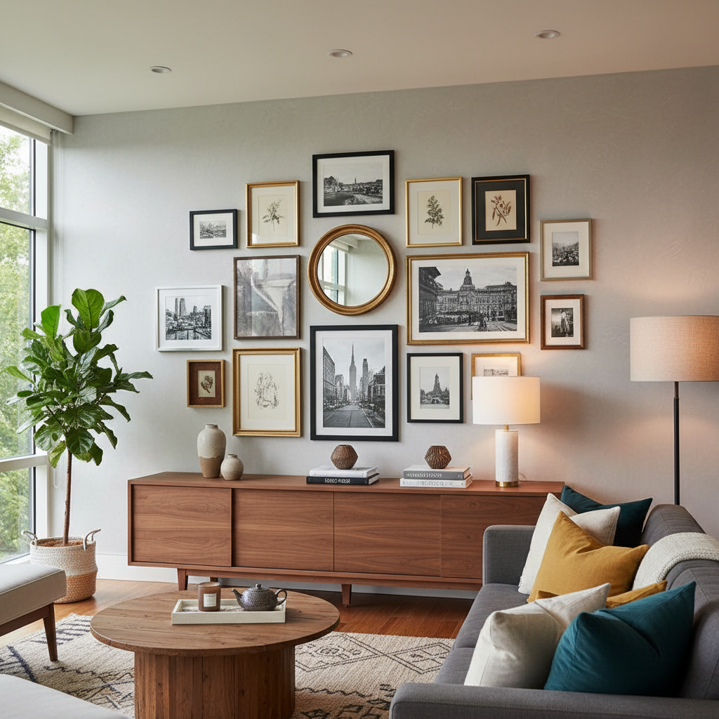
Mastering the Gallery Wall: Tips to Transform Your Space
Creating a gallery wall can elevate your home's aesthetic and reflect your personality. In this post, we'll share expert tips on arranging your art, selecting frames, and ensuring your gallery wall complements your decor style.
Choosing the Right Space for Your Gallery Wall
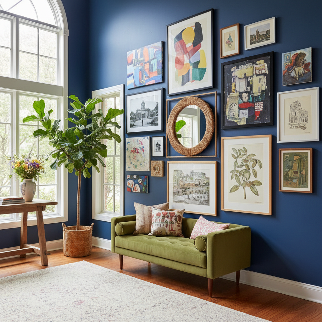
Okay, so before you even think about artwork or frames, you need to get really honest with yourself about where this gallery wall is actually going to live. This is the step most people skip, and it's also the reason a lot of gallery walls end up feeling awkward or just kind of... off. The space you choose sets the entire tone. It's not just about finding a blank wall, it's about finding the right blank wall.
Honestly, the best spots tend to be places where people naturally pause and spend a little time. Think about your entryway, the hallway, the wall behind your sofa, or even that weird nook at the top of the stairs that you've been ignoring for three years. These are high-traffic visual zones. Your eyes land there, your guests' eyes land there, and that's exactly where a curated collection of art is going to do its best work. A gallery wall tucked behind a door or crammed into a corner nobody sees is a waste of your time and energy.
Here's the thing about scale that nobody really talks about enough. The size of your wall matters, but so does everything that's already around it. A large, open wall above a narrow console table can feel top-heavy and strange unless you really nail the proportions of your layout. Conversely, a smaller wall above a big, wide sofa gives you an incredible opportunity to go bold and dense with your arrangement. Measure the wall. Measure the furniture. Tape out a rough outline on the floor first if you have to. It sounds tedious but trust me on this, it saves so much frustration later.
Lighting is another huge factor that tends to get overlooked at this stage. Natural light, overhead fixtures, sconces, all of it changes how your artwork reads throughout the day. A wall that gets direct afternoon sun might cause glare on glass frames or even fade certain prints over time. North-facing walls with softer, more consistent light are actually ideal in a lot of cases. If you're set on a specific wall that gets intense light, consider non-reflective glass for your frames and make sure nothing precious or irreplaceable goes where harsh UV can reach it.
Wall texture matters too. Smooth drywall is the easiest surface to work with, obviously, but if you've got brick, shiplap, or textured wallpaper, that background becomes part of the composition. Lean into it. A gallery wall against exposed brick looks incredible with the right mix of industrial and organic pieces. Just account for the fact that hanging on those surfaces requires different hardware and a little more patience.
Selecting Artwork That Speaks to You
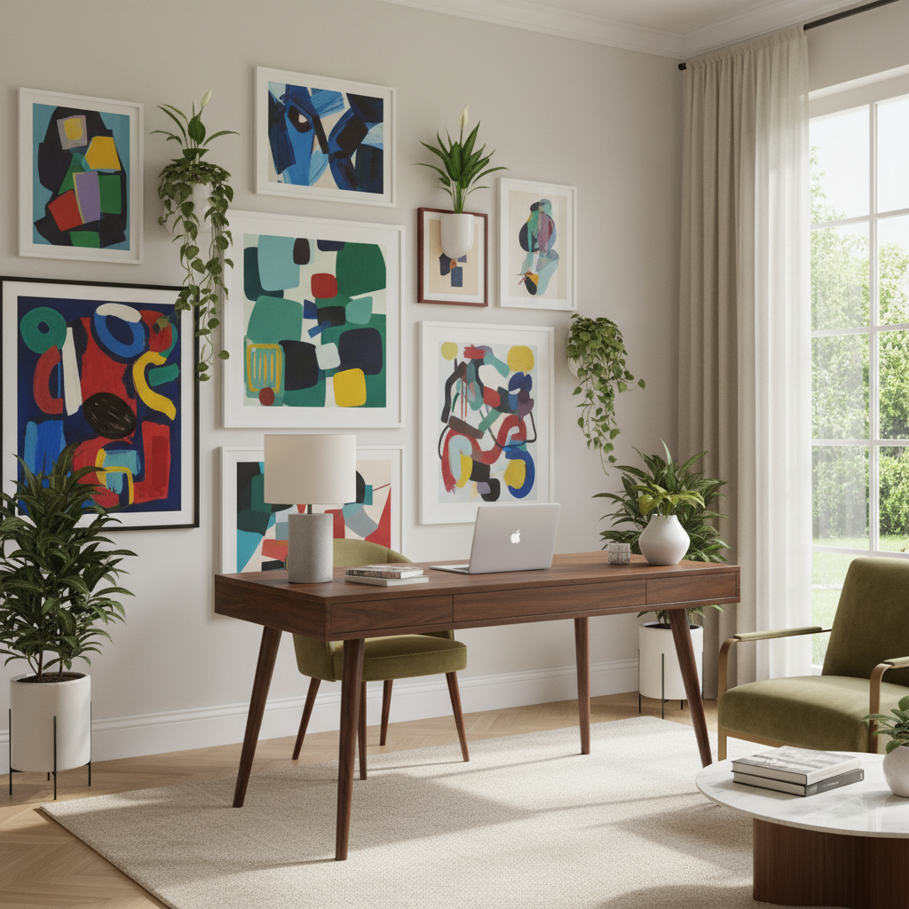
Real talk: the biggest mistake people make when building a gallery wall is trying to make it look like something they saw on Pinterest instead of something that actually reflects who they are. And look, there's nothing wrong with getting inspiration online, that's literally what it's there for. But if every piece you pick is chosen because it matches a trend or fits a certain aesthetic you're chasing, the whole thing is going to feel hollow. Gallery walls work best when they tell a story, your story.
Start by pulling together pieces you already own and genuinely love. Family photos, that print you bought at a street market two summers ago, the watercolor your friend painted for your birthday, a page torn from an old art book that you framed on a whim. These are the anchor pieces. They carry emotional weight and that's what makes a gallery wall feel lived-in and real rather than like a showroom display. Once you've got your anchors, you can build around them with pieces that complement the mood, color palette, or theme those originals are already setting.
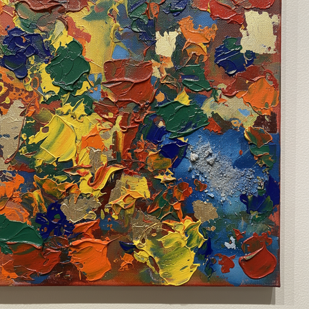
Don't stress too much about everything matching perfectly in terms of subject matter or style. Some of the most compelling gallery walls I've seen mix abstract prints with portrait photography, botanical illustrations with graphic typography. The key is finding a common thread, whether that's a consistent color family, a similar mood or tone, or even just a shared sense of scale. That thread doesn't have to be obvious to everyone, it just needs to exist so the whole arrangement feels intentional rather than random.
When it comes to sourcing new pieces, you've got more options than ever. Etsy is genuinely fantastic for affordable prints from independent artists. Local art fairs, thrift stores, estate sales, all goldmines. Society6 and Art.com are solid for more accessible decorative prints. If you're willing to invest a bit more, platforms like Saatchi Art connect you directly with emerging artists and you can find genuinely original work at reasonable prices. The point is, you don't have to spend a fortune to build something beautiful. You just have to be thoughtful and a little patient.
One more thing: don't feel like every single piece has to be framed art. Mirrors, decorative plates, small shelves with objects, vintage signage, all of these can work beautifully within a gallery wall arrangement. Mixing art with non-art items adds dimension and personality. We'll get into that more later, but keep it in mind as you're curating your collection.
Mix and Match: Framing Techniques for Impact
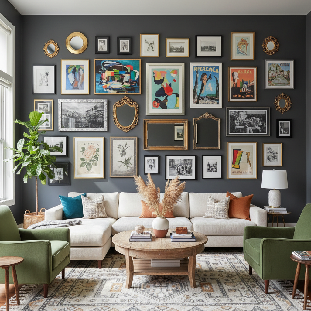
Frames are honestly so much more important than people give them credit for. They're not just something you put around art so it doesn't look naked on the wall. Frames contribute to the overall texture, color story, and visual weight of your entire display. Getting your framing strategy right can elevate even the most basic collection of prints into something that looks genuinely curated and intentional.
There are two main schools of thought here and both are totally valid depending on the look you're going for. The first is the unified frame approach, where every frame is the same color, finish, or material. This creates a really clean, cohesive look that reads as sophisticated and deliberate. Black frames are the classic choice here, they work with almost everything, add definition, and feel modern without being trendy. White frames are great for airy, Scandinavian-influenced spaces. Natural wood tones work beautifully in bohemian or earthy interiors.
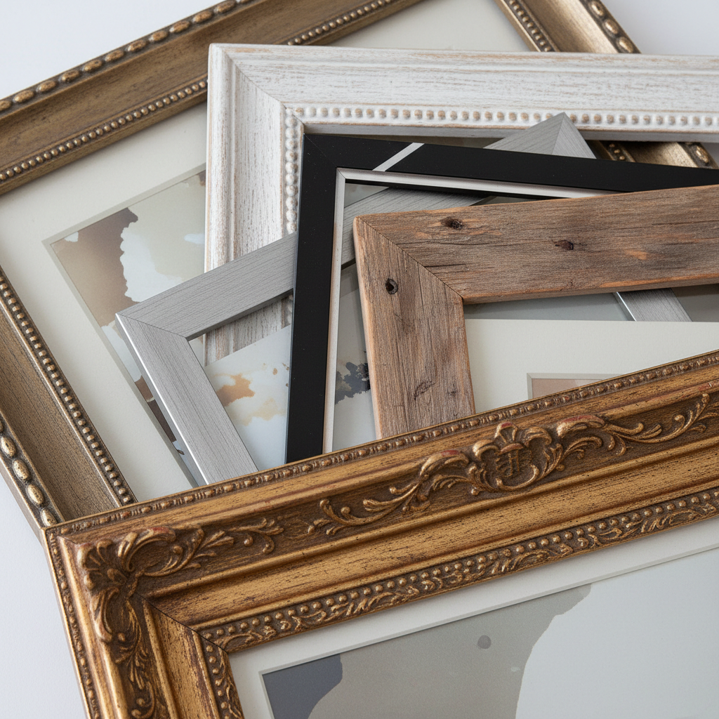
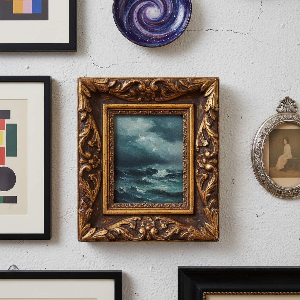
The second approach is the eclectic mix, where you deliberately vary frame styles, finishes, and materials. This takes more skill to pull off well, but when it works it is truly stunning. The trick is to find one element that ties all the different frames together. It might be that all the frames are roughly the same weight or thickness, even if the finishes differ. Or maybe you're mixing gold and brass tones throughout, creating a warm metallic thread across the arrangement. You could also mix frame styles but keep them all within a similar color family.
- Don't mix too many different frame thicknesses. If you have a super chunky ornate frame next to a super thin minimalist one, they'll fight each other visually.
- Consider mat boards carefully. A wide white mat can make a small print feel much more substantial and gallery-worthy. Narrow or no mat gives a more casual, accessible feel.
- Don't be afraid to frame unexpected things. Fabric swatches, pressed botanicals, vintage postcards, children's drawings, all of these can look incredible with the right frame treatment.
- Frame sizes matter for rhythm. A mix of small, medium, and large frames creates visual flow. All the same size can feel static and boring unless that's the very deliberate effect you're going for.
One more framing tip that I swear by: buy a few extra frames in a couple of your key styles before you finalize anything. Having spares means you can swap things out if the layout isn't working, and it gives you flexibility to add to the collection later without hunting for a discontinued frame style in six months.
The Power of Symmetry and Balance
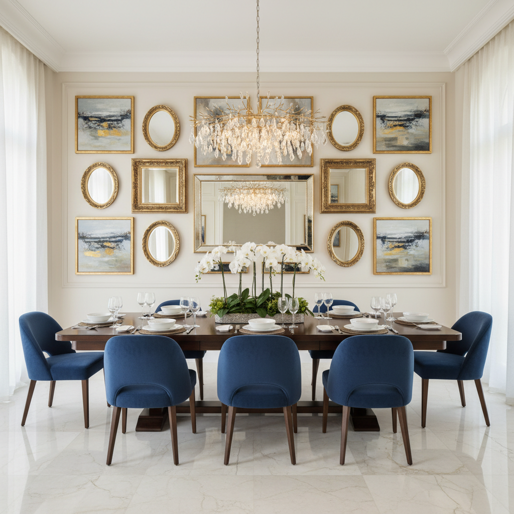
Here's where a lot of people get tripped up: they think balance means symmetry, and they're not the same thing at all. Symmetry is one specific tool in your toolkit and it's a powerful one, but it's not the only way to create a gallery wall that feels visually settled and harmonious. Understanding the difference between the two opens up a lot of creative possibilities.
A symmetrical gallery wall is exactly what it sounds like: pieces arranged in a mirror-image pattern around a central axis. This works incredibly well in formal spaces like dining rooms, living rooms with a strong architectural focal point, or entryways where you want a polished, composed first impression. A classic example is two identical frames flanking a larger central piece, then two more identical pieces below each of those. The result is orderly, calm, and satisfying in a way that feels almost mathematical. It's the gallery wall equivalent of a perfectly pressed linen shirt.
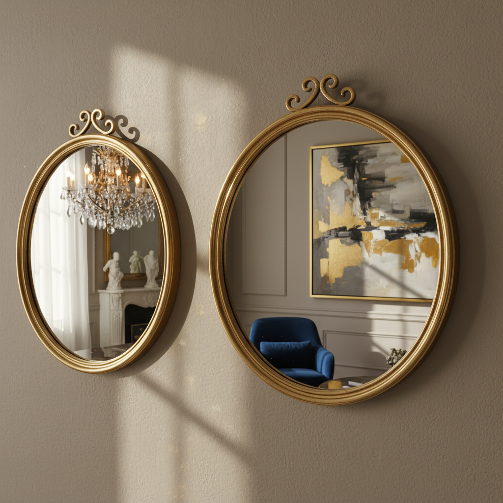
Asymmetrical balance is trickier but it's what gives those gorgeous, seemingly spontaneous gallery walls their magic. The idea is that visual weight doesn't have to be distributed identically on both sides, it just has to feel equal overall. A large, dark piece on the left can be balanced by two smaller lighter pieces on the right. A dense cluster of small frames can balance a single oversized statement piece on the opposite side. You're essentially playing a visual game of scales, and the goal is to keep the arrangement from tipping too heavily in one direction.
A practical technique I love is to lay everything out on the floor first, arranged roughly the way you want it on the wall. Step back and squint at it. Seriously, squint. This blurs the details and lets you see only the shapes and values, which is exactly how your eye reads the arrangement from across a room. If one side feels heavier, darker, or more crowded, adjust. Keep tweaking until the whole thing reads as settled even when you blur your vision. Then, and only then, start putting things on the wall.
Spacing is a part of balance that often gets forgotten. Consistent spacing between frames, usually somewhere between two and four inches, creates a sense of order even within an eclectic, asymmetrical layout. Too much space and the pieces start to feel disconnected, like they don't actually belong together. Too little and the whole thing gets claustrophobic and busy. Find your spacing sweet spot, mark it with painter's tape if you need to, and stick to it throughout the arrangement.
Personalizing Your Gallery Wall with 3D Elements
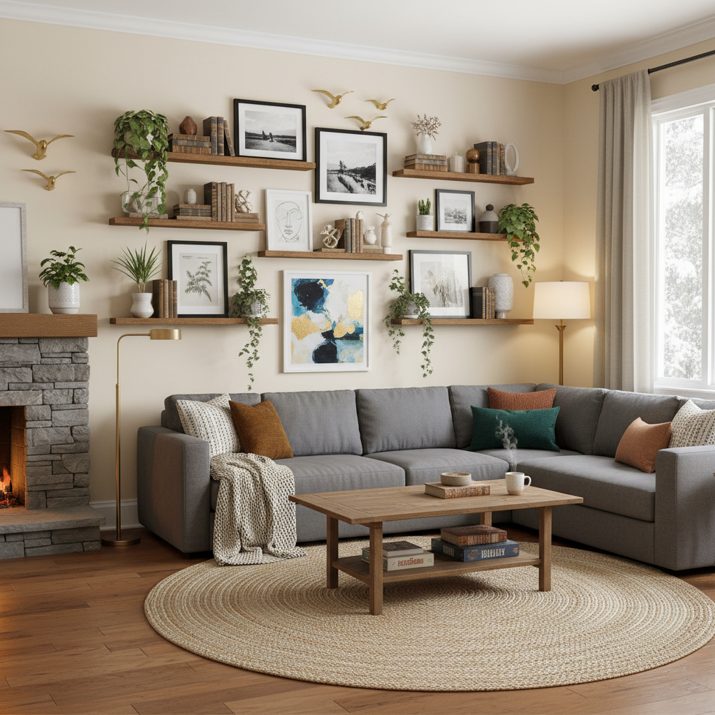
Honestly, this is my favorite section to talk about because it's where gallery walls go from "nice" to genuinely unforgettable. The moment you start introducing three-dimensional objects into a flat wall arrangement, something magical happens. The whole thing gains depth, texture, and a kind of sculptural quality that photographs and prints alone simply cannot achieve.
So what exactly counts as a 3D element? Pretty much anything with physical depth or texture that you can mount on a wall. Decorative mirrors are the classic example, they add dimension, reflect light, and create a sense of space. Woven wall hangings and macrame pieces bring softness and organic texture. Sculptural wall art made from metal, wood, ceramic, or even paper can serve as a dramatic focal point. Small floating shelves that hold a curated object or two, like a tiny plant, a ceramic vessel, or a cherished keepsake, blur the line between gallery wall and display shelf in the most delightful way.
The key to making 3D elements work within a gallery wall is to treat them with the same intention you'd give a framed piece. They need to relate to the rest of the arrangement in terms of scale, color, and visual weight. A large woven tapestry can anchor a corner of your layout the way a large framed print would. A small ceramic wall flower or decorative plate can fill a spot where a small frame might otherwise go. Think of it as substitution rather than addition: you're swapping a flat element for a dimensional one, not piling more stuff onto an already busy wall.
- Mirrors are versatile, light-enhancing, and work in almost any interior style.
- Woven or textile pieces add warmth and softness, especially valuable in spaces with a lot of hard surfaces.
- Wall-mounted plants or air plant holders bring life and color without taking up floor space.
- Decorative plates or ceramic wall art nod to tradition while feeling fresh in a modern context.
- Small shadow boxes let you display tiny collected objects, shells, rocks, vintage pins, in a way that frames them beautifully.
One thing to be mindful of with 3D elements is hanging hardware. Heavier items like large mirrors or thick wooden pieces need proper anchoring into studs or with appropriate wall anchors. Don't just trust a picture hook with something weighty. Take the extra ten minutes to do it right. A gallery wall that falls in the middle of the night is not the kind of impact you're going for.
And look, don't overthink the mix. The best gallery walls I've seen in real homes have a kind of relaxed confidence to them, like the person who lives there simply collected things they loved and found a way to hang them together. That ease comes from authenticity, not from following a formula. Start with what you love, layer in the 3D elements that feel right, and adjust as you go. Your wall will evolve over time and that's actually the best part.
Final Thoughts
Building a gallery wall is one of those projects that sounds simple but actually rewards patience, intention, and a fair bit of trial and error. The five things we covered, choosing the right space, selecting meaningful artwork, getting your framing strategy right, understanding balance, and layering in 3D elements, are the building blocks of every gallery wall that actually works. None of them are complicated in isolation. The magic is in how they come together.
Start small if you're nervous. A tight grouping of three to five pieces in a hallway is a much lower-stakes way to figure out your personal style than diving straight into a massive living room feature wall. Get comfortable with the process, learn what you like, and then scale up. And don't be afraid to move things around. Gallery walls are not permanent tattoos. If something isn't working, take it down, rearrange, try again. The best ones usually go through several iterations before they feel truly right.
Most importantly, make it yours. Fill it with things that mean something to you, things that make you smile when you walk past them, things that tell a little piece of your story to anyone who visits. That's what a great gallery wall actually does. It's not just decor. It's a conversation.
More in Interior
Stay Inspired
Subscribe for new essays on architecture, design, and the spaces that shape us.