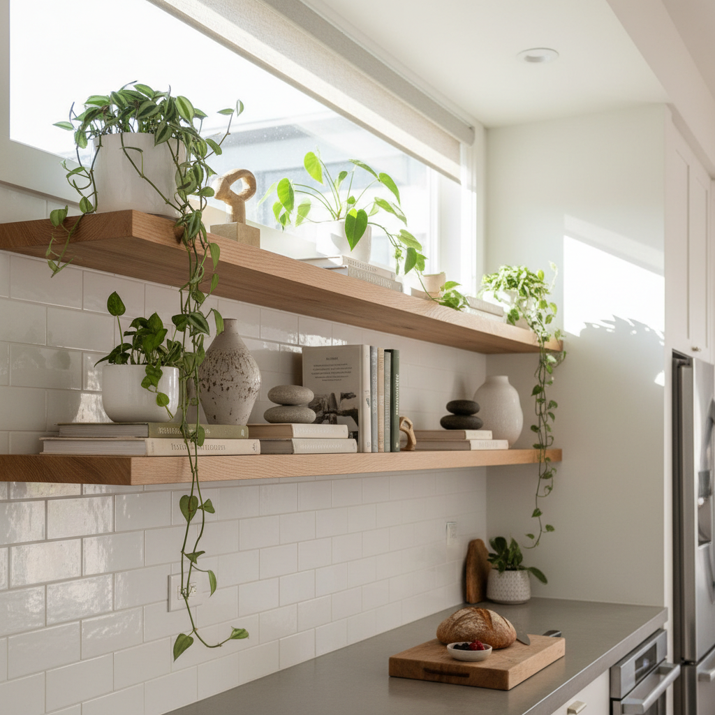
Open Shelves Made Beautiful: Your Guide to Perfectly Styled Displays
Decorating open shelves can transform your space into a stunning showcase of personality and style. This guide will help you master the art of shelf styling with practical tips and inspiring ideas for your home. Let's get those shelves looking their best!
Choosing the Right Shelving Materials
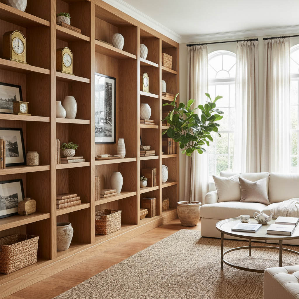
Honestly, this is where most people go wrong before they even put a single thing on a shelf. The material you choose is not just a functional decision. It's a design statement. It tells the room what it's going to feel like, and it either plays nice with everything else you've got going on or it fights everything at every turn.
Wood is the classic choice for good reason. Solid wood shelves, whether you go with oak, walnut, pine, or something more exotic, bring warmth and texture that almost nothing else can replicate. Walnut in particular has this rich, dark grain that looks incredibly expensive even when it isn't. Floating wood shelves on a white wall? Timeless. But here's the thing: not all wood is equal. Solid wood behaves differently than MDF wrapped in veneer, and the cheaper stuff tends to bow under real weight over time. If you're planning to load up your shelves with books, ceramics, and actual heavy objects, invest in the real thing.
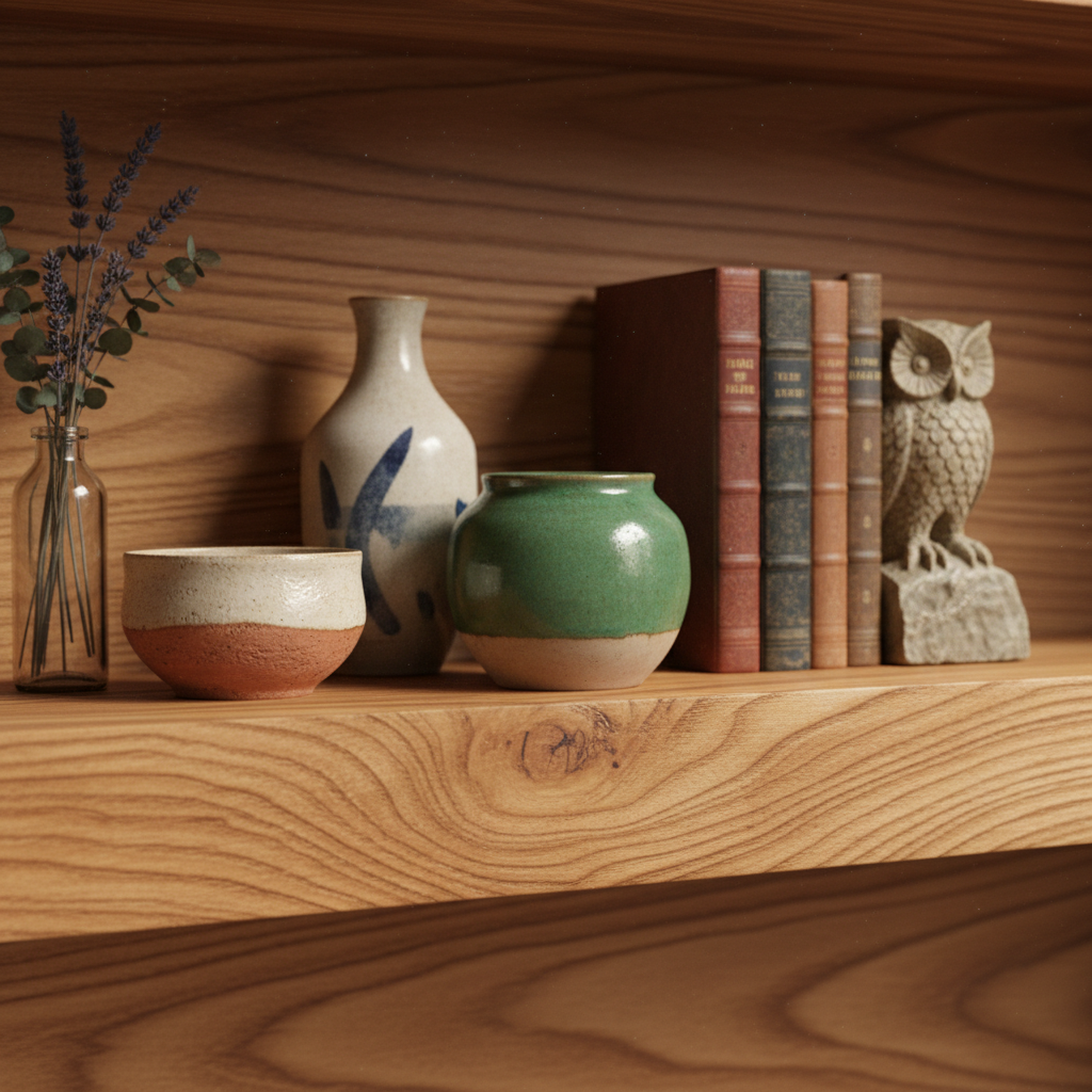
Metal shelving has had a serious glow-up over the last few years. Matte black iron brackets with thick wood planks have become almost a design cliche at this point, but they're popular for a reason. They work. The contrast of hard metal and organic wood hits that sweet spot between industrial and cozy. Glass shelves, on the other hand, are trickier. They look sleek and airy, great in bathrooms or more minimal spaces, but they require more curation. Every fingerprint shows. Every imperfect object placement screams at you. Use them intentionally.
Consider the finish of your wall before committing, too. Open shelves mounted on textured plaster or exposed brick need materials that complement the roughness, usually something with its own natural character like raw wood or aged metal. Smooth drywall gives you more flexibility. And real talk, the bracket situation matters just as much as the shelf itself. Hairpin legs, invisible floating brackets, pipe brackets, decorative corbels, they all send a very different message. Choose yours deliberately.
The Art of Layering Items
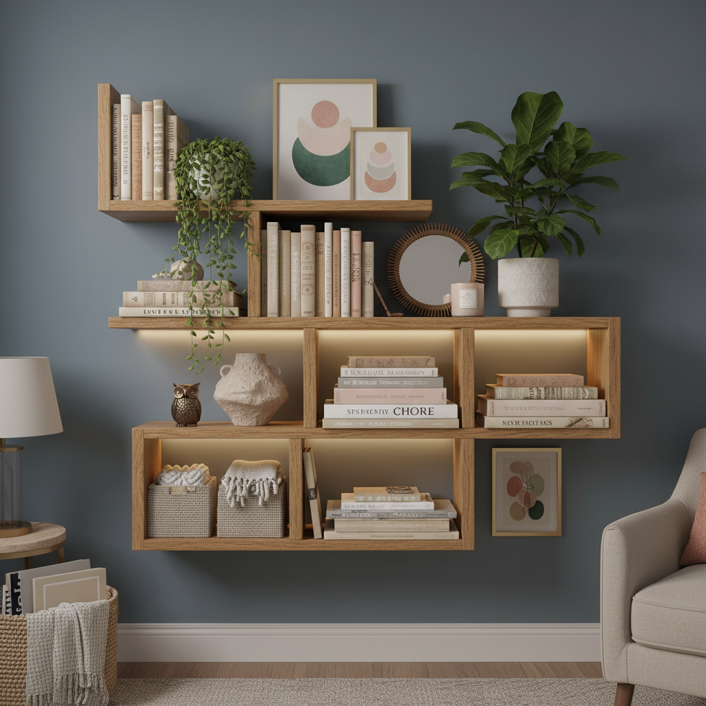
Look, this is the part that separates a shelf that looks intentional from one that looks like you just put stuff wherever it fit. Layering is everything. It's the difference between a display that draws you in and one that feels like a dusty forgotten corner of your grandma's spare bedroom.
The basic idea is simple: you want to create depth by placing items at different distances from the wall. Start with something taller at the back, maybe a stack of books stood upright, a framed print leaning against the wall, or a tall vase. Then layer smaller items in front of and beside it. A small sculpture in front of the books. A tiny candle beside the vase. The layering trick creates that sense of abundance and curation without making things look cluttered.
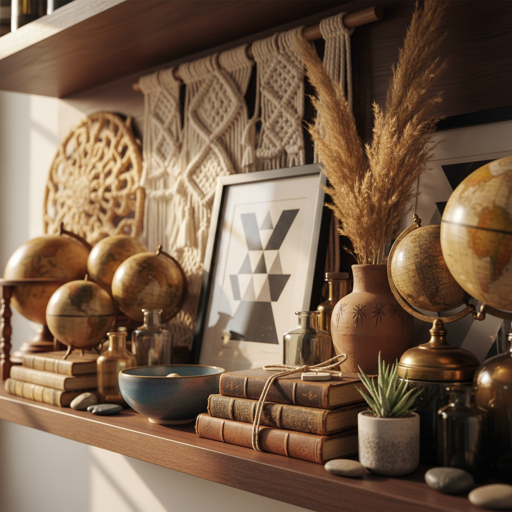
Height variation is your best friend here. A shelf full of items that are all roughly the same height is visually flat and kind of boring, honestly. Mix it up. Group a few books lying horizontally as a little platform, then place something interesting on top. Alternate between tall and short objects as your eye moves across the shelf. Some designers talk about this in terms of triangles, basically arranging three items so their tops form a triangle shape. It sounds overly technical but once you see it in practice, you'll notice it everywhere and you won't be able to unsee it.
Don't forget negative space. This is where a lot of people fumble. The urge to fill every inch of the shelf is real, especially if you have a lot of stuff you love. But empty space is not wasted space. It's breathing room. It lets the eye rest and it makes the objects you do display feel more special and considered. A good rule of thumb: aim for roughly 60 to 70 percent filled, 30 to 40 percent open. Trust me on this, it will instantly make your shelves look more styled and less chaotic.
Creative Color Combinations
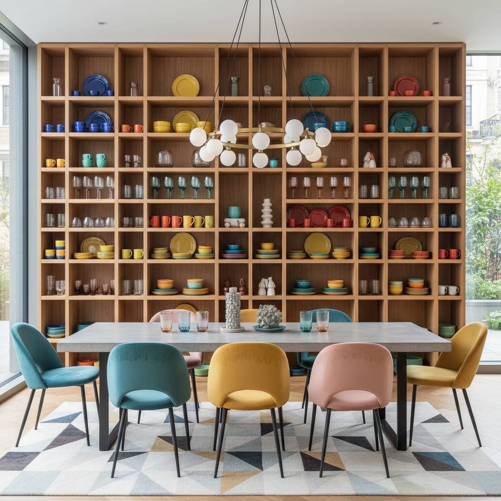
Color is the thread that ties a shelf display together, and when you get it right, the whole thing just sings. When you get it wrong, it looks like a garage sale. Harsh but true. Here's the thing though: you don't need to be an artist or have any formal training to nail color on your shelves. You just need to understand a few basic principles and apply them with a little intention.
The easiest approach is to work within a limited palette. Pick two or three colors and let them repeat across the shelf in different forms and textures. Think warm terracotta, creamy white, and a soft sage green. Or moody navy, brass, and natural linen tones. When the same colors show up in different objects across the display, everything feels cohesive even if the individual pieces are wildly different in style or origin. This is the secret behind those perfectly styled shelves you see on design accounts and wonder how they pulled it off.
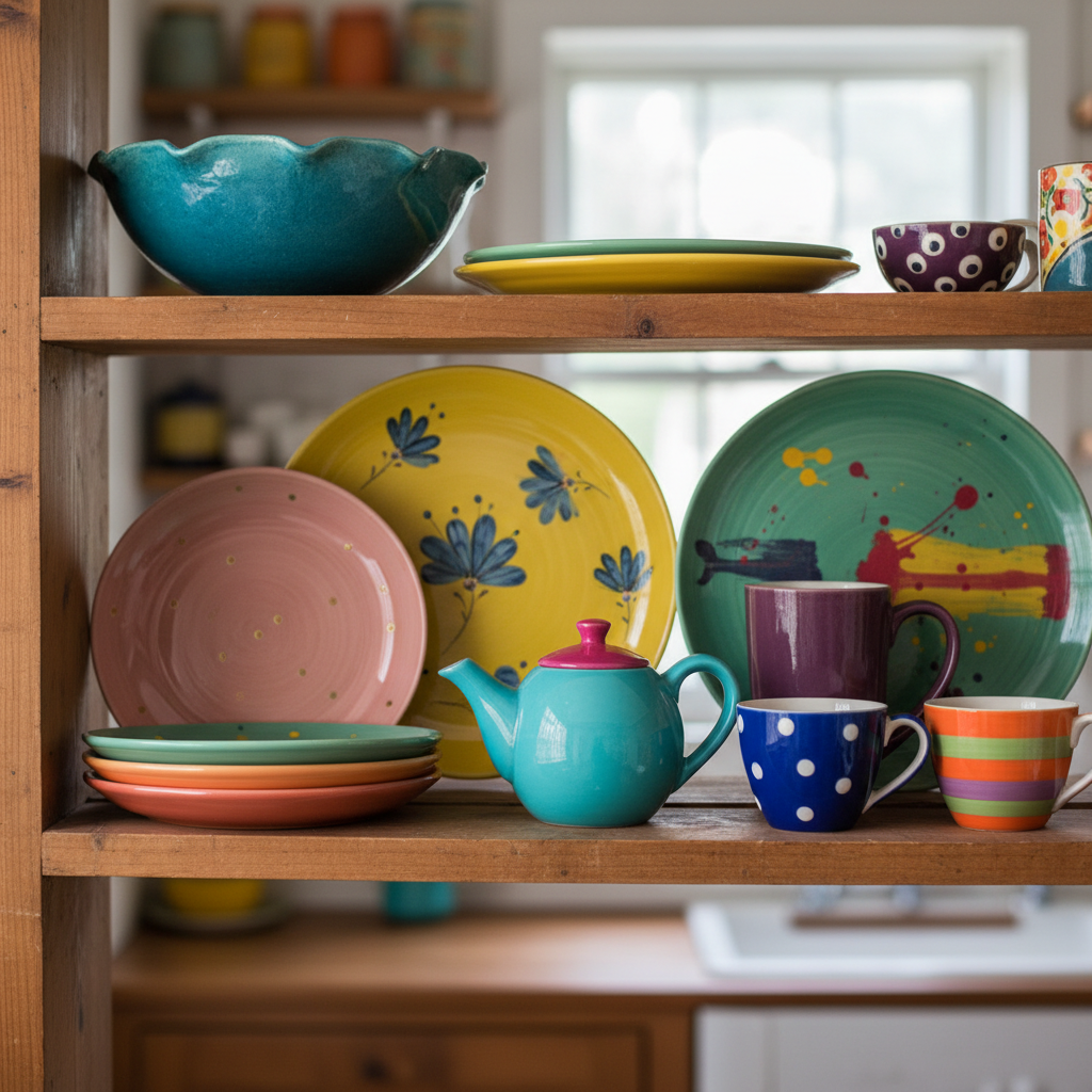
Neutrals are your safety net but they're not your only option. Honestly, some of the most stunning shelf displays I've seen lean heavily into one unexpected bold color, like a deep forest green or a burnt orange, used sparingly and deliberately as an accent against an otherwise neutral backdrop. A single cobalt blue vase in a sea of whites and naturals becomes a focal point that pulls the whole shelf together.
- Stick to a palette of two to three main colors to avoid visual chaos.
- Repeat colors across the shelf in different textures and object types for cohesion.
- Use neutrals as your base and let one accent color do the heavy lifting.
- Consider the room's existing palette so your shelf doesn't feel disconnected from the space around it.
- Don't be afraid of dark tones on shelves, deep colors add drama and sophistication.
One more thing: the color of the shelf itself and the wall behind it matters a lot. A white shelf against a white wall creates a seamless, airy feel. A dark shelf against a painted accent wall makes every object pop. Paint the inside back of your bookcase a contrasting color if you really want to elevate the whole display. It's a small move with a huge impact.
Incorporating Greenery and Natural Elements
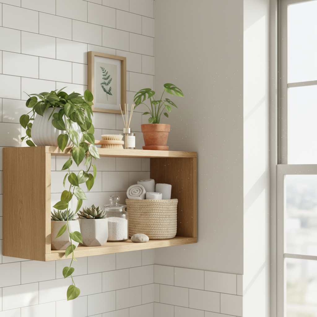
This is probably my favorite tip in this whole guide, and and honestly, I think it's the single easiest way to instantly make your shelves look better. Add something alive. Or at least something that looks like it came from the earth.
Plants are the obvious choice and for good reason. A trailing pothos spilling over the edge of a shelf looks effortlessly stylish and adds movement in a way that no ceramic or book can replicate. Small succulents and cacti work beautifully on shelves with more light and a more minimal aesthetic. A single dramatic snake plant in a textured pot can anchor a whole shelf. Even dried botanicals, dried pampas grass in a slender vase, a bunch of dried lavender, dried citrus slices tucked into a small bowl, they all bring that natural, organic quality that makes a space feel like real people live there.
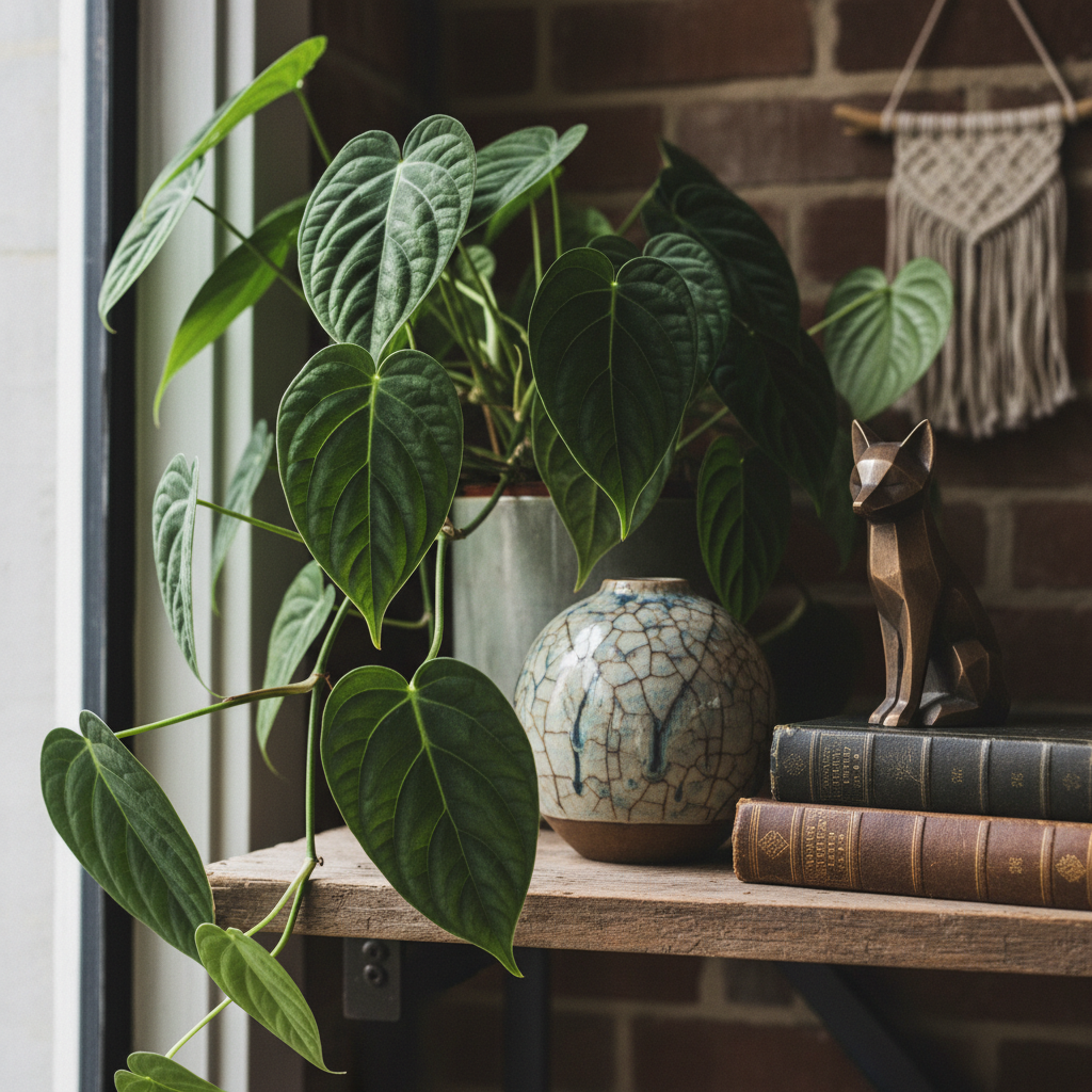
Beyond plants, think about other natural materials. Smooth river stones grouped together in a small bowl. A piece of driftwood as a sculptural accent. A woven basket tucked into a lower shelf to hold odds and ends while still looking great. Wooden beads or a small piece of raw crystal. These elements add texture and an earthiness that makes a shelf feel grounded and warm rather than cold and showroom-ish.
The practical side of this is worth thinking about too. If you're using real plants, make sure your shelf gets enough light to keep them happy, or choose shade-tolerant varieties. There's nothing sadder than a dead brown plant on an otherwise beautifully styled shelf. High-quality faux plants have come a long way and there's zero shame in using them, especially in spots that don't get natural light. Just make sure they look convincing up close because the sad plastic ones will undo all your hard work.
Personal Touches: Family Photos and Mementoes
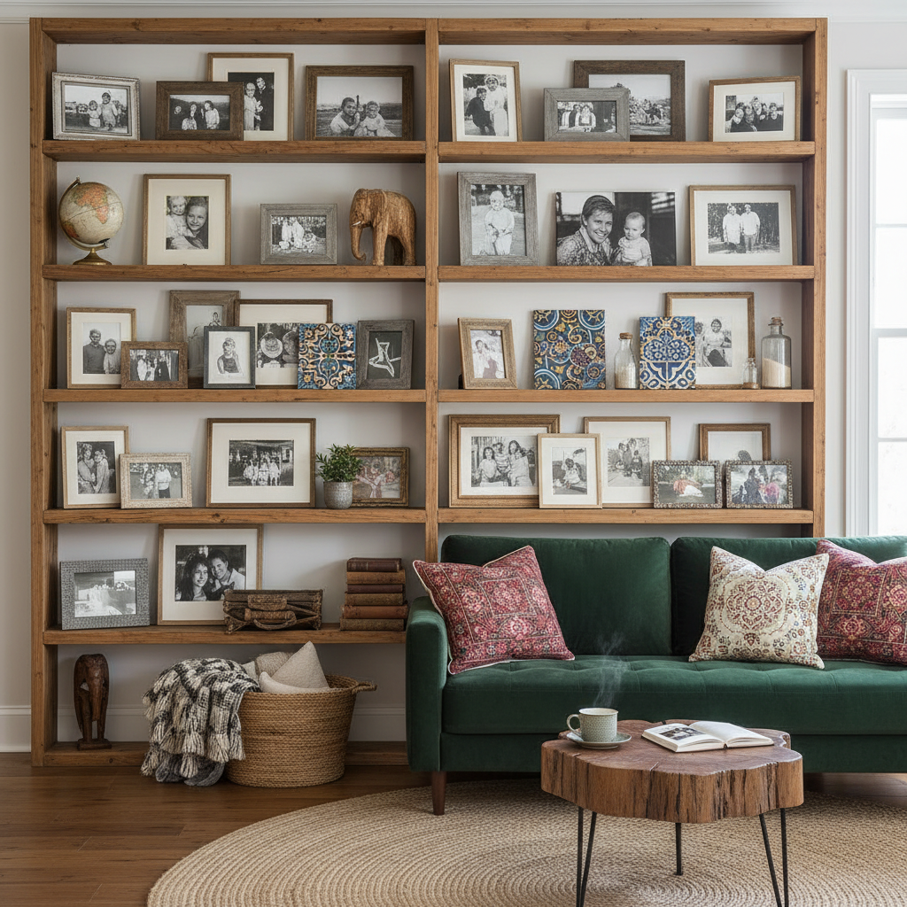
Here's where a lot of design advice goes a little cold and clinical, and I want to push back on that. Yes, curation matters. Yes, restraint is important. But a shelf that has zero personality, no photos, no mementoes, nothing that speaks to the actual person living there, just feels like a hotel lobby. And nobody wants to live in a hotel lobby.
The trick with personal items is in how you display them, not whether you display them. Family photos work beautifully on shelves when you approach them with some consistency. Choose frames that feel cohesive, whether that's all matching black frames, a mix of natural wood tones, or a collection of vintage brass and silver frames. Mixing every style of frame you own usually looks messy. If you have mismatched frames that you love, try spray painting them all the same color for an instant upgrade. Leaning frames rather than hanging them feels more casual and editorial, more like something you arranged than something you installed.
Mementoes are trickier because they're often odd shapes, weird colors, or just not conventionally beautiful. But that's the point, isn't it? The little ceramic dish your kid painted, the souvenir you brought back from a trip that changed you, the trophy from something ridiculous and funny. These things have stories. Group them thoughtfully, pair them with objects that complement their colors or shapes, and give them their own little corner of the shelf where they can be appreciated without cluttering the whole display. A well-placed memento adds soul. A pile of random stuff with no thought behind it just looks like clutter.
"The best interiors feel like the person who lives there, not like a page from a catalog. Your shelves should tell your story, just with a little style."
Maintaining Balance and Harmony
Real talk: you can do everything else right and still end up with shelves that feel off if you haven't thought about balance. Balance doesn't mean symmetry, though symmetry is one way to achieve it. It means that no single part of the shelf feels so heavy or so empty that it throws the whole thing off.
Visual weight is the concept to understand here. Larger objects, darker objects, and objects with more complex textures all carry more visual weight than small, light, or simple ones. If you put all your heavy, dark items on one side of the shelf and all the light, airy ones on the other, it's going to feel lopsided even if you can't immediately put your finger on why. The fix is to distribute visual weight across the shelf more evenly. A large dark vase on the left can be balanced by two or three smaller dark objects spread across the right side. It doesn't need to be a mirror image, it just needs to feel stable.
Harmony comes from the relationships between items. This is more of an intuitive thing that develops with practice, but some practical ways to build it in are to repeat materials, repeat colors, and repeat shapes. If you have a circular mirror on the wall above your shelf, bring in a few circular objects on the shelf itself, a round bowl, a spherical candle, a circular framed photo. That repetition creates a visual language across the display that makes it feel unified rather than random.
- Distribute visual weight evenly across the shelf, not just physically but in terms of color and texture.
- Repeat shapes and forms to create a sense of visual rhythm.
- Step back regularly while styling to check how the whole display reads from a distance.
- Edit ruthlessly and remember that removing one thing often makes everything else look better.
One habit that will genuinely transform your shelves: step back. A lot. When you're in close working on arranging, you lose perspective. Physically walk across the room and look at the shelf from where most people will actually see it. That's the view that matters. Squint your eyes slightly to blur the detail and you'll immediately see if the balance feels right or if something is pulling too hard in one direction. Adjust. Step back again. Repeat. It sounds tedious but it genuinely works, and after a while it becomes second nature.
Final Thoughts
Open shelves are one of those design elements that can either be a total showstopper or a constant source of visual stress. The difference really does come down to intention. Once you start thinking about your materials, your layering, your color palette, your natural elements, your personal touches, and your overall balance as a unified system rather than a collection of random decisions, everything starts to click.
Don't expect to nail it on the first try. Honestly, the best shelf displays I've ever seen were ones that evolved over time, where things were swapped out, edited down, and slowly refined as the person's eye and confidence grew. Start with less than you think you need. Edit more than feels comfortable. And add back only what genuinely earns its place. Your shelves will thank you.
More in Interior
Stay Inspired
Subscribe for new essays on architecture, design, and the spaces that shape us.