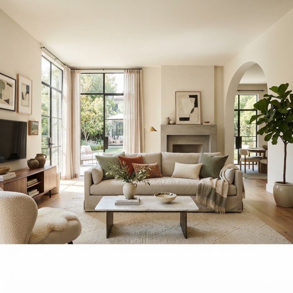
The Art of Layering: Throw Pillow Combinations That Actually Work
Struggling to style your sofa like a professional designer. We break down the simple formulas and fabric mixing secrets that make throw pillow combinations look intentional and high-end every single time.
The Golden Ratio of Pattern Mixing
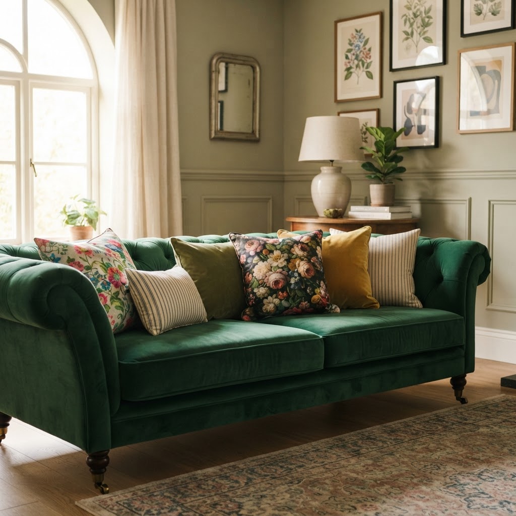
Okay, so here's the thing about mixing patterns on throw pillows: most people are either way too scared to do it, or they go completely overboard and end up with something that looks like a craft store exploded on their couch. There's a sweet spot in the middle, and once you find it, everything just clicks.
The golden ratio I always come back to is one large-scale pattern, one medium-scale pattern, and one solid or near-solid. That's it. That's the whole secret. If you've got a big bold floral, pair it with something like a classic stripe or a small geometric, and then anchor the whole thing with a plain linen or a subtle tone-on-tone texture. The eye needs somewhere to rest, and that solid gives it exactly that.
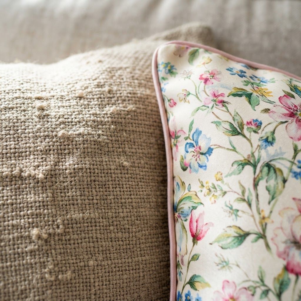
One thing I tell everyone who asks me about this: scale contrast is your best friend. Don't put a small ditsy print next to another small ditsy print. They fight each other visually and neither one wins. But a big sprawling botanical next to a tight little houndstooth? That works beautifully because they're doing completely different things.
Also, don't stress too much about patterns "matching" in the traditional sense. They don't need to match. They need to relate. If they share even one color in common, they're going to look intentional. That's honestly all it takes to make a pattern mix look curated rather than chaotic. Trust me on this, it's a game-changer once it clicks.
Mastering the Color Palette
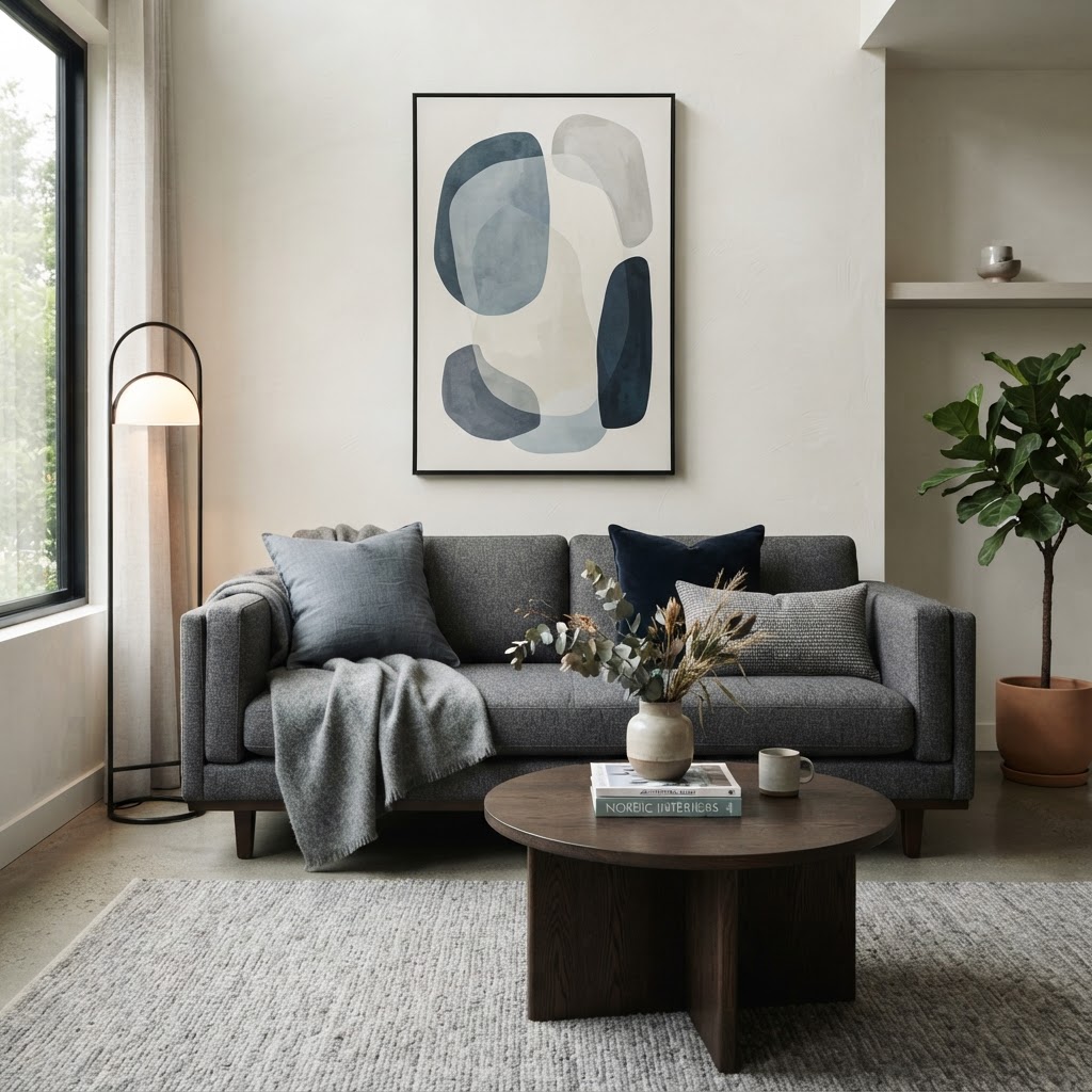
Color is where people get the most tripped up, honestly. They see a pillow they love at the store, buy it, get home, and then realize it has absolutely nothing to do with anything else on their sofa. Been there. Done that. The fix is simpler than you think.
Start with your room's existing palette and identify two or three anchor colors you're working with. These should already be present somewhere in your space, whether that's the rug, the curtains, a piece of art, or even just the wall color. Your pillow collection should pull from those same tones, even loosely. You don't need to be matchy-matchy about it. A warm terracotta accent wall can inspire pillows in rust, blush, burnt orange, and even a deep chocolate brown. They're all in the same family.
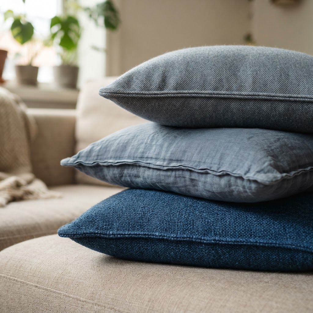
Here's a formula I swear by: use a 60-30-10 color split across your pillow arrangement. Sixty percent should be your dominant or neutral color, thirty percent your secondary color, and ten percent an accent that pops. So if your sofa is a warm gray, you might have mostly soft cream and greige pillows, with some dusty blue mixed in, and then one or two with a hit of mustard or deep teal. That little ten percent accent does a ton of heavy lifting.
"Color doesn't have to be perfect to be beautiful. It just has to feel intentional."
Real talk: don't be afraid of a little contrast. An all-neutral pillow setup can feel safe but also kind of flat and forgettable. One bold pillow in an unexpected color can lift an entire room. Just keep it connected to something else in the space and it'll feel purposeful rather than random.
Texture Overload: Why Variety Matters
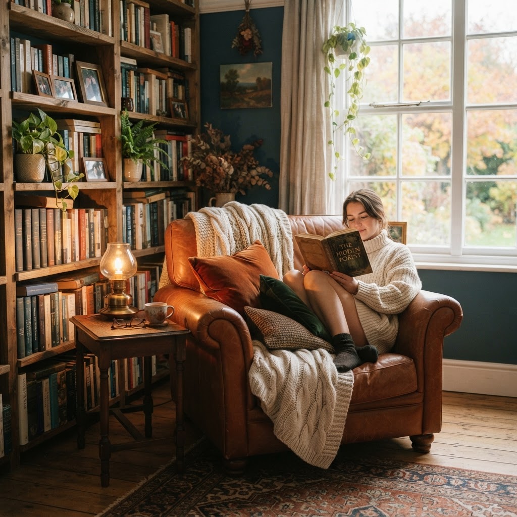
Look, texture is the secret weapon that even experienced decorators sometimes forget to use properly. You can have a completely monochromatic pillow arrangement, every single pillow in shades of cream and white, and if you've got the right mix of textures, it'll look incredibly rich and layered. No color drama required.
Think about the range of textures available to you: chunky knits, smooth velvet, rough-woven jute, silky embroidered cotton, fluffy faux fur, tight boucle, nubby linen. These all feel completely different against your hand and they read differently in a room too. Mixing at least three distinct textures in a pillow grouping is what separates a styled sofa from one that just has pillows thrown on it.
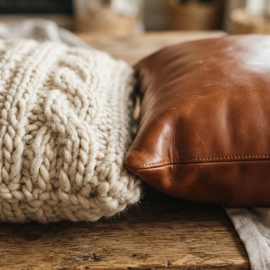
One combination I genuinely love and recommend all the time is pairing a velvet pillow with a woven or macrame style and then a printed cotton. The velvet brings that touch of luxury, the woven piece adds an organic, casual vibe, and the printed cotton keeps things grounded and approachable. It's a really balanced trio that works across a ton of different interior styles.
- Velvet: Adds richness and a slight formality, works in both modern and traditional spaces
- Linen or cotton: Casual and breathable, the workhorse of any pillow arrangement
- Boucle or knit: Cozy and tactile, perfect for living rooms that need warmth
- Embroidered or beaded: A little decorative detail that catches light beautifully
- Faux fur or shag: Use sparingly as an accent, not a main event
The other thing worth mentioning is that texture affects how color reads. A deep navy velvet looks completely different from a deep navy linen, even if they're technically the same hue. Velvet absorbs light and looks moody and saturated. Linen diffuses light and looks softer. Keep that in mind when you're building out a palette, because texture and color are always working together whether you intend them to or not.
The Power of Odd Numbers
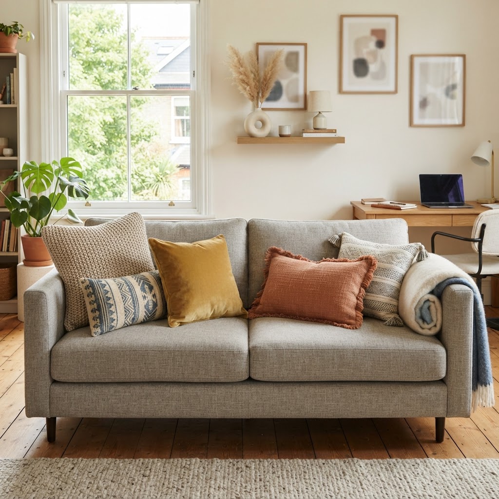
This one sounds like a design rule that could easily tip into annoying overthinking territory, but honestly, once you see the difference, you can't unsee it. Odd numbers of pillows just look better. Three pillows on a loveseat, five on a full sofa, seven on a king bed. There's something about an even, symmetrical arrangement that reads as stiff and almost corporate. Odd groupings feel lived-in and dynamic without being messy.
The reason this works is actually pretty intuitive. With an even number, the eye naturally wants to divide them into equal halves and assess their symmetry. With an odd number, there's always one element in the middle pulling focus, and the eye travels around the whole grouping rather than splitting it down the center. It creates visual movement rather than visual stillness.
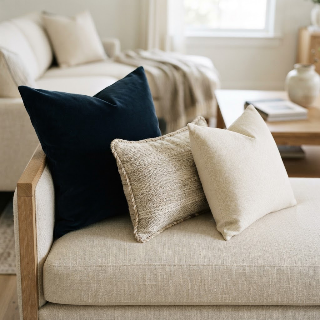
For a standard three-cushion sofa, a grouping of five pillows is usually the sweet spot. Here's how I'd break that down: two larger square pillows at each end (about 20x20 inches), two medium pillows slightly overlapping toward the center (18x18), and one lumbar pillow laid across the front center. That arrangement has depth, variety in size, and a clear focal point. It looks intentional without feeling fussy.
And look, if you've got a smaller sofa or a chair, three pillows is perfect. Two in the back and one smaller one in the front, or all three of different sizes arranged in a slight cascade. The key is that the sizes should vary, not just the patterns and colors. A group of three pillows all the same size looks a bit like a lineup. Varying the dimensions makes the arrangement feel more natural and relaxed.
Seasonal Swaps Made Simple
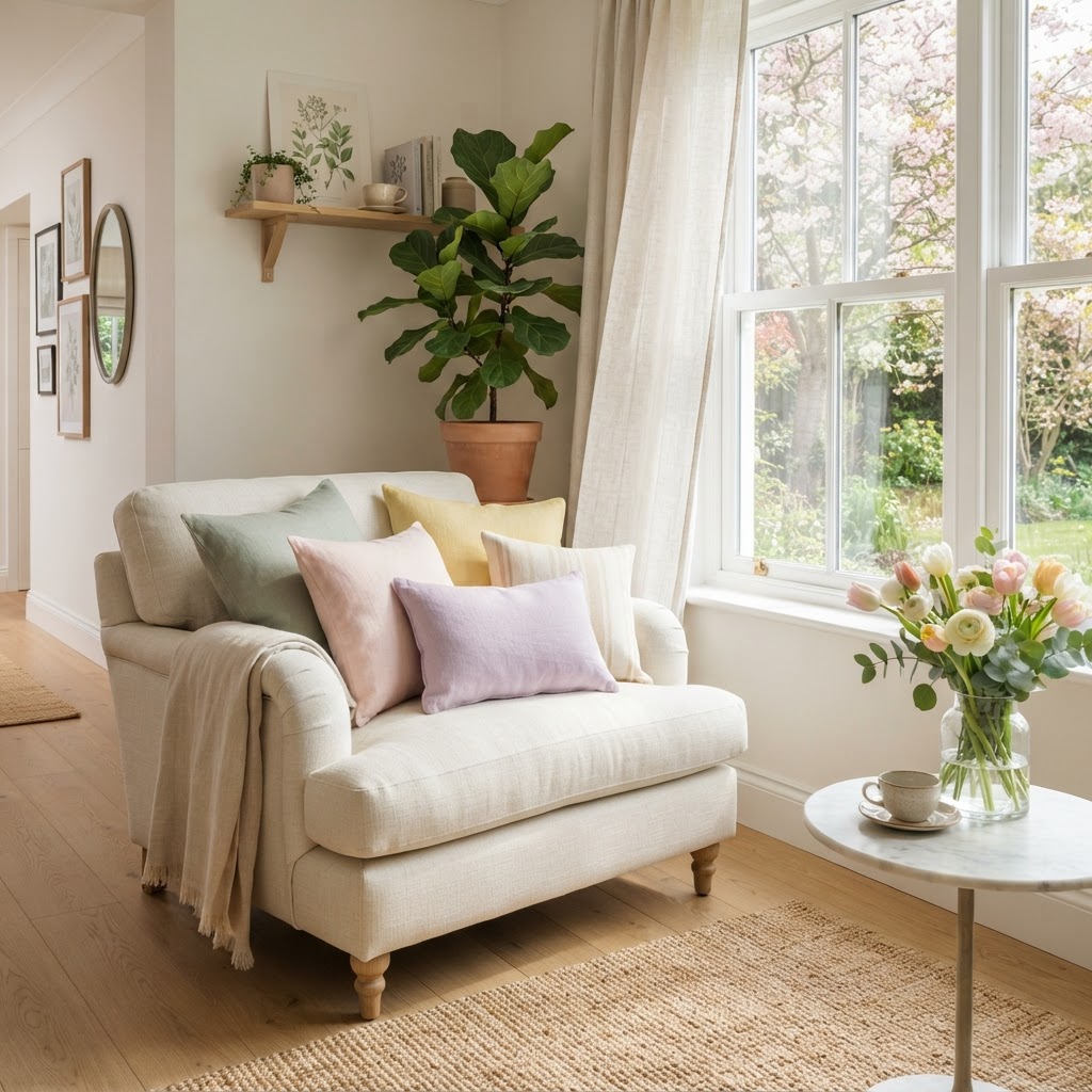
Here's the thing about seasonal decorating: you don't need to overhaul your entire living room four times a year. That's exhausting and expensive. But swapping out a couple of throw pillows? That you can absolutely do, and it makes a bigger difference than most people expect.
The smartest approach is to build a core collection of neutral, year-round pillows that you keep out permanently. Think classic stripes, solid linens, timeless patterns in versatile colors. These are your foundation. Then you have a smaller rotating set of seasonal accents, maybe two or three pillows per season, that you swap in and out to shift the mood of the space without starting from scratch.
In practice, this might look like keeping your cream boucle and charcoal woven pillows out all year, and then in autumn swapping in some rust velvet and a plaid wool. Come winter, those get replaced by a deep burgundy with some metallic embroidery and maybe a faux fur accent. Spring calls for something lighter, a fresh sage linen or a pretty botanical print. Summer gets breezy with a washed indigo stripe or a bright coral cotton.
- Autumn: Warm rust, ochre, burnt orange, deep olive, plaid patterns, chunky knits
- Winter: Deep jewel tones, metallic accents, faux fur, rich velvet in burgundy or forest green
- Spring: Soft blush, sage, lavender, botanical prints, lightweight cotton and linen
- Summer: Bright whites, coastal blues, coral, washed linens, casual stripes
The budget-friendly secret here is to invest in quality inserts once and simply swap the covers. Good pillow inserts are not cheap, but they last for years. Pillow covers, on the other hand, are often really affordable, especially if you shop end-of-season sales. A set of four seasonal covers is a fraction of the cost of full pillows, and you're not storing giant fluffy squares in your closet. Just flat fabric. It's genuinely one of the best decorating hacks out there.
Final Thoughts
Throw pillows get a bad rap sometimes. People joke about them being excessive or impractical, and okay, fair point on the impractical front. But as a decorating tool, they're honestly one of the most powerful things in the room. They're low commitment, relatively affordable, easy to change, and they have an outsized impact on how a space feels.
The rules we covered here, mixing pattern scales, working a color ratio, layering textures, leaning into odd numbers, and rotating seasonally, are all just frameworks. They're meant to give you confidence, not to box you in. Once you understand why these principles work, you'll start breaking them in ways that still look great because you'll know what you're doing and why.
Start small if this all feels like a lot. Pick one sofa, apply the pattern mixing ratio and an odd number arrangement, and see how it feels. I promise once you nail it even once, you'll be rearranging pillows in every room of your house within the week. It's genuinely addictive once you get the hang of it.
More in Interior
Stay Inspired
Subscribe for new essays on architecture, design, and the spaces that shape us.