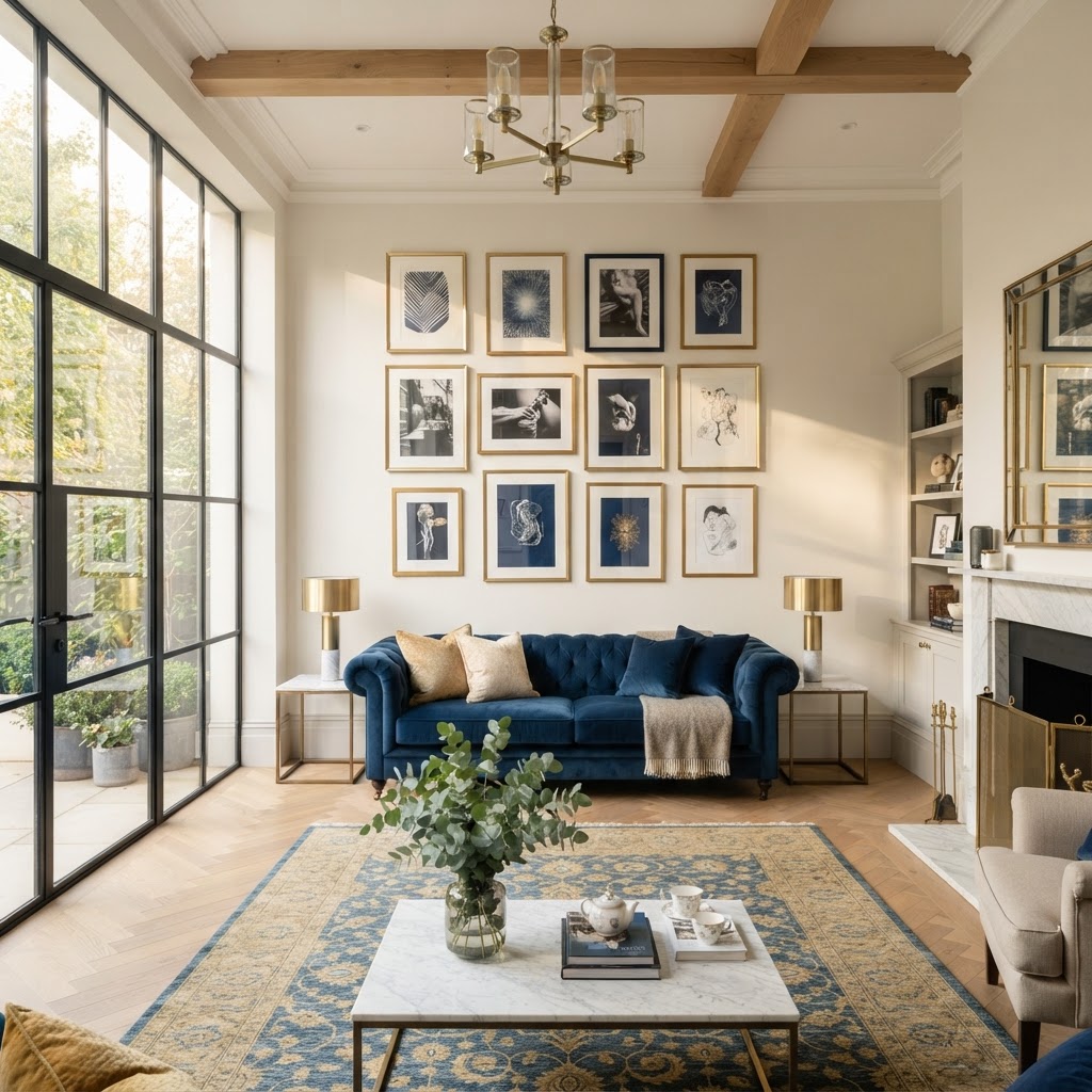
Wall Art Arrangements That Actually Look Professional
Struggling to hang your art without it looking like a cluttered mess? I am sharing my favorite layout formulas and styling tricks to help you create a gallery wall that feels intentional and elegant.
The Symmetry Method for Beginners
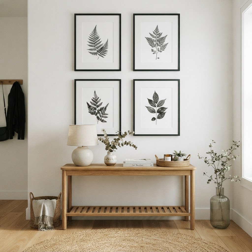
If you're brand new to hanging art and you want something that looks polished without a lot of guesswork, symmetry is your best friend. Honestly, it's the cheat code nobody talks about enough. Symmetrical arrangements rely on balance, and our brains are hardwired to find them satisfying. Think two matching frames on either side of a sofa, or a neat grid of four prints in equal sizes. It just works.
Here's the thing about symmetry though: it doesn't mean boring. You can keep the layout perfectly mirrored while still playing with interesting subject matter, bold colors, or mixed media inside the frames. The structure is what gives you the professional look, not the content itself. So feel free to go wild with what you actually hang, as long as the placement is balanced.
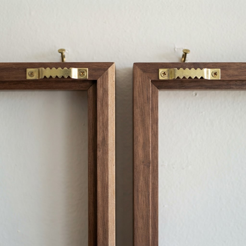
When you're setting this up, start by finding your anchor point. That's usually the center of the wall or the center of a piece of furniture underneath it, like a console table or a bed headboard. Measure out from that center point equally on both sides before you put a single nail in the wall. I know it sounds tedious, but trust me on this: those ten minutes of measuring will save you from a whole afternoon of patching holes.
Keep the spacing between frames consistent too. Somewhere between two and four inches between pieces tends to feel right. Too close and it looks cluttered, too far and the arrangement starts to feel like individual random frames rather than one cohesive display. A little painter's tape on the wall to mark your spots before you commit is absolutely worth it. No shame in that whatsoever.
Mastering the Salon Style Chaos
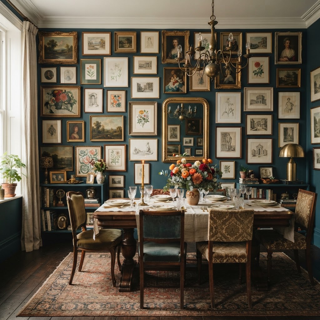
Okay, salon style is the one that looks completely spontaneous and collected over a lifetime, and it is the hardest to pull off without looking like an actual mess. Real talk, I have seen so many attempts at this that end up looking like someone just hammered nails into the wall at random. The difference between a salon wall that looks curated and one that looks chaotic comes down to a few specific decisions made before anything goes up.
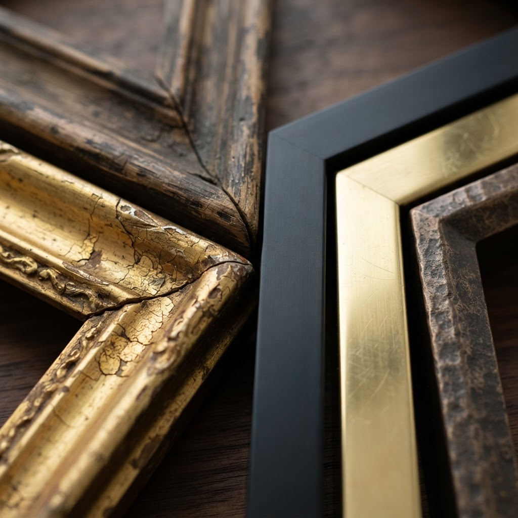
The first thing you need is a unifying element. It can be color, frame finish, subject matter, or even just the vibe of the pieces. A collection of mismatched frames all in black or all in natural wood automatically starts to feel cohesive. A mix of botanicals and vintage maps can work beautifully together because the aesthetic speaks the same language even if the styles aren't identical. Pick your thread and run it through everything you're including.
Here's how I actually approach this layout. Trace all your frames on kraft paper or newspaper, cut out the shapes, and tape them to the wall first. Live with the arrangement for a day. You'll immediately spot the spots that feel too heavy on one side, or where there are two similar-sized pieces sitting right next to each other when they should be spread out. You want variation in size distributed across the whole arrangement, not clustered.
- Start with your largest piece and place it slightly left or right of center to anchor the whole thing without being rigid about symmetry.
- Alternate frame sizes so large and small pieces are spread across the arrangement evenly.
- Keep outer edges somewhat irregular, a staggered silhouette looks intentional, a perfectly rectangular outline looks like a grid gone wrong.
- Add at least one non-frame element like a small sculpture, a woven piece, or a ceramic wall hanging to add depth and texture.
And honestly, leave some breathing room. A salon wall that's packed edge to edge reads as desperate. The negative space between pieces is part of the composition. Let your walls breathe a little.
Anchoring with Large Scale Pieces
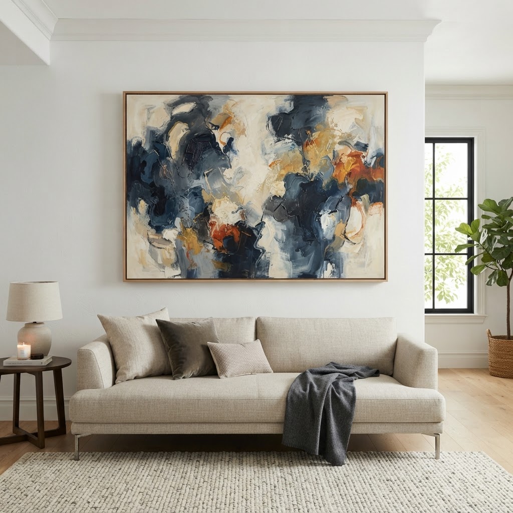
Look, if there's one piece of advice I'd give someone who's starting from scratch with wall art, it's this: go bigger than you think you need to. Seriously. Most people chronically underestimate scale when it comes to art, and the result is a room full of dinky little frames floating in a sea of empty wall. It looks timid. One large, well-chosen piece hung correctly does more for a room than five small ones scattered around.
Large scale art works because it commands the eye and gives the room a sense of confidence. When you walk into a space and there's a big, gorgeous piece above the sofa or leaning dramatically against the wall in a bedroom corner, it signals that someone made a decision. That's what professional spaces do. They commit. A huge abstract canvas, an oversized photograph, a large framed textile, these things tell the room's story without you having to say a word.

For sizing guidelines, a piece hung above a sofa should be roughly two thirds the width of the sofa. Not the full width, that tips into overwhelming, but not less than half either, that starts to look like an afterthought. Above a bed, you can go wider because the headboard and bedding create a visual base that can support more visual weight up top.
And here's a tip that honestly changed how I think about art placement: you don't always have to hang it. Leaning a large canvas against the wall, especially in a bedroom or behind a sofa, gives off this effortless, collected energy that looks incredibly editorial. It also means zero commitment, zero holes, and total flexibility to change things up whenever you feel like it. Win all around.
Using Ledges for Flexible Styling
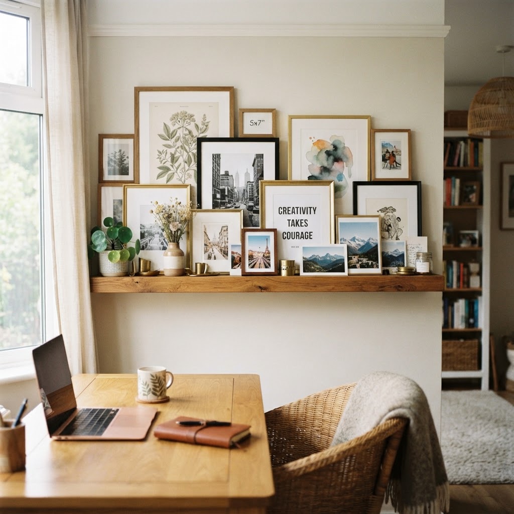
Picture ledges might be the most underrated tool in the whole wall art world. I'm not exaggerating. They give you all the impact of a gallery wall with none of the commitment, and honestly, for renters or anyone who just likes to switch things up seasonally, they're an absolute game changer. You install the ledge once, and then you can rearrange, add, swap, and refresh the art on it as many times as you want without touching the wall again.
The styling possibilities on ledges are really endless. You can layer pieces at different depths, lean a large print behind a smaller one, mix framed art with unframed prints, add small objects like a ceramic vase or a little plant, and create something that feels genuinely layered and alive. It stops being a flat display and starts feeling like a little still life. Which is so much more interesting.
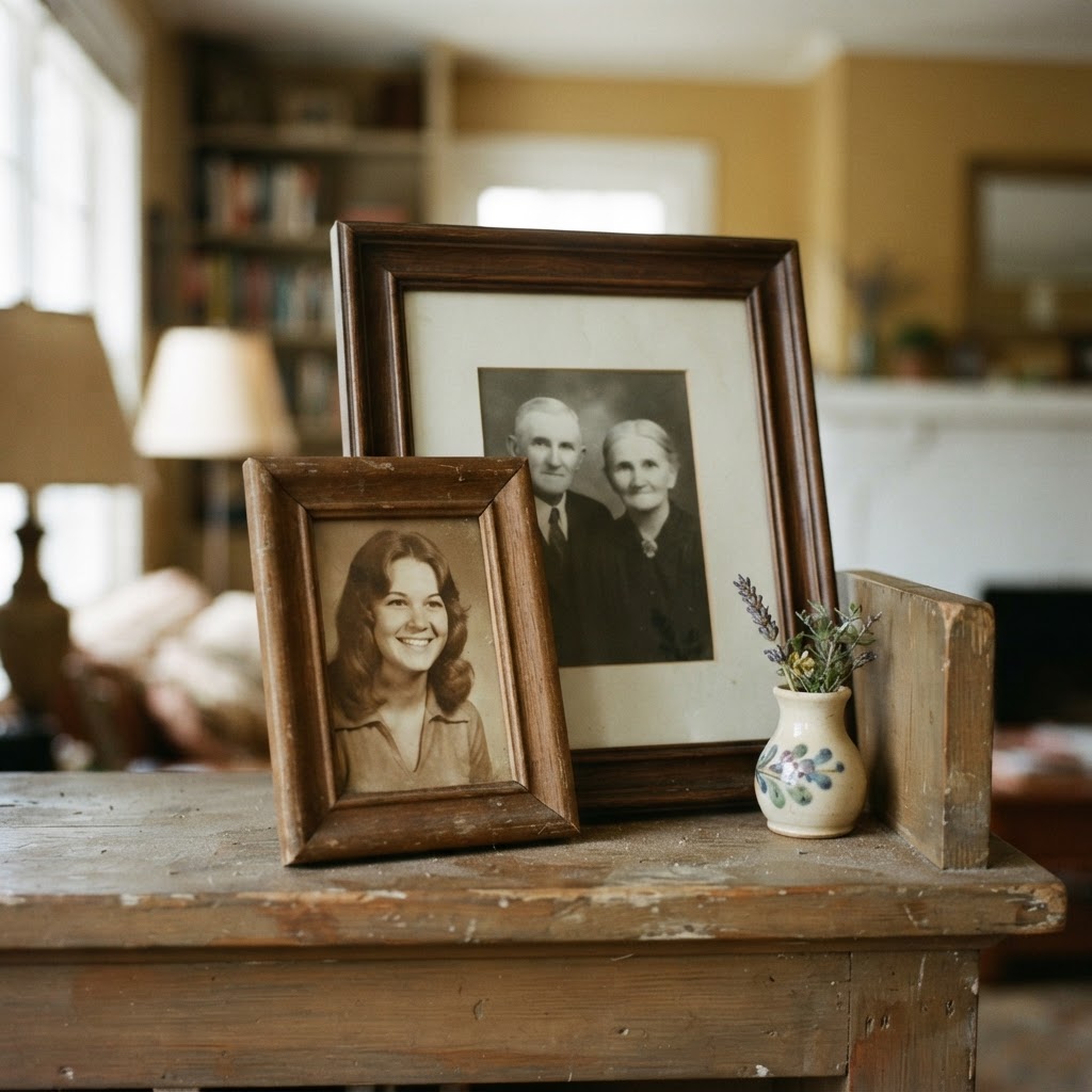
- Install multiple ledges at varying heights instead of just one for a more dynamic arrangement.
- Mix frame finishes freely since the ledge itself acts as the unifying structure.
- Don't fill every inch of the ledge, leave gaps and let pieces breathe.
- Layer pieces by leaning them at slightly different angles for a relaxed, casual feel.
- Swap pieces seasonally to refresh the whole room without any new holes in the wall.
Ledges work beautifully in hallways, above desks, in kids' rooms where art changes constantly as they grow, and in living rooms where you just can't commit to a permanent arrangement yet. If you haven't tried them, honestly, get some ledges up this weekend. You'll be rearranging things by Sunday afternoon and wondering why you waited so long.
The Golden Rule of Eye Level
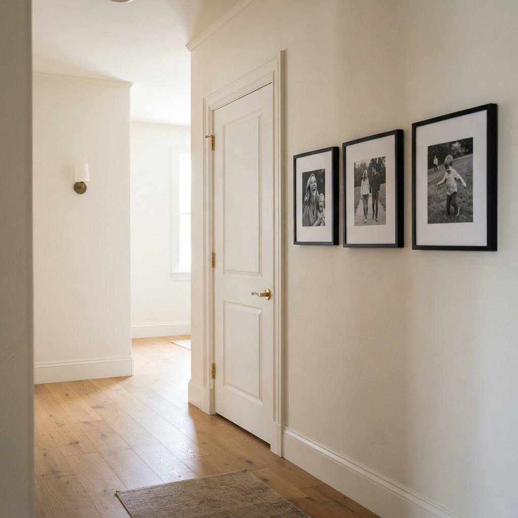
Here's the thing that most people get completely wrong, and it's the single biggest mistake I see in homes that otherwise have great taste. They hang their art too high. Way too high. Like, at a height where you have to tilt your head back to look at it, which is not how anyone experiences a painting in a museum or a gallery. Art hung too high feels disconnected from the room, like it's floating up near the ceiling with no relationship to the furniture or the people in the space.
The museum standard is to hang art so that its center is at 57 to 60 inches from the floor. That's roughly average human eye level when standing. This is the rule that galleries and professional interior designers use, and it works in basically every residential context too. Measure to the center of the piece, not the top, not the bottom. The center at 57 to 60 inches. That's your target.
Now here's where it gets a little nuanced. When art is hung above furniture, you do want to account for the visual relationship between the piece and what's below it. The bottom of the frame should sit about six to eight inches above the top of a sofa, console table, or bed headboard. That gap keeps the art feeling connected to the furniture without looking like it's squishing down onto it. Any closer and it feels crowded. Any further and they look like they belong to different arrangements entirely.
"The center of the frame at 57 inches from the floor. That's it. That's the whole secret. Everything else is styling, but this one measurement is what makes it look like a professional did it."
One more thing worth mentioning: when you have a grouping of pieces, treat the arrangement as a single unit and apply the eye level rule to the center of the whole grouping, not to individual frames within it. This keeps the collection reading as one cohesive display rather than a bunch of separate decisions. And remember, in rooms where you're mostly seated, like a dining room or a cozy reading nook, you can drop the hanging height slightly to account for the fact that eye level in those spaces is lower. Context matters. Use your judgment, trust your eye, and don't be afraid to adjust.
Final Thoughts
Wall art arrangements that look genuinely professional come down to a handful of principles, not talent, not a design degree, and definitely not an unlimited budget. Symmetry gives beginners a reliable foundation. Salon style rewards patience and a good eye for curation. Large scale pieces give rooms confidence. Ledges give you freedom. And hanging everything at the right height ties the whole thing together in a way that instantly elevates the space.
The honest truth is that most rooms with underwhelming art walls aren't suffering from bad taste, they're suffering from small scale and awkward height. Fix those two things first and you'll be shocked by the difference. Then layer in the other techniques as your collection grows and your eye develops. It's a process, and it's supposed to be fun. So go ahead, get some frames up on the wall, and see what your space can do.
More in Interior
Stay Inspired
Subscribe for new essays on architecture, design, and the spaces that shape us.