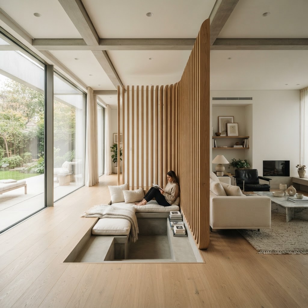
Why You Need a Nook: The Art of Designing for Privacy at Home
Modern open floor plans are beautiful but they often lack the solitude we crave. Discover how thoughtful architectural design can help you create private retreats within your own walls without sacrificing style.
The Psychology of Hidden Spaces
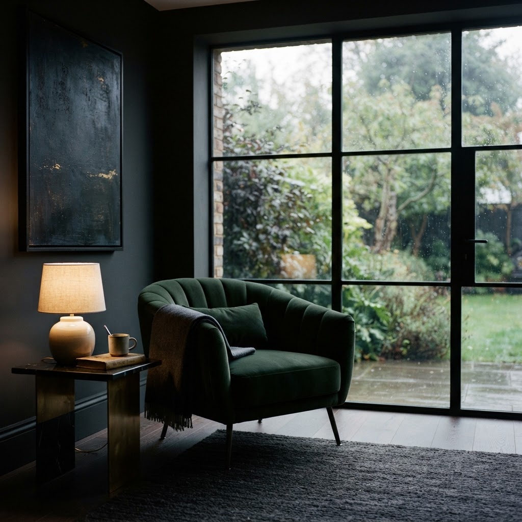
Honestly, I think about this all the time. Why does sitting in a corner booth at a restaurant feel so much better than sitting in the middle of the room? Why do kids instinctively build forts out of couch cushions and bedsheets? There's something deeply wired in us that craves small, bounded, semi-enclosed spaces. And yet most of the homes we build and buy completely ignore that instinct.
The concept is called prospect and refuge theory, and it was developed by geographer Jay Appleton back in the 1970s. The basic idea is that humans evolved to feel safest when they could see out into open space (prospect) while being sheltered and partially hidden themselves (refuge). It explains why we gravitate toward the back of a cave rather than the entrance, and why a window seat feels so irresistible. You get the view, but you're also tucked in. Protected. You can observe without being fully exposed.
What's wild is that architects and designers have known about this for decades, but the open-plan revolution of the 2000s basically steamrolled the whole idea. Suddenly everything was about knocking down walls and flooding spaces with light and making everything feel big and connected. And look, I get the appeal. Open plans have real benefits. But somewhere along the way we forgot that human beings also need a place to retreat.
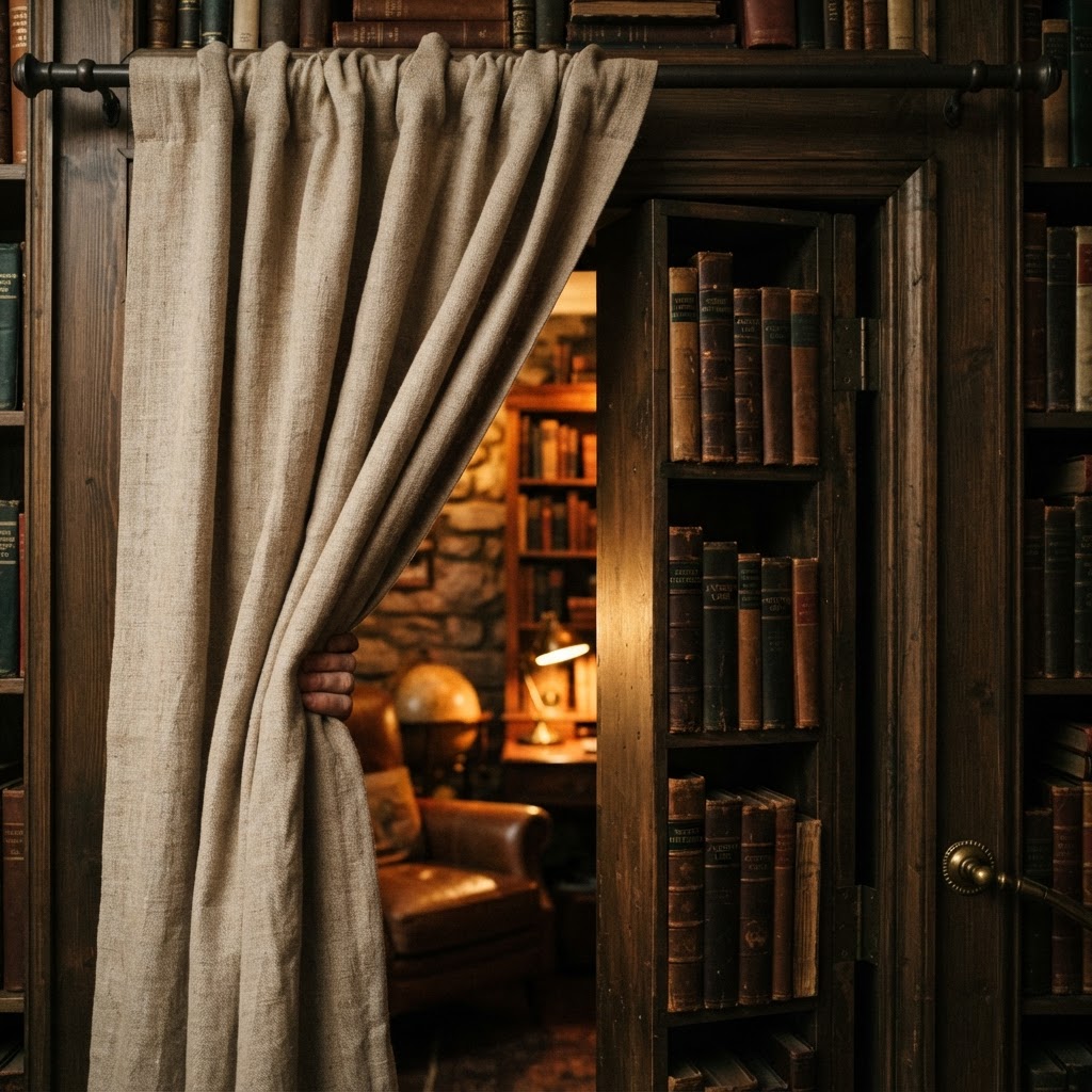
A nook doesn't have to be a dedicated room or even a major architectural feature. It just needs to signal to your nervous system: this is your spot. That signal can come from a lowered ceiling, from walls on two or three sides, from a change in flooring material, from the simple act of positioning a chair so your back is toward something solid. The brain picks up on these cues and starts to downshift. Heart rate slows a little. You exhale a bit more fully. You stop scanning the room.
Real talk, this matters a lot more now than it did twenty years ago. We're all doing more things at home. Working, schooling, exercising, socializing, resting, creating. The home has become a multi-functional environment that never fully lets you off the hook. Having a defined space that psychologically says "this is where you get to be small and quiet" is genuinely good for your mental health. It's not a luxury. It's infrastructure.
Screening Without Closing Off
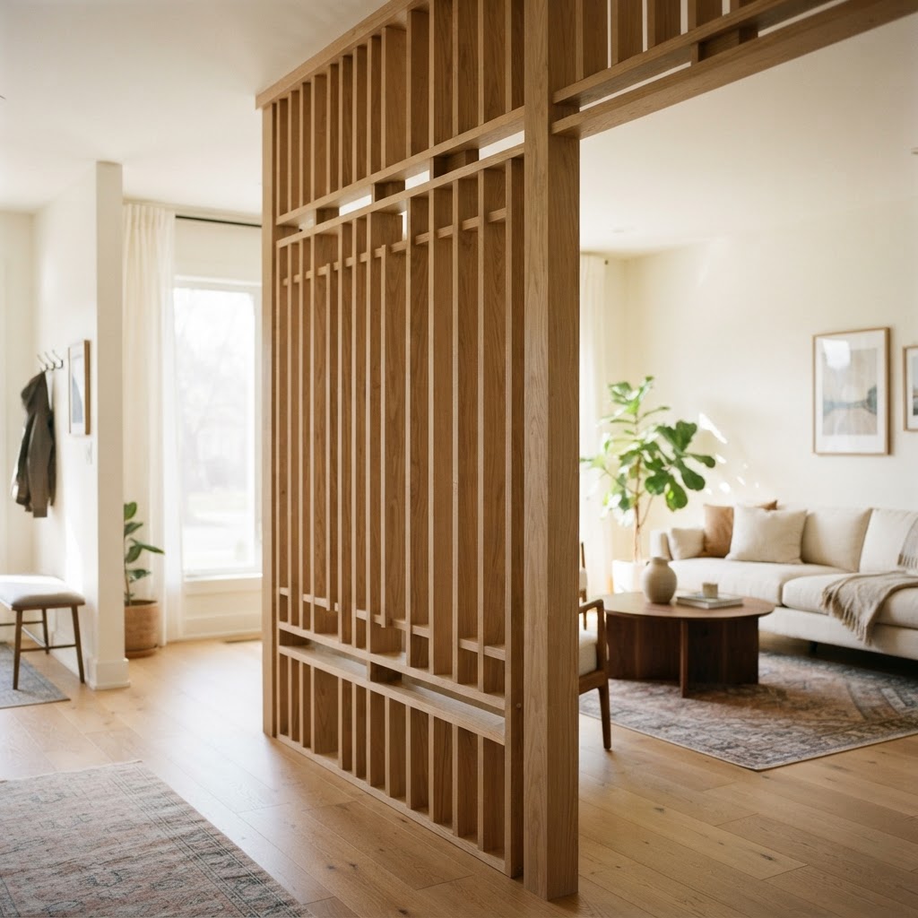
Here's the thing about privacy in an open-plan home: you don't necessarily need walls to create it. Some of the most beautifully private spaces I've ever walked into weren't enclosed at all. They were screened. Filtered. Separated from the rest of the room by something that defined the edge without slamming a door in your face.
Screens, dividers, shelving units, hanging textiles, bead curtains, perforated panels, tall plants arranged in a row. These are all ways of creating what designers sometimes call a permeable boundary. The space on the other side is still visible, still connected to the larger room, but there's a clear edge that signals: this zone is different. The visual separation alone does a surprising amount of work. You step behind the screen and suddenly you feel like you've arrived somewhere.
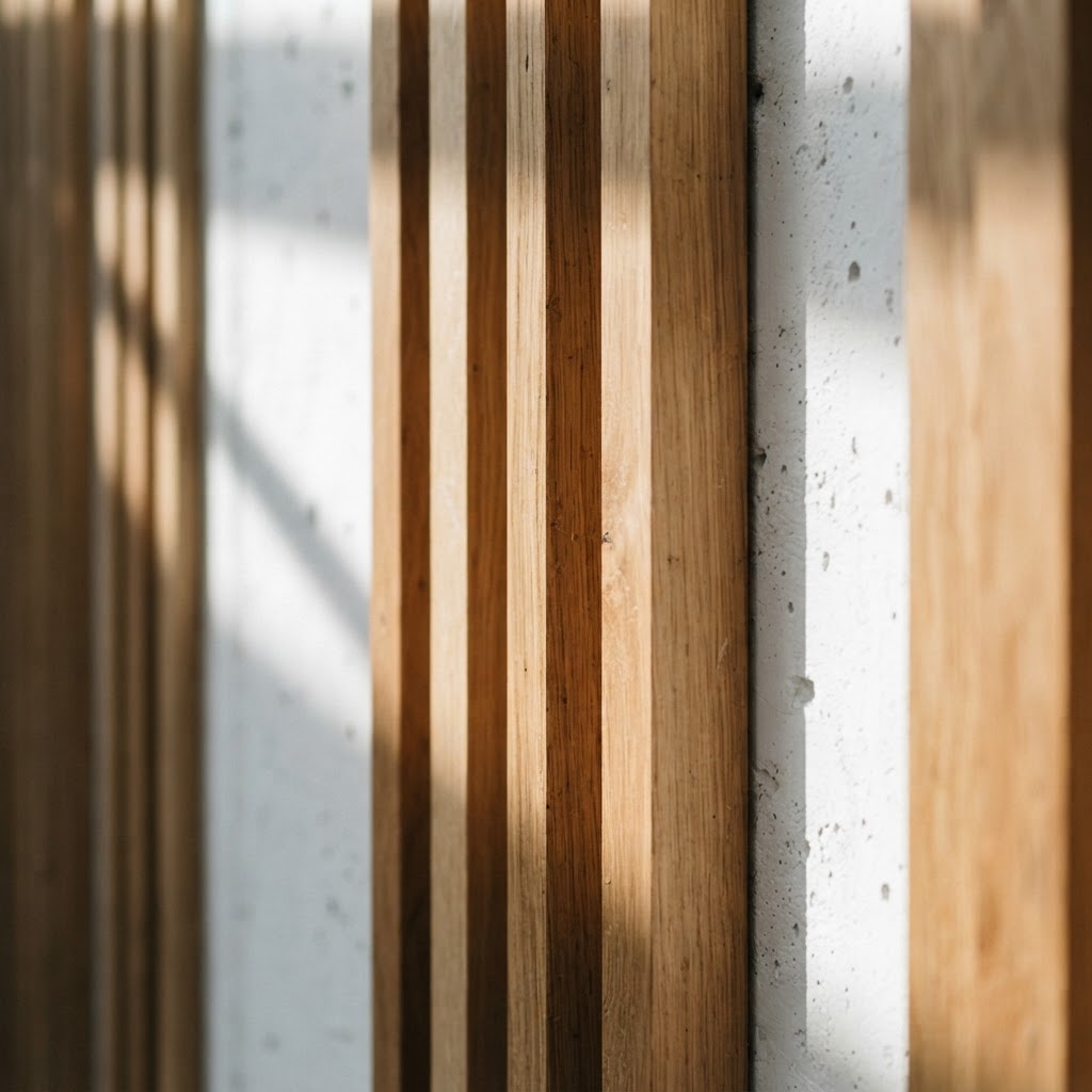
One of my favorite approaches is the bookshelf divider. A tall, open shelving unit positioned perpendicular to a wall creates a secondary room within the room. It's not opaque, which means light still flows through and the space doesn't feel claustrophobic. But it creates enough of a visual break that the area behind it reads as its own territory. Load it with books and objects and you're also adding texture, warmth, and personal meaning to the divide itself. That feels intentional in a way that a plain partition wall never quite manages.
Textiles are another underrated tool here. A ceiling-mounted curtain track that allows you to draw fabric across an opening when you want privacy and pull it back when you don't. This kind of flexibility is incredibly valuable in homes where the same space needs to serve multiple functions throughout the day. A dining area that becomes a homework zone that becomes a quiet reading space in the evening. The curtain is what allows that transformation to feel real rather than just theoretical.
And honestly, don't underestimate the power of a simple change in ceiling height. Even a partial soffit or a dropped ceiling element over a seating area creates an enclosure effect that the brain immediately reads as "a place." You haven't built a room. You've just suggested one. And often that suggestion is enough.
Designing the Modern Alcove
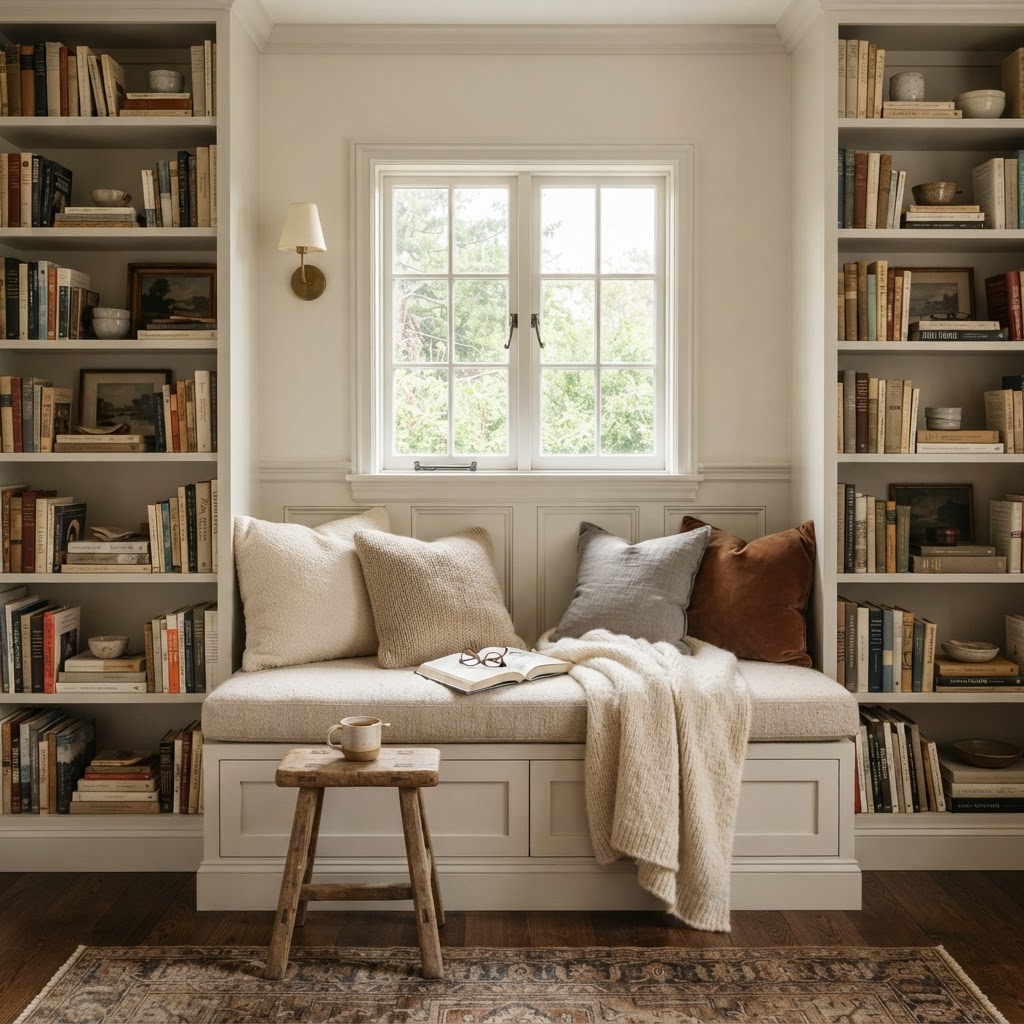
If you've got any architectural flexibility at all, the alcove is one of the most satisfying things you can build into a home. I'm a little obsessed with alcoves, honestly. They're essentially a controlled indent in a wall or room that creates a shallow, sheltered pocket of space. Think of the classic window seat, recessed into the thickness of a bay window, with cushions and storage underneath and the outside world framed perfectly in front of you. That's a masterclass in nook design.
The modern alcove can take a lot of forms. In a kitchen, it might be a small breakfast nook built into a corner with banquette seating on two sides and a fixed table. In a bedroom, it might be a reading alcove carved out of what would otherwise be dead corner space. In a living room, it might be a slightly raised platform with low surround walls that creates a sunken conversation pit, a format that was popular in the 1970s and is absolutely due for a serious comeback.
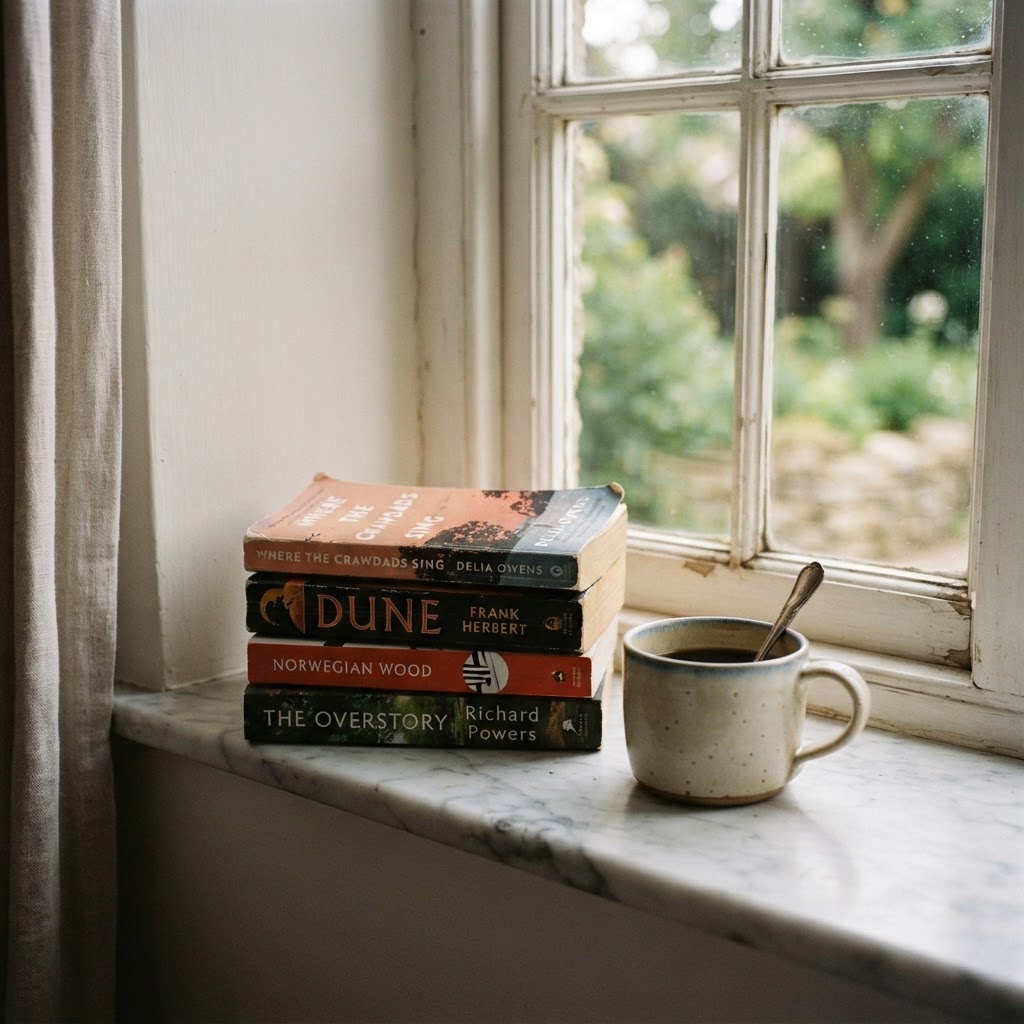
What makes a good alcove work architecturally is the relationship between its dimensions and the human body. The space should feel like it was sized for a person. Not too big, not too small. As a rough guide, a reading alcove should be about 90 to 100 centimeters deep (enough to fully seat and lean back), 120 to 150 centimeters wide (enough for one person to really spread out or two people to sit close), and with a ceiling or overhead element that comes down to around 180 to 200 centimeters above the floor. Those proportions create that cozy, scaled-to-you feeling that makes an alcove so compelling.
Lighting is crucial here. A nook without its own dedicated light source is just a dim corner. Built-in shelf lighting, a small wall sconce, an adjustable reading lamp mounted to the wall at the right angle. The alcove needs its own warm, low-level light that separates it from the overhead lighting of the rest of the room. That contrast in light levels does as much as the architecture itself to define the space as somewhere distinct and special.
Acoustics and the Geometry of Silence
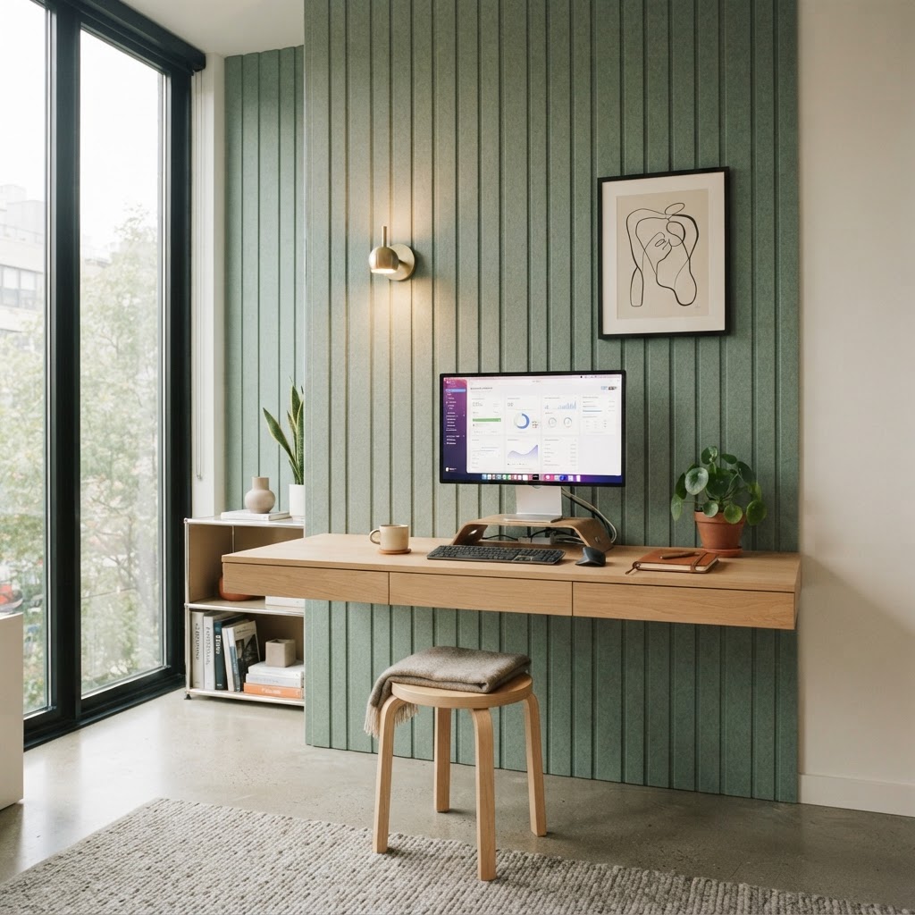
Visual privacy is one thing. But acoustic privacy is a whole different conversation, and in my experience it's the one people underestimate the most. You can design the most beautiful, enclosed-feeling nook in the world, and if sound from the rest of the house pours straight into it, it just won't deliver the sense of retreat that it promises. Sound is invisible, but it shapes our experience of a space just as powerfully as anything we can see.
Here's a basic principle worth knowing: sound travels in straight lines, but it also bounces off hard surfaces and accumulates in open, reverberant spaces. An open-plan room with concrete floors, glass walls, and a high ceiling is essentially an echo chamber. Every sound made anywhere in that space is present everywhere in that space. Adding a nook into that environment without also thinking about acoustics just creates a visually separate zone that's still acoustically merged with everything else.
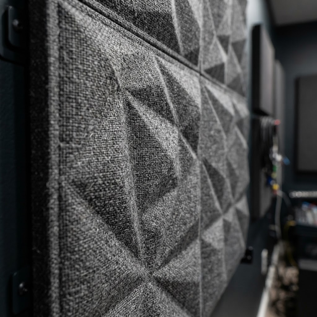
The fix involves layering soft, sound-absorbing materials within and around the nook. Upholstered seating, thick cushions, curtains, rugs, cork wall panels, acoustic felt, heavy wool textiles. These materials absorb sound energy rather than reflecting it, which reduces both the noise coming in and the way sound behaves within the space itself. A deeply cushioned alcove lined with fabric feels quieter because it actually is quieter. The geometry matters too. Angled surfaces scatter sound rather than bouncing it back at you, which is why some of the most acoustically comfortable spaces have slightly irregular wall angles rather than perfect right angles.
Don't overlook the floor-to-ceiling connection. A rug placed specifically within the nook zone creates an acoustic boundary that your ears register almost before your eyes do. When you step from a hard floor onto a rug and into an enclosed space, the change in the sound environment is immediate. That transition cues your brain to shift modes. Trust me on this. It's one of those design moves that sounds almost too simple but makes an enormous difference in how a space actually feels to be in.
Thresholds as Emotional Boundaries
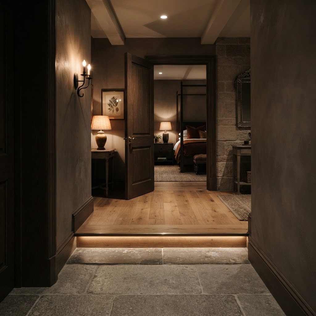
This is the one that most people never think about consciously, but every good nook designer understands it intuitively. The threshold, that moment of crossing from one space into another, is a hugely powerful emotional cue. When you have to duck slightly to enter a low-overhead reading nook, when you step up onto a platform, when you push through a curtain, when you turn a corner, your brain registers that as a meaningful transition. You're not just moving through space. You're arriving somewhere.
Architecture has used thresholds this way for centuries. Think of the compressed, low entrance to a Japanese tea house, which forces you to bow as you enter and signals a complete shift in mode. Think of the garden gate that separates the busy street from a private courtyard. The threshold is doing emotional work. It's saying: what you were doing out there doesn't have to follow you in here.
In residential design, you can create these moments without going full tea-ceremony-architecture. A slight step up into a bay window seat. A narrow passage between two bookshelves that opens into a reading room. A doorway that's deliberately kept narrower than standard width, so you have to consciously choose to enter. Even a change in flooring material right at the entrance to a nook, from hardwood to a warm wool rug, acts as a threshold that the body registers at a sensory level. These are small gestures, but they're doing significant psychological heavy lifting.
- A change in floor material at the entry point of a nook creates an immediate sensory signal of arrival
- A slight level change, either a step up or a sunken area, reinforces the sense of crossing into a different zone
- A narrowed passage between elements makes entry feel deliberate and separates the nook from casual traffic flow
- A shift in ceiling height right at the threshold marks the beginning of a more intimate, enclosed environment
- A tactile surface change on the walls or overhead, like moving from smooth plaster to warm wood paneling, completes the sensory transition
What I find most compelling about thresholds is that they work in both directions. They mark the moment you enter the private space, but they also mark the moment you leave it. That departure cue is actually really valuable. It helps you to mentally close the chapter. You were in your nook, you were quiet, you were private. Now you're stepping back out into the shared space of the home and you can be present there in a different way. Without that threshold, the two modes blur together, and you get the worst of both.
Final Thoughts
Look, the bottom line is this: designing for privacy at home isn't about being antisocial or building a bunker. It's about acknowledging that human beings are genuinely complex creatures who need different kinds of spaces at different moments in the day. We need openness and connection and light and flow. And we also need somewhere to be small and quiet and held.
The nook, in all its forms, is the architectural answer to that second need. Whether it's a built-in alcove with a window seat, a reading corner screened by a tall shelving unit, a sunken conversation pit lined with soft textiles, or simply a chair positioned with its back to a wall in a well-lit corner, the principle is the same. Give yourself a place that feels like yours. Make it warm, make it acoustically considered, give it a threshold that marks the entry as meaningful, and let the psychology do the rest.
Honestly, I think adding a proper nook to a home is one of the highest-return design investments you can make. Not in financial terms necessarily, though a well-designed built-in adds real value, but in terms of how much better the home actually feels to live in every single day. That's what good architecture is supposed to do. And a good nook does it better than almost anything else.
More in Residential
Stay Inspired
Subscribe for new essays on architecture, design, and the spaces that shape us.